|
| Group |
Round |
C/R |
Comment |
Date |
Image |
| 49 |
May 22 |
Reply |
Hi David - thanks for taking the time to reply. I'm a sucker for the shallow DOF, sometimes to my own dismay. Thanks for the reminder to capture w/various DOFs.
I'm also a bit gun-shy when it comes to vignettes. I do try to keep them subtle, but I guess if they're too subtle - then you might as well not have 'em!
Thanks for feedback, I appreciate it and will keep it in mind moving forward. |
May 13th |
| 49 |
May 22 |
Reply |
Thanks for the input Dicky ting ming Law. |
May 11th |
| 49 |
May 22 |
Reply |
Hey Craig - ya! Or even a little more subtle... Unless you bounce back and forth between the two, you almost done even realize the difference but there's something a little more about it - it takes the edge off. |
May 10th |
 |
| 49 |
May 22 |
Comment |
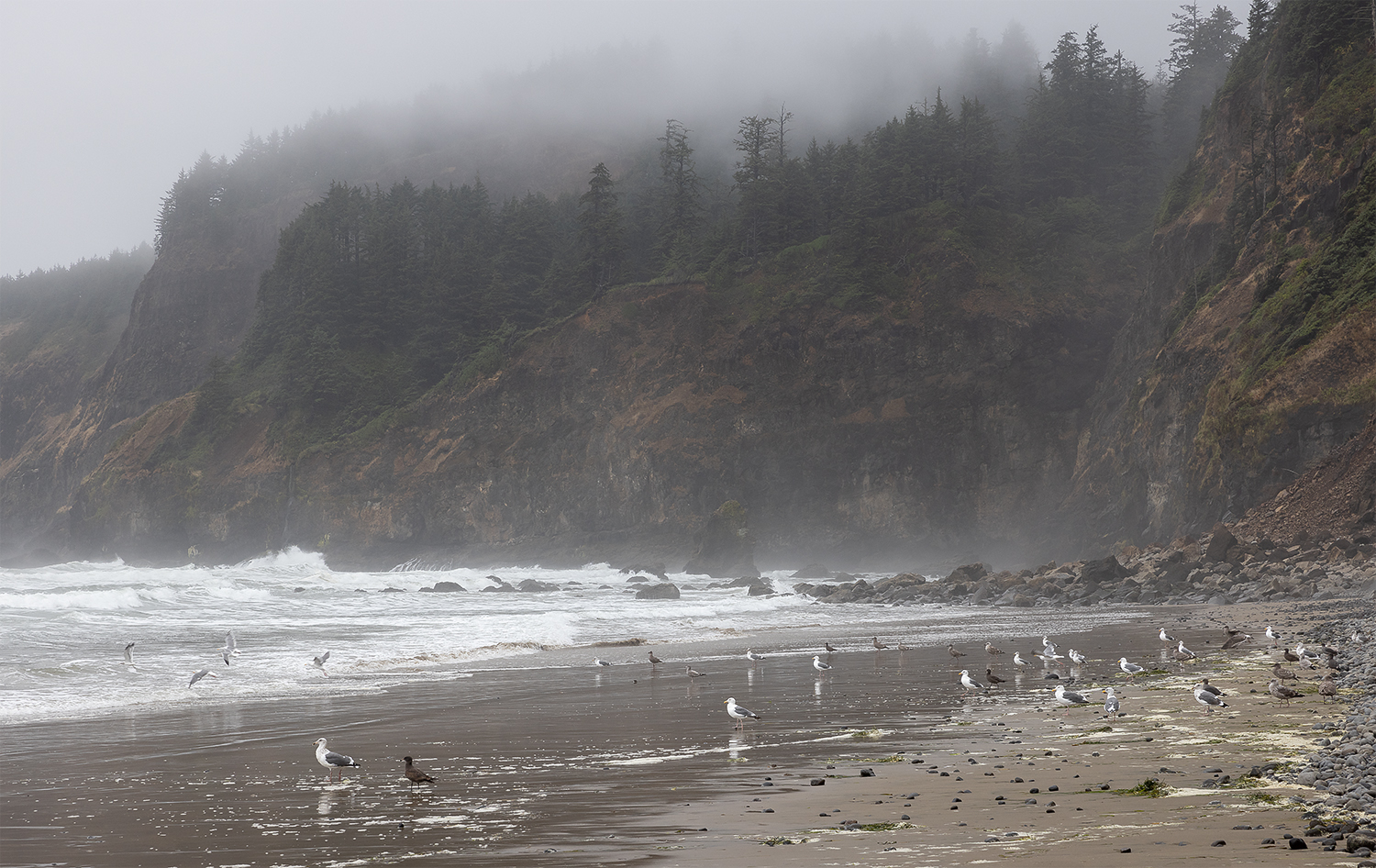
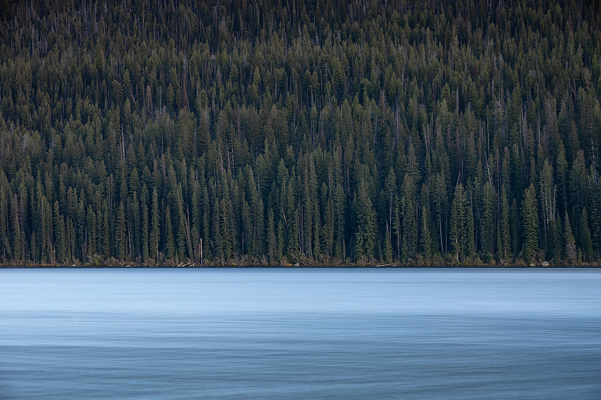
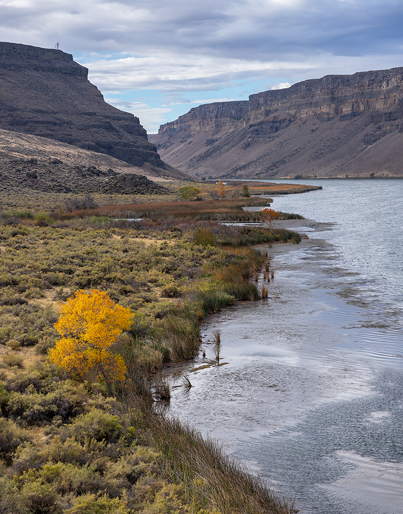
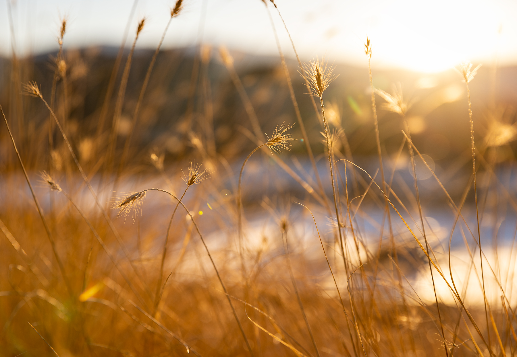
This is a really cool image and makes me want to ride the cable car! I agree with the edit suggestions from Alan and Craig. Also, there's a little dead space on the right that could be cropped in. Not sure if you have other exposures of this, but I'm conflicted about the top. Part of me wants to see the rest of that coastline on the left that's cropped out of the image and the other part of me wants to get rid of it altogether. I suppose give a little thought to the crop of this and make sure it's what you want. Thanks for sharing! |
May 10th |
| 49 |
May 22 |
Comment |
Nice image Alan, those new mirrorless bodies are amazing. I switched in February to the Canon R5 and have actually come close to reducing sharpness in some cases - they definitely take a little getting used to.
Anyway, I like how you handled this image, I didn't realize you'd manually blurred the background, I just figured it was a shallow DOF, so nice job handling that. It's well exposed too. One minor thing, which may not be worth hassle to make look realistic, but my eye keeps jumping to the big leaf on the bottom right.
|
May 10th |
| 49 |
May 22 |
Comment |
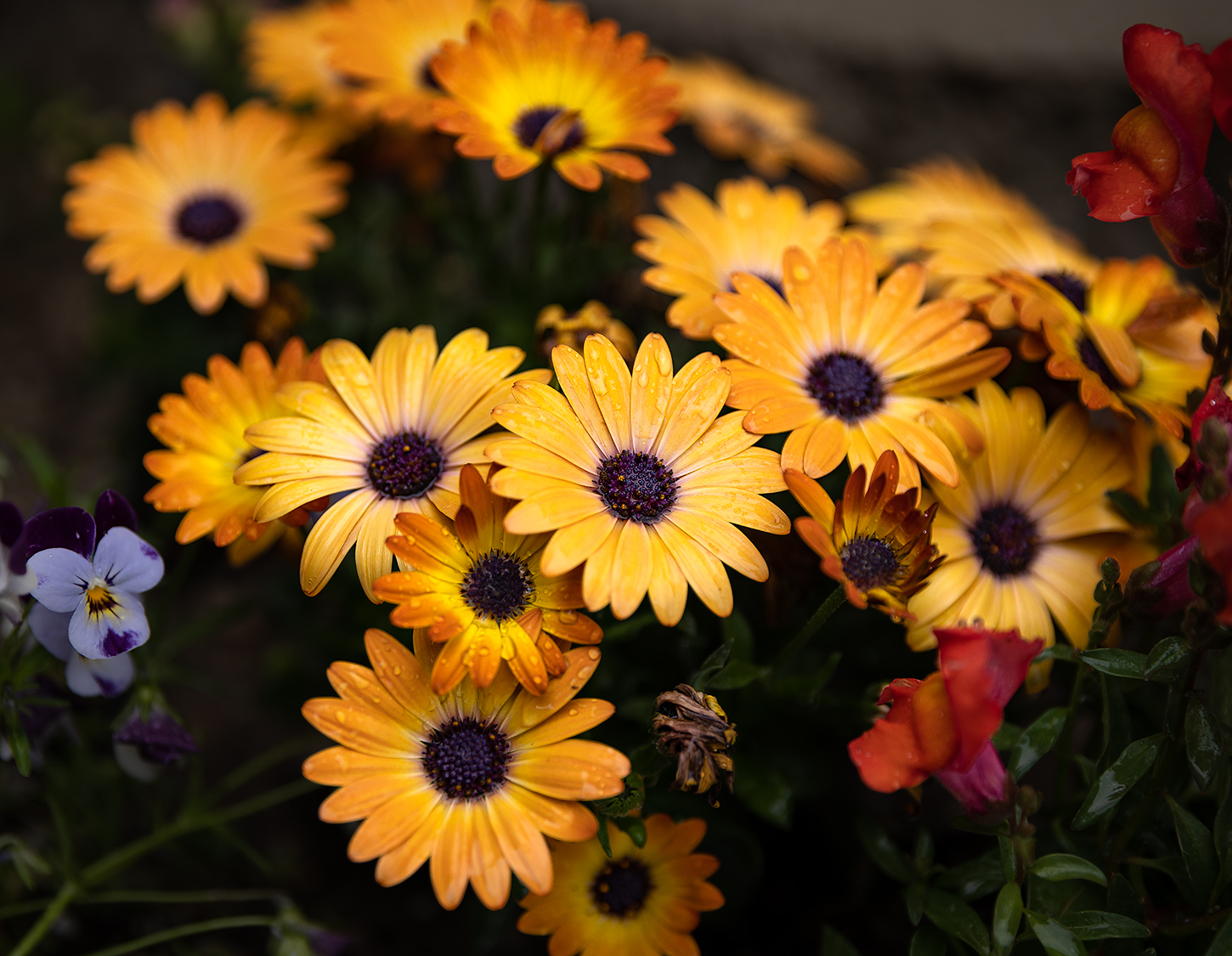
I like what you've going for here. The contrast of the colors works really well, and the backlit leaves are amazing. I think you have a little room to push the image too though, in terms of accentuating the brightness and contrast between the leaves and background. I tried bumping exposure, dehaze, and pushing the temperature a little to the yellow (to offset the blue cast) and came up with something in the neighborhood of what Craig uploaded so I didn't bother posting it too. Awesome image! |
May 10th |
| 49 |
May 22 |
Reply |
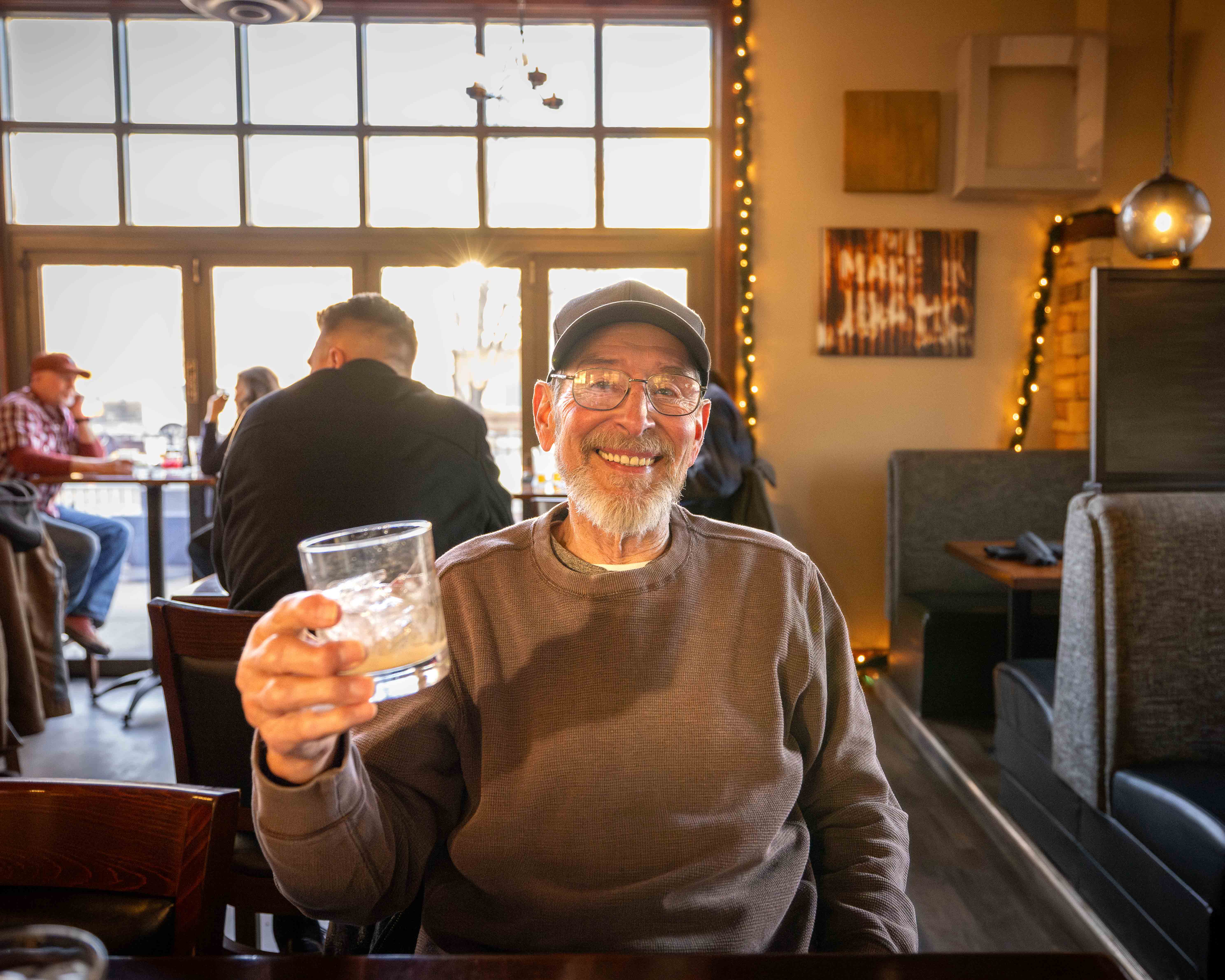
I agree with Alan's thoughts on this image. If you are married to it as it sits, you could try bringing the shadows on the gator up a bit to make it stand out. As the image sits now, the dark skin and bumps on its back make it meld into the color and shape of the water. |
May 10th |
| 49 |
May 22 |
Comment |
Technically, the image is strong. It's very sharp and the colors feel accurate to me - vibrant, but not overly so - it's also really well exposed. I think I'm a little conflicted on the subject though. The dancers appear to be having a good ol' time, which I want to pay attention to, but my eye is constantly being pulled to the background, which is also quite sharp and in focus, and interesting in its own right.
This may be exactly the intent and I'm just being thick, but that's what I got. I did play w/blurring the background a bit, and even subtly, it felt like it helped keep my eye on the dancers. |
May 10th |
| 49 |
May 22 |
Comment |
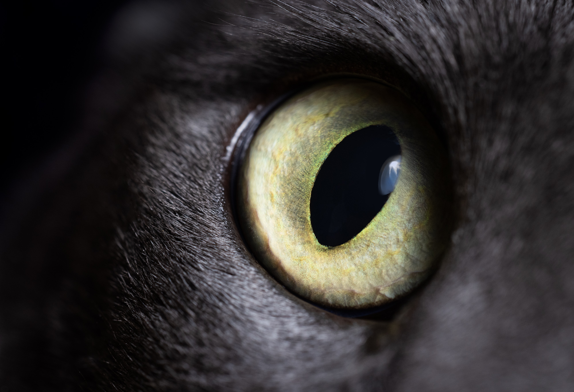
The composition of this image works well for me. It's got a fair bit of negative space, but it's balanced by the subtle green tones, nice leading lines, which add nicely to this image. Technically, I'm not sure what you did to it, but it's pleasing and seems intentional - so go with it!
The one suggestion I'd make, and it's similar to what was made to my image so it's fresh on my mind, is that the brightest part of the image is against the lower left corner of the image, and presumably not your subject. My initial reaction was to increase the shadows of the rose (which doesn't look bad either), but if you were going for the toned-down brightness and want the roses to remain at the levels they are, you might consider burning-down the brighter section to keep my eye's focus on the roses. A linear gradient from that corner might do the trick too. |
May 10th |
| 49 |
May 22 |
Reply |
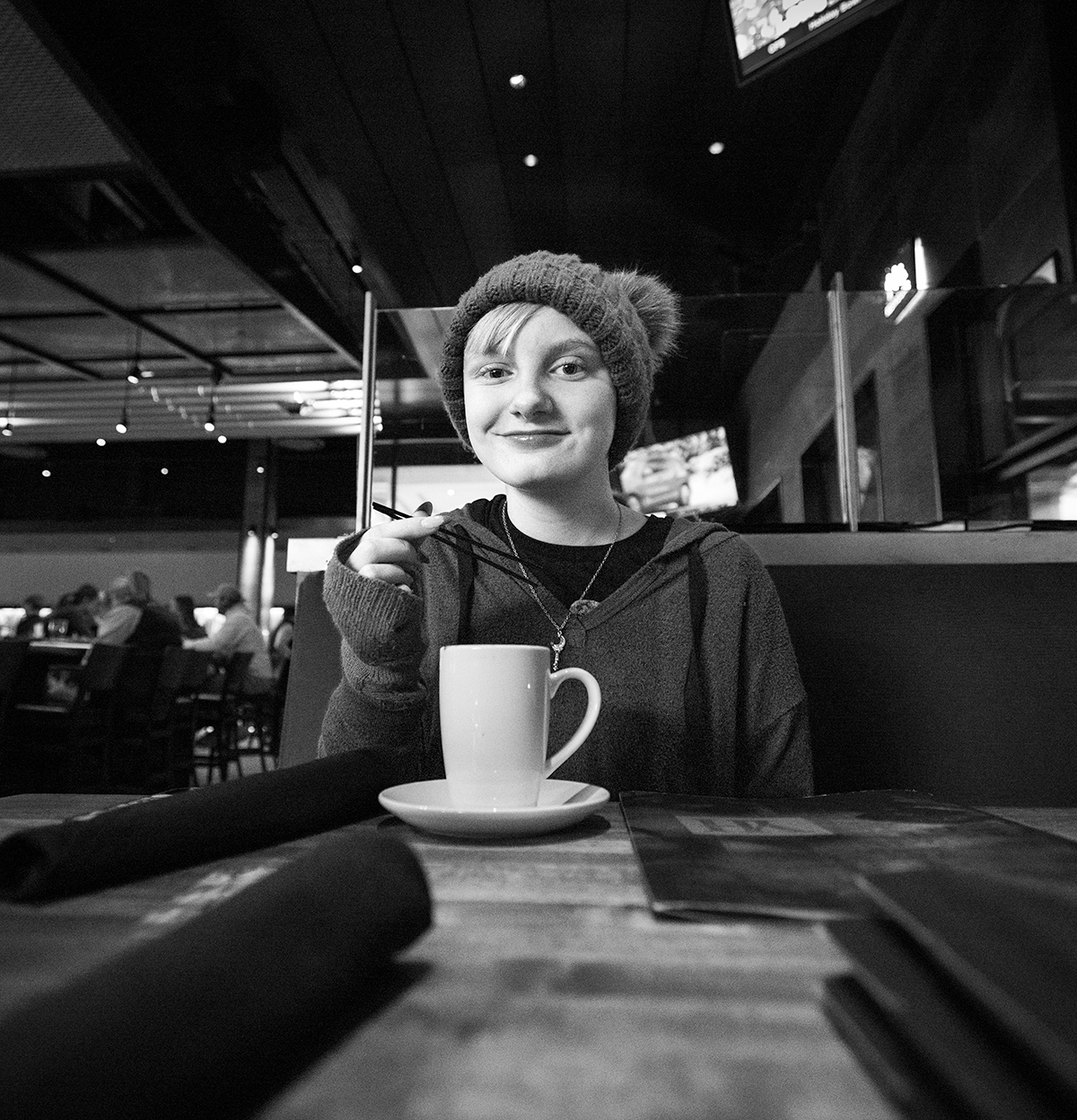
Hi Craig
Thanks for the specific feedback, I originally didn't rotate the image because I thought the vertical line of the pantry would look worse then the apparently crooked carpet (which isn't actually, the image was just taken at an angle so it appears that way). Regardless, I tried it out and I like it this way too.
Also, I tend to struggle with not wanting to overdue dodging and burning, sometimes to my own detriment, which is what happened here - now that you point it out though - I agree. So, I burned that bright spot on the top left, immediately followed by the bright spot above Pip's ears, which became the next brightest spot, and definitely like it more. My eye is officially not wandering to anything aside from Pipper's face. I've attached a revised version of the image, but not sure if it goes through some sort of review process before you can see it, but I guess well see. Thanks again!
|
May 10th |
 |
| 49 |
May 22 |
Reply |
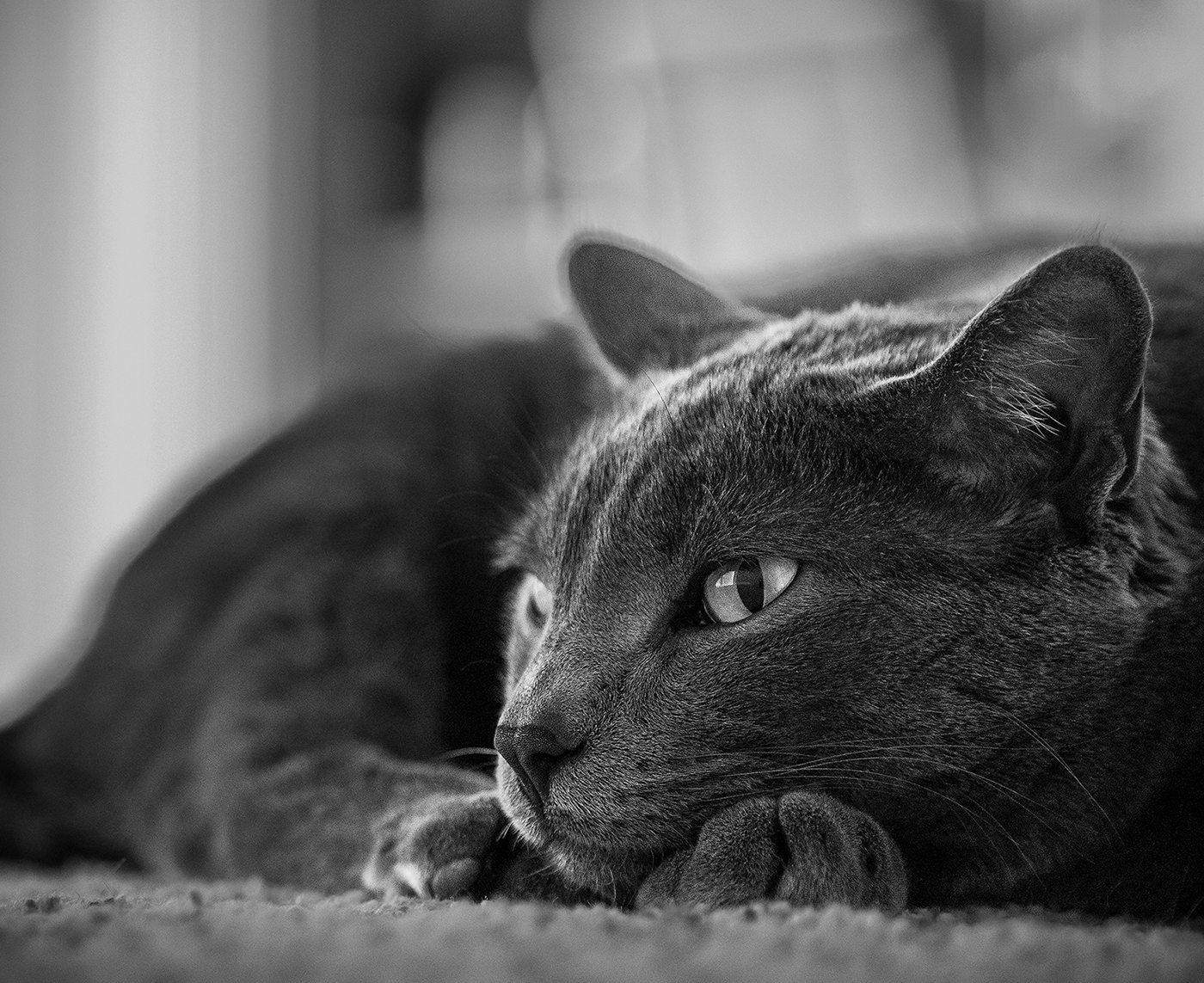
Hi Alan - thanks for the kind words! I can tell you what he's thinking about... figuring out how to steal his sister's (Ms. Potter) dinner ;) |
May 10th |
6 comments - 6 replies for Group 49
|
6 comments - 6 replies Total
|