|
| Group |
Round |
C/R |
Comment |
Date |
Image |
| 49 |
Apr 22 |
Comment |
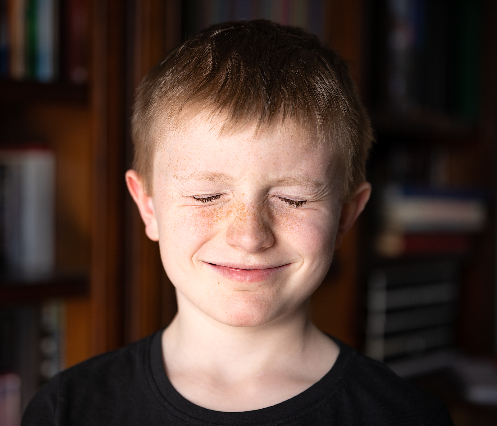
Thanks for the comments folks! The light is definitely brighter on our left (there's a window in that room causing that), but it never occurred to me that it'd be distracting to the image itself or to try balancing it with an additional light source - thanks for pointing it out, it's a good consideration.
As far as the closed eyes, the goal was to do something non-traditional from a portrait standpoint. I've got thousands of portraits with both eyes open. I think there's a bit of a disconnect between the fact that I of course know this little guy and have a world of context, and none of you have ever met him. I think images should stand on their own and my brain is filling-in too many things with this image, so having your completely unbiased feedback that this doesn't work as well as a different portrait type is awesome, I'll keep it mind moving forward - thanks again! |
Apr 23rd |
| 49 |
Apr 22 |
Reply |
Great call Alan, I'm only peripherally aware of the rules around nature photography competitions, but now that you mention it, it does sound familiar. Disregard the cleanup!! ;) |
Apr 23rd |
| 49 |
Apr 22 |
Comment |
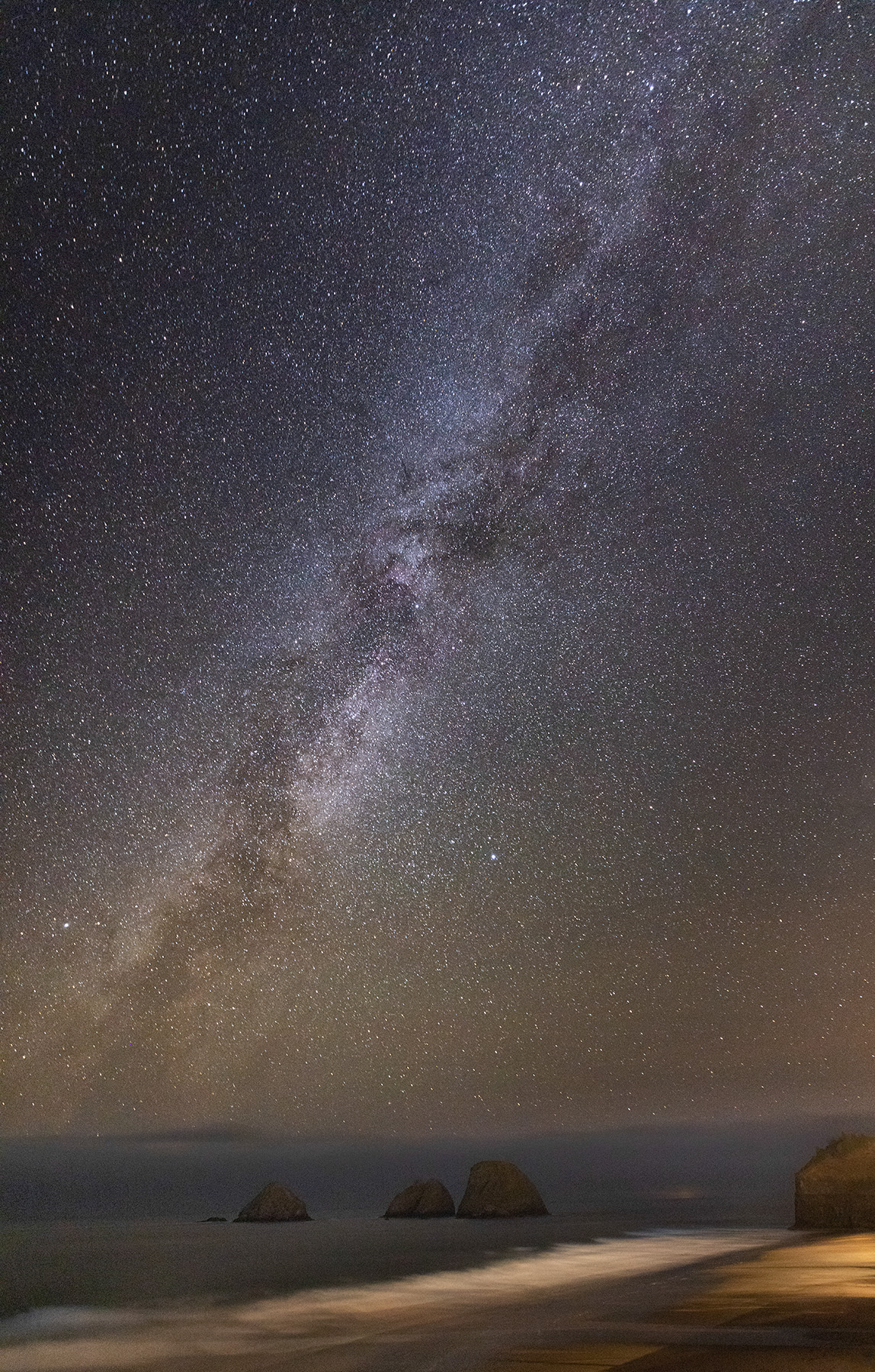
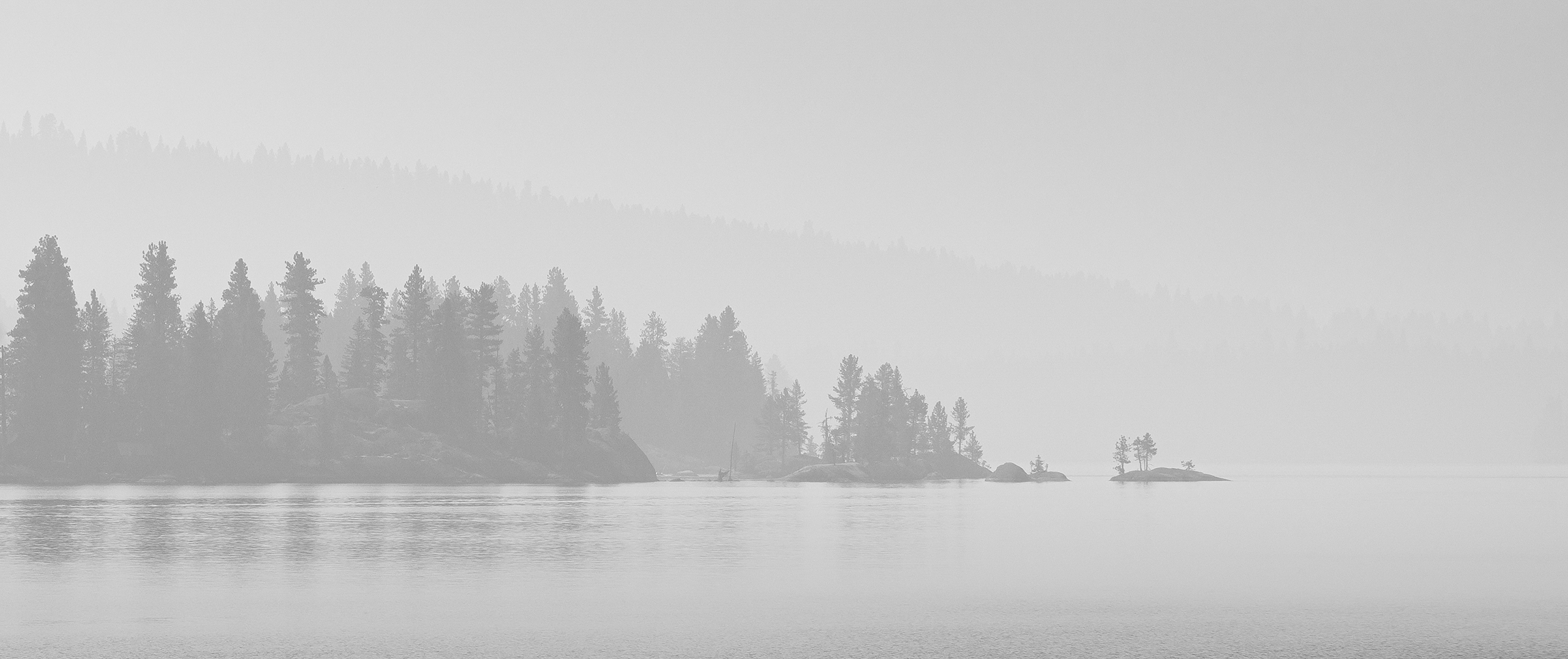
This image carries a lot of mood with it. It really feels like I'm at the bridge at blue hour and the warm yellow glow works very well to set that mood and compliments the blue sky nicely. The stars that the high aperture yields are a nice addition too. A few thoughts on the water - about halfway from left to right the water goes from very smooth, as is common with a long exposure shot of water, to a much sharper image - maybe the seas were rougher on the left? Something else maybe? My eye's a little confused by it and wants it to be the same on both sides. Another detail to consider is the reflection in the water on the left - consider cloning that out, or simply cropping the left side of the image a bit to remove the distraction. |
Apr 14th |
| 49 |
Apr 22 |
Comment |
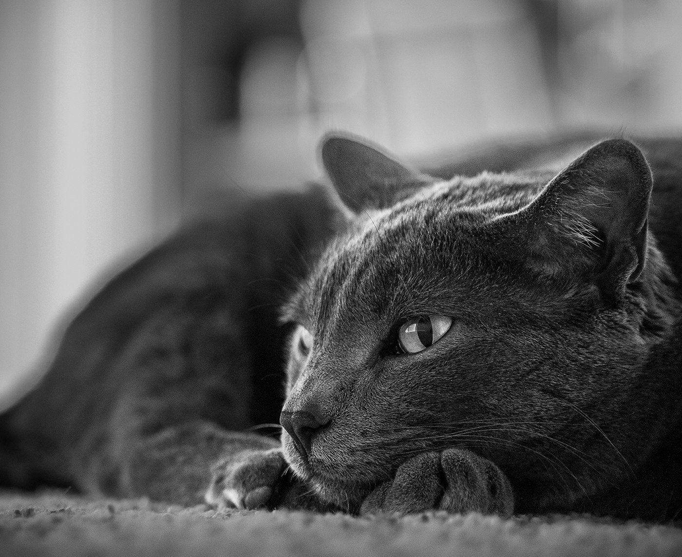
The simple composition of this image is striking and is complimented by its depth of field, leaving your eye to focus on the subject and the subject alone. Highlights were handled perfectly too - nothing's blown out, and it makes for a very pleasing experience. There are some dark spots on the branch itself that could have been brought-up, but I don't think that would have improved the image, and in fact - draws your eye away from the ice and for me, eliminates some of the mystery of this image. In reviewing it, I converted it to monochrome (which didn't change much), but it works very well as a black and white too - thanks for sharing! |
Apr 14th |
| 49 |
Apr 22 |
Comment |
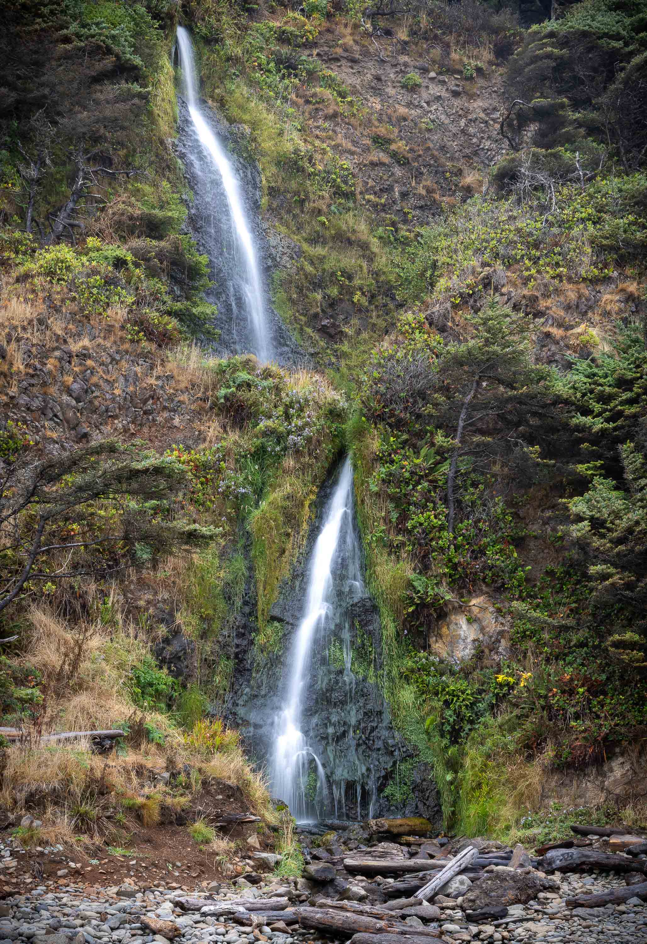
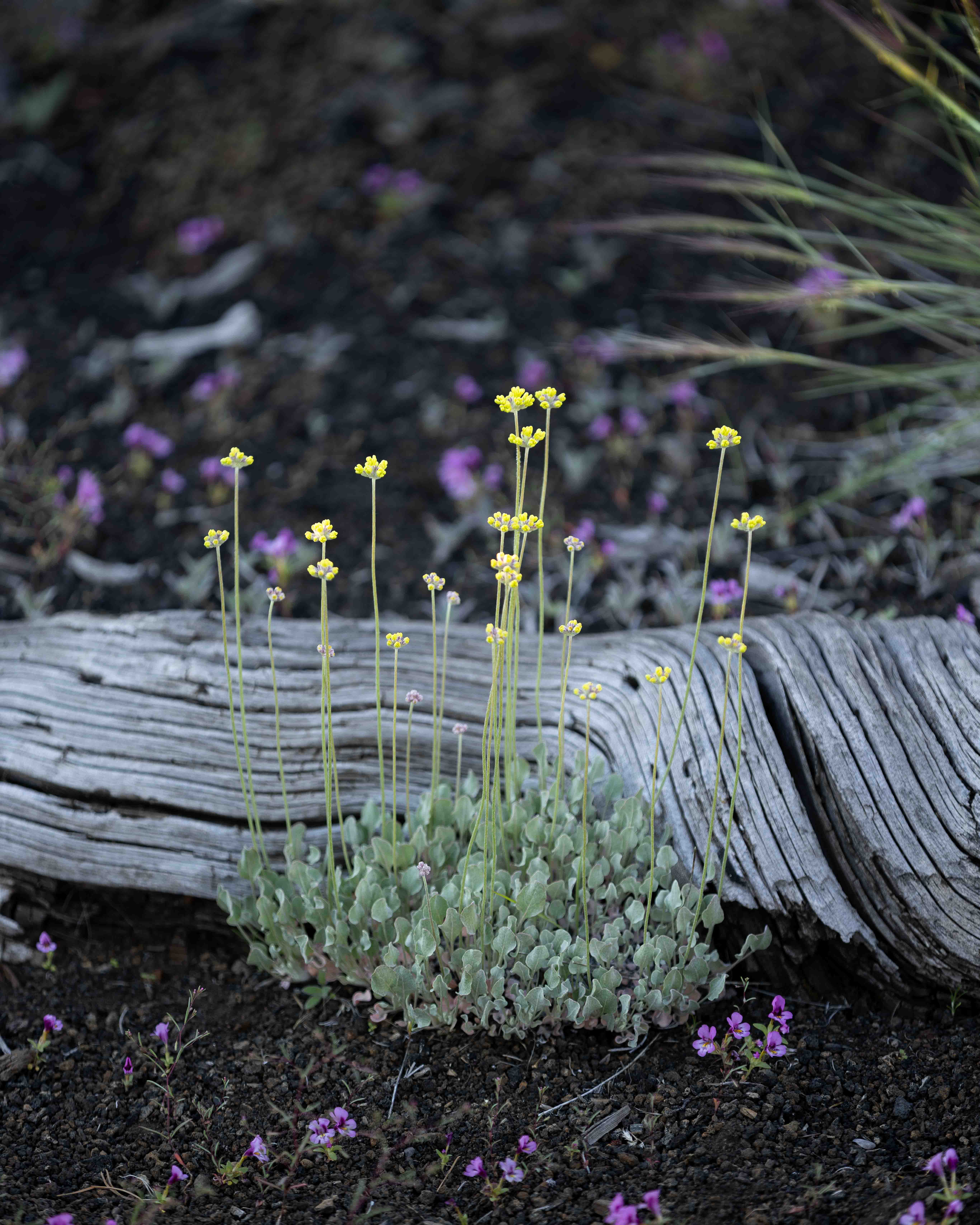
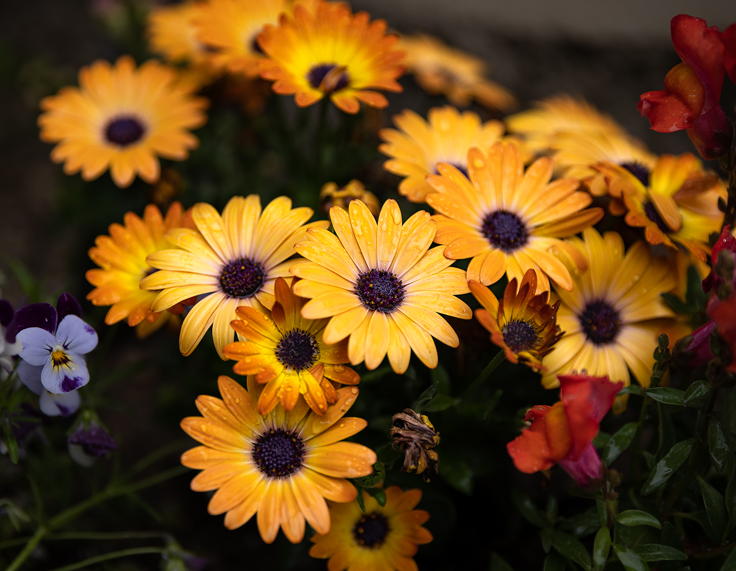
I think the variation in levels and textures in this image add to its interest. From the beautiful rock wall in the background, to the dark trees in the mid-ground, to the bright lit-up subject trees in the foreground. Some feedback that I've been given in the past regarding monochrome images is that they should have a range of exposure, all the way from pure whites to pure blacks. Rules are made to be broken, and seldom, if ever, apply in all cases, but I agree in this case that bumping the highlights in this image may help with impact as well as bring out some of the beautiful detail. This is a pretty low-resolution image, so that may be the cause, but I'm seeing some kind of artifacts to the right of the subject trees, possibly from a cloning job or something, that you may want to address. |
Apr 14th |
| 49 |
Apr 22 |
Comment |
Reading the supplemental information about this image helped with context. Without that though, I was a bit lost. If there is ocean on the other side of it, and that's supposed to be part of the story, perhaps consider trying to incorporate that as a more dominant part of the image. If the subject is supposed to be the thatched roof, which seems to be the case in this image, perhaps include a little more of the surrounding environment or adjust the composition of the image in some way to help capture more of its story. |
Apr 14th |
| 49 |
Apr 22 |
Comment |
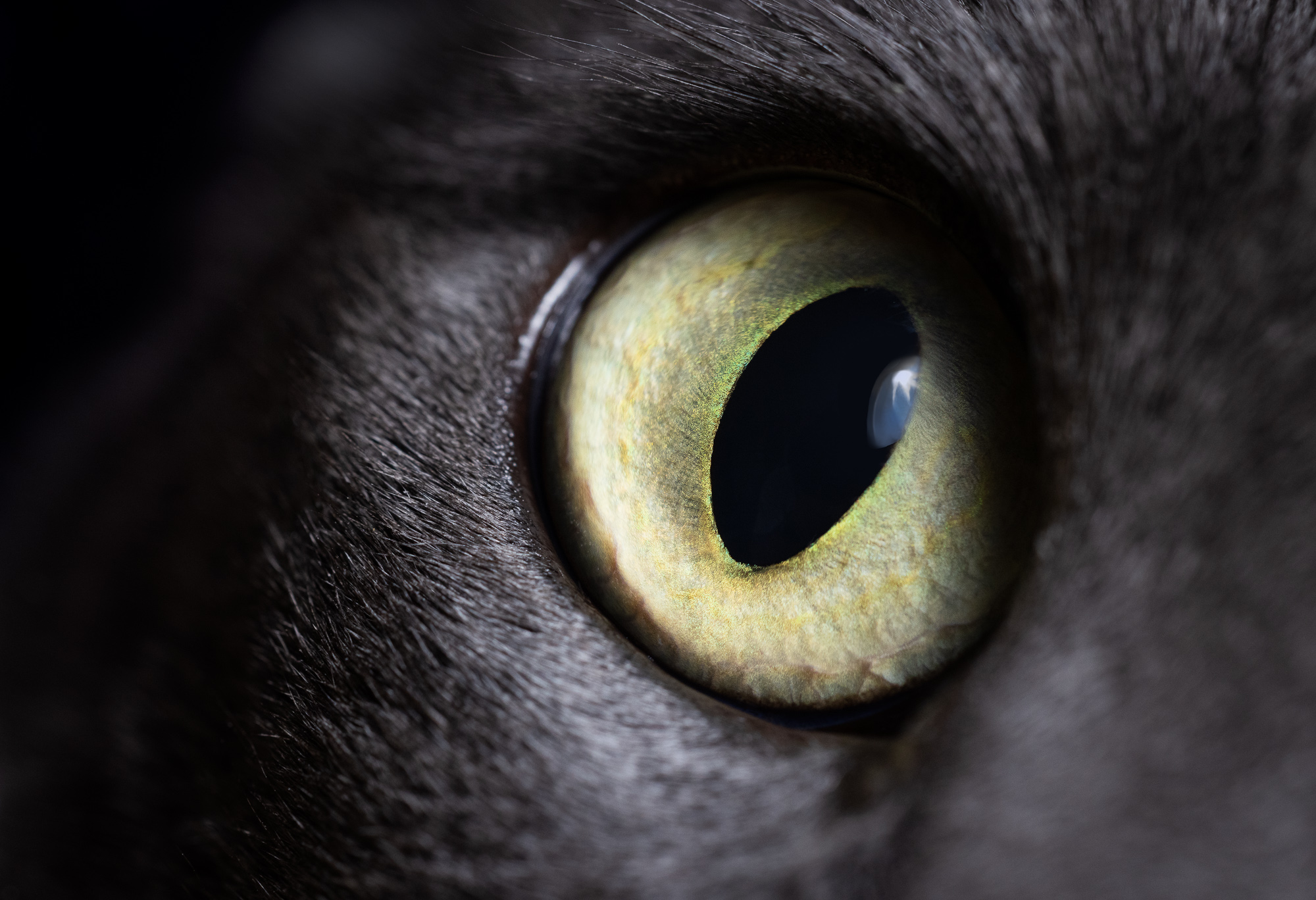
This image feels really well handled from a capturing and processing standpoint. The colors are bright and vibrant, but not too much so and I like the choice of the f/13 aperture. It gives a great depth of field, putting the subject, specifically its eye, in nice focus and providing some detail in the background, but not to the point of it being distracting. I'm not sure if the vignette was applied, or occurred naturally, but it works very well too - there's zero question about what the subject is. If I were to offer-up one suggestion, it would be to remove the blemish (I think it's a bubble) next to the reflection of the frog's eye and possibly the light spot on the bottom right corner that's touching the purple vertical section - they're a little distracting. Great image! |
Apr 14th |
| 49 |
Apr 22 |
Comment |
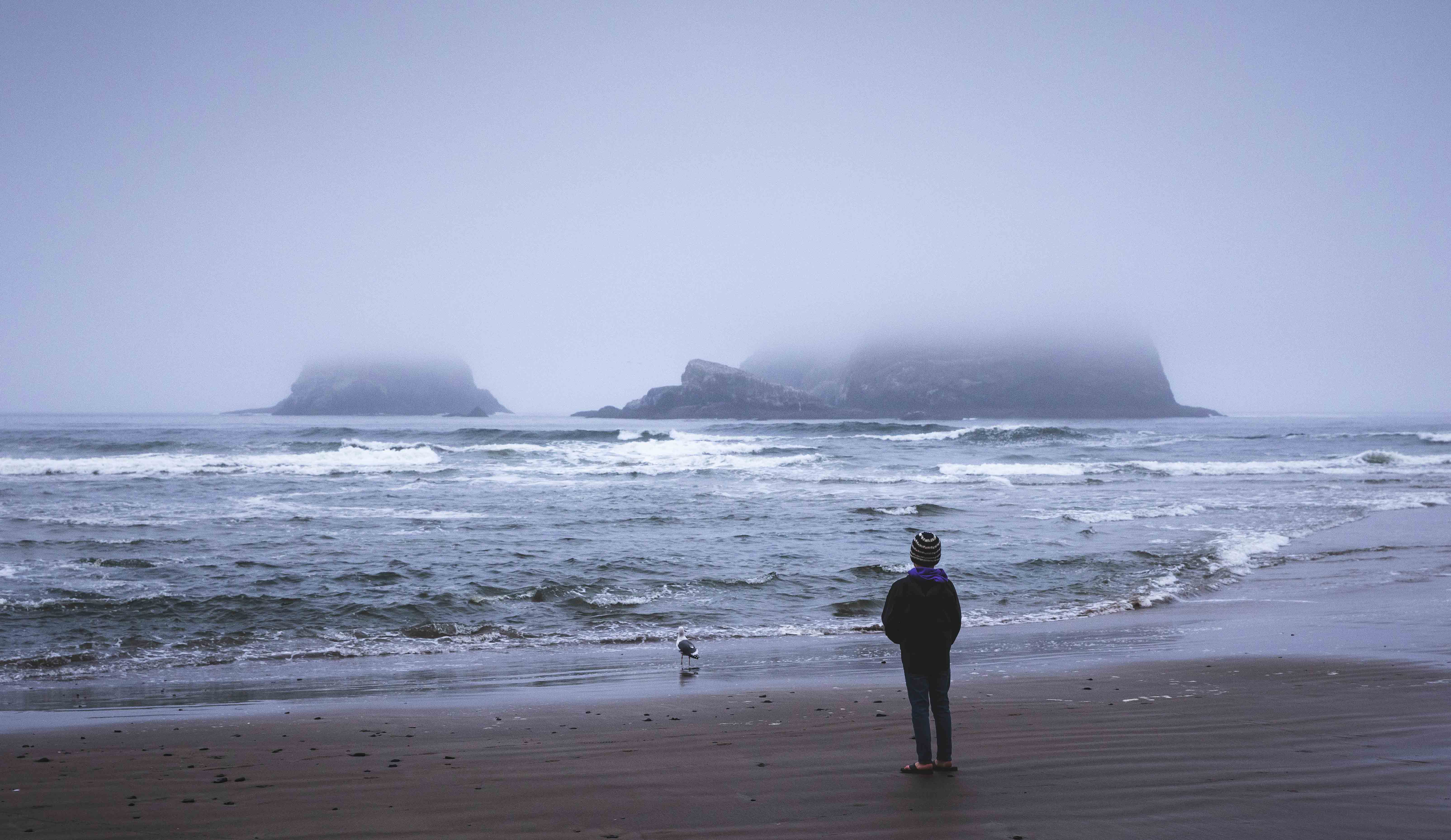
The location is quite stunning - definitely an attention getter, and the complimentary colors work well too. I would play with the contrast a little, possibly bumping it up a bit to reduce the white hazy affect and see about that purple cast. Also, while the top of the rock hits right about on the 1/3rd line, often a good thing, you might try cropping some of the sky off a bit - it's very bright and seems to be pulling my eye away from what is presumably the subject, the rock formation. |
Apr 14th |
7 comments - 1 reply for Group 49
|
7 comments - 1 reply Total
|