|
| Group |
Round |
C/R |
Comment |
Date |
Image |
| 10 |
Jan 23 |
Reply |
Looks good! The subject and his colors really pop now. |
Jan 15th |
| 10 |
Jan 23 |
Comment |
I like the 100-300 lens, even though it isn't a PRO lens. It's not too heavy to carry around all day, and the image quality is good (though, the images benefit from post-processing). I bought my used because I was trying to keep my whole "travel" kit affordable. I hope to get out this spring for some bird photography and see what quality I get. |
Jan 15th |
| 10 |
Jan 23 |
Comment |
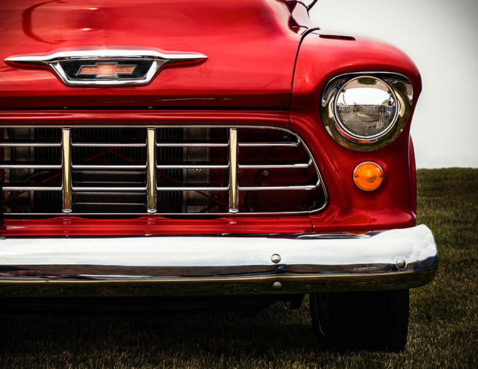
Interesting perspective. A specific subject doesn't really stand out since the coloring and focus are the same throughout the photo. Zooming in on the building in question might have helped remove distractions. |
Jan 12th |
| 10 |
Jan 23 |
Comment |
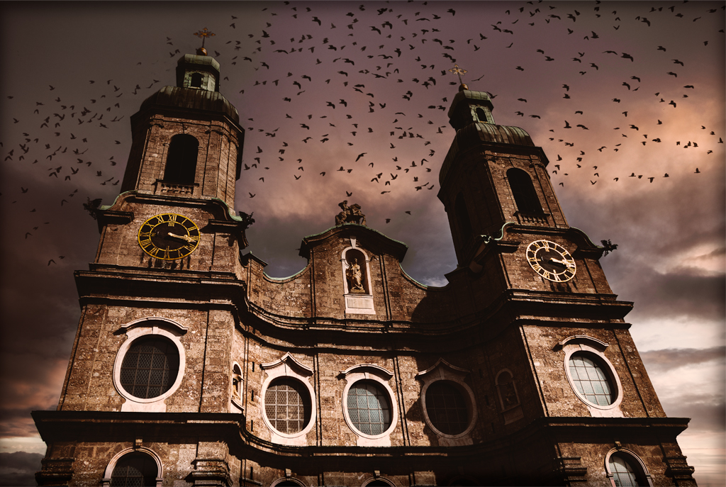
It's a nice photo of the fireworks creating an interesting shape. It might be effective to clone out or slightly blur the names on the buildings so they don't come off as prominent as the fireworks. |
Jan 12th |
| 10 |
Jan 23 |
Comment |
The subject is very interesting...I like how the lines in his t-shirt and hair-spikes are emphasized with the lines of the fence behind him. It might be effective to blur some of the background to keep the focus on the subject and fence, as the building in the back doesn't add more to the story. |
Jan 12th |
| 10 |
Jan 23 |
Reply |
The filters were applied in Photoshop (there is a Photo Filter adjustment layer, with options of colors, including orange). The blue in the original was very stark, so the orange filter toned it down throughout the photo. |
Jan 12th |
| 10 |
Jan 23 |
Comment |
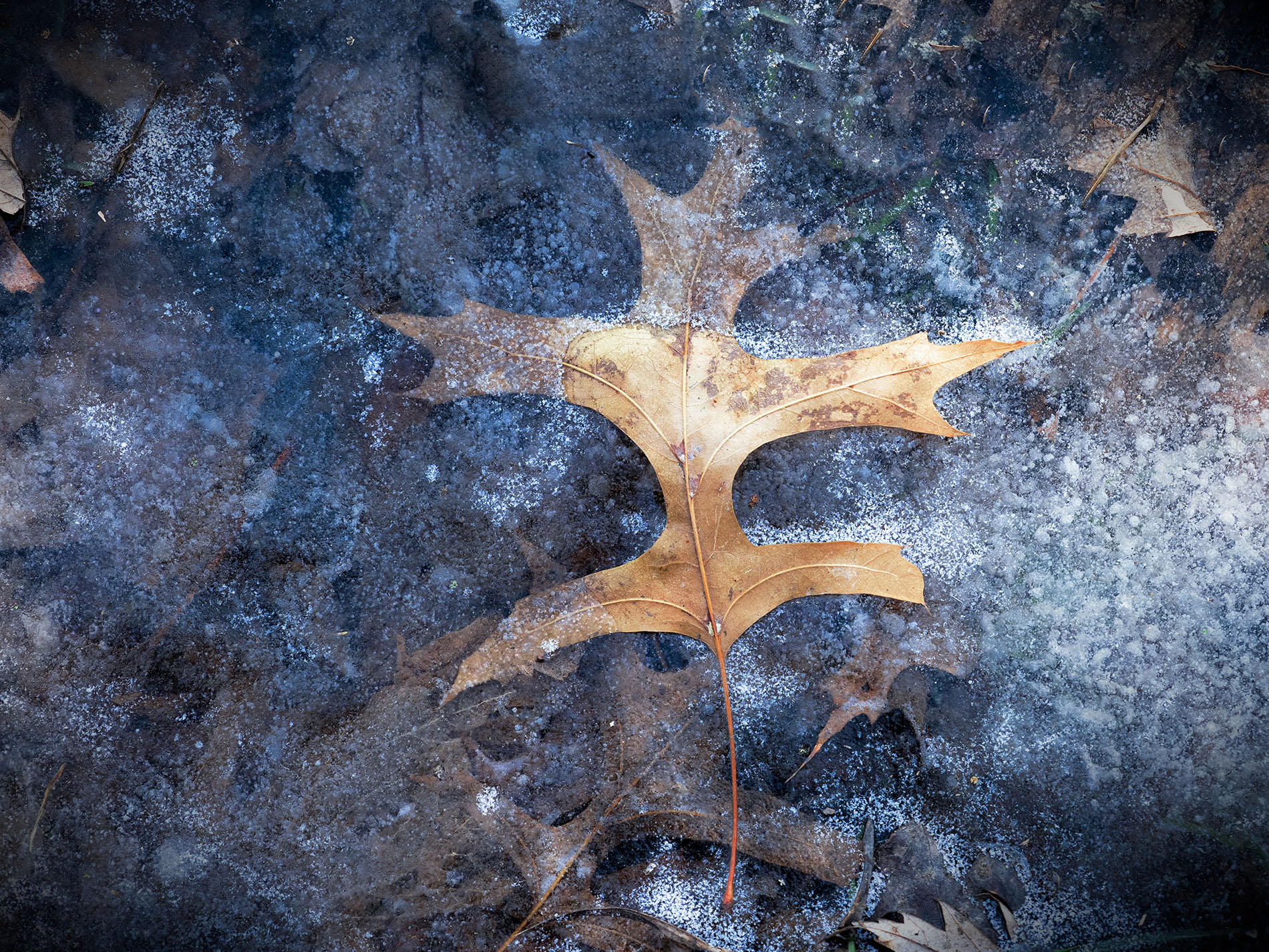
It's interesting that the "nail sculpture" can be represented as something more organic looking. When I first saw the image, I immediately tried to figure out what natural object it was derived from. I like the idea of going back to my pre-DSLR photos and running them through filters and such to see what I can create. |
Jan 8th |
| 10 |
Jan 23 |
Comment |
I really like the overall composition of the photograph. The snow creates a natural flow into the photo, while the tree and lighthouse create flow back down to the snow. My only feedback is the color of the rocks, as it seems more saturated than the rest of the image and draws the most attention. (But, I'm a bit torn as to whether to tone down the saturation because it creates a good leading line. Maybe it's just my monitor that shows the rocks as a mustard yellow that doesn't fit with the blues of the sky.) |
Jan 8th |
6 comments - 2 replies for Group 10
|
6 comments - 2 replies Total
|