|
| Group |
Round |
C/R |
Comment |
Date |
Image |
| 2 |
Nov 22 |
Comment |
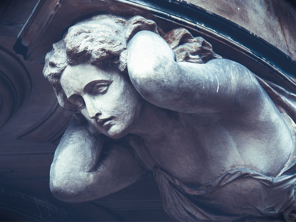
I'm not from Group 2, but wanted to comment on your photo and technique. I found the photo to be engaging, both before knowing the technique and after. Her eye and mouth become a focal point, which they weren't in the original, and make for an interesting "story." I appreciate you sharing the details about the technique, as it's something I might try (with something other than a mannequin, since I don't own one). Very interesting play on light and shadow to create a sort of illusion. --Carrie |
Nov 8th |
1 comment - 0 replies for Group 2
|
| 10 |
Nov 22 |
Comment |
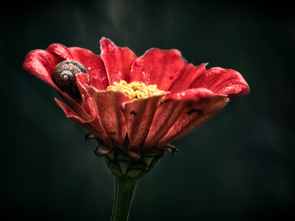
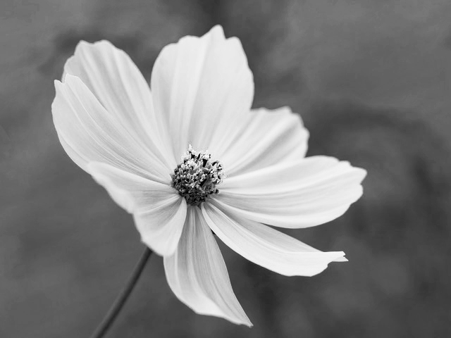
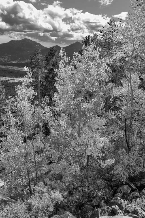
This is a pretty flower to photograph because of its well-defined shapes and lines. To me (or my monitor) the image lacks good contrast so it seems a bit faded. But, my personal preference is moody images...as seen as my blue toned image for this month. Because color isn't the highlight of the image, and shape/texture is, you may want to consider a black and white version or otherwise adjusting the contrast. |
Nov 19th |
 |
| 10 |
Nov 22 |
Comment |
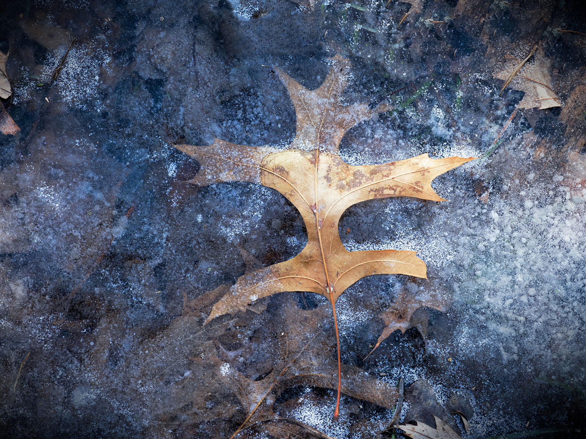
Whenever I have an image that seems (naturally) over saturated, I try to see if it works better in black and white. When I tried it with your photo, I found (in my opinion) the focus shifted to the texture of the leaves rather than being drawn to the sky. I love the colors of changing leaves, so it'd be a tough call for me whether to desaturate the whole image. |
Nov 19th |
 |
| 10 |
Nov 22 |
Comment |
I'm always drawn to these types of flower photos (both my own and others), where just a few petals are crisp--like they're drawing you in--while everything else fades out of focus. This style doesn't appeal to everyone, but Kathleen Clemons inspired me to realize that I cannot appeal to everyone when I want a more artistic view of the subject. |
Nov 19th |
| 10 |
Nov 22 |
Comment |
I like the use of the yellow background with the yellow flower, making it a soft effect overall. My eye is drawn to the left corner, where there is more white. It may help to soften the white with a bit of yellow brushwork. I agree with Doug, as well, that a bit of brightness in the center of the flower would draw the eye in that direction more. |
Nov 19th |
| 10 |
Nov 22 |
Comment |
Nice shot, especially hand-held! I like the complementary colors between the bluish dragonfly and the red-ish flower. Both subjects work together to act as a single subject in this case. |
Nov 12th |
| 10 |
Nov 22 |
Reply |
Thanks for the feedback! The blue tint was intentional, and maybe too much of a personal preference for me. |
Nov 11th |
 |
| 10 |
Nov 22 |
Comment |
Great image! I like the balance between the foreground, middle, and background, especially the low-to-the-ground perspective. The detail in the stream portion is unique. Did you also use a tripod?
--Carrie |
Nov 8th |
6 comments - 1 reply for Group 10
|
7 comments - 1 reply Total
|