|
| Group |
Round |
C/R |
Comment |
Date |
Image |
| 10 |
Oct 22 |
Comment |
Interesting sport photo. I like the inclusion of the bridge/background to add interest, context, and scale overall. |
Oct 26th |
| 10 |
Oct 22 |
Comment |
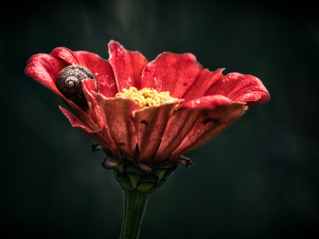
Beautiful dahlia! I like your choice in background color to blend/complement the colors of the flower rather than contrast it (such as using green or other non-pink colors). Did you modify the texture color to match the colors or is that the original color? I struggle with using textures because I can't decide whether to using contrasting colors, match the background color (e.g., green), or just keep the original texture color. |
Oct 26th |
| 10 |
Oct 22 |
Comment |
Dahlias each have their own personality and it changes from day to day. You picked the right green to complement the colors of the flower...it's very appealing together. As for the idea of cropping more, I like it with the full petals stretching to the right and the fuller parts of the petals only visible on the other three edges. I always struggle with cropping...too much/not enough/square/other. Do you find that club competitions deduct points for similar photos? I'm always curious to understand competition judging and whether they adopt traditional ideas of what a "winning" photograph looks like. |
Oct 23rd |
| 10 |
Oct 22 |
Reply |
Thank you for the feedback! The museum is in Union, Illinois. They have a scrapyard full of rusting parts and a lot of rusting train cars, which get more interesting every year (especially with midwest weather eroding away at the cars left outside).
https://www.irm.org/ |
Oct 23rd |
| 10 |
Oct 22 |
Comment |
What drew you to this scene? Because the houses are similar and not distinct, I'm not clear on what the visual interest or uniqueness might be from this perspective. But, all the slanted roofs and contrast might stand out with an extreme crop, for example. |
Oct 16th |
 |
| 10 |
Oct 22 |
Comment |
I love how each flower is pointed in a different direction while still showing their best sides. It's almost like each have a personality/story. The lighting setup you used worked really well to add highlights in the right areas to pop them off the background. |
Oct 16th |
| 10 |
Oct 22 |
Comment |
It's a cool looking landscape/abstract. The dehazing worked well to bring the textures and colors out. I don't have any experience with competitions, so I'm not much help. It's interesting that you used a point and shoot, as it reminds me of something from drone photography. What was your vantage point? Airplane? |
Oct 16th |
6 comments - 1 reply for Group 10
|
6 comments - 1 reply Total
|
