|
| Group |
Round |
C/R |
Comment |
Date |
Image |
| 10 |
Sep 22 |
Reply |
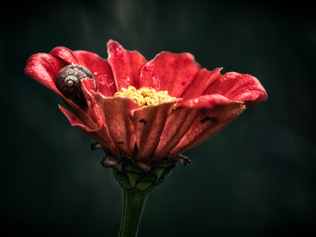
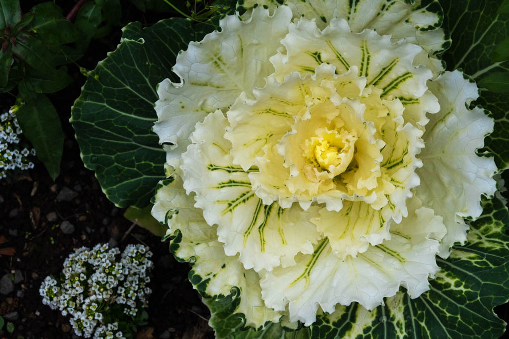
I agree with increasing brightness, and probably contrast. I gave it a shot in Photoshop (curves, overall brightness and contrast, with added brightness in the middle). I find that sometimes my photos look washed out because my monitor is too bright, so it looks good on that monitor but doesn't show as well on other devices or in print. I like the different layers of the flower, which creates interesting depth. |
Sep 11th |
 |
| 10 |
Sep 22 |
Comment |
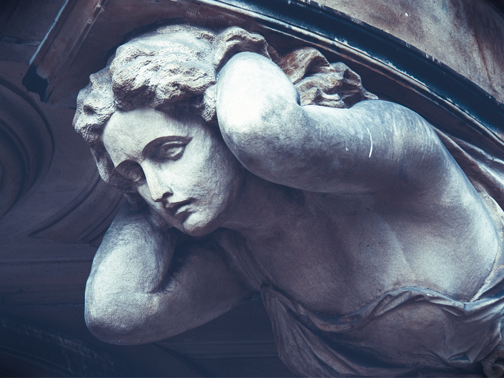
Cool image! I like the texture. I was curious as to how it might look as black and white...I'm a fan of black and white stripes, so thought this might work as well. I had to significantly lower the quality to get it to upload. The color version will catch the audience's attention better than the black and white version. |
Sep 11th |
 |
| 10 |
Sep 22 |
Comment |
Great capture of the expansiveness of the landscape. It's hard not to get lost in all the layers and depth of the image.
--Carrie |
Sep 11th |
| 10 |
Sep 22 |
Reply |
Thank you for the feedback! |
Sep 11th |
| 10 |
Sep 22 |
Reply |
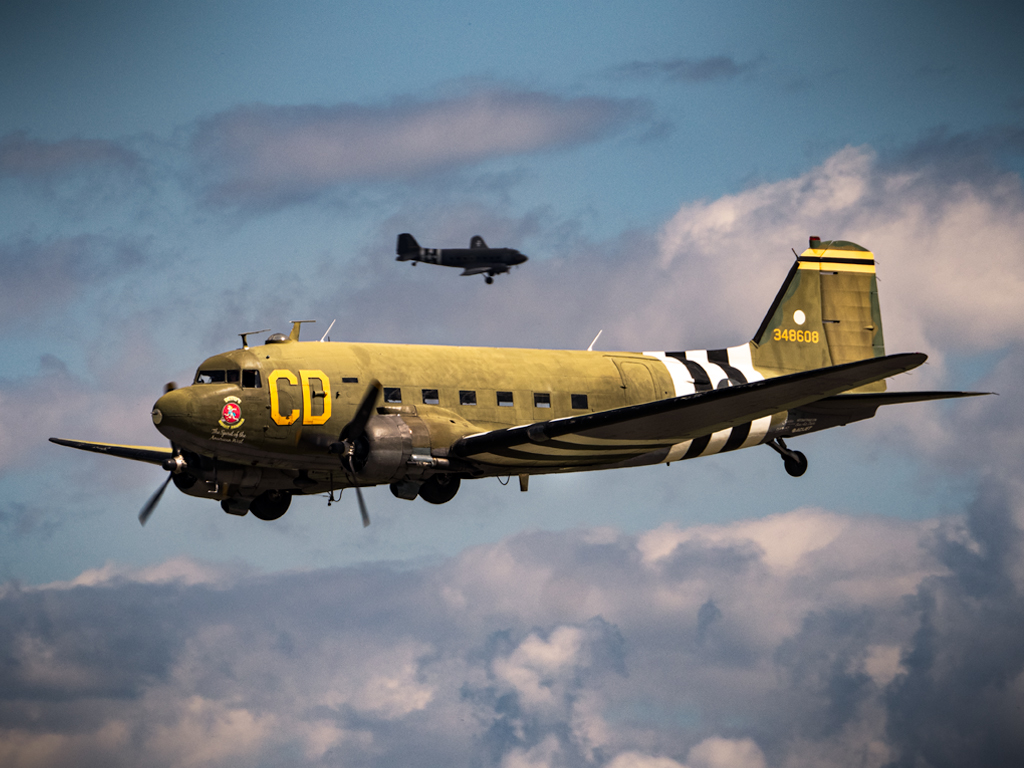
Thank you for the additional insights about the aircraft! |
Sep 11th |
2 comments - 3 replies for Group 10
|
2 comments - 3 replies Total
|