|
| Group |
Round |
C/R |
Comment |
Date |
Image |
| 10 |
Mar 22 |
Comment |
As other comments noted, the view is amazing--with or without clouds. Adding some dodging/burning or curves might help separate the foreground, mid-ground, and background better to show depth. I have found that photographing landscapes doesn't always capture the sense of depth and grandeur that I see with my eyes, so I rely on dodging/burning to highlight the areas that captured my attention originally. |
Mar 24th |
| 10 |
Mar 22 |
Comment |
As already mentioned, the use of contrasting colors is eye catching. For an overall abstract photo, the texturing works, and perhaps can be pushed further by adding blur in some areas (such as the background). Another option is less abstract and using a mask to remove or lower opacity of the texture in the background or the dark shadow areas. |
Mar 24th |
| 10 |
Mar 22 |
Reply |
I agree with your point about including some of the side of the building to add depth/perspective. I think it's a matter of what our eyes see in the moment, which our brain interprets as three-dimensional with good contrast, versus the flat image the camera captures. The addition of the clouds add good contrast, but something similar might be gained through dodging/burning so as to add a sense of depth. |
Mar 24th |
| 10 |
Mar 22 |
Reply |
Thanks! |
Mar 18th |
| 10 |
Mar 22 |
Reply |
Thanks for the suggestion! The leaf was surrounded by uglier leaves, but if I had a macro lens for my camera, I might have tried different perspectives as well. |
Mar 18th |
| 10 |
Mar 22 |
Reply |
Thanks! I got a late start this winter (...I'm not a fan of the cold), but I think that I'll start earlier next winter and get more practice. |
Mar 18th |
| 10 |
Mar 22 |
Reply |
Great suggestion! I'm too stuck in my ways with a standard crop, and I really need to try different approaches. Thank you for the feedback. --Carrie |
Mar 17th |
| 10 |
Mar 22 |
Comment |
I love tulips when they aren't perfect...it's when they have character that stands out. I agree with a previous comment that the back petal throws off the symmetry, but it also makes it unique. So, if you're trying for a photo that engages interest, then the back petal works. If you're more interested in a "pleasing" photo, then maybe clone the petal out. I always struggle with interesting versus pleasing, as my Facebook audience (friends and family) appreciate the pleasing photos, whereas I always like the interesting ones. |
Mar 11th |
| 10 |
Mar 22 |
Comment |
I really like how the stem is sharp, and the petals are softer (implying their actual softness in texture). The top of the photo looks white (on my screen). Was the gradation intentional? The off-white works well with the colors of the flower. |
Mar 11th |
| 10 |
Mar 22 |
Comment |
I love this abstract photo. I had no idea what it was, but still find it very interesting. The contrast between the gold and blue work well. The blue seems less exposed than the gold, so for consistency, perhaps a slight increase in brightness to the blue section might work well. Overall, great work seeing the slime as photographable. |
Mar 10th |
| 10 |
Mar 22 |
Reply |
Thank you for the feedback! I'm also looking forward to spring and summer photos. I'm in northern Illinois, and we're getting another deep freeze this week, followed by a warm-up, so our trees/flowers will be confused as to what's next. |
Mar 10th |
| 10 |
Mar 22 |
Reply |
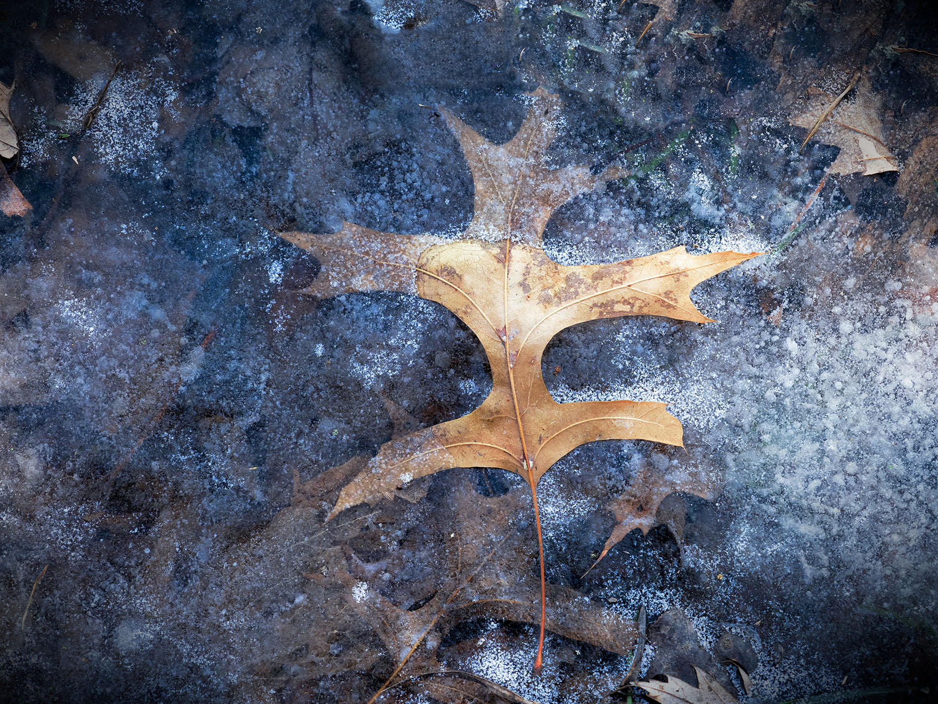
Thank you for the feedback and suggestions! The water was totally frozen, but the middle of the leaf was exposed. I actually dodged the middle of the leaf to add contrast to the darker ice (and I'm accustomed to brightening up the center of flowers, as if they are kissed by sunlight), but I understand the value of darkening the leaf in this case. |
Mar 10th |
5 comments - 7 replies for Group 10
|
5 comments - 7 replies Total
|