|
| Group |
Round |
C/R |
Comment |
Date |
Image |
| 18 |
Sep 22 |
Comment |
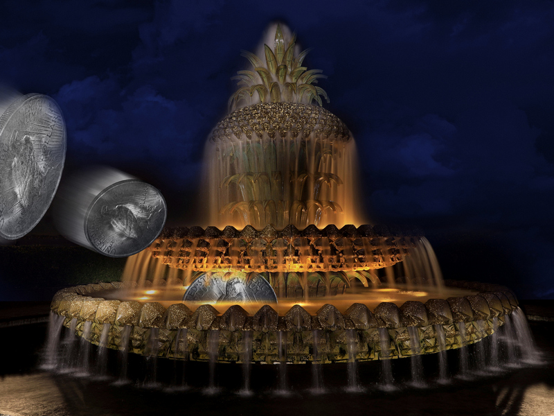
This creation do show bright colors and the details of the water faucet are very well defined. Good choice in removing the black line in the bottom.
Just a suggestion, will a horizontal flip enhanced it bit more? It seems the faucet is not in use why the red circle?
|
Sep 19th |
| 18 |
Sep 22 |
Comment |
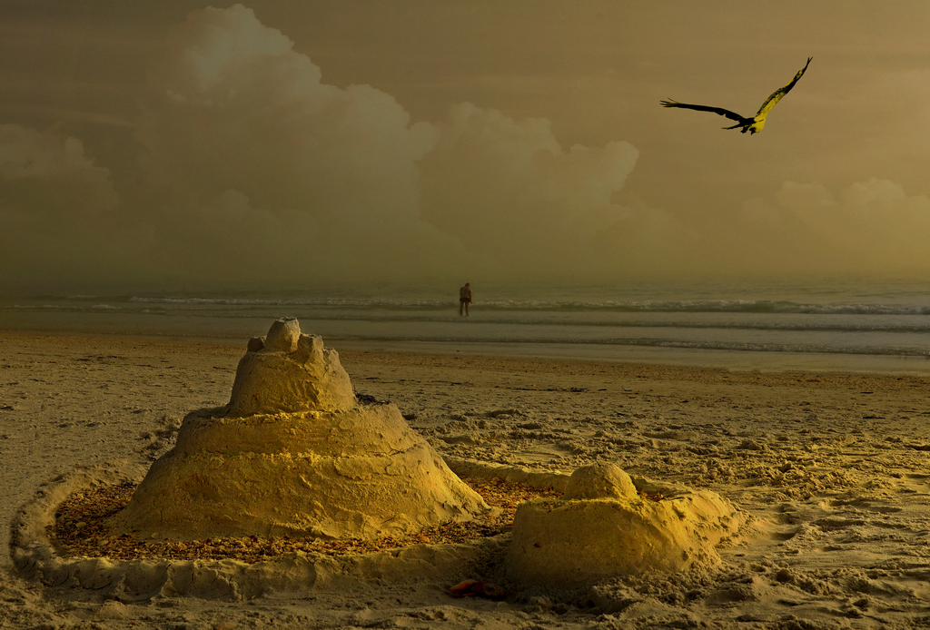
Very interesting creation, You feel to be walking through the fields. The gold color and the contrasting black, blue and white of the birds build this image to be admired.
In reference to positions and rules I would have positioned the birds further lower from were they are now. Like flying diagonal to the upper right hand corner. Just an opinion.
I think I hear those birds!
|
Sep 19th |
| 18 |
Sep 22 |
Comment |
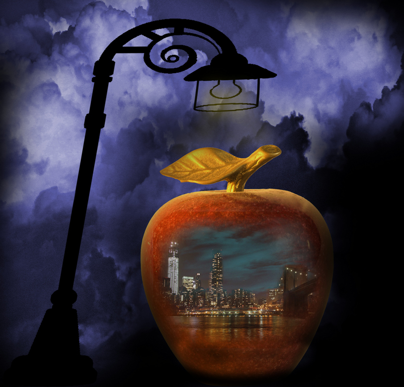
Very creative. The title shows the image perception and adds more value to this image. Clear and sharp, yet not "smoky".
Although the element are well positioned, I would have made the star a bit larger. Perhaps actually make it the main element.
Just an idea. Did the fire alarm go off during this making?
|
Sep 19th |
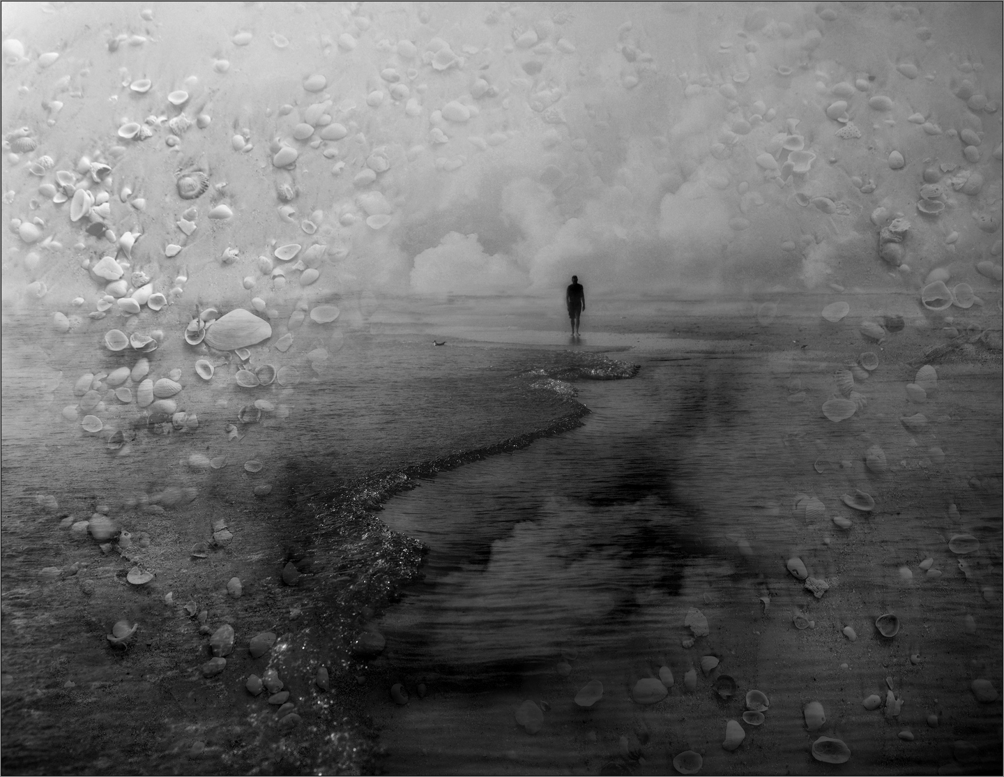
| 18 |
Sep 22 |
Comment |
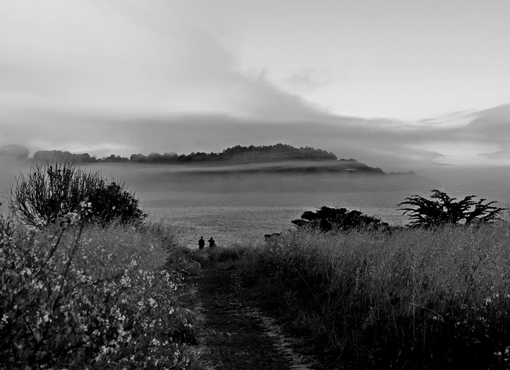
The image brings you there. You have a chance to see a shore line in California. Yes the sky is not contributing much but as an artistic image looks good. At the same time in my opinion I would have reduce the contrast a bit, give it a softer image.
For sure I would like to be there now. |
Sep 19th |
| 18 |
Sep 22 |
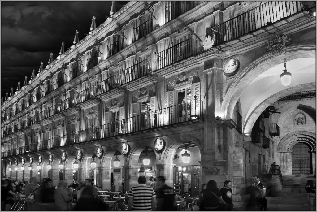
Comment |
Very nice presentation of an ordinary balcony in Europe.
The 2/3 rule is well exemplified here. The post processing work is well executed. The only thing I would have done to it, was to brush of the line that runs from the top center to the left. "Not to important". I wonder what kind of detergent was used, liquid or powder? |
Sep 19th |
5 comments - 0 replies for Group 18
|
| 83 |
Sep 22 |
Reply |
Thanks for the comment, Yes I think the elements are competing, not complementing. But the though as I was taking it was to show 'age'.
|
Sep 23rd |
| 83 |
Sep 22 |
Comment |
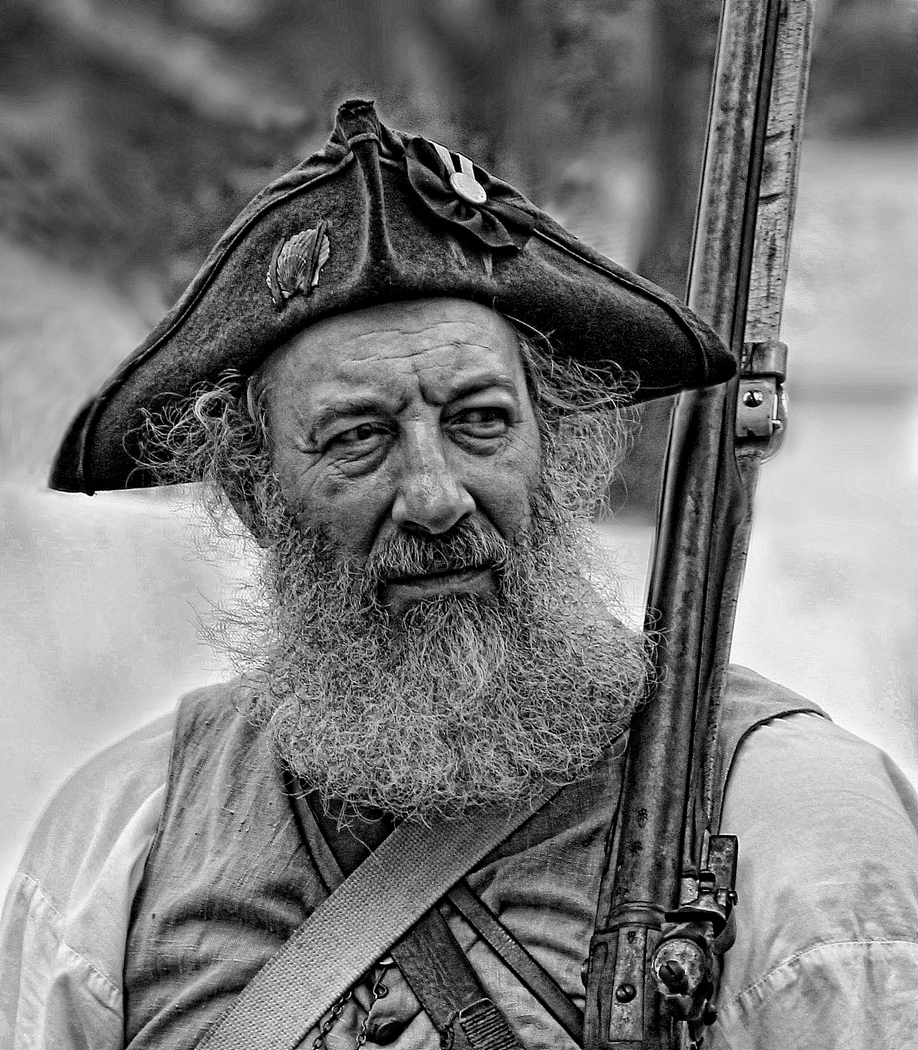
That is a portrait that both of you will enjoy it very much.
You for taking it and him for looking very good.
The Blacks and white are well shown. I like the eye to eye position. My only suggestion would have been to add more of the puzzle, just a bit more.
I wonder how long did he spend working at it? |
Sep 19th |
| 83 |
Sep 22 |
Comment |
The old days of film.... Yes, I miss them a bit.
This image captures an item that for railroad fans is great.
I do too appreciate it. Very nice exposure and sharp details.
Speaking of details, I see some markings, ASF, AAR and MT.
Amalgamated Steel & Fasteners
AAR (American Association of Railroads) AAR steel banding
Montana Steel.
I wonder how much each contributed or where these parts were made? The ASF is in the UK.
This for sure is an stealing image.
|
Sep 19th |
| 83 |
Sep 22 |
Comment |
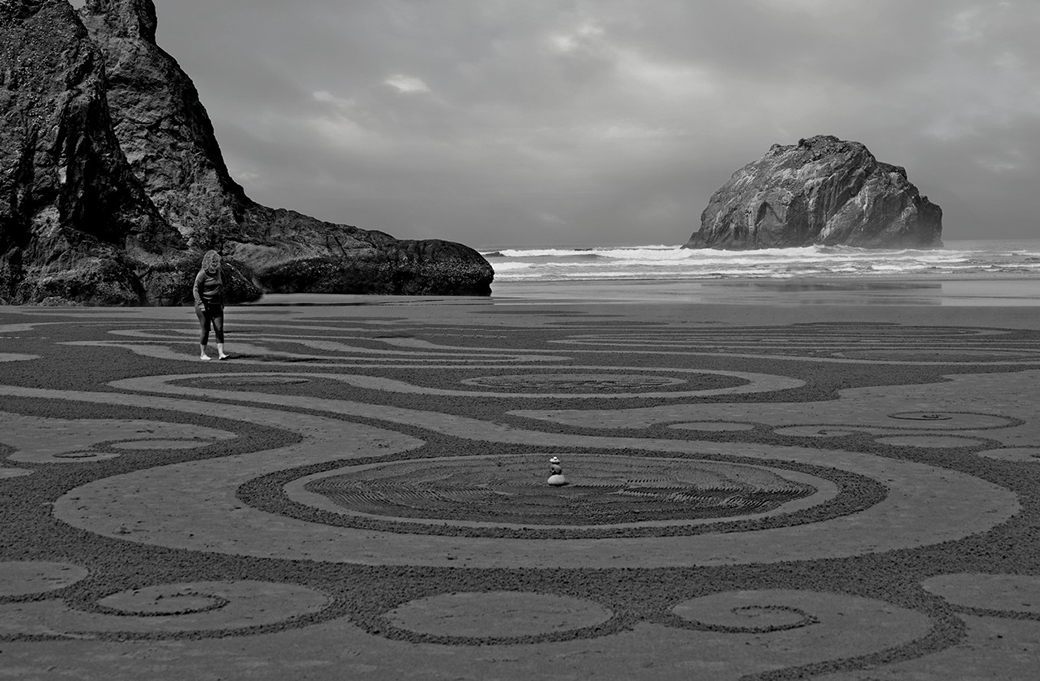
With very little experience in IR, I can only comment in the image itself. GREAT!!!! I love the range of Black to white.
The zig composition is for sure worth mentioning to be very expressive. I think you can get the hint that I like it. |
Sep 19th |
| 83 |
Sep 22 |
Comment |
For sure a good splash. In this image I feel I did not get enough of the action. Were you using single shot or multiple burst? Perhaps a few microseconds earlier would have given us more detail. It would have been exciting.
|
Sep 19th |
| 83 |
Sep 22 |
Reply |
The image shows 2 focal points. Perhaps giving more emphasis on one over the other could make it more impressive. The site shows two items that tells about a time. What would it be the intent of this image? Historical or artistic? In this case primarily is historical and second artistic photography.
Glad that you like the composition. |
Sep 19th |
| 83 |
Sep 22 |
Reply |
Thanks, glad that you like it. I enjoyed that visit very much. |
Sep 19th |
| 83 |
Sep 22 |
Reply |
Uhhhh...correct I missed that. |
Sep 19th |
| 83 |
Sep 22 |
Reply |
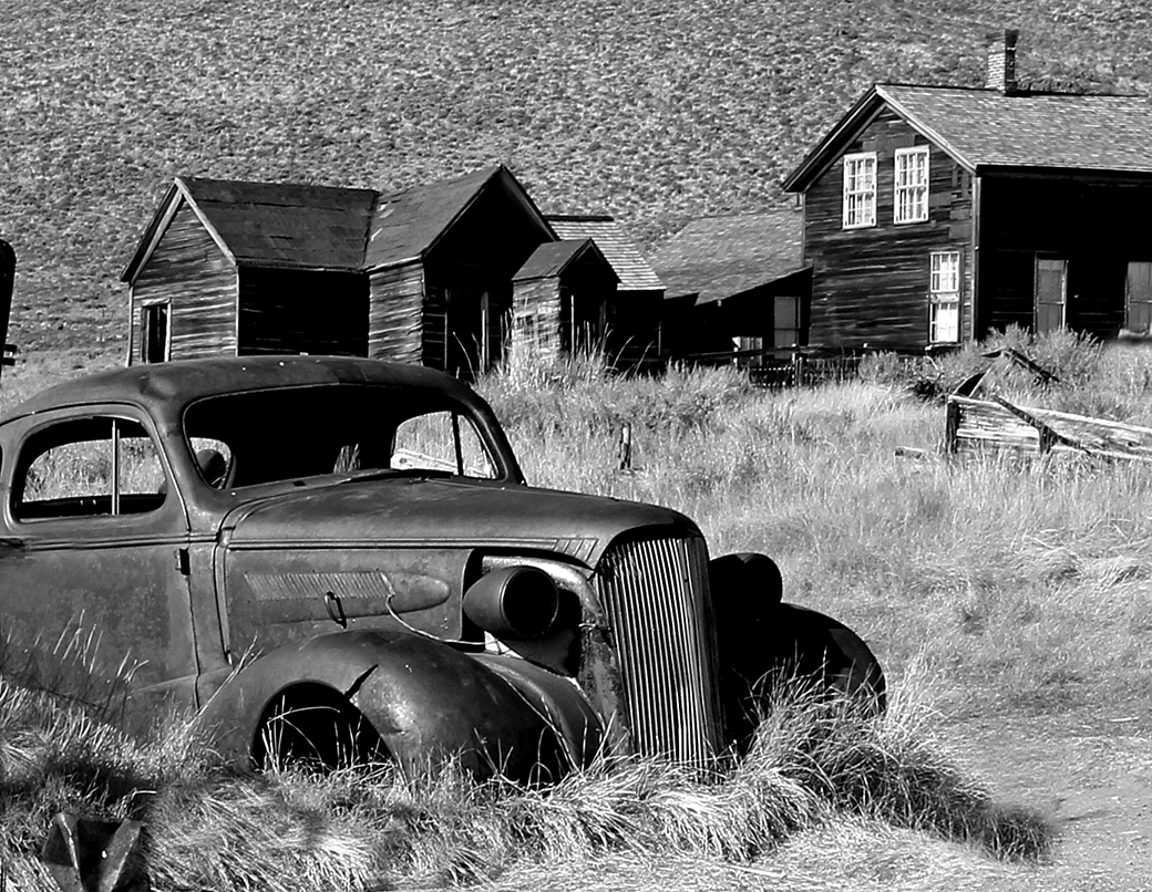
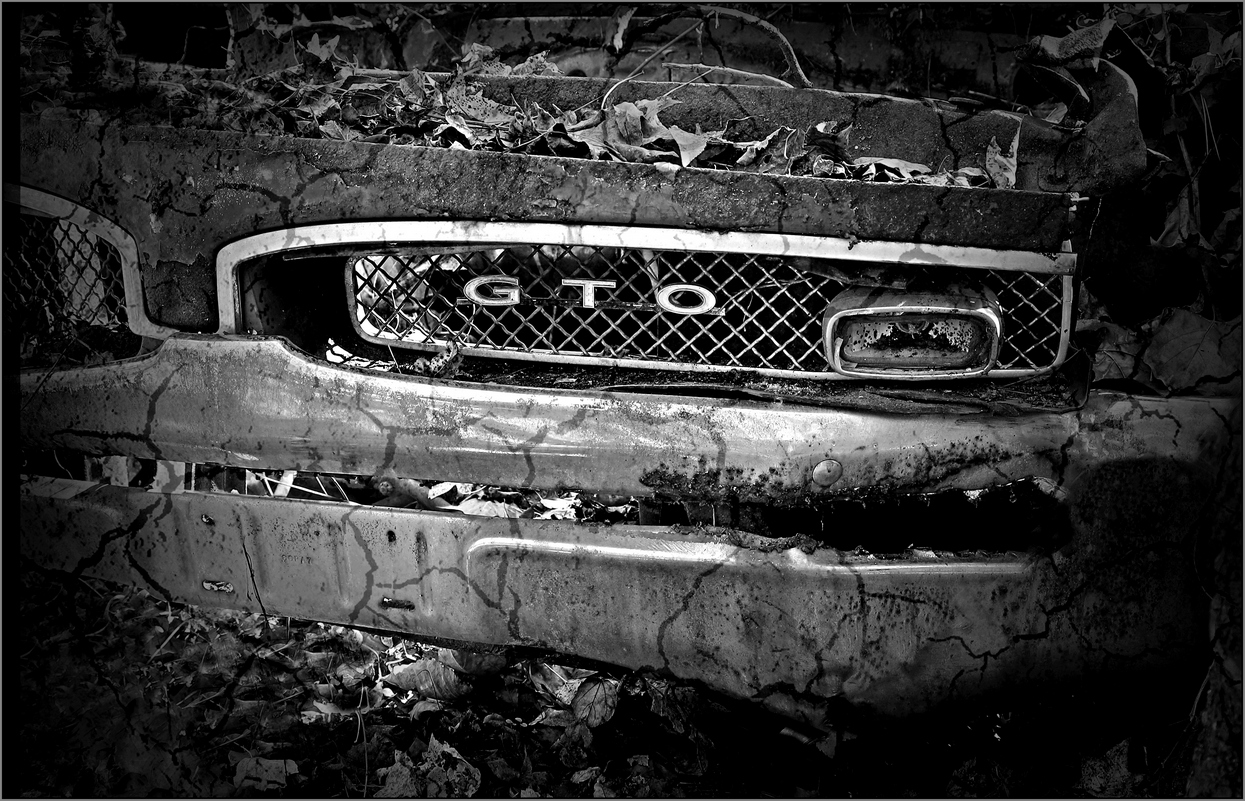
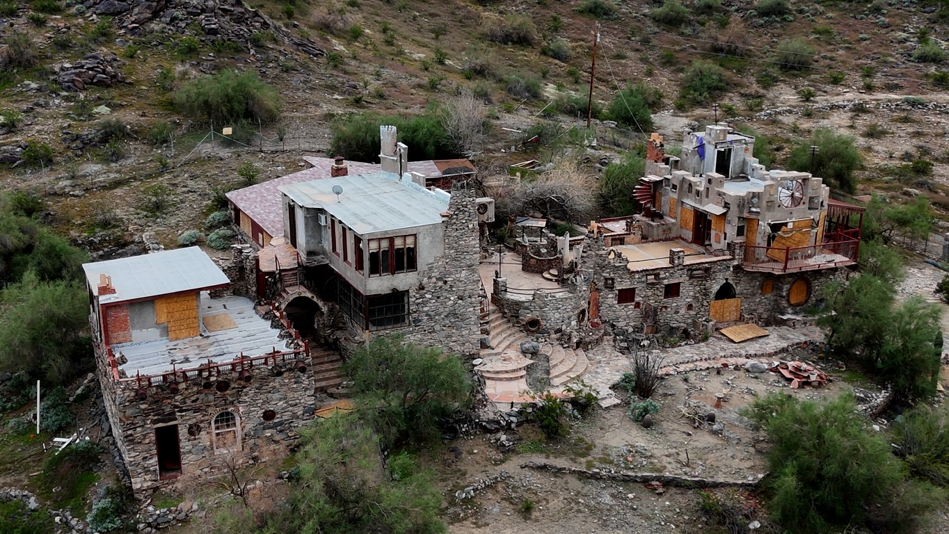
Chuck glad you stop by and thanks for those good comment.
Good point. The scene shows the car and the abandoned buildings. Could more emphasis on one over the other, make the image more impressive, will be worth experimenting.
Some time we have no choice of where the elements are located or what is next to them. In this case the best presentation was what is shown. As I recall, there were some other artifacts not suitable for the image. |
Sep 19th |
| 83 |
Sep 22 |
Reply |
Very good assessment about the light. Things to consider in my future images. Correct if the hills were lest sharp, would have added more attention to the car, |
Sep 19th |
| 83 |
Sep 22 |
Comment |
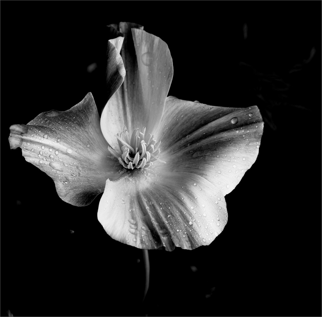
I do admire this picture, as I love closeups. The details are very good and sharp. The rendition in BnW is very good.
Actually the details are so clear that for sure you can tell the thinking process of the animal, the expression is for sure revealed very clearly and well determined:
"Why is this guy bothering me, I am in no mood for this"
Two questions, approximately how far were you? If cropped. how much?
I am researching long lenses. I will open in the bulletin board |
Sep 7th |
5 comments - 6 replies for Group 83
|
10 comments - 6 replies Total
|