|
| Group |
Round |
C/R |
Comment |
Date |
Image |
| 21 |
Mar 22 |
Comment |
Yes The calibration for sure is due....
One small issue, I only have clocks with 24 hrs.
I wish Amazon had one with 26. Will be so helpful!!!!!
I am using windows 10 and is automatically upgrading.
Good or bad? Not sure.
Thanks. |
Mar 29th |
| 21 |
Mar 22 |
Comment |
Yes The calibration for sure is due....
One small issue, I only have clocks with 24 hrs.
I wish Amazon had one with 26. Will be so helpful!!!!!
I am using windows 10 and is automatically upgrading.
Good or bad? Not sure.
Thanks. |
Mar 29th |
| 21 |
Mar 22 |
Reply |
Bit underexposed? It is very possible. I use a viewsonic monitor connected to the laptop. They were calibrated about a year ago.
Yet I feel I am overexposing the images.
Removing the person and making the bird lighter, does makes a good image too. I like it. As I said before, I did debate that option as I was deleting the 1st person.
"Quite often I talk to myself. It is one way to get an opinion from an expert." |
Mar 28th |
| 21 |
Mar 22 |
Reply |
Very good suggestions, but my aim would have been defeated. Please visit the forum. we have more over there. |
Mar 25th |
| 21 |
Mar 22 |
Reply |
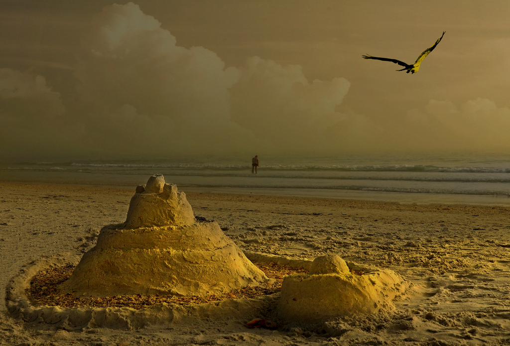
Kind of agree, but can yo expand in "must also have a creative concept, which I Donn't see here"
Do you mean something unreal, something that could not exist, like a kid with mittens and scarf making the sand castle? |
Mar 25th |
| 21 |
Mar 22 |
Reply |
That is an engaging comment. I love it.
There is so much to it. You are touching a few interesting points and I wonder if this could be a thread in the forum? |
Mar 24th |
| 21 |
Mar 22 |
Comment |
Oh, yes that looks good. I did considered those options, I though that eliminating the person would reduce the tri element.
Black and white, for sure makes it great.
Thanks for all the attention to my picture. |
Mar 22nd |
| 21 |
Mar 22 |
Reply |
$1000.00? |
Mar 17th |
| 21 |
Mar 22 |
Comment |
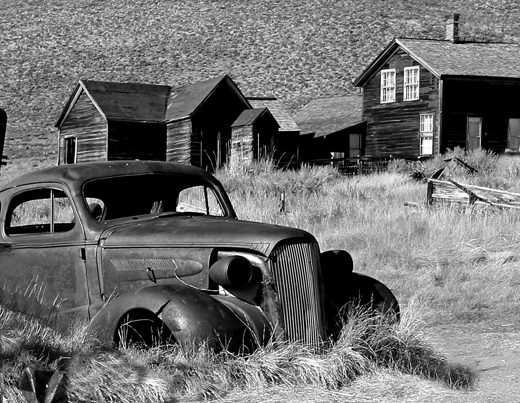
It seems to be a travel photo.
The image is correct, quite sharp.
Not sure if the cropping of some of the areas will have focused the image a bit better. |
Mar 15th |
| 21 |
Mar 22 |
Comment |
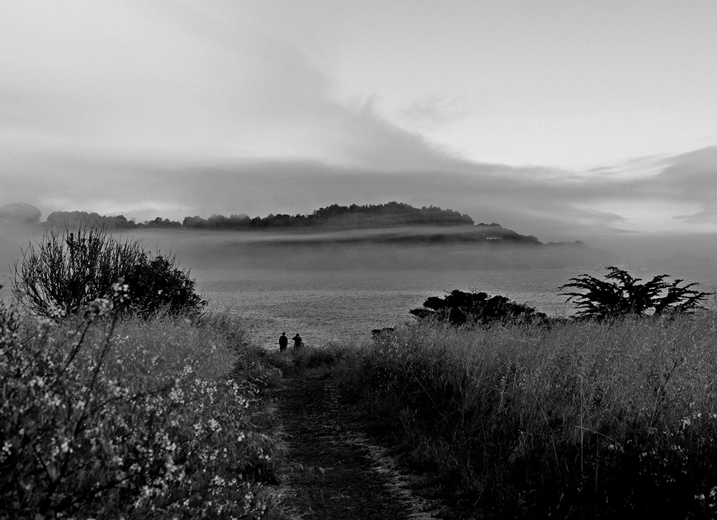
The blur of a landscape images bring a certain mystic.
I would have done a little less blurring, so the subject will have shown more.
Again an artistic image, is the maker option.
|
Mar 15th |
| 21 |
Mar 22 |
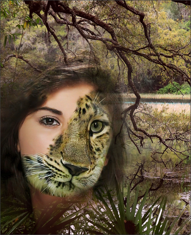
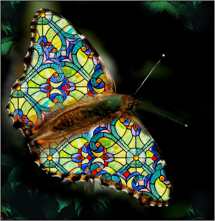
Comment |
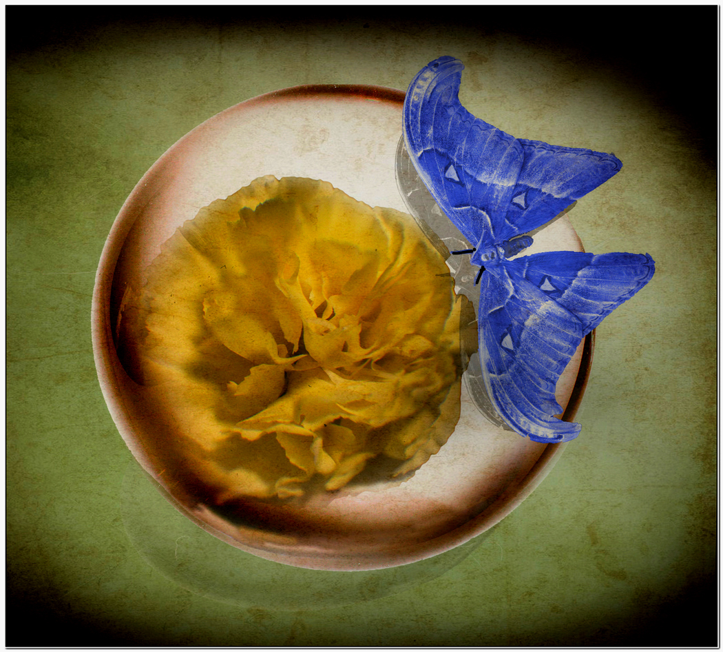
Blue and Yellow, excellent combination.
It is an image to appreciate.
The butterfly sure adds a natural element and takes away the criticism of not photographing somebody's art.
|
Mar 15th |
| 21 |
Mar 22 |
Comment |
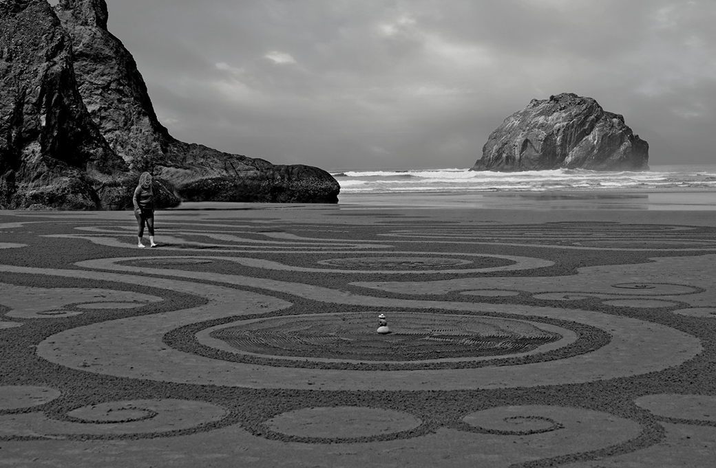
I see the patterns in this image of the 2 parallel and the down intercepting line.
Interesting image.
I wonder if it is shown in a club competition will score high.
If placed for sale in a ritzy area, probably will fetch a couple of thousand dollars.
|
Mar 15th |
| 21 |
Mar 22 |
Comment |
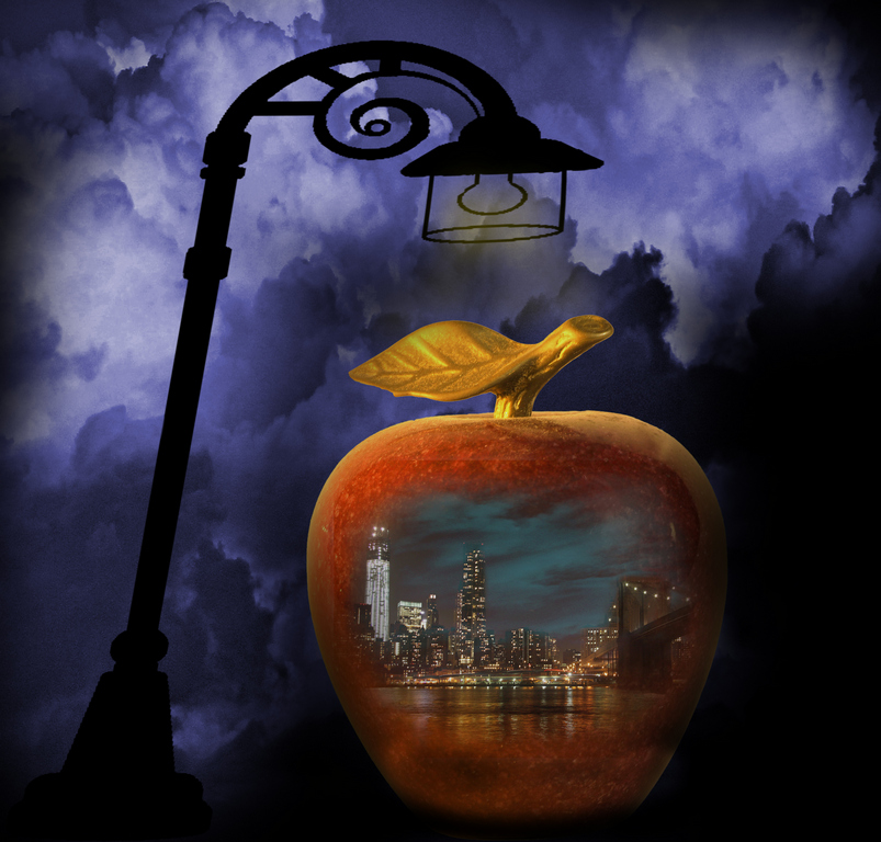
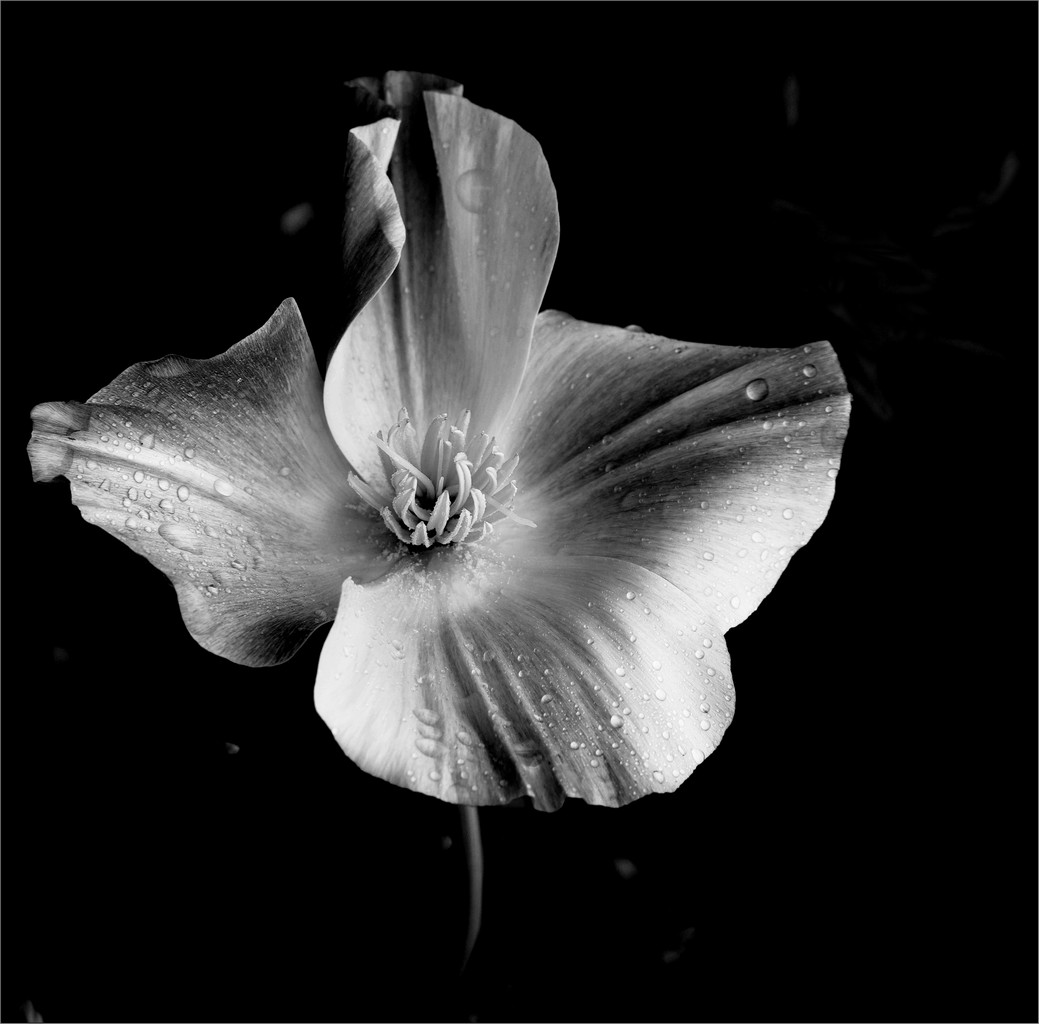
A black and white image with added clear specific color or colors is for sure a photo to admire.
Very good creation.
|
Mar 15th |
8 comments - 5 replies for Group 21
|
| 83 |
Mar 22 |
Reply |
I guess you guys and the judges in the club agree..... Thanks for taking the time in my picture |
Mar 23rd |
| 83 |
Mar 22 |
Comment |
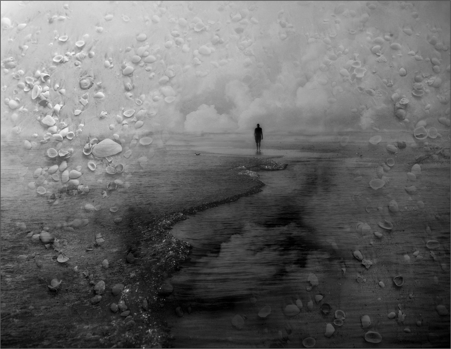
Yes Lance, I am a member of 23.
Correct about creative. Actually I did submit the image for competition this week and got a First Place with 27.5 of 30.
But I did not realized I had submitted a version prior the 'Texture of the shell'. see attached
|
Mar 15th |
 |
| 83 |
Mar 22 |
Comment |
I have found myself in this situation. This is a great image, not only for the elements, but the composition.
Yet in the original, before in the color image, there was a very small factor in loss of sharpness. For most part hardly noticeable.
Was a tripod used?
Even at 800, I found that just the shutter movement, can contribute to that minute effect.
I am not very good at holding a camera, so 95% of my images I use a tripod. So to me photography is a 'heavy burden'!!!!! |
Mar 15th |
| 83 |
Mar 22 |
Comment |
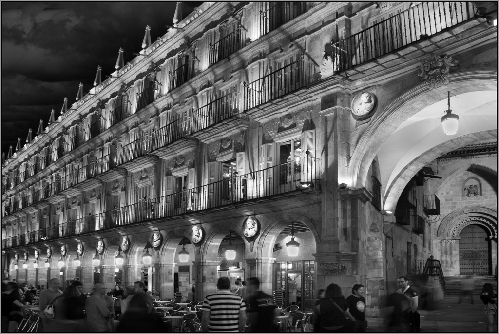
Very well presented... The timing for a veil look in water is very good. Buildings in the background kept the sharpness.
Sometimes when slowing down, some areas loose sharpness.
Not here.
The spread between black and white is good.
One thing I always check is for horizons.
The stack shows not straight up, but a degree to the left.
Great picture.
|
Mar 15th |
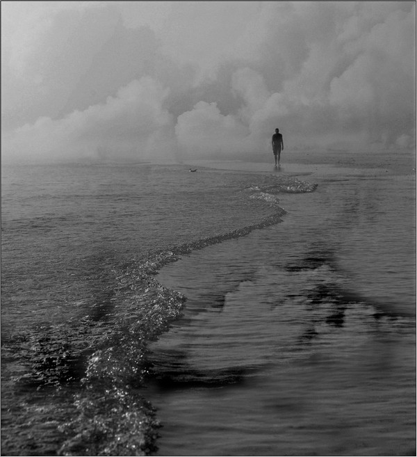
| 83 |
Mar 22 |
Comment |
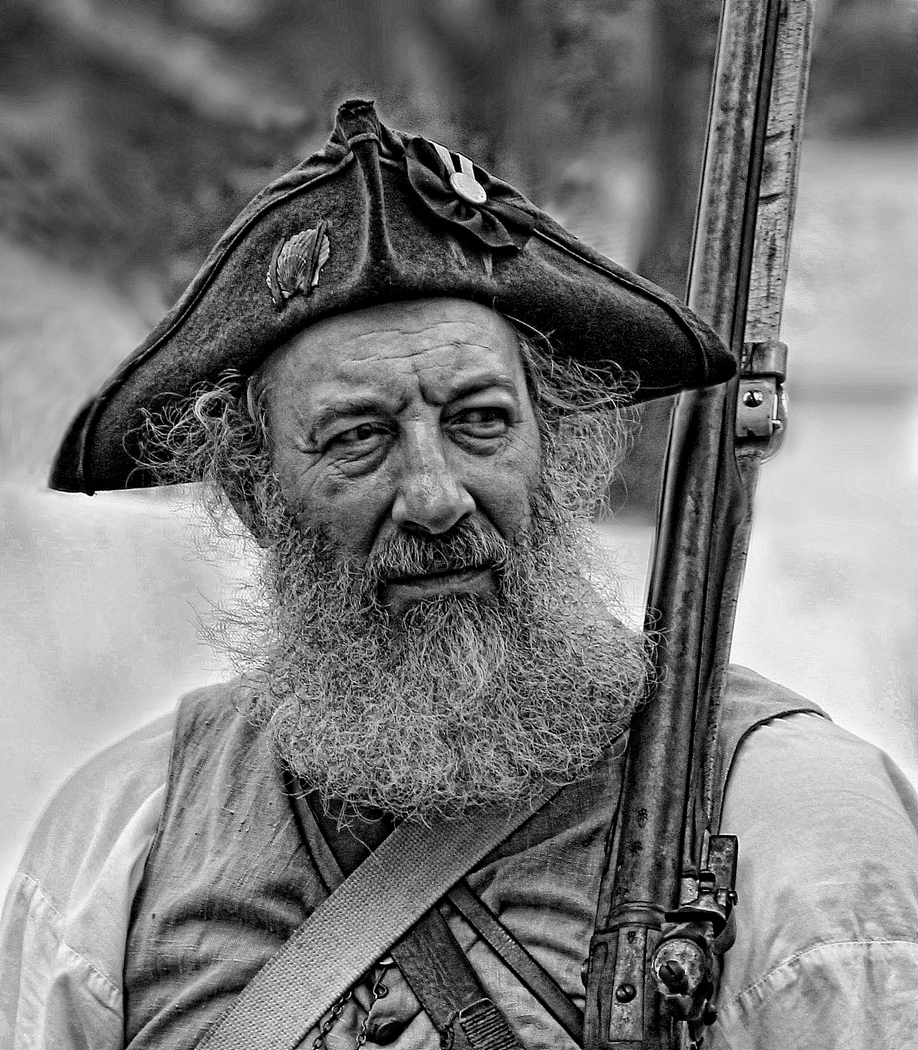
Excellent photograph. Excellent take.
All elements are there trees, mountain, mist and clouds
Dark to light to gives perspective. All falls good.
I love nature and this black White gives lots of credit. |
Mar 7th |
4 comments - 1 reply for Group 83
|
12 comments - 6 replies Total
|