|
| Group |
Round |
C/R |
Comment |
Date |
Image |
| 21 |
Feb 22 |
Comment |
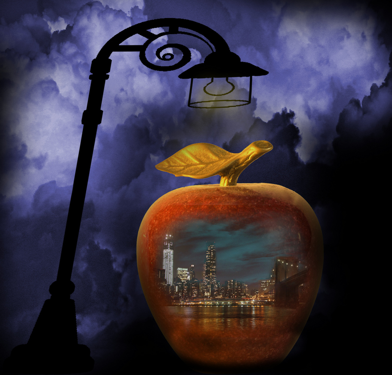
Lets make it 25.... Thanks to all.
I am very pleased to receive such attention. |
Feb 24th |
| 21 |
Feb 22 |
Reply |
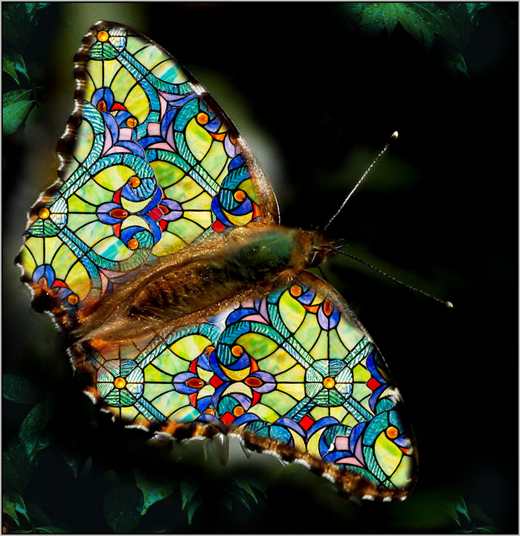
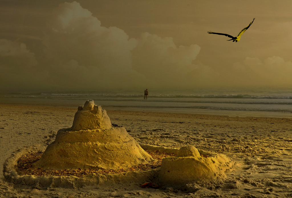
I guess that could have done. A bit of distortion of the moth wings shadow. |
Feb 21st |
| 21 |
Feb 22 |
Reply |
Thanks, very good points.
Yes when it comes to borders, I have been experiencing that in most cases, they diminish the images rating according to judges.
I love to add vignette to the images, yet is the same as borders. I am getting killed in competitions. |
Feb 21st |
| 21 |
Feb 22 |
Comment |
Oh yes, quite a few strokes.
You feel like Monet after a while.
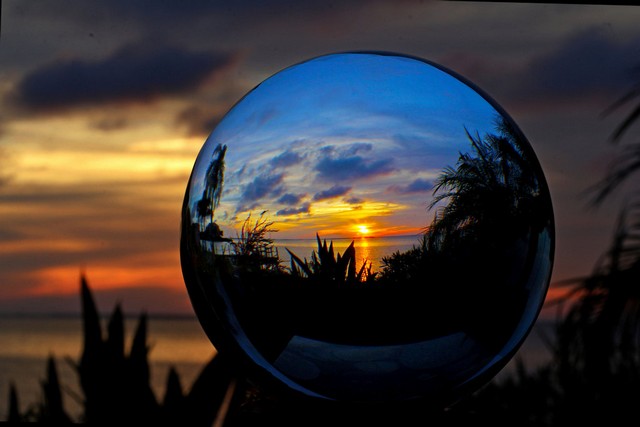
Another way is to photograph a glass ball under various lights.
Then use them as sources/backgrounds.
A ball like this: HBlife Clear Crystal Ball 3 Inch (80mm) Including Wooden Stand and Gift Package for Family Decorative Figurine Fortune Telling $15 in amazon. It is great for spheres pictures. See an example |
Feb 20th |
 |
| 21 |
Feb 22 |
Reply |
Wise man!!!!!!, Perfect..... |
Feb 13th |
| 21 |
Feb 22 |
Comment |
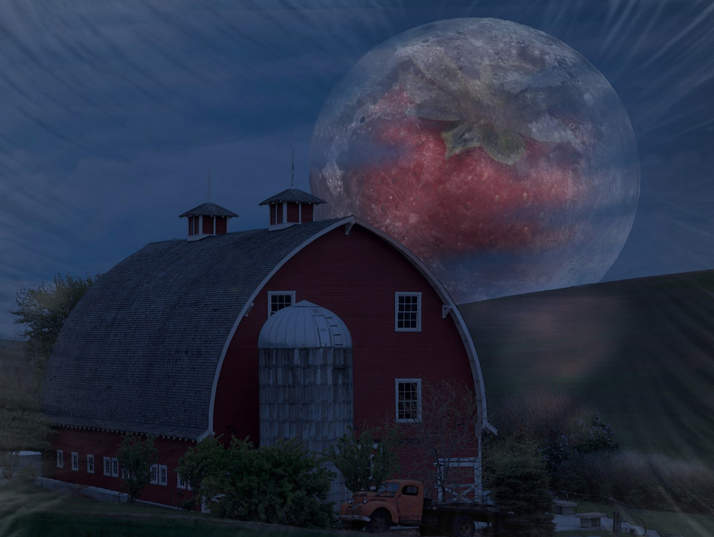
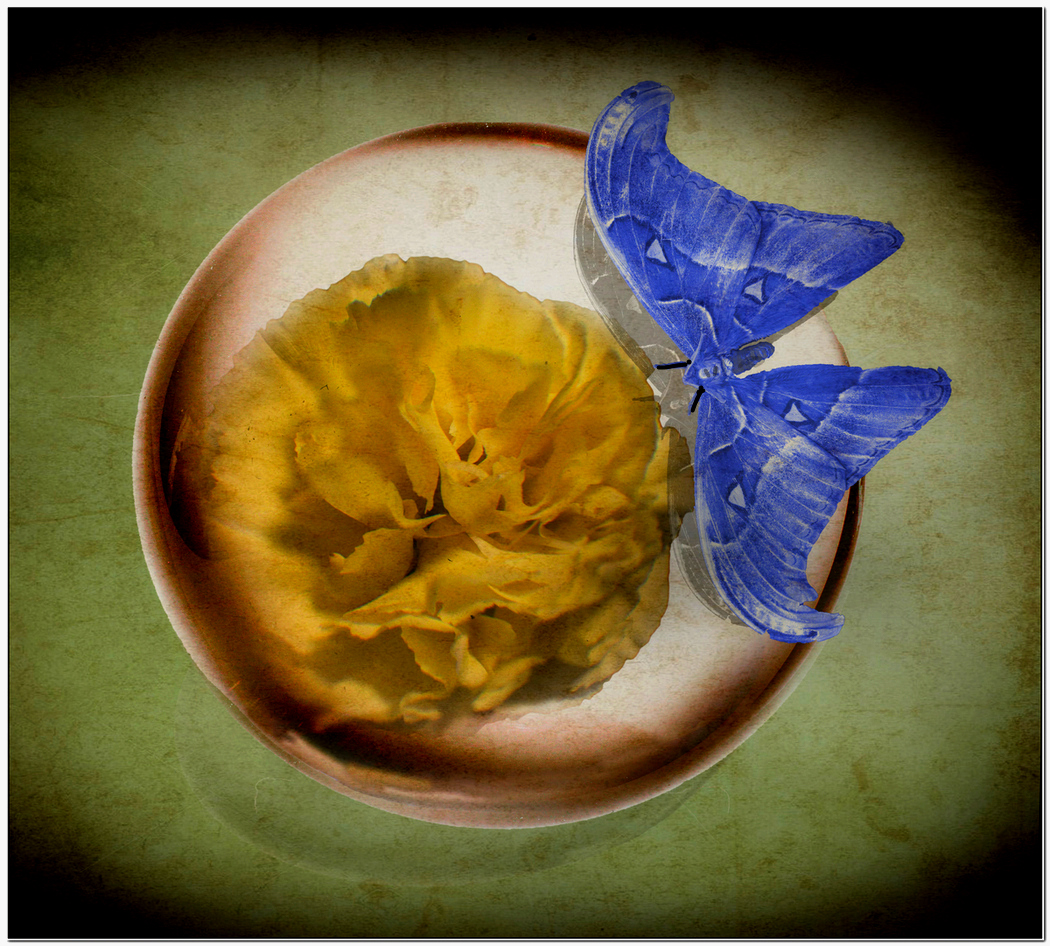
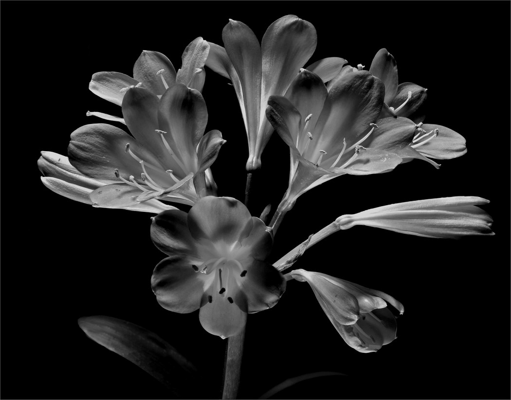
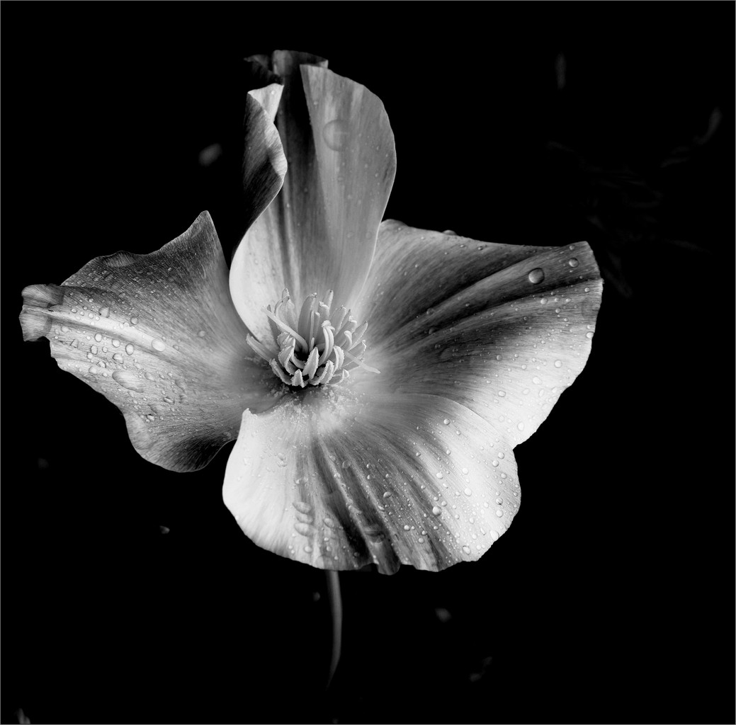
The image is very good. The earth colors are complimentary.
In my opinion, (I do not know if I would have seen as I was creating it. I am playing Monday morning QB.) Is that I would have do one more layer of the original and show the upper main reflection layer just a bit sharper. Not sure if that could have been done, but I think, would have given the image a bit more impact. I am sure other will have a more defined comment. |
Feb 8th |
| 21 |
Feb 22 |
Reply |
Correct, I did a few manipulations trying to get the glass in sync, neglect the light.
I was not happy with the ball either after examining and showing it.
If you notice the original sphere, that was pure glass. here the texture got in the way.
Also the shadow of the moth, should have pure gray.
Perfection! so elusive; I am going to Macys tomorrow, to see if it is on sale. |
Feb 8th |
| 21 |
Feb 22 |
Reply |
I do appreciate all of your comments.
But in addition, I am pleading with all the members of this group; the reason I am participating in these groups is to get deep critiques. Let me explain:
I would say that all of us when submitting an image, we feel "It is a great image!" otherwise we would not have it posted or showed it.
So in my case, It is nice to hear the good points of the images, but I will also appreciate comments in how imperfect, wrong approach, improper composition, bad subject, color scheme, borders or no borders, low impact, etc.
I really need and appreciate that response! Nothing like a gentle comment but realistic, from the bottom of your hart.
So you could say instead of "This picture is trash", "This picture does not have an impact". Please hear me out.
In other words, the classic case that happens in many competitions in the clubs; a judge at a competition says, "I love that image, very nice" yet in a score of 6 to 10, he gives me a 7.
Love and nice do not go with 7.
I want to hear why I did not get a 10. So I do not continue doing the wrong thing.
I want to feel at home among friends, so I am opening to all of you.
What are your opinions?
Mike, have fun.......
PS: Hope I do not get thrown out of the group! |
Feb 8th |
| 21 |
Feb 22 |
Reply |
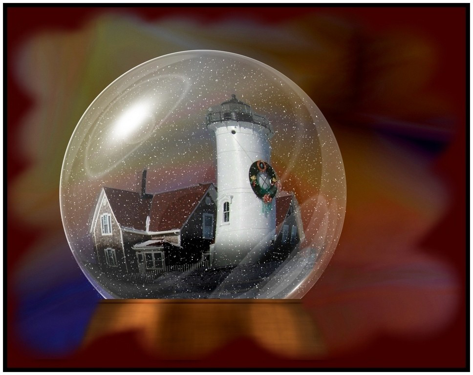
Here is how to do what you want.
An image all computerized using Photoshop.
See an example I did a few years back.
In my case only the lighthouse was a real image.
Famouth MA. Lighthouse in Christmas time.
https://www.youtube.com/watch?v=6QigXWWtjh0 |
Feb 8th |
 |
| 21 |
Feb 22 |
Reply |
MD is a problem, but recall that C Monet paintings are worth lots of Euros even with sight problems.
So keep on creating!!!!!! |
Feb 7th |
| 21 |
Feb 22 |
Reply |
Oh yes. Very true!!!! |
Feb 6th |
| 21 |
Feb 22 |
Reply |
Thanks for the nice words and comments, very appreciated.
Also thanks for taking the time in finding the moth class.
The only thing I saw was a small difference in the web images associated with this class, which was the white triangles.
I have to agree that the white bright border, did substract from the image.
Either the shade of the green or some light grey, was a better choice to enclose the image.
Correct, most images are better viewed with objects from left to right.
In most situations as part of my final checkout of image processing, I do flip to see if the other way will have more impact.
Flipping the horizontal in this image, may be seen by some as a better choice.
To me in this case, my visualization was that the moth was better to the right.
But good point. |
Feb 6th |
| 21 |
Feb 22 |
Comment |
Interesting cutouts.
At first I did not correlate the picture with the title.
A bit of search, gave me that this is a preserved British steam locomotive.
61306 Mayflower was the last B1 locomotive to run on the Great Central Railway.
The line to Marylebone is an area of the City of Westminster in the UK.
In reference to the image, somehow the lines show an abstract of a boat/yacht.
The triangles, squares and rounds cutouts add a certain interest.
I wish that the underlining view in the cutouts would have shown a bit more of the locomotive indicative parts.
An example would be like part of the wheel or a section of the conductor.
In overall a very interesting image.
|
Feb 6th |
| 21 |
Feb 22 |
Comment |
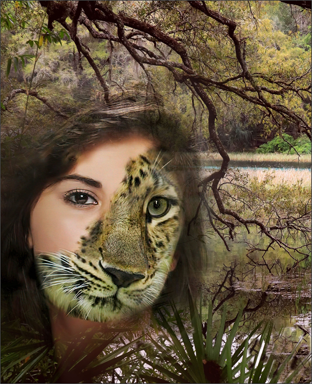
The use of split/mirror images are engaging.
Using the lions as a part of the center medallion did add interest.
My only suggestion would be, that I would not have stretched the lions image.
|
Feb 6th |
5 comments - 9 replies for Group 21
|
| 30 |
Feb 22 |
Comment |
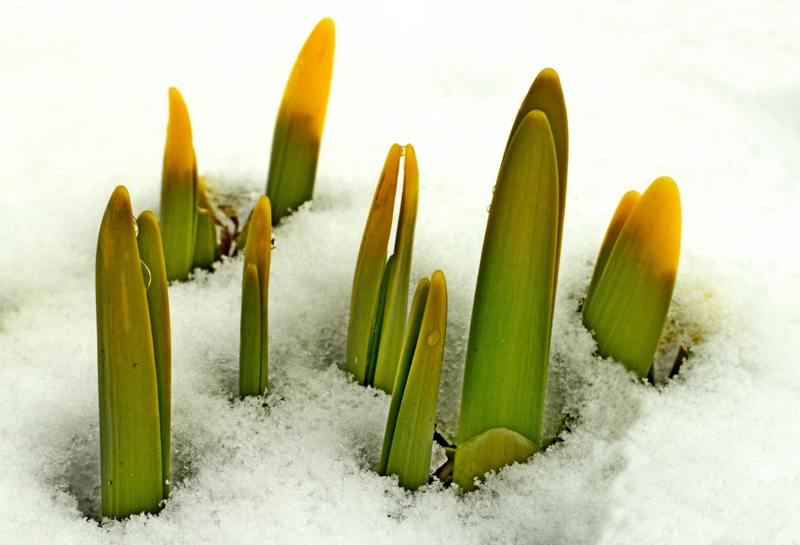
I am from group 21 and I was viewing all entries for this month and I saw yours.
So I have to share an attached image taken about 12 years ago in Stratford, CT.
I was amazed about the coincidental image of a moment in time
in Feb; Daffodils about to bloom after snow.
Glad someone had the same idea.
I think yours has more impact. |
Feb 8th |
 |
1 comment - 0 replies for Group 30
|
| 83 |
Feb 22 |
Reply |
Total agreement!!!!! |
Feb 21st |
| 83 |
Feb 22 |
Reply |
Great notes... I will follow! |
Feb 21st |
| 83 |
Feb 22 |
Comment |
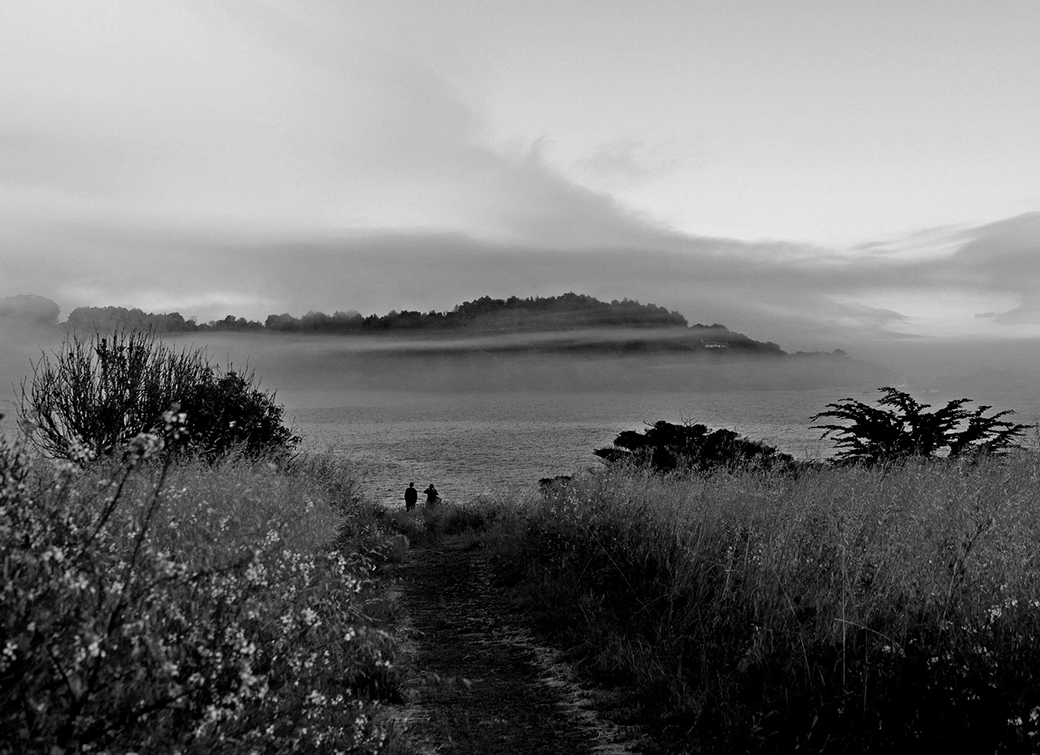
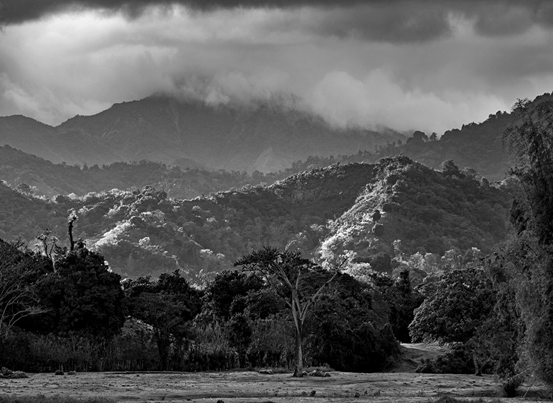
Just looking for comments on this:
In the past few competitions I hear the following comment:
I scored low, as I did not see a focus point. "It should have something like a bird, a person or and animal."
More than 4 times I hear above lines.
Are landscape images like this one not viable in photography anymore? Or are judges shifting concepts/criteria?
I see the focus point in the clouds, the mountain or the trees. Am I wrong?
|
Feb 20th |
| 83 |
Feb 22 |
Comment |
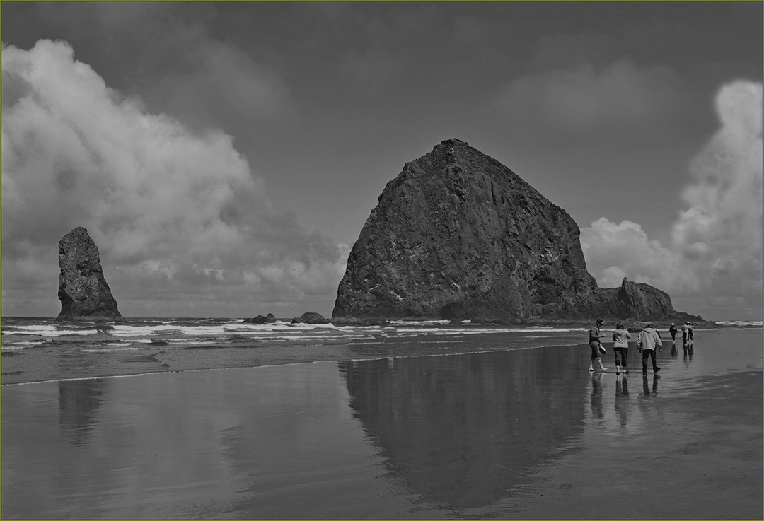
It seems that Mr Lance is ahead of me. Again I agree with him.
The Blacks to white are there. Good. Good panorama.
In my opinion I find the lower foreground, not doing much to the high impact of the top 80%.
If I was going to retouch this images, I wonder if removing a small percentage of the lower part and play with resizing percentage of the horizontal to 95 or 90 and unclicking keep aspect ratio. See sample I did try it. Do this improve the image? Maybe not!!!!
I would like to hear what Mr. Rodriguez feel about it.
|
Feb 20th |
 |
| 83 |
Feb 22 |
Comment |
I agree with lance. But the image has a lot of room in the lower part. In many cases of reflecting photographs, they could have more impact if you see not only the reflection, but subject too.
As an abstract, is fine. I wonder in a competition how will score as it is? |
Feb 20th |
| 83 |
Feb 22 |
Comment |
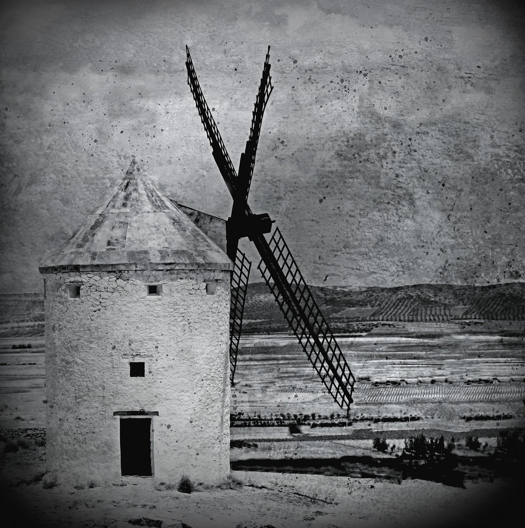
I have study this image for a while and the fact that shows a a mountain in a misty time in black and white, should be an image of high impact.
The question is for what audience?
For geographers, is perfect. For a club competition I think is missing that oomph I would like to see.
Darkening slightly the mountain, Perhaps adding some minimal clouds, should improve it. In my opinion in black and white pictures is to maintain a fair level of Black to whites. This image is mostly white and grey. Am I correct????? What others will say?
|
Feb 20th |
| 83 |
Feb 22 |
Reply |
Very good points. I will try them. |
Feb 20th |
4 comments - 3 replies for Group 83
|
10 comments - 12 replies Total
|