|
| Group |
Round |
C/R |
Comment |
Date |
Image |
| 21 |
Aug 23 |
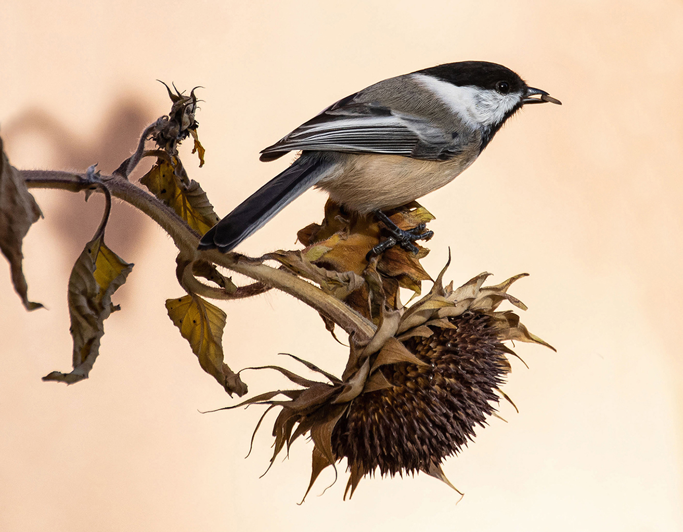
Comment |
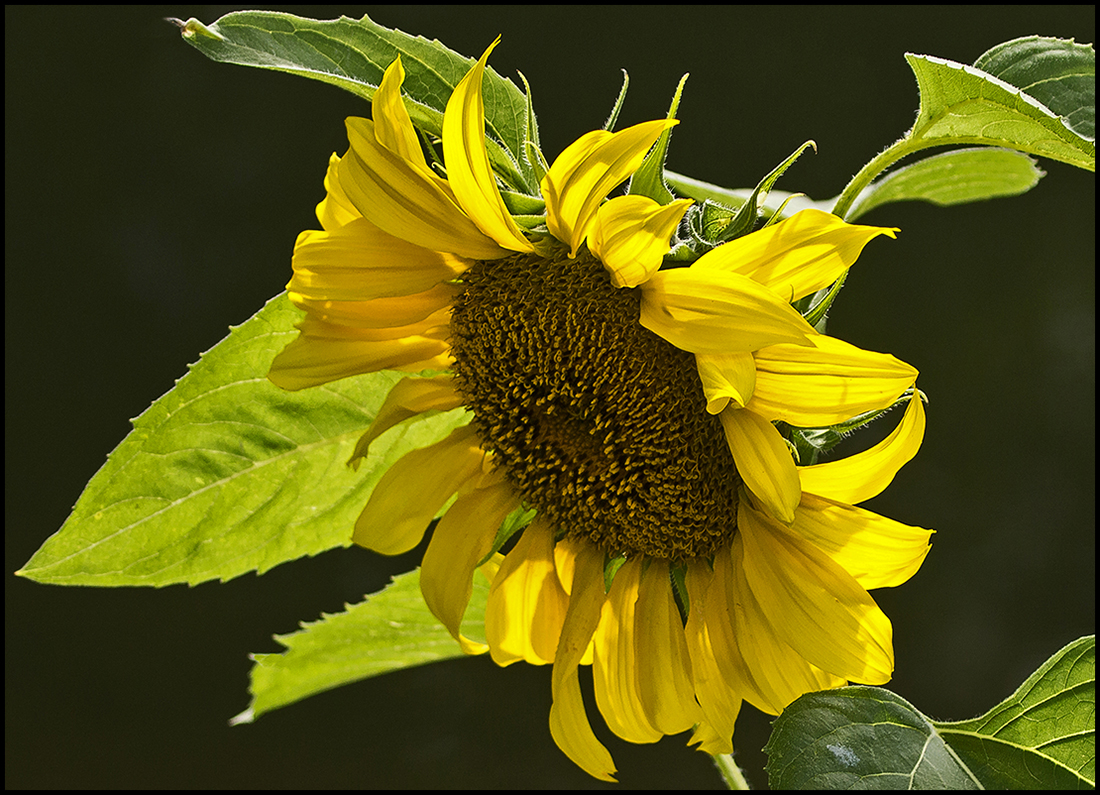
No, I didn't replace the background. The sunflower was next to the stucco house. Thanks for the kudos. |
Aug 8th |
| 21 |
Aug 23 |
Reply |
Hard to tell any difference on my small laptop monitor, but you are the ultimate decider. I think all but the large water drop in front enhance the photo. |
Aug 8th |
| 21 |
Aug 23 |
Comment |
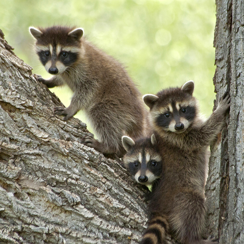
I'm going with the Cooper's ID, definitely a juvenile. Since this isn't cropped you could add a bit with content-aware fill with the cropping tool on top and sides. Doubt it could fill in the tail. It's so sharp you could make it a portrait. What a great face! |
Aug 4th |
| 21 |
Aug 23 |
Comment |
Great shot! And the red eyes didn't surprise me. Lovely birds.
I might even emphasize the red eye with a touch of dodging. And maybe a touch of burning on the white breast area to tone down the bright white. You could even give them a little more room to swim and not crop quite so close. |
Aug 4th |
| 21 |
Aug 23 |
Comment |
The problem with closer cropping is the noise and focus factors. It was a great idea and a humorous catch, but the detail isn't there. The focal objects need to be separated from the background, and yes, cropped in. There may be fixes in PS, it can do so much these days. Sorry to be so ruthless. |
Aug 4th |
| 21 |
Aug 23 |
Comment |
I like this capture. Yes, tone down white area on head and if it were me, I'd also darken and blur the light areas of the upper background. |
Aug 4th |
| 21 |
Aug 23 |
Comment |
Don't know if anything can be done about the blown out area under the wing, too bad about that. You could try cloning, but it's a large area. You might also want to run the blur tool over the noisy upper background. Colors are very intriguing.
Who doesn't love blue booby feet? |
Aug 4th |
| 21 |
Aug 23 |
Comment |
Have to agree with MB, run through Levels in the adjustment panel of Photoshop to brighten it up a little. Water drops don't bother me, but could delete the big one on the breast area...just slightly distracting. All in all a very nice shot. |
Aug 4th |
7 comments - 1 reply for Group 21
|
| 94 |
Aug 23 |
Comment |
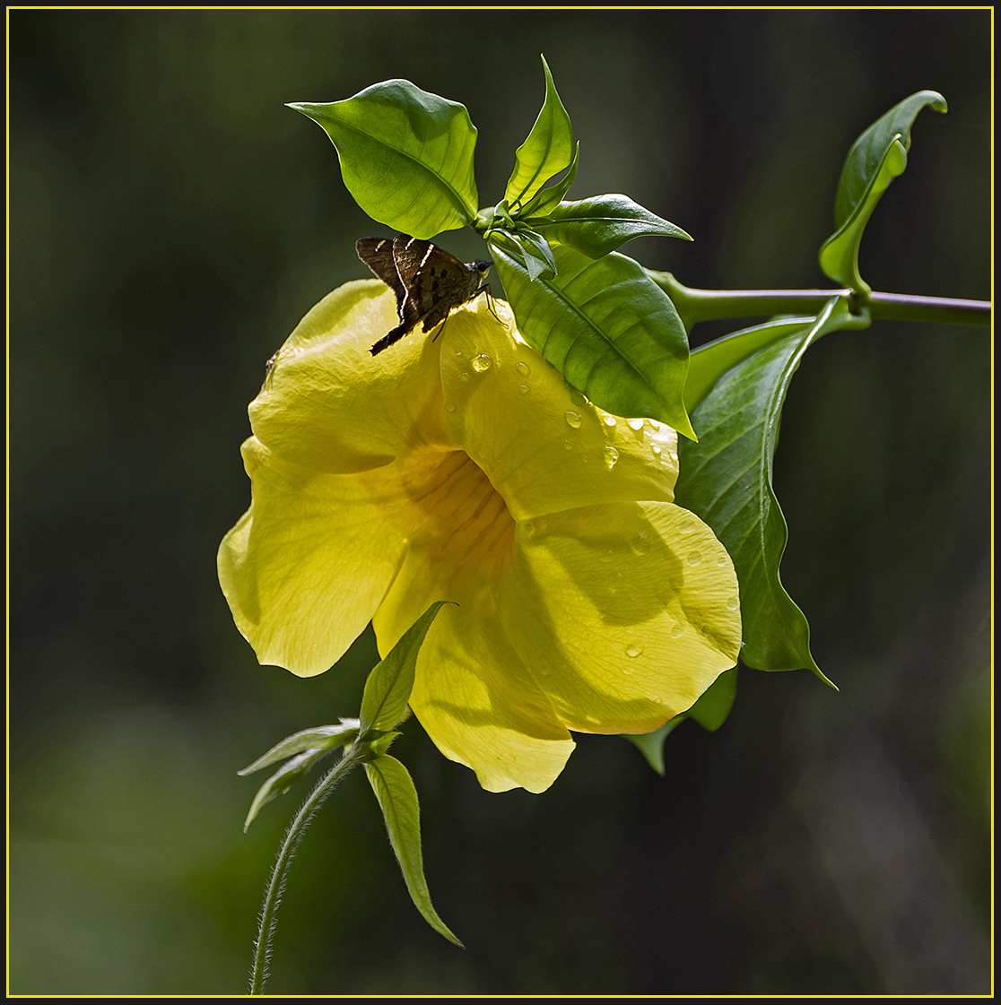
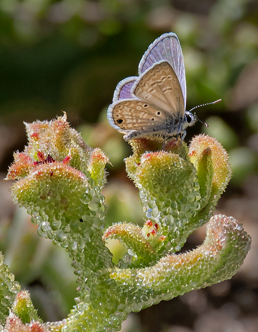
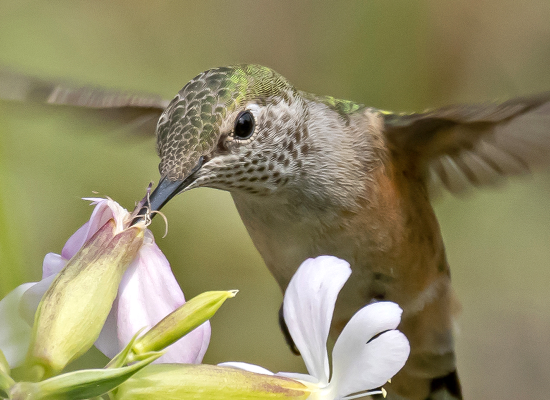
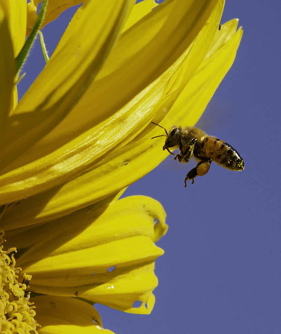
Agreed, glad you are back at it. Shadow not an issue for me. It looks to me like a shadow from the flower petal on which it is nectaring. Nice colors and focus. Like that you blurred the background. |
Aug 14th |
| 94 |
Aug 23 |
Comment |
Not sure why the colors in your original are so much better...redder reds and greener greens. If the focus is good enough, you could crop out all but the 2 really good flowers and forget the rest. |
Aug 11th |
| 94 |
Aug 23 |
Comment |
I agree with you, your crop looks better. |
Aug 9th |
| 94 |
Aug 23 |
Reply |
My expertise ends at the borders of Colorado, but I do have good field guides for the whole of USA |
Aug 8th |
| 94 |
Aug 23 |
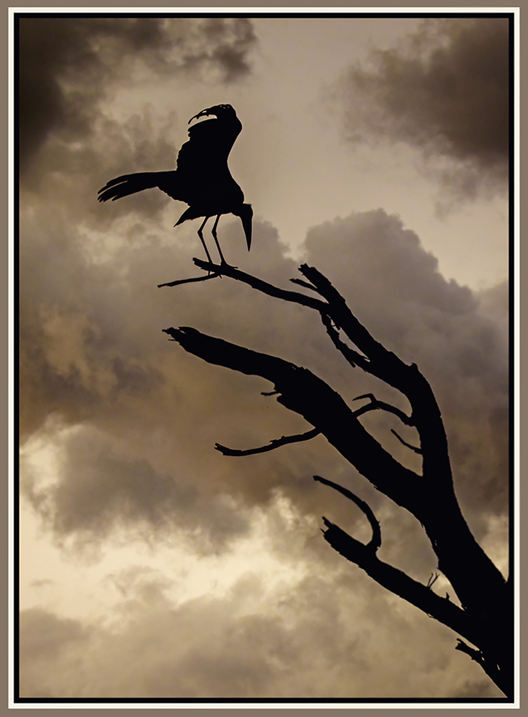
Comment |
It doesn't look like the original!? That was some amazing Photoshop work...just kidding. You explained the two photos. I like both limpkins, but the one with wings extended a little more...more action and good focus on head. If it were me I would crop a bit closer on the left making it a square composition. Interesting dew drops. |
Aug 6th |
| 94 |
Aug 23 |
Comment |
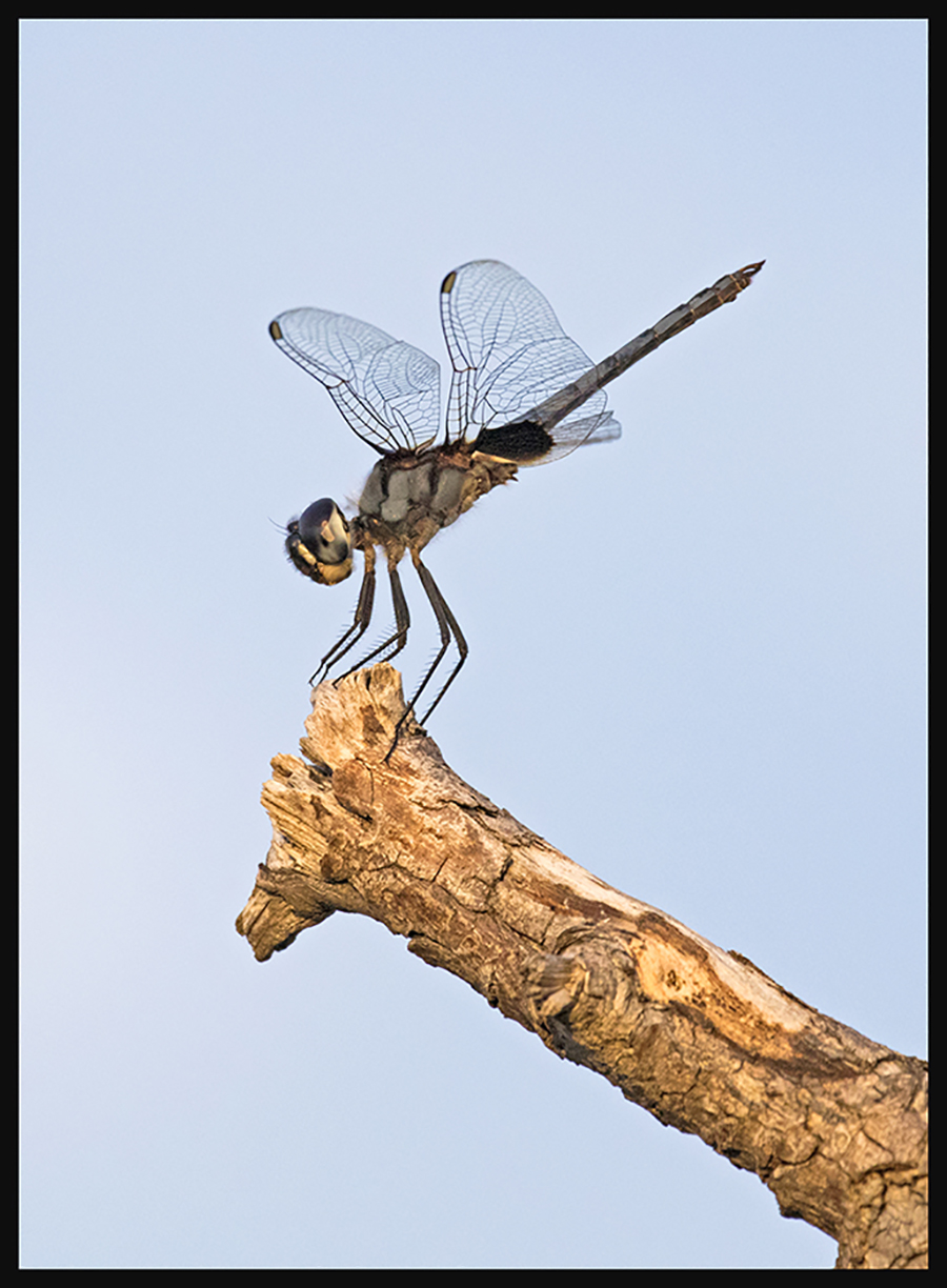
I'm a total "Ode" head...have taught classes and led field trips on dragonflies. This is a lovely shot of the smallest of dragons. well done |
Aug 4th |
| 94 |
Aug 23 |
Comment |
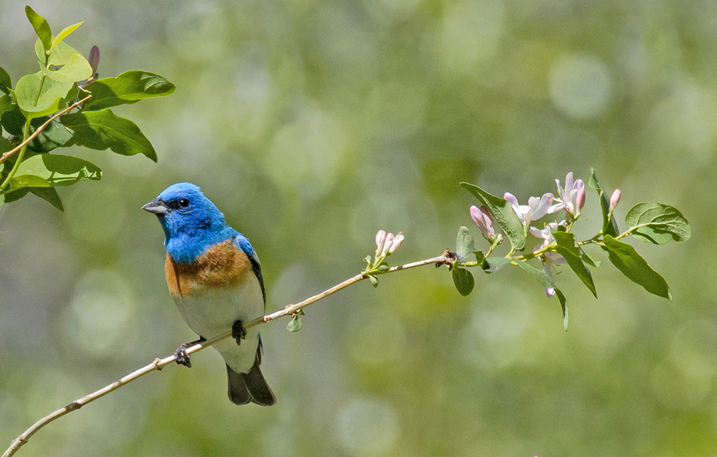
I love this shot, but I wish you had cropped it closer. The "indigo" bunting is gorgeous and should star in the photo without so much background...in my opinion. |
Aug 4th |
6 comments - 1 reply for Group 94
|
13 comments - 2 replies Total
|