|
| Group |
Round |
C/R |
Comment |
Date |
Image |
| 60 |
Aug 25 |
Comment |
Interesting shot. It still looks a little fuzzy to me, so maybe sharpening it some more would help. Also, the colors could be brightened more (in saturation or a filter) to make the orange pop a little more. |
Aug 20th |
| 60 |
Aug 25 |
Comment |
The B&W is beautiful. It could fit in either category, and it looks fine on my monitor. Good luck on the competition with it! |
Aug 20th |
| 60 |
Aug 25 |
Comment |
Diana, looking at this again, you did a great job with taking out the fence background and focusing on the face of the bird. Good job! |
Aug 20th |
| 60 |
Aug 25 |
Comment |
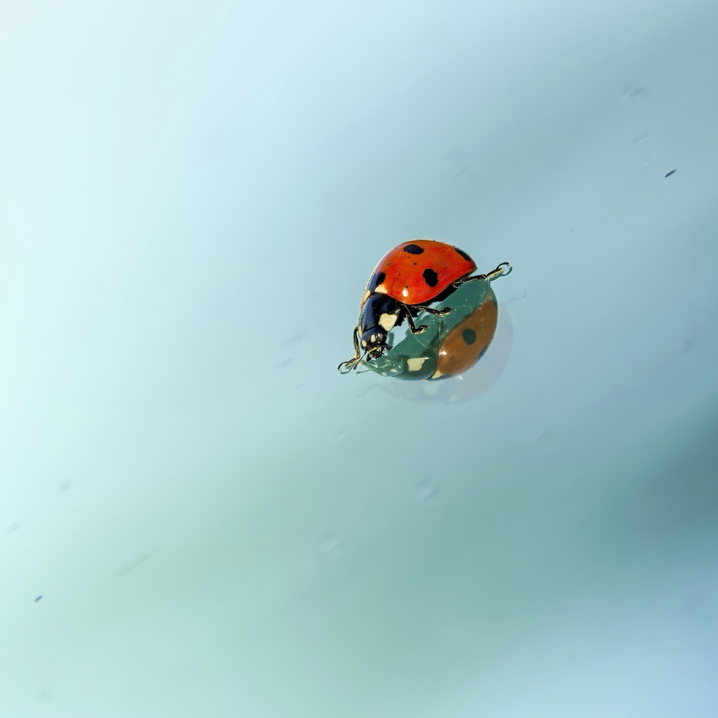
Really nice photo. What a spider web that must be to hold those drops. Consider blurring it a little and making it an abstrast just for fun! |
Aug 20th |
| 60 |
Aug 25 |
Reply |
Thank you! I am already working on it. |
Aug 11th |
| 60 |
Aug 25 |
Reply |
Thank you! |
Aug 11th |
| 60 |
Aug 25 |
Reply |
Thank you!
|
Aug 11th |
| 60 |
Aug 25 |
Comment |
Diana, here is a suggestion on getting rid of the white line all along the bird profile. In the clone mode, chose darken, over normal. Click the clone spot in the space by the bird. Check aligned also while you are cloning along side the bird. I have used this on sharpened images that had this result. |
Aug 9th |
5 comments - 3 replies for Group 60
|
| 77 |
Aug 25 |
Comment |
Denise, I understand your struggle with the water, and have tried many things in the past. I think either the green or the blue will work, so it is just a preference. |
Aug 20th |
| 77 |
Aug 25 |
Comment |
So sweet! I like the sunflower best, but both are good and creative. |
Aug 20th |
| 77 |
Aug 25 |
Comment |
Like the others said I believe too - this is a powerful image. It is a good sign that you can pick up your camera again and create something meaningful. |
Aug 20th |
| 77 |
Aug 25 |
Comment |
You definately improved it with the filters and texture. Beautiful job! |
Aug 20th |
| 77 |
Aug 25 |
Comment |
Very creative! I do like the rotated one a little better, and it seems to be an abstrast. You might try it with different colors to just give it a different look and feel. |
Aug 20th |
| 77 |
Aug 25 |
Comment |
Carol, this is lovely. I really like that you put in 3, looking like they are blowing in the breeze. |
Aug 20th |
| 77 |
Aug 25 |
Reply |
Thank you. I remember Lisa's work, and I will take a look now that you mention her. I knew this was not fine art but a nature photo, but all are you are so good at fine art, I wanted to put it in here to get your thoughts and feedback on it. |
Aug 20th |
| 77 |
Aug 25 |
Comment |
Thank you both. I darkened the background and submitted it to the contest today. |
Aug 19th |
7 comments - 1 reply for Group 77
|
12 comments - 4 replies Total
|