|
| Group |
Round |
C/R |
Comment |
Date |
Image |
| 8 |
Mar 22 |
Comment |
This shot is all about the dynamics of the dance floor which you have captured beautifully. I can almost feel the rhythm of the beat in your photograph. Personally I would have cropped in from the right to take out the white dress (not sure it adds anything to the shot) and leave the image more in a vertical format. The image otherwise works very well and I am enjoying this a lot - thanks for sharing. |
Mar 12th |
| 8 |
Mar 22 |
Comment |
I was always taught to avoid using converging verticals in a shot, but on this occasion I think it works and demonstrates the degree of scale and the enormity of the tree. I think I would have bought the highlights more under control as it is drawing my eye to the top of the shot. I would also enhanced the "Glow" from the light shining in the middle of the branches which is an obvious feature of the image. Otherwise well captured and thanks for sharing. |
Mar 12th |
| 8 |
Mar 22 |
Comment |
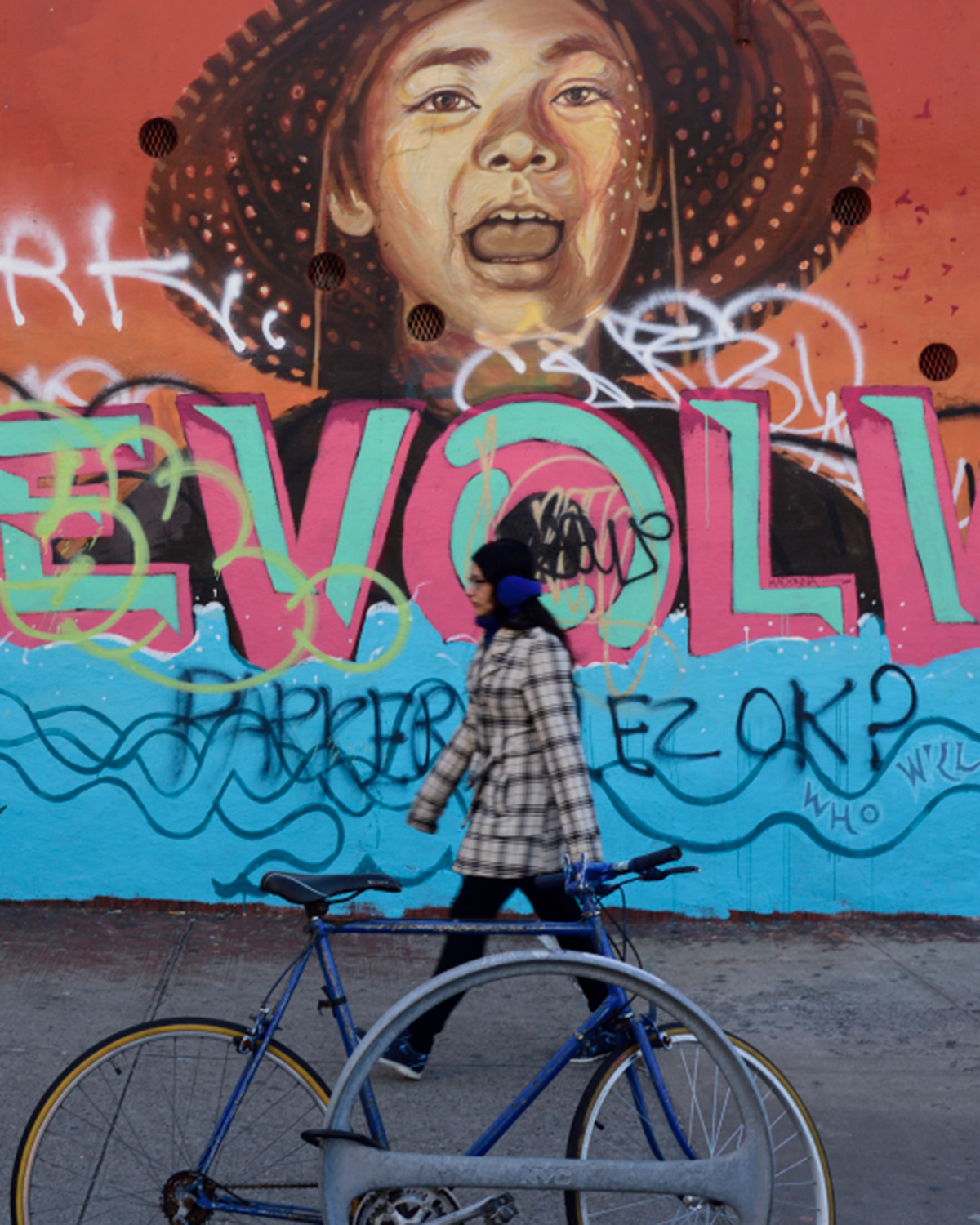
I love street photography and everybody's ideas are different. I would certainly have lost the young lady from the shot and cropped in from the right to loose the rubbish which are both distraction's in the shot. Whilst I agree with Pinaki that the Skater adds to the shot you have chosen to use an 18mm lens which would have given you scope to go in much tighter to the vendor himself and take a portrait of such a wonderful character. For me I would have chosen him as the main subject and cropped in closer. |
Mar 12th |
| 8 |
Mar 22 |
Comment |
The concept of the shot I think is very interesting, but think you have hit some walls along the way in putting this shot together. The Red fabric is a overpowering and think you could have got away with just a few pieces of Silverware arranged in the form of an orchestra on a dark background, this I think would have made more sense. Personally I dont like to us Plastic Figures and I think you should have found a friend in a white "Jacket" and a Baton which would have made the concept of a orchestra more realistic. I also agree with Pinaki that the Logo is a distraction. Nothing wrong with the image you have produced but I feel with a bit more thought you could have produced something with Impact. |
Mar 12th |
| 8 |
Mar 22 |
Comment |
Nice street Image, I would have preferred to see focus on the main subjects which are all nicely in alignment and I find that the sides of the Image distracting my eye. The shot itself is exposed well and sharp from front to back but I think some work to be done on formatting the shot for more impact. |
Mar 12th |
 |
5 comments - 0 replies for Group 8
|
5 comments - 0 replies Total
|