|
| Group |
Round |
C/R |
Comment |
Date |
Image |
| 31 |
Sep 22 |
Reply |
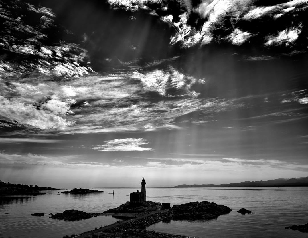
Ella, I did like your suggestion to try to make the one or more of the light beams "touch the lighthouse". In practice, I did not have the skills to pull it off yet but in the attached you can see I have tried to apply Peter's and your suggestion to create this version |
Sep 19th |
 |
| 31 |
Sep 22 |
Reply |
I agree with you and thank you for your input |
Sep 19th |
| 31 |
Sep 22 |
Reply |
I agree with you and thank you for your input |
Sep 19th |
| 31 |
Sep 22 |
Reply |
Ella, I did like your suggestion to try to make the one or more of the light beams "touch the lighthouse". In practice, I did not have the skills to pull it off yet but in the attached you can see I have tried to apply Peter's and your suggestion to create this version |
Sep 19th |
 |
| 31 |
Sep 22 |
Reply |
Thank you, I found this very constructive & I have applied your suggestions |
Sep 19th |
| 31 |
Sep 22 |
Comment |
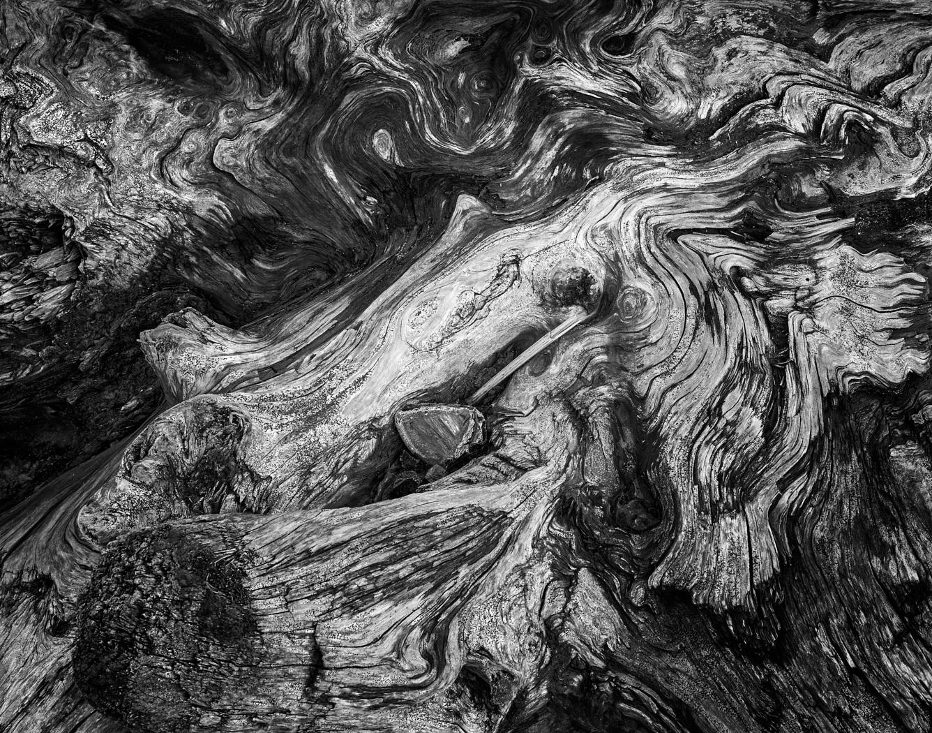
Ella...you are so right about that camera being photogenic, it is wonderful and I think you technical execution of the photograph is abolutely perfect. As a composition, that block of wood disrupts the narrative for me personally. I understand your comment that it would not balance on the side edge, would not it's side & lens tipped down position it be a composition too? |
Sep 19th |
| 31 |
Sep 22 |
Comment |
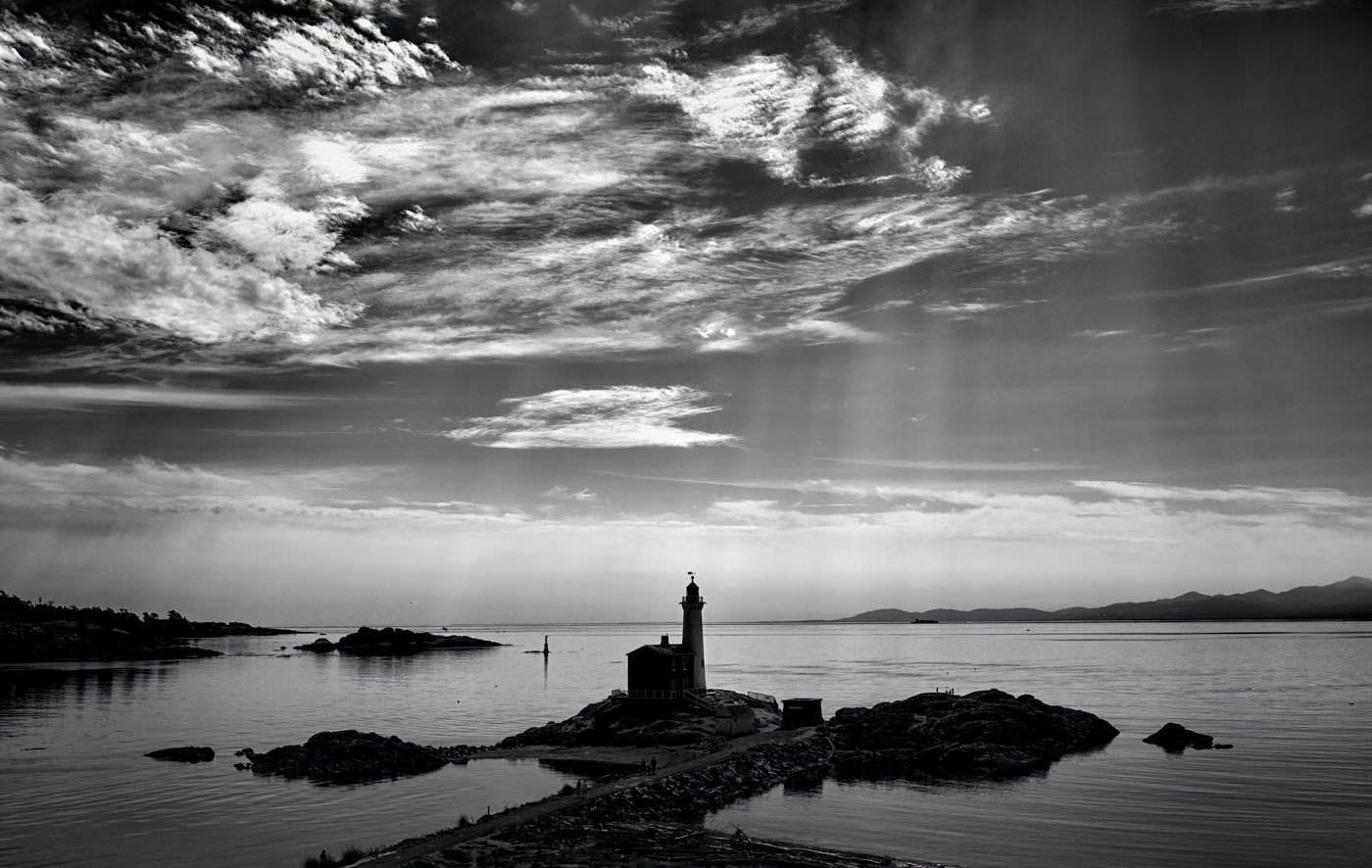
Ed this is a great image with a well thought out original composition and leading lines. I am impressed with the care and restraint you applied to your processing leaving us with an image that is calm and depicting very well a balmy Florida day. The darker horizon against the lighter clouds produces a subtle and unusual tension. |
Sep 19th |
| 31 |
Sep 22 |
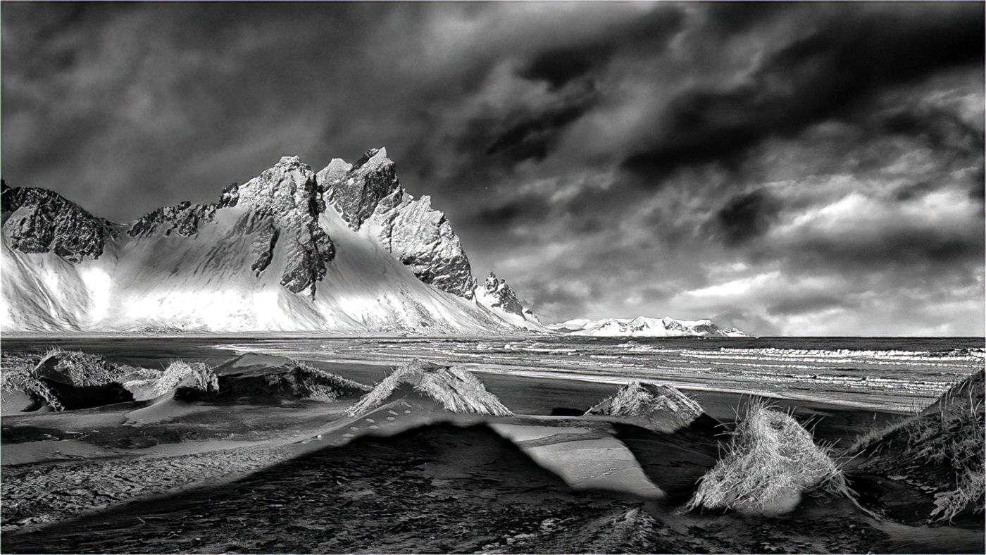
Comment |
Ian....what a brilliantly concieved composition ! It is expertly processed with good tone and depth. I am at a loss to suggest any way it can be improved. Well done ! |
Sep 19th |
| 31 |
Sep 22 |
Comment |
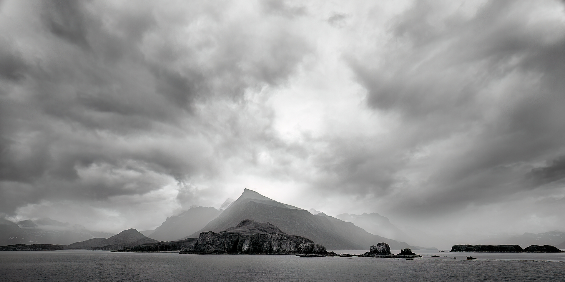
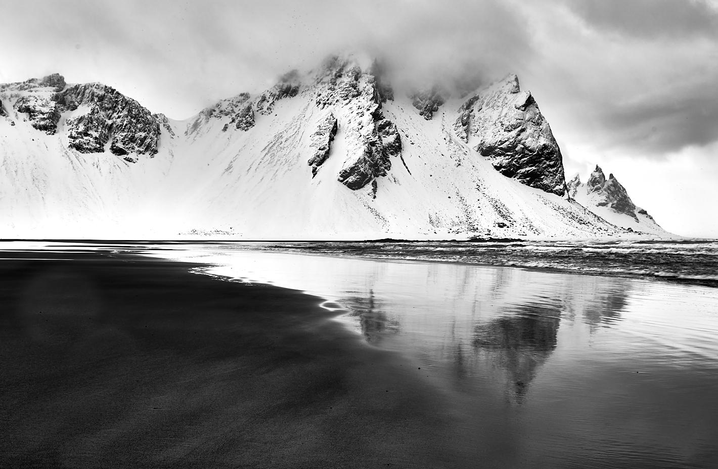
Peter, Vestrahorn never seems to fail in offering a dramatic image. Congrats on the color version and the well deserved award. On the B&W version the clouds look too "smooth" and I failed in my efforts to reprocess them. I would recommend you stayed with the sky in the color image as I believe it has potential in B&W too. Forgive my abuse of your image, I ran the color version quickly through CEP to see if the sky could be suitable & believe you could deliver a much better version that would work for you. |
Sep 19th |
 |
| 31 |
Sep 22 |
Comment |
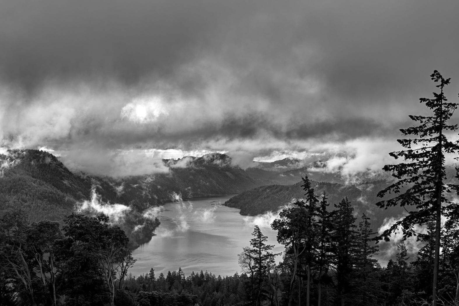
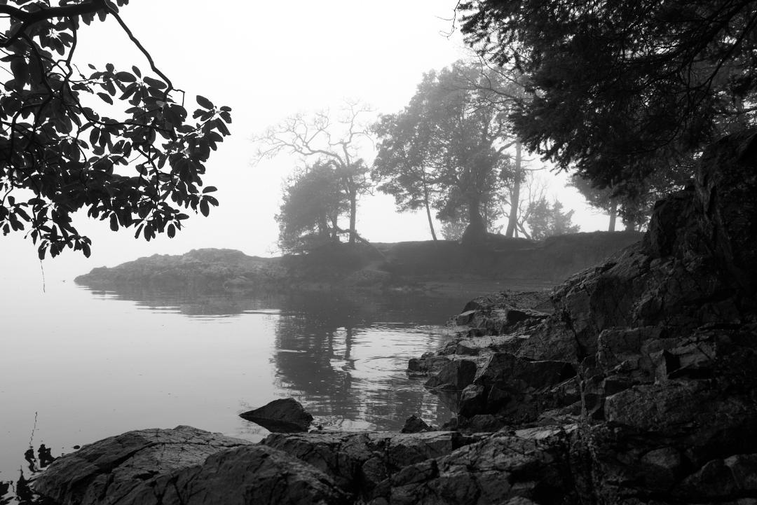
John this is an interesting image but I wander if the view to the right might be favoured over the strong grass in front. Darkening the foreground might help in leading the eye to back. The Tonal Contrast in CEP always has a strong effect and you seem to have picked up some debris/spots in the cloud that could be reduced by using the "Fine" setting in Tonal Contrast or perhaps with a DeNoise Processing. On the top of the dark hills in the background their is faint halo possibly caused by CEP that might also disappear. |
Sep 19th |
5 comments - 5 replies for Group 31
|
5 comments - 5 replies Total
|