|
| Group |
Round |
C/R |
Comment |
Date |
Image |
| 31 |
Jun 22 |
Comment |
Hello John, the composition and cropping comments have been well made and I concur. The eye is always drawn to the light and on this image that tends to be on the outside. Therefore a Vignette might be worth your consideration to soften the highlights. |
Jun 12th |
| 31 |
Jun 22 |
Comment |
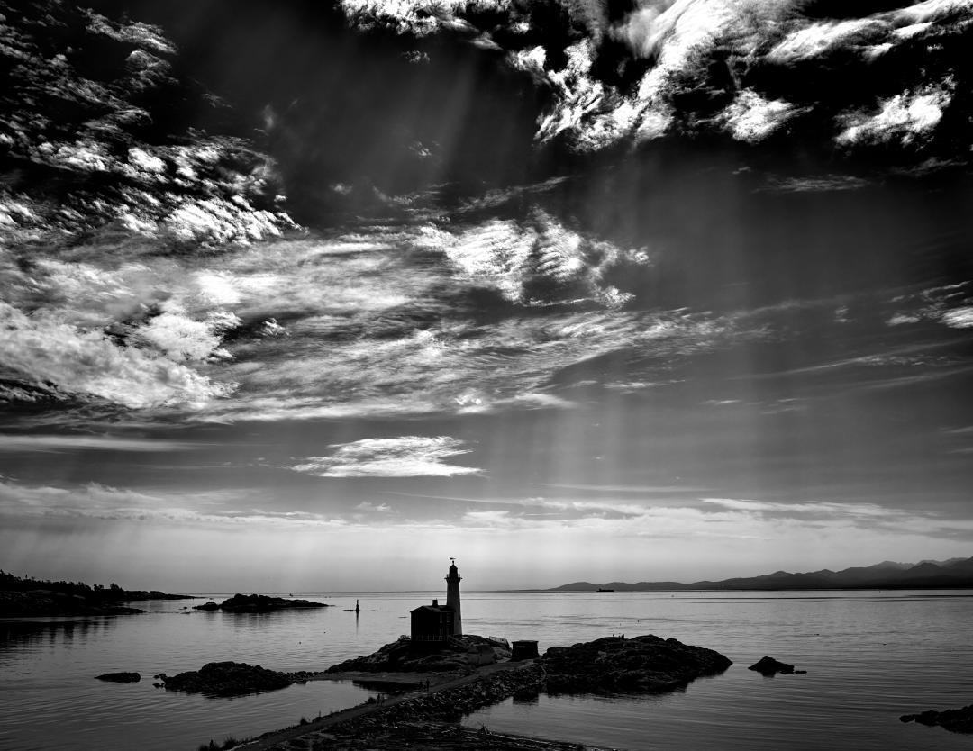
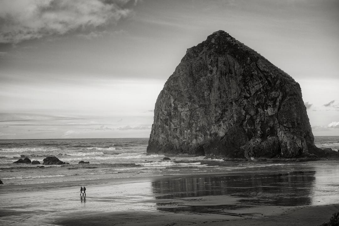
Peter- thanks for sharing the color as it demonstrates how much more tonal contrast you bought ot in the B&W version. It is my subjective opinion the darker sky works well in the color version but in the B&W, with the increase in tonal contrast on the rocks showing strong low light coming from the left, the clouds look unnatural. I would recommend lighening them slightly with some contrast. |
Jun 12th |
| 31 |
Jun 22 |
Comment |
Ian - deft execution of a difficult subject. I like your choice of background however it does bleed onto the face & helmet and I am not sure whether that is by design. |
Jun 12th |
| 31 |
Jun 22 |
Reply |
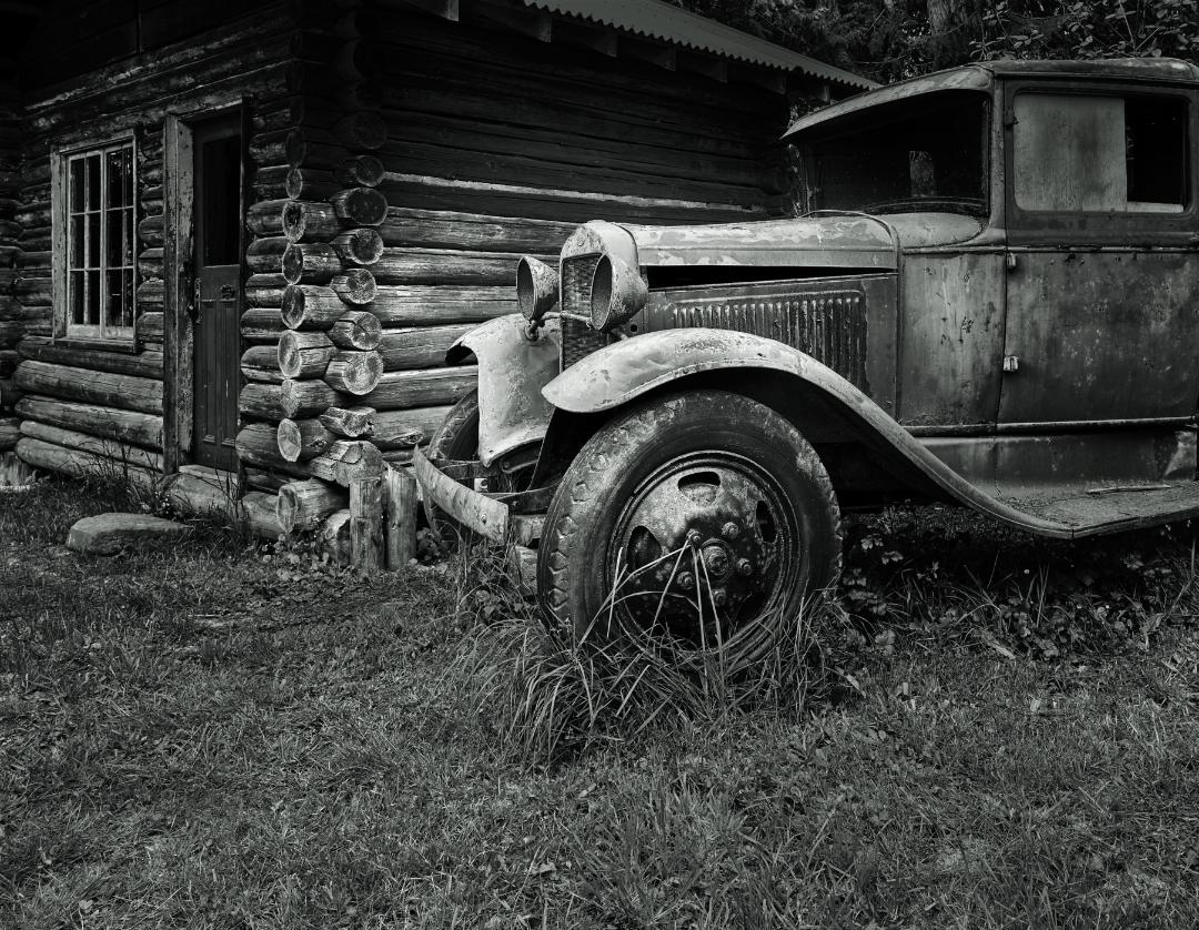
I agree the mud guards and bonnet need more work despite my two prior attempts. I know it's darker than when I started but I need to look with fresh eyes as to how much further it needs to go. |
Jun 12th |
| 31 |
Jun 22 |
Reply |
You are right Ella about the truck & grass |
Jun 12th |
| 31 |
Jun 22 |
Comment |
Ella - separate question.....what is "adding a 3 pix grey stroke " , how is it done and what desired effect does it apply?....thanks |
Jun 12th |
| 31 |
Jun 22 |
Comment |
Ella...I do enjoy this image and it conveys the size and grandure of Alaska well. Your inclusion of the cyclist helps the viewer comprehend the scale and was a good call. I think your processing and tonal separation is excellent. I am wondering whether you considered the option of leaving the foreground bushes out of the image flipping the image from left to right?? |
Jun 12th |
 |
5 comments - 2 replies for Group 31
|
5 comments - 2 replies Total
|