|
| Group |
Round |
C/R |
Comment |
Date |
Image |
| 31 |
Mar 22 |
Reply |
Here is a screenshot of the same image created by myself using CEP4 for the first time |
Mar 11th |
 |
| 31 |
Mar 22 |
Reply |
Thank you John, I would agree that will improve it |
Mar 11th |
| 31 |
Mar 22 |
Reply |
Peter...thank you for the excellent suggestions. I finally succumbed and I have started using the same software and it is a good starting point |
Mar 11th |
| 31 |
Mar 22 |
Reply |
Peter....you had a sunny day...where is the challenge of doing at 9am in a snow blizzard? :-) |
Mar 11th |
| 31 |
Mar 22 |
Comment |
Such an interesting image but I can understand your question as to whether it works in B&W. My first reaction was that you had not adjusted your levels but that proved wrong when I found both ends of the light spectrum. I feel that there is not enough contrast and I would drop the exposure to at least the point you get some definition in the denhim shot back. |
Mar 7th |
 |
| 31 |
Mar 22 |
Reply |
Ella, Thank you for your comments. I did not see the yellow cast & will be interested if anyone else sees it. However when peering closely at the snow on the left I did see a rain drop on the lens. (It was an awful day!) |
Mar 7th |
| 31 |
Mar 22 |
Comment |
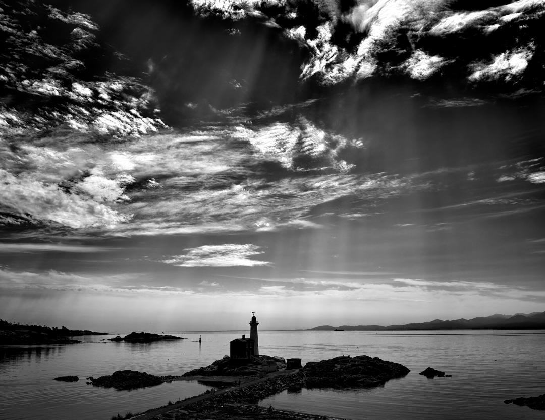
Peter, I confess I have no idea about infrared photography therefore cannot comment technically.
The composition is wonderful with the dramatic sky and light falling on the Castle. |
Mar 7th |
| 31 |
Mar 22 |
Comment |
Ian, Interesting composition and well executed with great tones. I agree with Ella & yourself that the "flare" in the top right is distracting but easily remedied. My eye is drawn to the wolf logo in the centre of the image and would like to suggest that it is worth enhancing it to make it pop out to become a stronger part of the narrative. (Layer just over the wolf increasing the blacks & contrast) |
Mar 7th |
| 31 |
Mar 22 |
Comment |
Ed, I like the composition and I am not familiar enough with the software you used to comment. Looking at the image subjectively, the intense processing for high contrast of the background tends to draw your eye away from the upper structure of the bridge. I'm of the opinion that it would be worthwhile to process the structure to reduce it's contrast to make it stand out from the background |
Mar 7th |
| 31 |
Mar 22 |
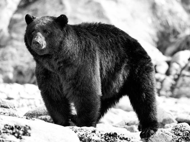
Comment |
A lovely image and I am glad you shared it. It is a strong nature portrait precisely in focus , well exposed and I like the bokeh. I think your edit maximises what you can draw from the image. |
Mar 7th |
5 comments - 5 replies for Group 31
|
5 comments - 5 replies Total
|