|
| Group |
Round |
C/R |
Comment |
Date |
Image |
| 31 |
Feb 22 |
Reply |
Thank you and I agree with your comment. That detail is there in the larger file and I will follow your suggestion |
Feb 14th |
| 31 |
Feb 22 |
Comment |
Paul, this is a lovely photo with the story being the facial interplay between the three boys. As a result, I might recommend further cropping to focus on the boys and take them out of the center. I would look at your curves or levels in HDR to check you have reached your black tone, it looks almost a sepia finish. |
Feb 9th |
| 31 |
Feb 22 |
Comment |
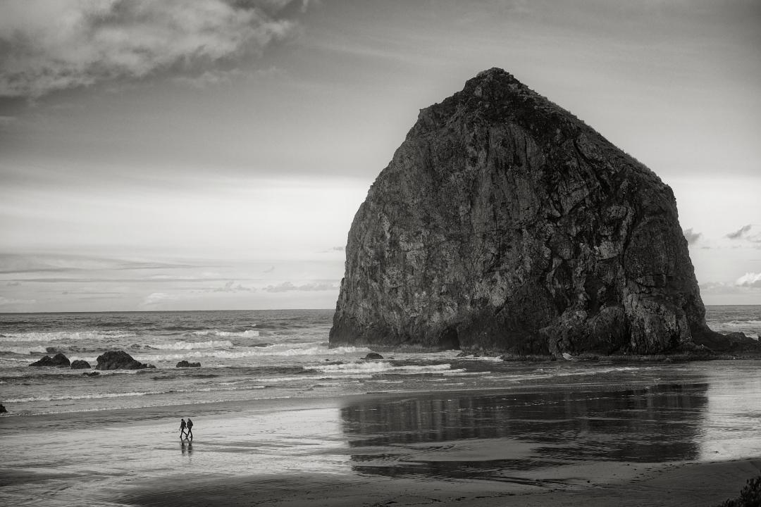
This is a high impact image well executed. I would be afraid that any changes would detract from what you have achieved. If I was in an experimental mood I might try placing a layers on the foreground water to enhance the reflection of the vessel and one on the sky to see if enhancing the contrast improves it. My main recommendation is for you to contact MSC and ask them if they would like to buy a very good photo of their new vessel on it's maiden voyage! |
Feb 9th |
| 31 |
Feb 22 |
Reply |
Thank you for the input |
Feb 9th |
| 31 |
Feb 22 |
Comment |
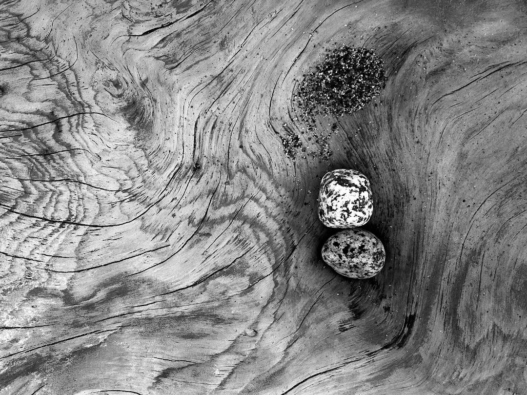
Ella, I hope you are healing fast and we will soon see new images of the great world outside !
This is a great still life and I especially love the wood tones in the background. Recommend you consider placing some "shadow" on the left side of the pear just to acknowledge the light direction. At the same time I might dodge in some light on the right side of the gourd for the same reason. |
Feb 3rd |
| 31 |
Feb 22 |
Comment |
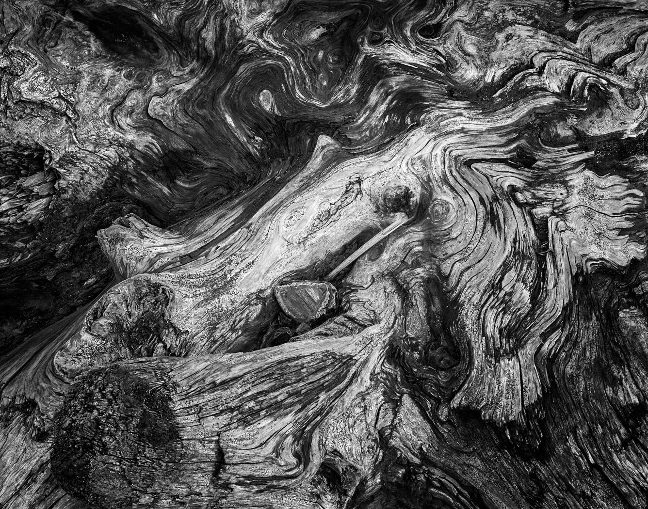
Ed, this is a really lovely subject. In the end the image has graphic effect like an etching but I do not know whether that is your intent, so I intend to comment as if it was not.
Overall the image has too much mid tone I think caused by the three images only having a single stop. A two stop gap between each may have served you better to provide a broader tonal range. On the composition, consider taking out the foreground rocks to make the Water Mill more dominant. |
Feb 3rd |
| 31 |
Feb 22 |
Comment |
Lovely photo from a brave photographer! Peter please be patient with me as I am new at this. It is an exquisite picture beautifully processed, however, I think you need dark tones to enhance the depth and create an even more interesting image. I was immediately drawn to Ansel Adam images of the Aspen trees in Colorado for reference. I would darken further the space between the trees in the forest in the background similar in the way it is on the left all the way to the right. There is also some detail in the sky on the right that could built out with some clarity. |
Feb 3rd |
| 31 |
Feb 22 |
Comment |
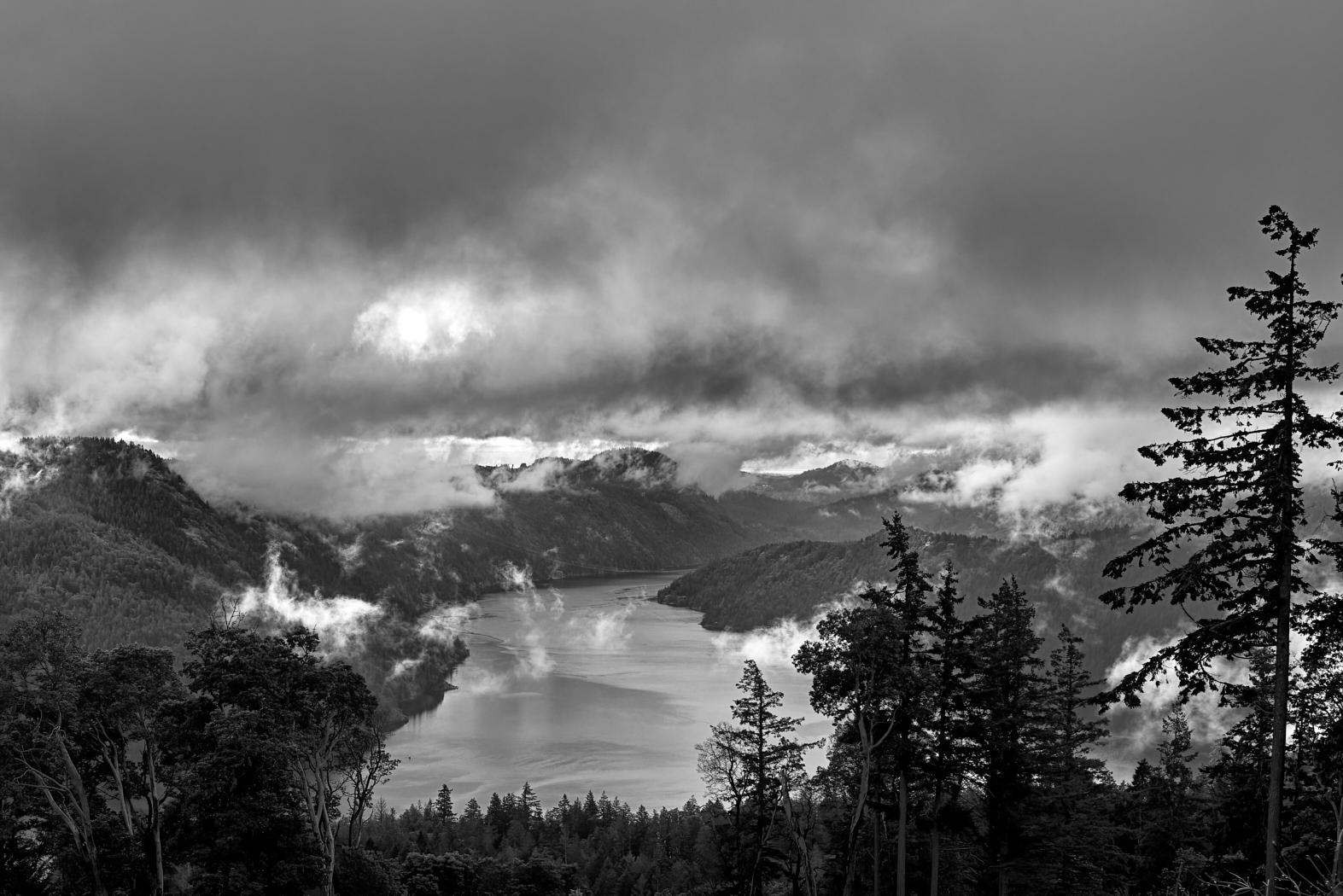
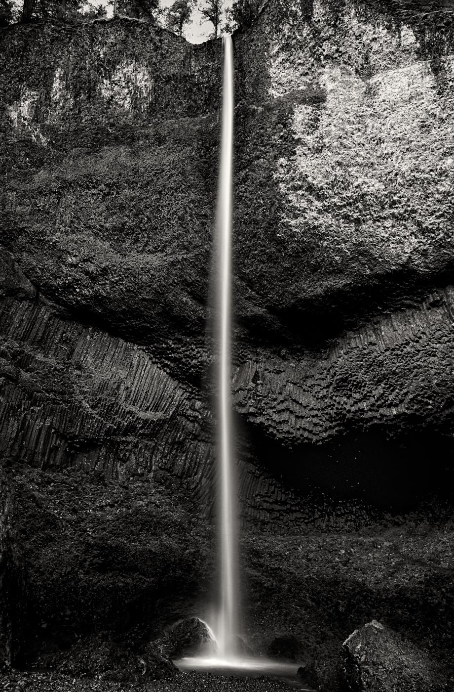
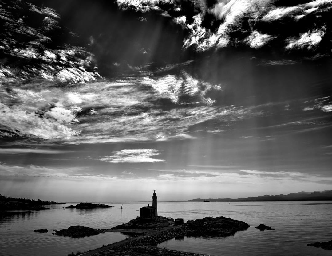
The sky is a nice subject in this image and like the way you have processed it. Since the subject is minimalism, I would consider cropping more of the bank (50%) to reduce it's dominant place in the composition.
Sure did not want to bring it up, but there is a lot of dust on something or your lens got rained on when you lifted it up |
Feb 3rd |
6 comments - 2 replies for Group 31
|
6 comments - 2 replies Total
|