|
| Group |
Round |
C/R |
Comment |
Date |
Image |
| 31 |
Jan 22 |
Reply |
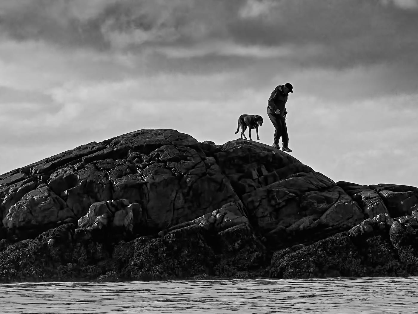
Thank you Ian, the advice has been helpful and welcome has been warm. Much appreciated. |
Jan 12th |
| 31 |
Jan 22 |
Reply |
Thank you, your help has been very beneficial |
Jan 10th |
| 31 |
Jan 22 |
Comment |
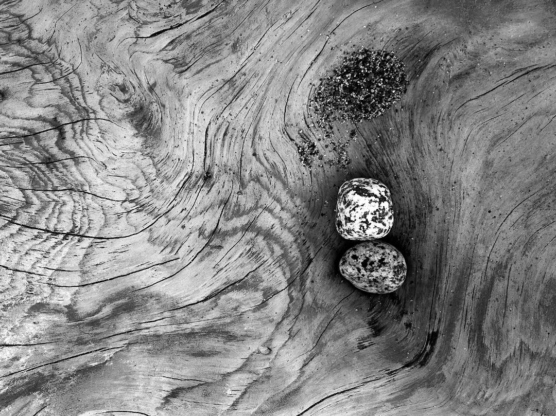
John, you are right it is not a dust spot but I did not know what to name it. Being a B&W image, I am assuming all adjustments are possible and you might want to remove this one. |
Jan 10th |
 |
| 31 |
Jan 22 |
Reply |
Peter....I'm sure that would work well, I need to try that method myself |
Jan 10th |
| 31 |
Jan 22 |
Reply |
Peter, thank you for the welcome and for evaluating and processing my image further. I had wrestled with increasing the shadow in the lower area but had not thought of working the lower clouds. I was pleasantly suprised at your changes and agree that I should continue to work it in the direction your suggest.
I have a challenge in that I am not using presets as I am learning B&W. I am going to look to create the same effect in the lower clouds using clarity, do you have any other suggestion on how I might achieve that effect? |
Jan 10th |
| 31 |
Jan 22 |
Comment |
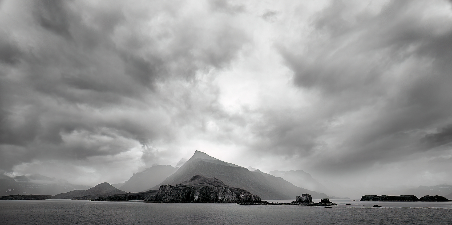
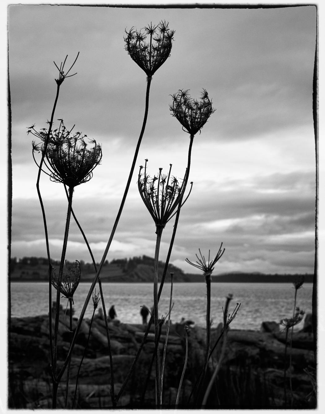
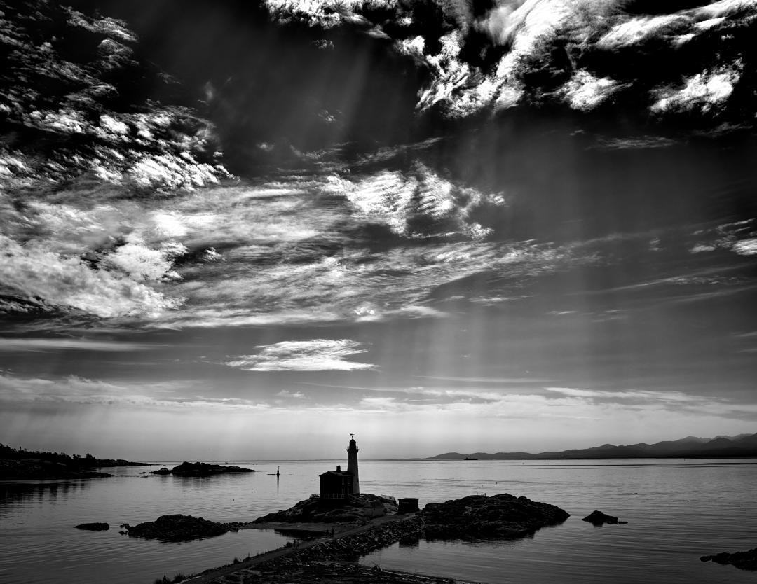
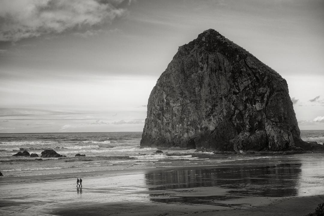
Hello Ian !
Lovely mellow composition and great capture. I have two suggestions for your consideration. Firstly, I would remove the vignette as I do not think it helps. Second, it maybe your intention but the light on the sand & rocks in the center of the foreground is bright enough that it draws my eye away from the prime subject. A subtle burn on the sand I think might make a difference. |
Jan 8th |
| 31 |
Jan 22 |
Comment |
Ella this is a great capture and well processed. I have no improvements on your technique but if you want some fun, I would dramatise the image by making it seem the mountain lion is moving out into the light.
I have taken the liberty with your image of placing an elliptical layer over him with a bias to the left side plus some further burning to the high spots in the bush behind him. I hope it makes for a fun project to create another version of your great shot. |
Jan 7th |
 |
| 31 |
Jan 22 |
Comment |
I envy you this capture ! The composition is great and that you are able to seem to be at eye level is awesome. The great contradiction of wildlife is they have coats designed to blend in with their environment but here I am going to suggest to you that you darken it to make them stand out. Can I suggest that you create a brush with settings of -0.2 to 0.4 exposure and a flow of 4 to rub the grass around the cheetahs. It is a slow way of applying a burn but it will appear more natural than deepening your excellently done vignette. |
Jan 7th |
| 31 |
Jan 22 |
Comment |
Ed, I confess the lighting in the image confused me until I read the description of your process. You have executed what you have set out to do very well. However, the effect of lighting it on both sides does to create contradictory information as the origin of the light and makes the picture appear unnatural. As an example, look at the shadows of the two vessels on the table telling the light is coming from the left. Then the right side of the kettle has high spots suggesting it's coming from the right. The strong vignette you have applied demands a defined light source. I would also consider darkening the background to create more contrast between it and the subject of the photo.
You might onsider applying light from one direction or alternatively, working away all the shadows as you did on the lily. |
Jan 7th |
| 31 |
Jan 22 |
Comment |
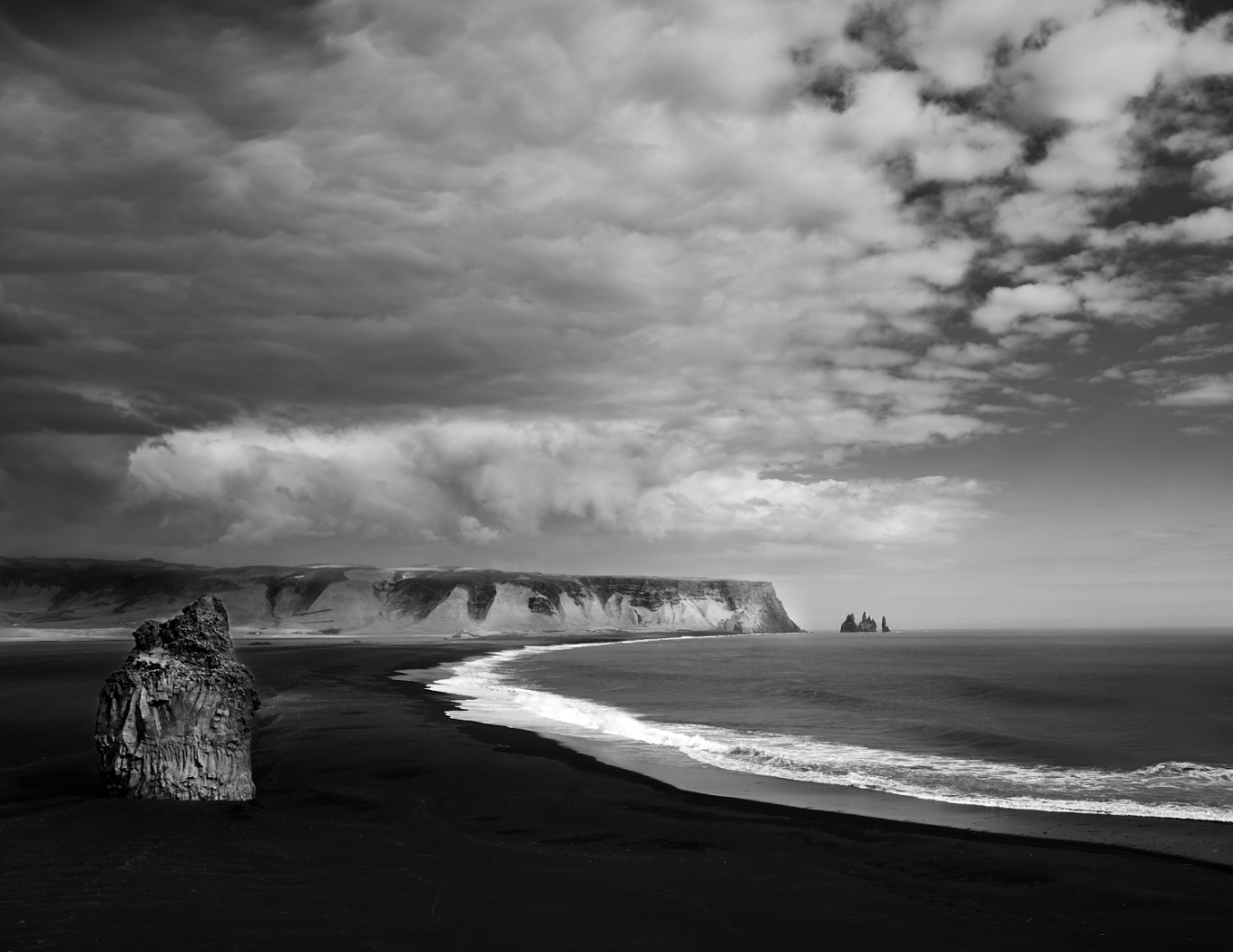
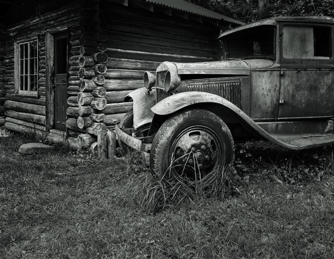
This is such an interesting image and well composed. The time of day will give you harsh light and intense contrast which is hard to control. I think you have applied all the trademark post processing techniques perfectly and I can neither criticise or recommend any further steps.
I do have a highly subjective opinion that it is suffering from too much contrast and would be better if the foreground was softened so that it is easier to draw the viewers eye into the image. |
Jan 7th |
| 31 |
Jan 22 |
Comment |
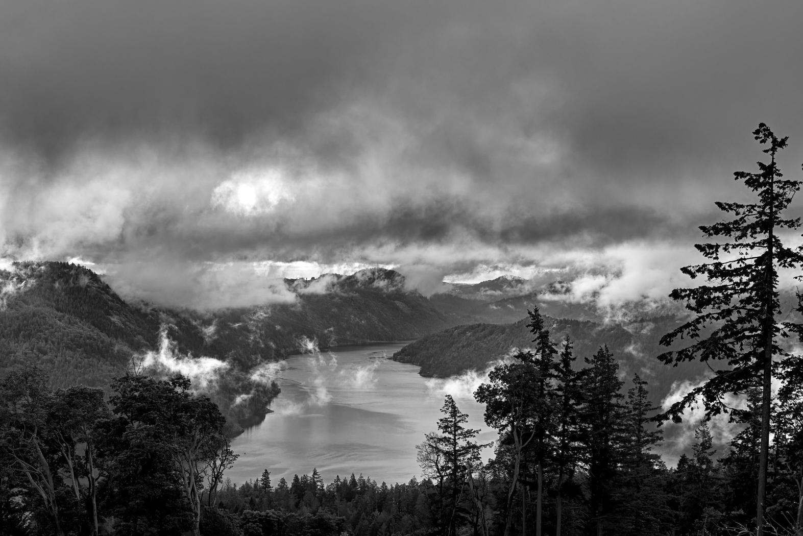
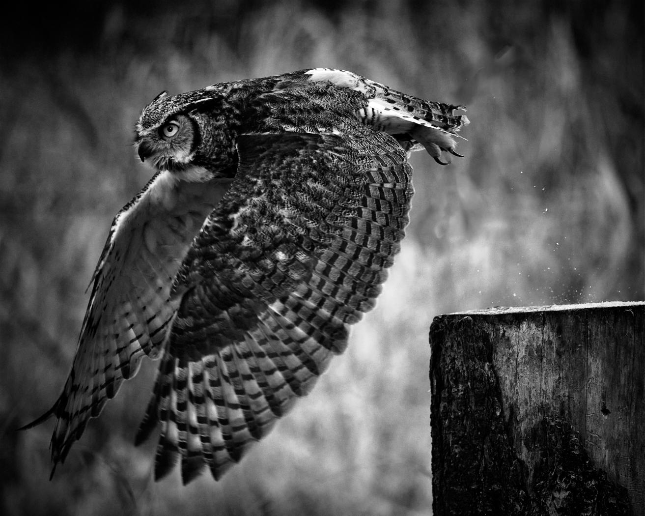
I think the technical execution is excellent except for the small amount of noise that can be easily adjusted for. I might suggest seeing if boosting the white further in HDR would not help dramatise the sky further increasing the impact of the trees against the sky. I'm not sure of this but 2/3 of the way up the left tree on the right side of the stem there might be a camera dust spot. Either way it tends to look unnatural. |
Jan 7th |
7 comments - 4 replies for Group 31
|
7 comments - 4 replies Total
|