|
| Group |
Round |
C/R |
Comment |
Date |
Image |
| 47 |
Sep 25 |
Comment |
Hi Robert and thanks for your comment. That's a good observation and I can't disagree that added depth could be a benefit. I'll have to see if I can figure out something that will do that. |
Sep 14th |
| 47 |
Sep 25 |
Comment |
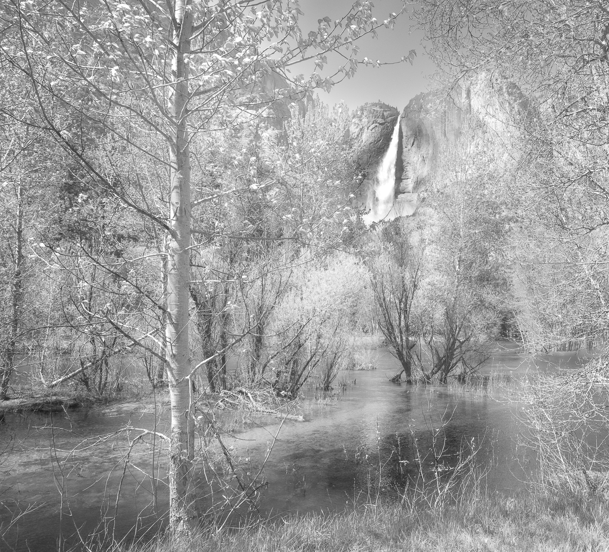
Hi Kirsti and thanks for the comments. I'll take another look at the tall tree's contrast. I've tried 3 times to upload a screenshot of the histogram but I can't get it to work. The resulting image is too tiny to even see. Or, if I include the photo alongside the histogram, the file is too large to load. Sorry! |
Sep 14th |
| 47 |
Sep 25 |
Reply |
Thanks Douglas! |
Sep 13th |
| 47 |
Sep 25 |
Comment |
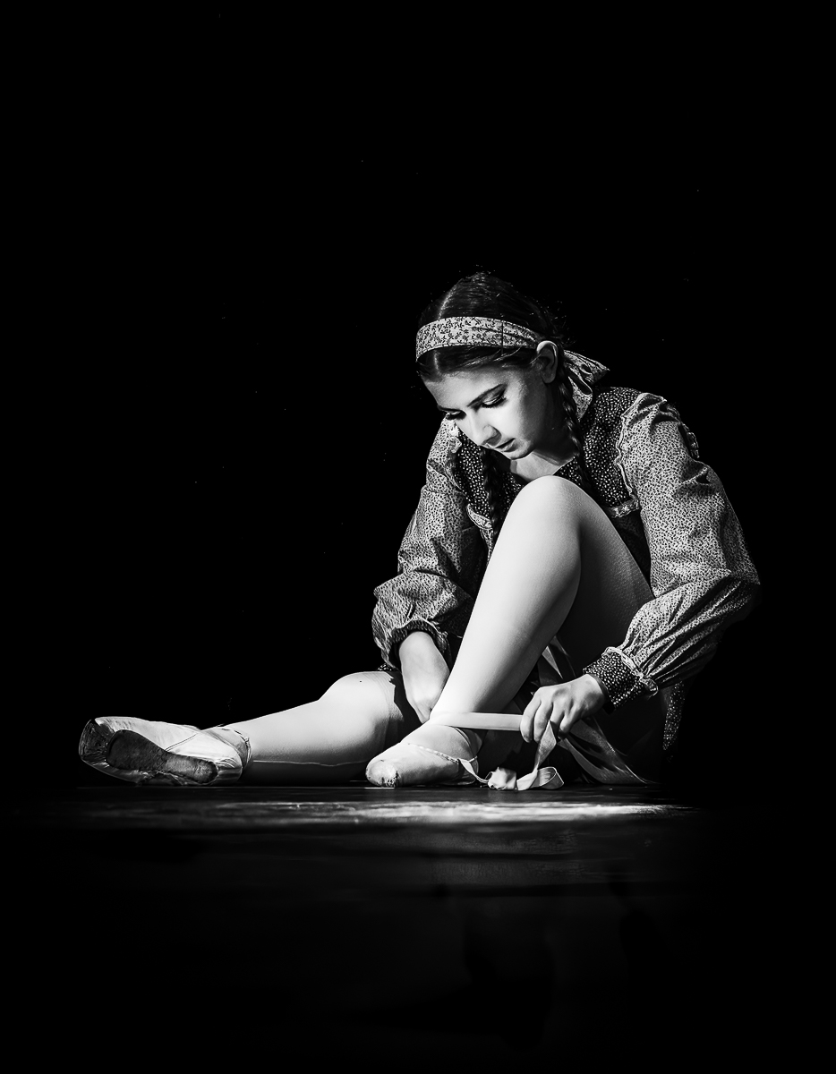
Hi Douglas - You've captured a great story-telling image! Your subject is very apparent in the shot and she is in an interesting pose, adding to the impact of the shot. The depth of field used helps to isolate the subject while providing a sense of place and depth. You might want to consider darkening the bright white area along the subject's torso and removing the protruding treetops behind her knee. Finally, you might try a vignette to see if that is a look you like for this shot. Regardless of these minor suggestions, great capture! |
Sep 12th |
| 47 |
Sep 25 |
Comment |
You've really captured a moody scene in this shot with the dark skies, clouds and silhouetted mountains. When I look at this shot, the moon distracts from the impact of this shot with its brightness and dark ring. You might consider cropping just below the moon so the viewers' attention stays with the moodiness of the dark mountains, wild clouds, and shimmering water. |
Sep 11th |
| 47 |
Sep 25 |
Comment |
Hi Ed - I believe I've never seen a shot of the Wailing Wall from this distance and it's very interesting. I like that you also included a view of the buildings in the far distance for a sense of place that, for me, works with a documentary shot like this. The blacks in the image seem a little heavy to me, especially the trees in the back. Raising those blacks a little may make them a little less prominent and keep viewers' eyes on the people and the Wall. |
Sep 10th |
| 47 |
Sep 25 |
Comment |
Hi Kirsti - What a fun experiment for an exposure! (I've never tried this so have no experiences to pass along.) I think your experiment was a success in terms of getting the same person to appear as two people. The passage of time element was pretty subtle for me when I was looking at the image. I would agree with your tutor's suggestion to remove the white cord. It seems to add complexity in an image that already requires some real inspection to figure out a story for the shot. I do think you've really got a solid idea to take further with all kinds of "double" (or more), long exposure images.? |
Sep 10th |
| 47 |
Sep 25 |
Comment |
Hi Robert - What an iconic shot you captured! The subject is sharp and had you not mentioned centering Atlas, I don't think I would have even noticed. I like how the darker buildings on the side keep viewers' eyes on the subject. When I look at the image, my eye keeps going down to the black area on statue's base at the bottom of the frame. (Kirsti's version addressed that particular thought). Also, you might want to try a small increase in the statue's exposure and see if that fits with your vision of this scene. |
Sep 10th |
| 47 |
Sep 25 |
Comment |
Hi Barbara - I can see the attraction of this scene with those massive, imposing clouds! You've got a nice tonal range in the shot and there is a lot of depth to the image. I read in your comments that you were questioning the crop. To my eye, the horizontal crop in the original feels more balanced. The portrait mode seems top heavy to me. Perhaps cropping down and even darkening the clouds a bit would get more balance while still conveying the presence and dominance of those beautiful clouds in this scene. |
Sep 10th |
8 comments - 1 reply for Group 47
|
8 comments - 1 reply Total
|