|
| Group |
Round |
C/R |
Comment |
Date |
Image |
| 47 |
Oct 24 |
Reply |
Thanks for the comments Trung! |
Oct 22nd |
| 47 |
Oct 24 |
Reply |
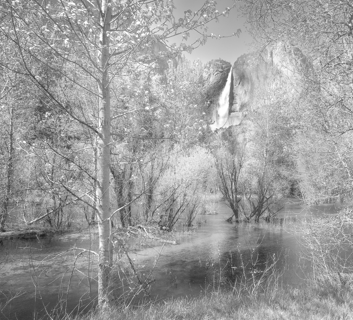
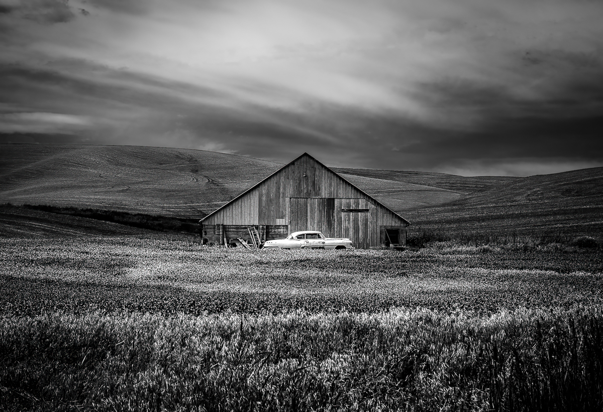
Hi Robert and thanks for the comments. I'm jealous that you get to see these sites frequently. I have to drive 9 hours... I'll try a version with the foreground grass darkened and mist brightened to see how that looks. |
Oct 22nd |
| 47 |
Oct 24 |
Reply |
Thank you Al! |
Oct 22nd |
| 47 |
Oct 24 |
Reply |
Hi Kirsti and thanks for the observations! |
Oct 22nd |
| 47 |
Oct 24 |
Comment |
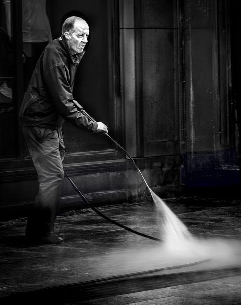
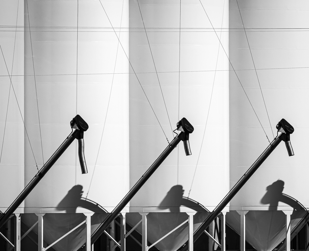
Hi Trung - You have another great shot this month. Your decision to go with a long exposure, really added impact to the image. My only (minor) suggestion would be to remove, or lower the exposure, on the small white pipe on the lower right of the building. Great capture! |
Oct 12th |
| 47 |
Oct 24 |
Comment |
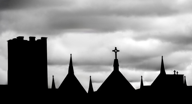
Hi Al - I like the black and white but the palace seems like it might benefit from a small increase in exposure. It seems just a little dark. Other than that, I don't have any suggestions. I like the way the trees frame the subject and I think the sky looks great. Nice image. |
Oct 12th |
| 47 |
Oct 24 |
Comment |
Hi Ed and thanks for the comments. I will try a version with the sky a little lighter and see how it looks! |
Oct 12th |
| 47 |
Oct 24 |
Comment |
Hi Ed - First, I think your choice to horizontally flip the image made a significant difference in the impact of the photo. The flipped version seems to give the viewer a better sense of the steepness of the stairs. I do think the conversion lacks contrast and looks a bit flat. Perhaps just increasing the exposure on the steps would add some dimension to the shot. |
Oct 12th |
| 47 |
Oct 24 |
Comment |
Hi Robert - I try to do my critiques without reading others but I messed up and read Ed's first. So with that as background, I would agree that the stones come across a little bright. Ed's conversion seems to have fixed both the brightness on the stones and the one cloud that looked a little blown out. I've always wanted to see Stonehenge in person and your photo is even more motivation to really make an effort to get there. |
Oct 12th |
| 47 |
Oct 24 |
Comment |
Hi Kirsti - I'll address my comments to the black and white image and I don't think it's too dark. I think the way you've processed the image really fits the scene and a viewer would be likely to feel the same hopelessness and despair you felt when you were there. I don't have any suggestions for changes. Great capture. |
Oct 12th |
6 comments - 4 replies for Group 47
|
6 comments - 4 replies Total
|