|
| Group |
Round |
C/R |
Comment |
Date |
Image |
| 47 |
Sep 24 |
Comment |
Hi Ed - Thanks for the comments! |
Sep 22nd |
| 47 |
Sep 24 |
Reply |
Thanks for the comments Trung! |
Sep 12th |
| 47 |
Sep 24 |
Reply |
Thanks Kirsti - You're correct. I originally had another image selected and when I sent it in I didn't attach the photo. I got the message from Al and I mistakenly sent in a different image than the one I had originally selected. I do like the idea of making the subject's face less bright. Thanks! |
Sep 11th |
| 47 |
Sep 24 |
Comment |
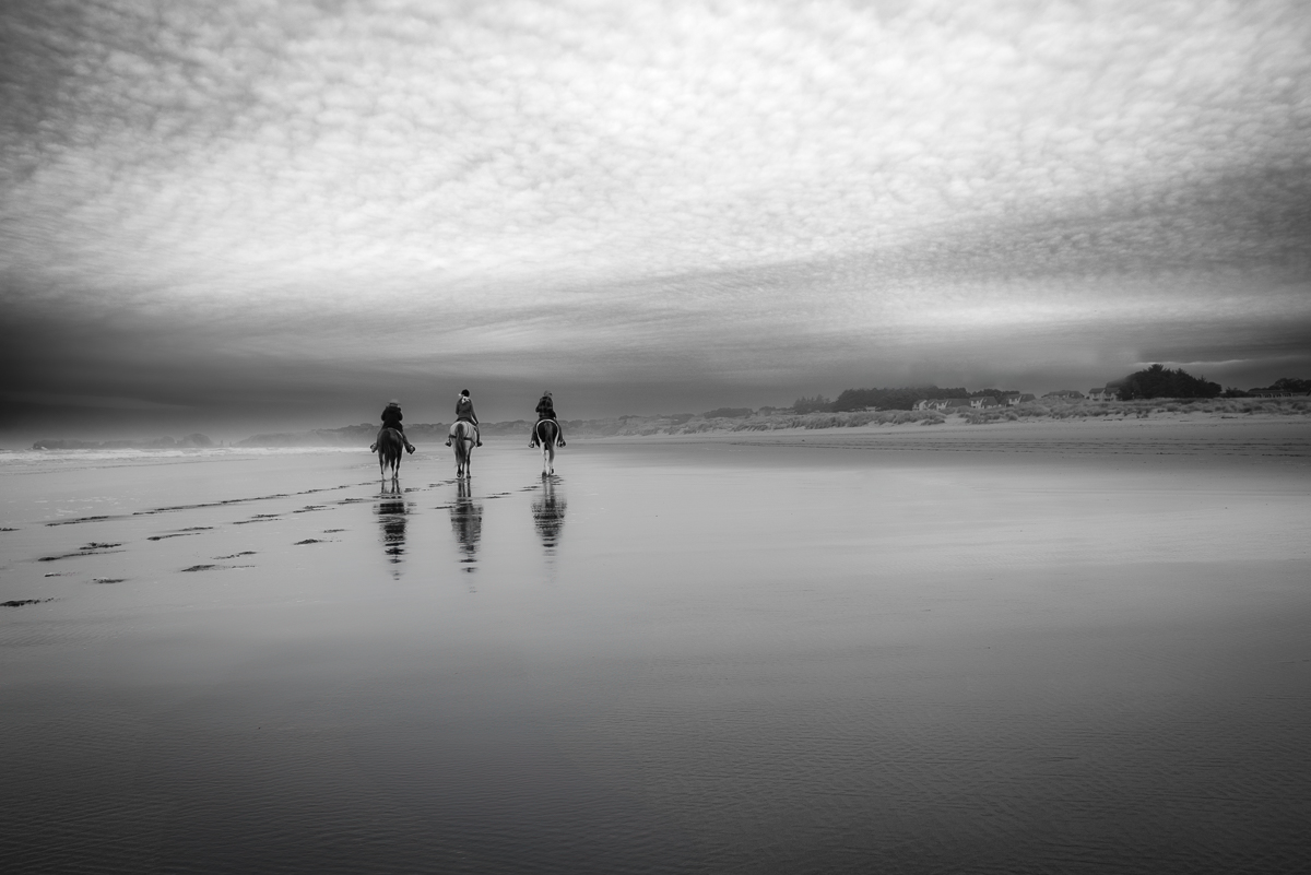
Hi Trung - I'm a big fan of rodeo shots and this image does not disappoint! One suggestion to try would be to darken the sky. I don't have the skills to do that with the sky between the tree branches, but in a crude test of your downloaded image, I thought it really made the rider pop off the screen. Just a thought of something to try. Great image! |
Sep 10th |
| 47 |
Sep 24 |
Comment |
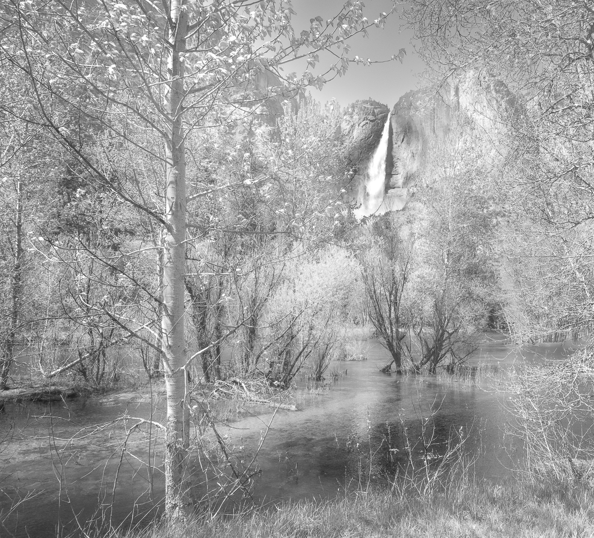
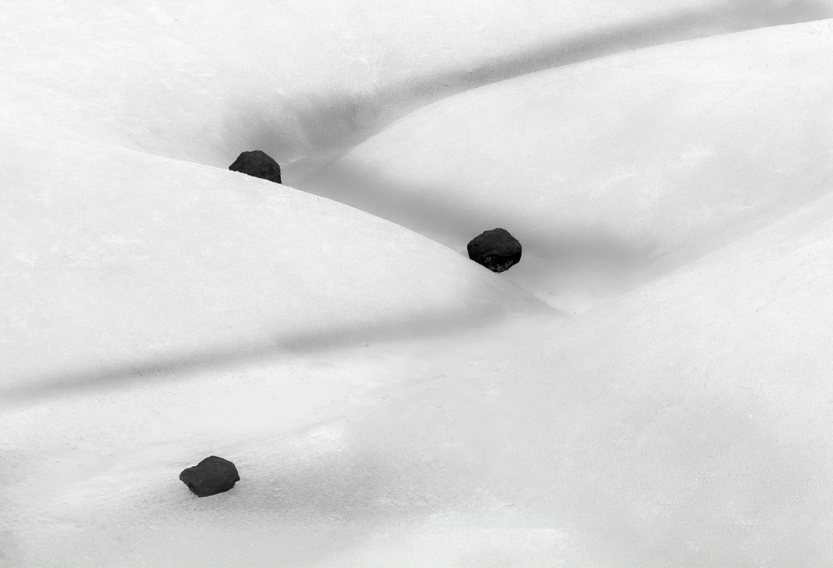
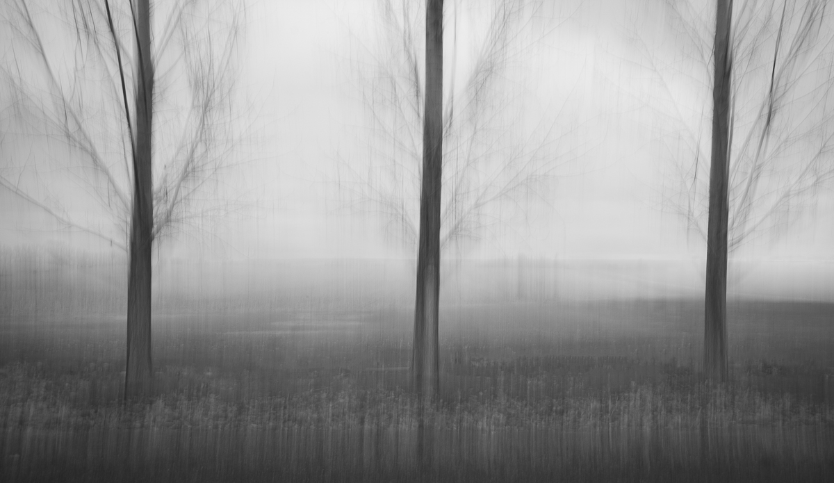
Hello Al - I really like the contrast of the dark trees and sky with the white minerals. If I were to make a suggestion, it would be to consider a crop to exclude the buildings on the right side of the image. I'd also consider trying to pull a little more contrast out of the foreground. |
Sep 10th |
| 47 |
Sep 24 |
Comment |
Hi Kirsty - I think you've done a really nice job in the black and white conversion on this shot. I also like the ethereal feel to the reflection. One observation is that I find my eye goes directly to the reflection first, I suppose because it's the brightest part of the image. I tried a version darkening the reflection but didn't like it. What if you brightened the dress itself a little? Another thought might be to flip the image horizontally, so the viewer's eyes see the main subject first as they look left to right, followed by the reflection. Perhaps that would raise the presence of the dress in terms of how it compares to the reflection. Regardless, well seen and good capture! |
Sep 10th |
| 47 |
Sep 24 |
Comment |
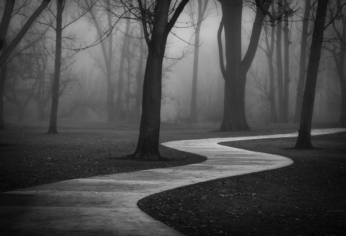
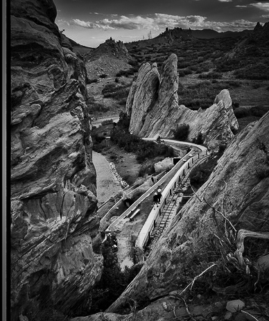
Hi Ed - I like the way the image is composed but if the walkers are the subject, I think they might be made more prominent along the lines of what Kirsti suggested. Even though I like the framing of the composition, I would crop to try and bring out the walkers even more. I applied a radial gradient around the walkers and the white path and brought up the exposure about 0.25 of a stop and then copied and inverted that selection to get everything else and reduced the exposure about 0.25 of a stop. I did crop somewhat aggressively to try and increase the presence of the walkers. Of course, this crop may not convey the tranquility aspect your image represented so just a suggestion of another way to process this shot. |
Sep 10th |
 |
5 comments - 2 replies for Group 47
|
5 comments - 2 replies Total
|