|
| Group |
Round |
C/R |
Comment |
Date |
Image |
| 85 |
Nov 25 |
Comment |
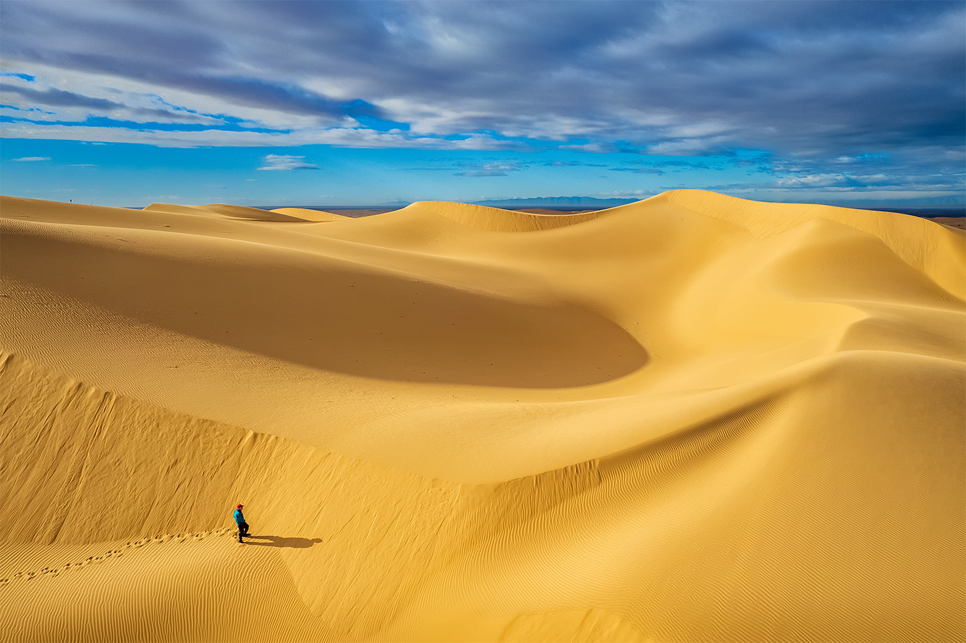
Hi Mike, while echoing some of the previos comments I'm gpoing to add one. This image is cropped pretty square and I am assumoing the original had more room on the left and right. This version seems a little tight to me. Especially the road in the upper left.
And, yes, for sure, use CAF to get rid of the trucks |
Nov 10th |
| 85 |
Nov 25 |
Comment |
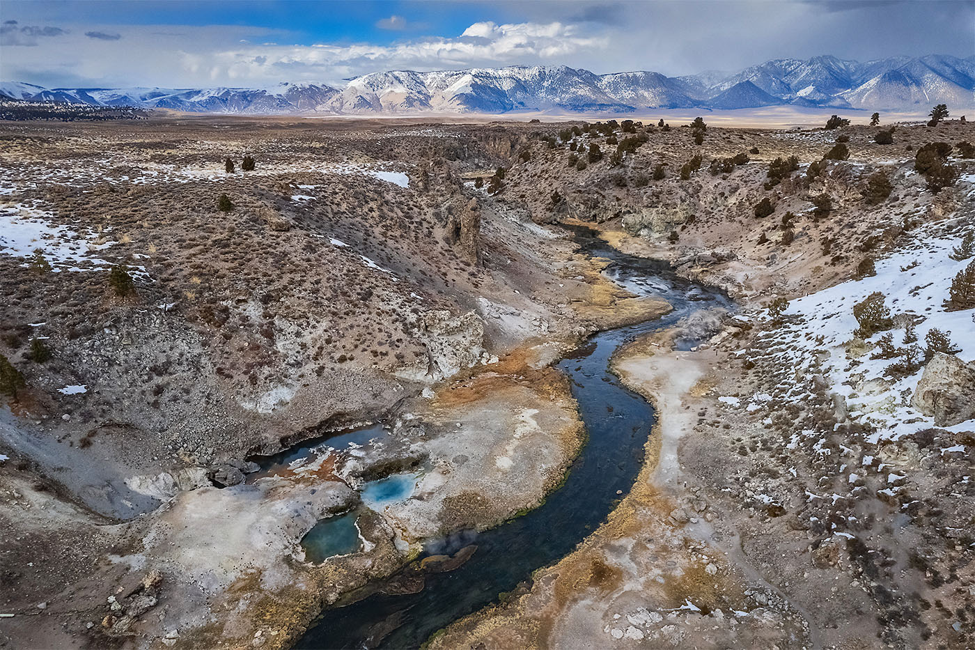
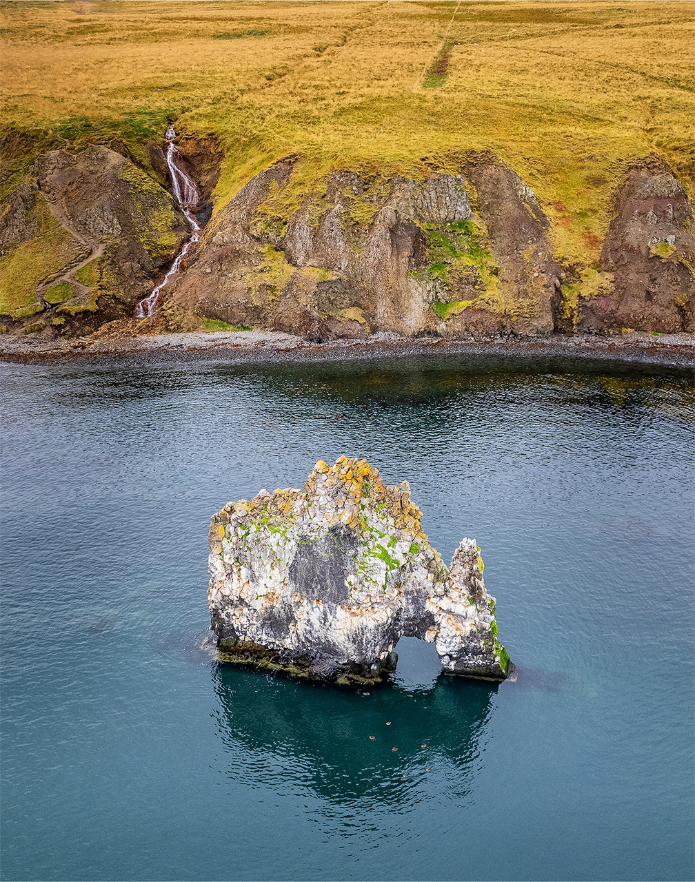
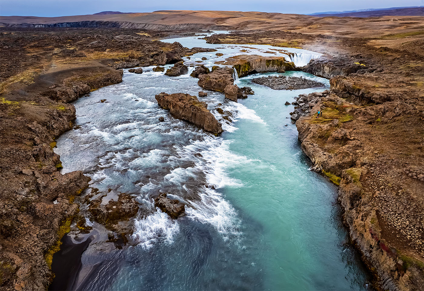
Sorry about your drone :-(
Nice scene. The colors, especially the blues, seem too saturated, on my monitor at least. Your horizon is tilted down to the right. Compositionally this is a nice, pleasing image of a place, but a clear center of interest would have improved the image. The water patterns in the lower middle seem lovely and interesting, and perhaps more of closeup of these could have been an alternative. |
Nov 6th |
| 85 |
Nov 25 |
Reply |
correction more dramatic light |
Nov 6th |
| 85 |
Nov 25 |
Comment |
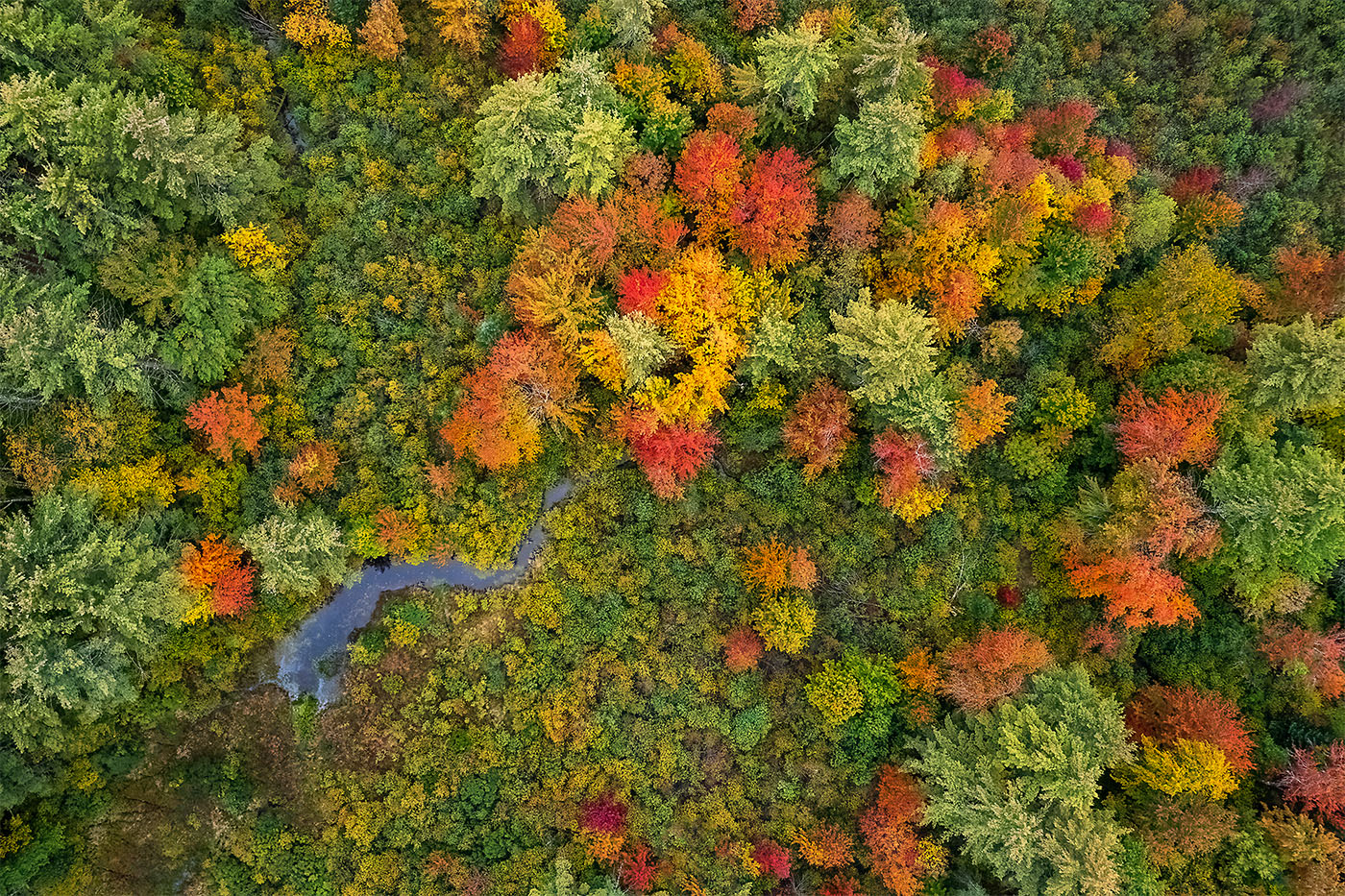
Lovely fall color and it is great to see images "hot off of the press".
The lower left seems too bright and saturated while the upper part seems too dark and lacking "punch". But mostly the composition seems to struggle for a clear point of view. There are great patches of color around the perimeter but the middle is just the water without too much interest. I almost thnink it would have been better without the clouds, so a deep blue, which would have added another color.
If you have the time in the next day or two, I'd consider a fall color abstract...just find an interesting patch, with perhaps a lone highlight, and aim straight down.
Yes the RC controller is a HUGE improvement |
Nov 6th |
| 85 |
Nov 25 |
Comment |
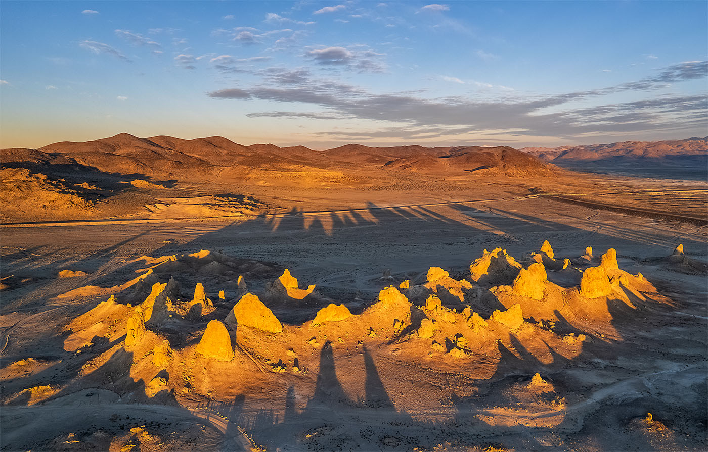
A few comments:
I would try a composition with the tractor not in the center of the image.
I don't think the right side of the image is helping much as the "story" is about the tractor and the harvesting.
The tone of the sky you selected does not fit with the tone of the ground. I would have used something closer in time of day to when you took the photograph, so it would still be blue, but with some interesting clouds. |
Nov 5th |
| 85 |
Nov 25 |
Comment |
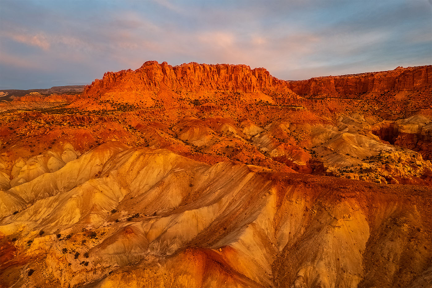
Good control over your exposure, especially the highlights! And i like how you cropped.
The ground part of the image could have used more "punch", and I would try at minimum imncreasing the contrast. And Nik-Color Effects Pro-Foliage filter would have helped the greens in the trees.
I am wondering how it would have looked if you had been higher, looking down more?
|
Nov 5th |
| 85 |
Nov 25 |
Comment |
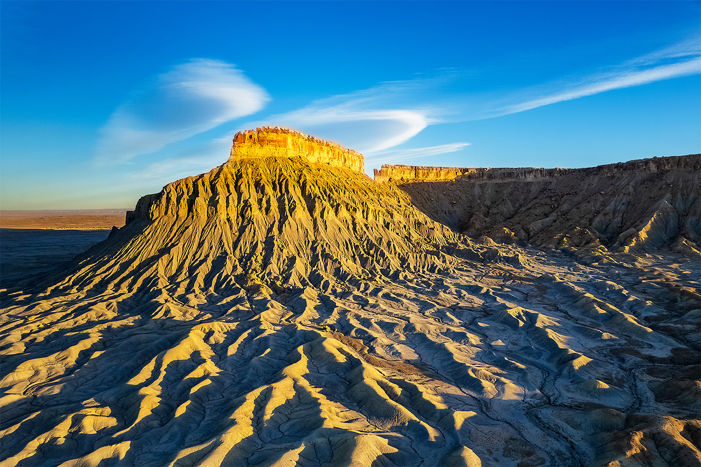
I don't think your post was overdone, but on my monitor the image looks too bright.
I like how you composed a lot, and yes, same image in more dramatic would be great |
Nov 5th |
| 85 |
Nov 25 |
Comment |
I can't stop myself when I see bridge images....did you fly under it? :-)
Very nicely composed (especially with the reflection), and exposed. And good light.
The only comment/question I have is the bridge is tilted up on the left. Is this reality or should you straighten? |
Nov 5th |
7 comments - 1 reply for Group 85
|
7 comments - 1 reply Total
|