|
| Group |
Round |
C/R |
Comment |
Date |
Image |
| 85 |
Dec 24 |
Reply |
I REALLY want to go there in the winter. Maybe 2024-25 |
Dec 24th |
| 85 |
Dec 24 |
Comment |
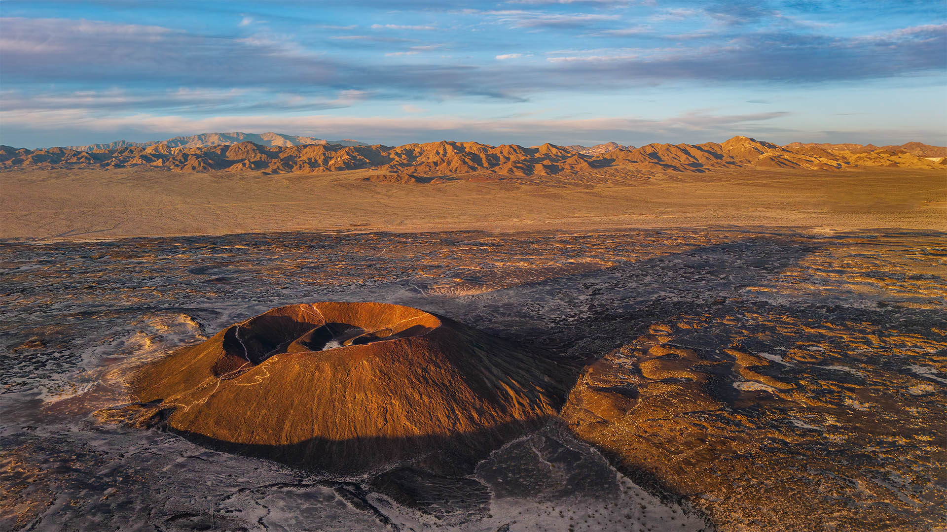
Yes, I agree with Lou and Richard -- nice photojournalism about the fire.
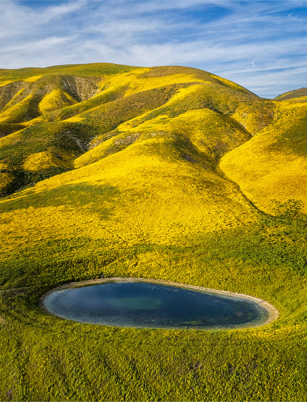
The image looks tilted down to the left, even if it wasn't shot that way. And yes, for my eye, too saturated and sharpened. Because there happened to be no clouds on the right, the sky looks unbalanced but the blue pond offsets that. |
Dec 12th |
| 85 |
Dec 24 |
Comment |
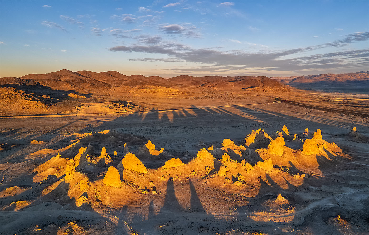
A very good idea! And an effective image. I might have tried a little more height to give the edges more room. But bravo for the concept. I wish I thought of it when I was there for the Festival |
Dec 12th |
| 85 |
Dec 24 |
Comment |
A nice one!
A couple of thoughts. Shooting a little more to the left or a different time of day and there would have been more side light/shadow on the smoke stacks which in turn would have given them more dimensionality (if that is a word). See how that is working on the cooling towers?
I'm not sure that all the blue on the right side is helping and it could have been cropped in. And the top seems a little tight. If you had ther ealestate a v ertical image might have worked better emphasizing the height of the stacks and cooling towers more. |
Dec 12th |
| 85 |
Dec 24 |
Comment |
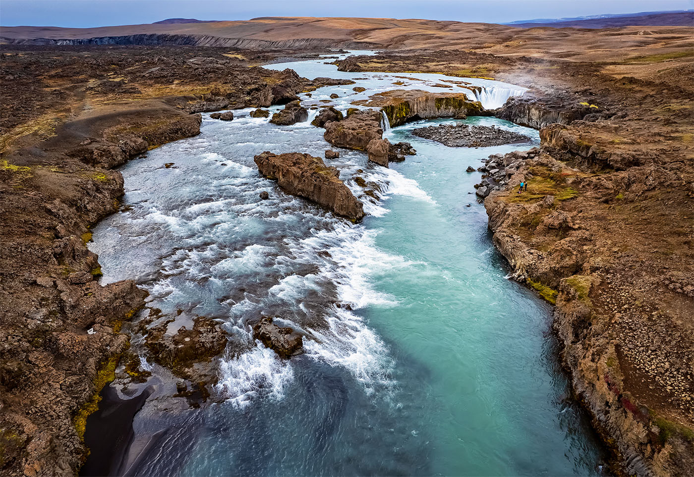
For images like this my first question is always "did you fly under the bridge"? :-)
Nicely put together and the sky replacement is convincing. As Richard said there are a few spots that might have used some burning (also the gravel in the foreground) but overall looks good
|
Dec 12th |
| 85 |
Dec 24 |
Comment |
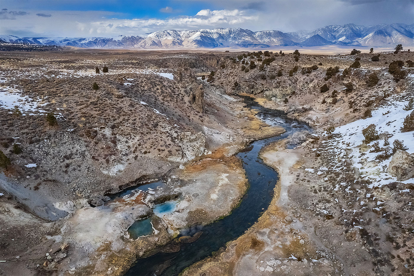
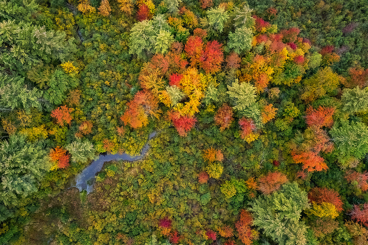
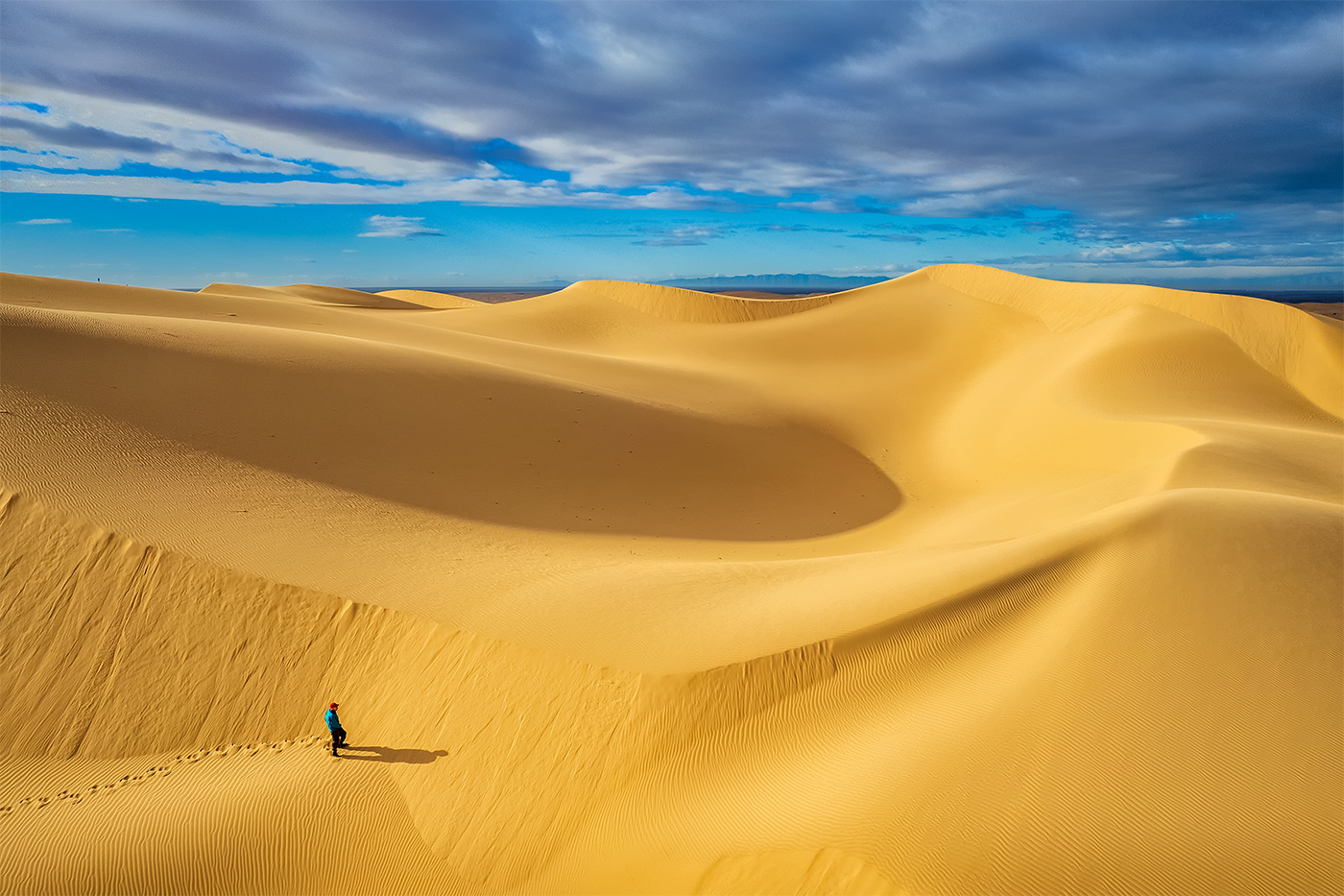
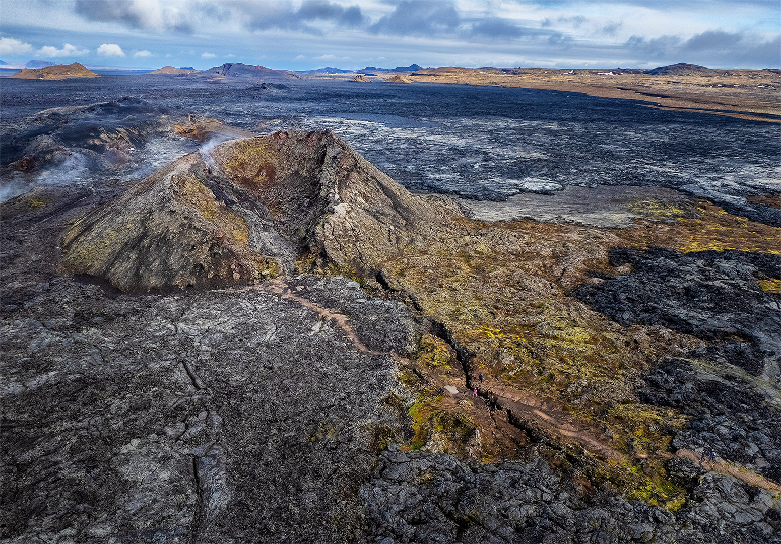
In post the foreground could have been brightened, as well as the shadows in general. The image seems very soft but that is probably because the resolution is so low. If you had more sky at the top I would have used it, the highest cactus is pretty tight. |
Dec 12th |
| 85 |
Dec 24 |
Comment |
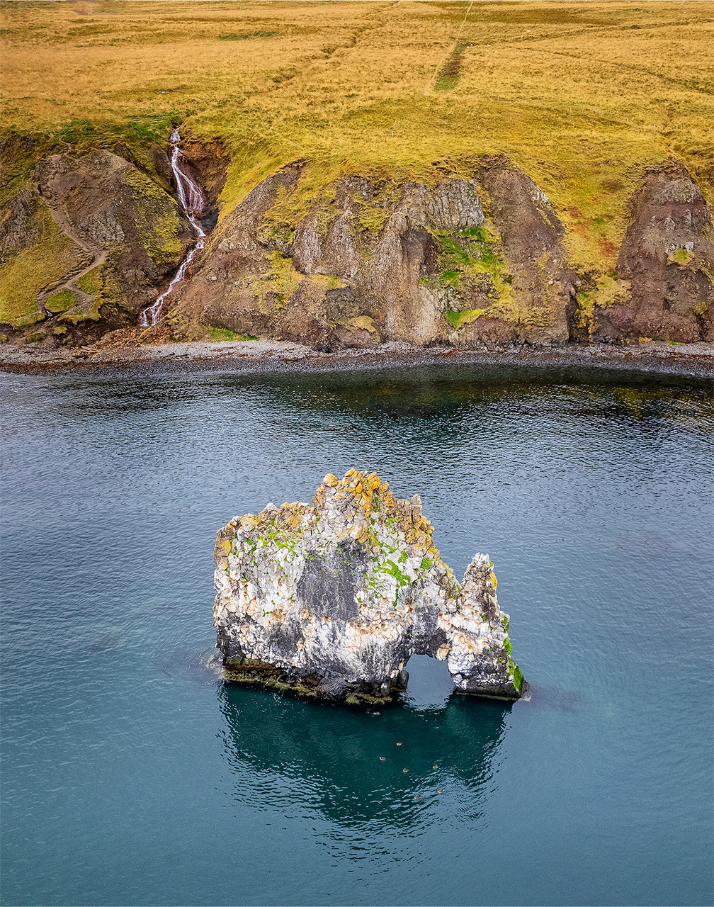
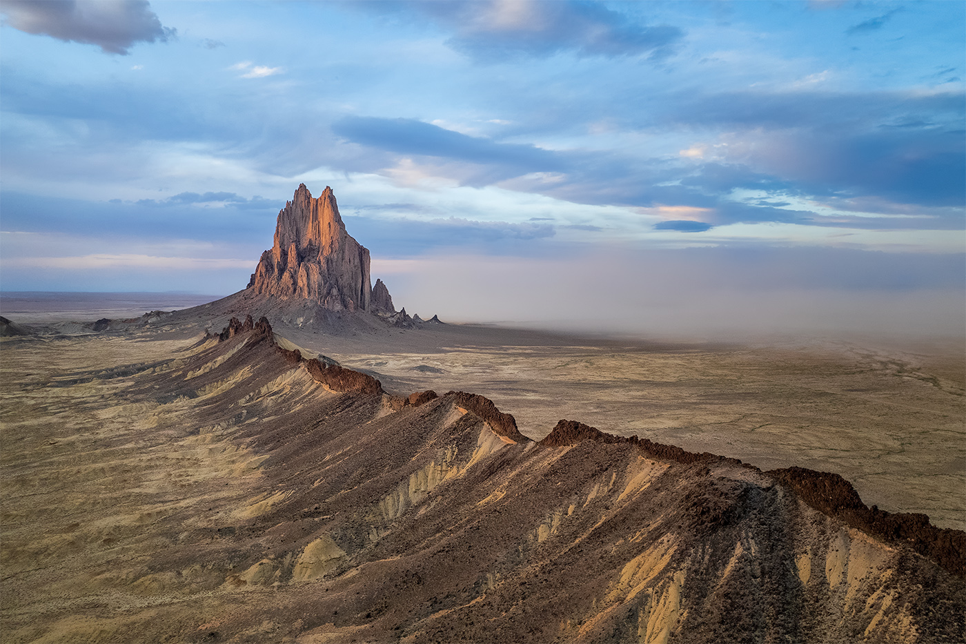
Both the capture and post are great. Yes, the sign is a pain. Maybe you could have masked off the letters and lowered their brightness? To my eye the top of the tower is too close to the top frame, but that aside a lovely image. |
Dec 12th |
6 comments - 1 reply for Group 85
|
6 comments - 1 reply Total
|