|
| Group |
Round |
C/R |
Comment |
Date |
Image |
| 41 |
Apr 26 |
Comment |
Thanks for your feedback Joan, I appreciate your interpretation of this image. If you could explain on how the old, dilapidated pick-up truck is incompatible with the tree would help in understanding what is needed for change. Not sure what happens in the US but in Australia we have old and new cars burnt and "dumped" in forests, especially those that have been stolen and parts taken out. They normally are against massive gum trees just like the one in this image. In any case, my style is altered reality, it doesn't have to be compatible with anything. |
Apr 17th |
| 41 |
Apr 26 |
Comment |
Joan a good interpretation of negative and positive of one image. For me, the positive doesn't align with the negative side. You might consider making the right eye a little bit lighter, so that the viewer can see the eye, removing the bright spot under the nose on the right side and the lips don't align, a negative one on the positive side. |
Apr 17th |
| 41 |
Apr 26 |
Comment |
Quite an interesting image Ian. What I particularly like is the contrast of the orange background against the artwork, it does makes it stand out. |
Apr 17th |
| 41 |
Apr 26 |
Comment |
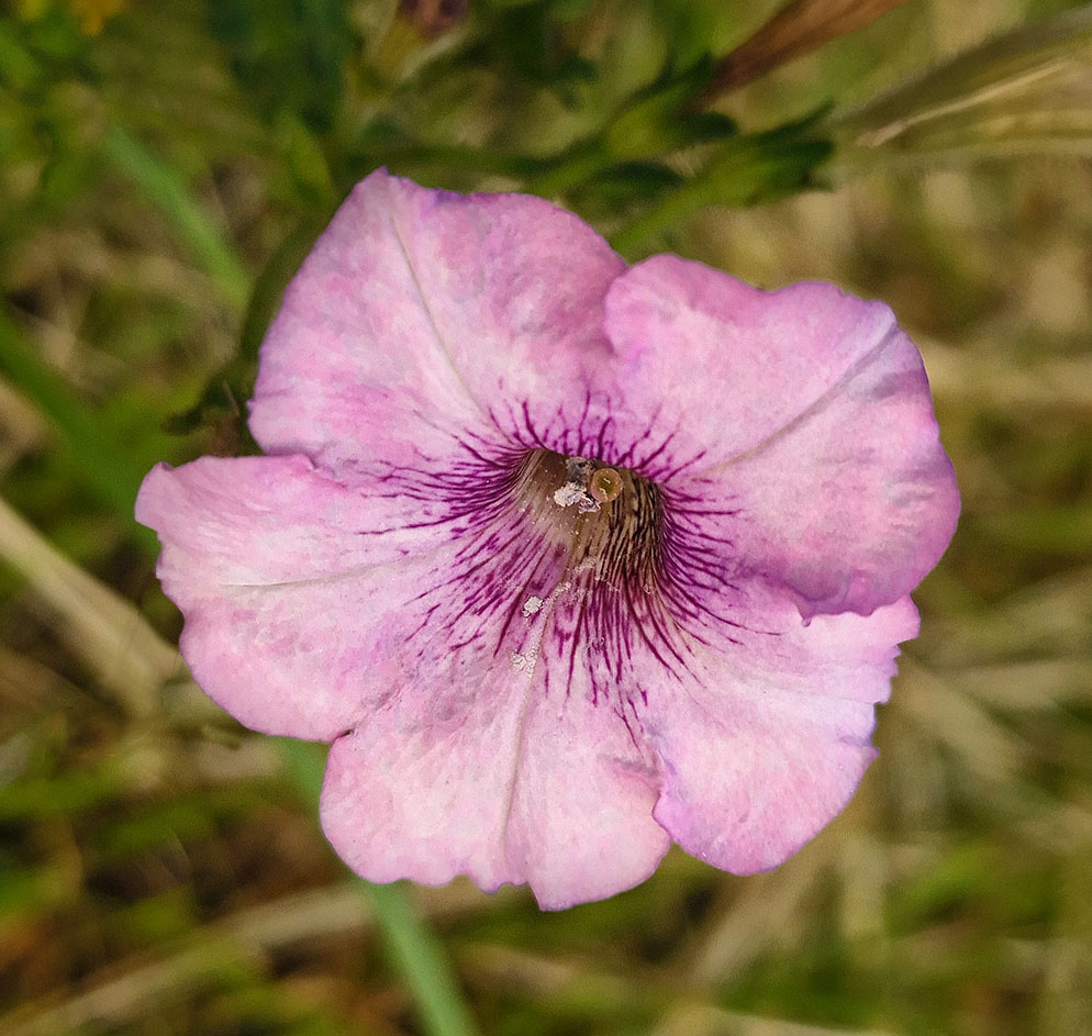
I quite like this image Hazel, the static flower with the one in movement makes an interesting combination. Well done. |
Apr 15th |
| 41 |
Apr 26 |
Comment |
It almost looks like a celestial body feel to the scene. Well done Brad. |
Apr 15th |
| 41 |
Apr 26 |
Reply |
Thanks for your comments Hazel, the eagle being the custodian of the abandoned car is well put. |
Apr 15th |
| 41 |
Apr 26 |
Reply |
Thanks for your feedback Ian, your comments describes the scene very well. |
Apr 15th |
| 41 |
Apr 26 |
Reply |
Thanks for your comments Deborah and welcome to the group. |
Apr 15th |
| 41 |
Apr 26 |
Reply |
Thanks for your feedback Robin, I can see what you're saying and I did initially didn't have the eagle there but it just looked empty and I believe that the eagle add some interest. |
Apr 15th |
| 41 |
Apr 26 |
Reply |
Thanks for your feedback Brad, much appreciated. I initially had this eagle a tad smaller and it looked out of proportion to the tree branch it's sitting on. The Australian Wedgetail Eagle is one of the largest birds of prey in the world. It has a wide windspan of up to 9feet or so for females. |
Apr 5th |
5 comments - 5 replies for Group 41
|
| 80 |
Apr 26 |
Comment |
Kamal, the original flower is delicate with a very subtle pale colour. Personally, I don't believe that it needs a lot of work to bring out its beauty. You might consider to first use the spot healing brush to remove the "bruise" on the top petal. This brush is very easy to use. You might lighten the flower a bit but not the background. You can do this by using the curve adjustment layer, inverse the layer mask and using the brush tool with the background colour on white. Use a light vignette to darken the background a little and do a tighter crop. This is an example of what I've done. |
Apr 18th |
 |
| 80 |
Apr 26 |
Comment |
Doug, I always enjoy your the way you make those dying leaves look so beautiful. How you bring out the colour, texture, lines and shape is just the language of nature. Just lovely. |
Apr 18th |
| 80 |
Apr 26 |
Reply |
Thanks for your feedback Rich, much appreciated. You have keen eyes, I can't recall how many times I've looked at this iris and never seen the little bug but once seen you just can't unsee it. I will be eliminated thank you. We've had an awful Spring, very windy and rainy. |
Apr 17th |
| 80 |
Apr 26 |
Reply |
Thanks for your comments Bob, much appreciated. Mine are just dying down and ready for winter. |
Apr 17th |
| 80 |
Apr 26 |
Comment |
What makes this composition nice, is the what appears to be light through the petals. The background is very nice and the red around the tulips gives it more interest. For me, the background is too smooth and looks unnatural and you might consider adding some noise to give it some texture; about 3-4px of noise is what I use. |
Apr 17th |
| 80 |
Apr 26 |
Comment |
Bob, I like what you have achieved with this daylily. As a matter of fact I like the blurred one at the back, for me that creates interest. Just personal recommendations, I would lighten the front flower a little but only to bring out the center part which is the focal point so that the stamen stand out more; they're almost the same colour as the petals. I like the colour of the background but for me it's too smooth and looks unnatural. An easy way would be to replicate how it comes out of the camera and that is to add some noise. I would go to filter, noise and add noise and add about 3.5 px or so and that would add some texture to the background.
This is a lovely flower. I bought my first day lily this season and according to the growing instructions it would take 2 or so years to give me some flowers. |
Apr 17th |
| 80 |
Apr 26 |
Reply |
Hi Marti, thanks for your feedback. I did do a tighter crop but it looked like it was "confined" in a narrower space. So, went back to the original crop. Personally, I think because the flower has "flowing" petals more space was needed. |
Apr 5th |
4 comments - 3 replies for Group 80
|
9 comments - 8 replies Total
|


