|
| Group |
Round |
C/R |
Comment |
Date |
Image |
| 41 |
Feb 26 |
Comment |
Thank you Hazel, I didn't think of covid lockdowns and that would be very appropriate for this image as well. Terrible time and felt sorry for people who live in units. |
Feb 22nd |
| 41 |
Feb 26 |
Comment |
Joan, love the concept, one of my favourite saying "if pigs could fly." I do agree with Brad that there is a small amount of blue left over from where you extracted the right pig especially between the pig's legs and its snout. Also the wings are not fully attached to the body. This can easily be fixed in PS. You might consider placing either a texture or gradient to blend the image more. I like it a lot, well done. |
Feb 17th |
| 41 |
Feb 26 |
Comment |
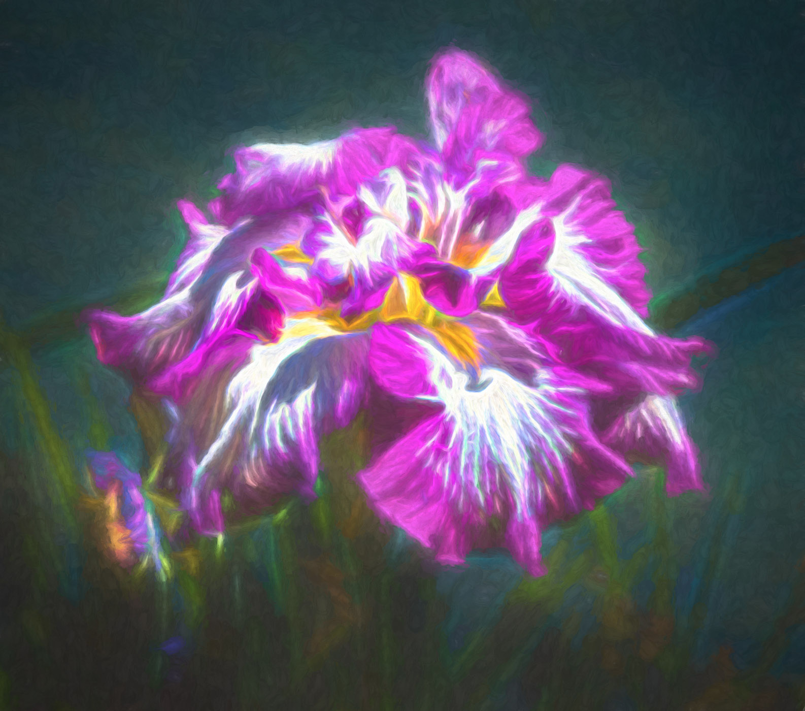
Ian, I do agree with Angela, this is a lovely abstract image with the center part in focus. However, the bright red is very dominant and detracts from the focal point. Also you can't see the swirls at the bottom which I believe are part of the visual elements that make up the total image. Is it your intention to minimize or eliminate the bottom part? I would consider desaturating the red to bring out the bottom swirls or alternative turn this image into a monochrome. Both work for me but I believe that the image is more suited to mono. I've took the liberty of converting to a mono with the bottom swirls in focus. Lovely concept |
Feb 17th |
 |
| 41 |
Feb 26 |
Comment |
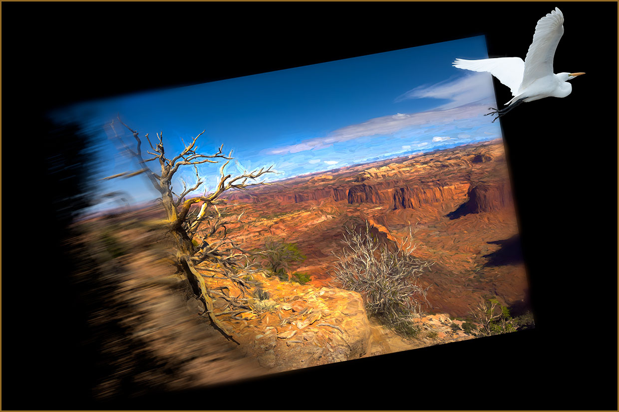
Hi Brad, a very interesting concept and well executed. The black background created a space where I couldn't find the ending of the frame. If this was your intention then to some extent it did create visual tension with the bird flying out of the landscape and into the "unknown". If your intention was to create a visual postcard, then you might consider placing a border around the image to allow the viewer to see the image in its whole concept. You might consider bring the bird in a little from its current position so that it's not so close the border of the frame. I haven't moved the bird, but I did place a border around the image. |
Feb 17th |
 |
| 41 |
Feb 26 |
Reply |
Thank you Angela. |
Feb 15th |
| 41 |
Feb 26 |
Reply |
Hi Ian, thanks for your kind comments, especially about the Queensland competition. Did you enter, if so, I hope that you did well? |
Feb 15th |
| 41 |
Feb 26 |
Reply |
Thanks for your feedback Brad, much appreciated. |
Feb 15th |
4 comments - 3 replies for Group 41
|
| 80 |
Feb 26 |
Reply |
Hi Marti, I'm glad you've asked. The reason I would need to start from the beginning is because of all the blending that I did in the background. For example, I cut the flower out. Then I painted the background with a stamp visible brush, blurred it and then added some textures to achieve the background colour. Then I blended both the flower and the textures. I used Topaz filters to help with that process and each process it added a subtle toning to achieve the final colour. If I added the stem straight out of camera on the final image, it would really look odd and wouldn't match the current toning. Hope I made some sense. Thanks for asking, really appreciate it.
By the way, the flower is spent and the stem is now visible. I might add the stem at a later stage and resubmit it in the group. |
Feb 26th |
| 80 |
Feb 26 |
Reply |
Thanks Ingrid, appreciate your feedback. I gave up after three years of nurturing the plant and it just appears this season. When I saw it, I thanked mother nature. I loved the plant when I saw it at a friends house. |
Feb 22nd |
| 80 |
Feb 26 |
Comment |
Rich, I don't know what to say about your gorgeous rose except that I just love what you've done with it, especially how you've made the center part the focus, the eyes are automatically drawn to it and surrounded with a lovely blur. Very creative, well done. |
Feb 15th |
| 80 |
Feb 26 |
Comment |
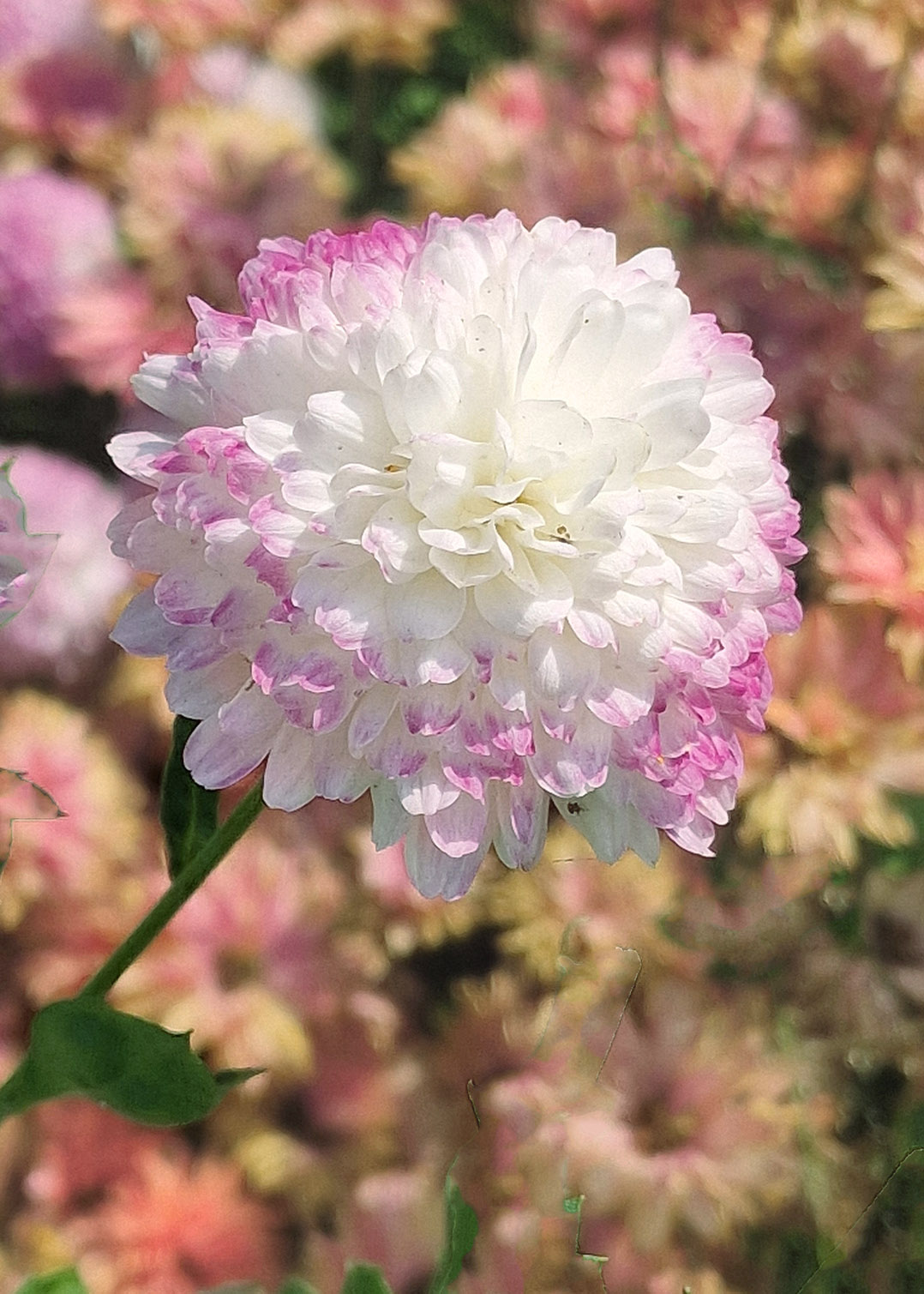
Hi Kamal, I'm always amazed on how good a phone camera is these days and your flower is a great example of its capabilities. The flower is well composed, sharp with nice blurred background. In my view, the background colours are very strong and does compete with the dahlia. You can easily fix this in CS6. Use curves to adjust the white balance and that will dull the orange colours in the background and then use the Black and White Adjustment layer, use the Luminosity blend mode and play with the colour sliders especially red and yellow to dull the background more. Here is an example of what I mean. Great work Kamal. |
Feb 15th |
 |
| 80 |
Feb 26 |
Comment |
Hi Ingrid, I love the flow of the reeds/grasses, in unison all bending with the weight of the snow in the same direction. As the others have said, the monochrome treatment suits it well. You might consider to add contrast to "punch-up" the black in the background so that the snow on the grasses can stand out more. I like Kamal's interpretation, it's in line with my thinking. Lovely capture |
Feb 15th |
| 80 |
Feb 26 |
Reply |
Thank you Kamal for your kind comments and feedback. |
Feb 15th |
| 80 |
Feb 26 |
Comment |
Doug, cactus flowers always amaze me and this one is a lovely example. Not seen a "star" flower. In my opinion, I would rather see the background blurred a bit more and you might consider field blur in the blur gallery. This keeps the flower in its surrounding and also makes it stand out more. I would also consider cropping it into a square, the bottom part doesn't add anymore to the flower. Nice work. |
Feb 14th |
| 80 |
Feb 26 |
Comment |
Hi Marti, like the other's comments, a very nice and creative way of showcasing the water lily. In my opinion, the reflection is dominant detracting from the flower. If that was your intention, then it's achieved its objective. If not, then you might consider muting it so that it complements the flower. The colours of the reflection are great, just too strong. Really nice work. |
Feb 14th |
| 80 |
Feb 26 |
Comment |
Hi Bob, your approach to softening the flower is, in my view, spot on as it makes the flower more appealing to look at. I've noticed that you used Studio 2. To make it more "arty" you might consider taking it back to Topaz Studio 2 and under the category "Dreamy" use either Dreamcloud or Dreamstrokes which will soften the background a bit more. You might consider it for another flower. I often use one of these on my work. I used "Dreamcloud" on the Tiger lily and in Photoshop masked some of it out in the center of the flower to bring out details.
I've taken the liberty of adding Dreamstrokes to your lovely flower to show what I mean, it has lightened the backgound and made the flower stand out more. It's just a suggestion. |
Feb 13th |
 |
| 80 |
Feb 26 |
Reply |
Thank you so much for comments and support Bob, it's very much appreciated. I just wanted to show case this beautiful flower. |
Feb 13th |
| 80 |
Feb 26 |
Reply |
Thanks for your feedback Rich. I would have loved to put a stem on the tiger lily but as I mentioned, it was so hard to photograph. I had it in a pot which was underneath some roses and against a fence. No matter what I did, I could not get the stem so went with what I have. I agree with everybody on this page about the flower floating and that it needs anchoring. It took almost five years to grow this flower and was so excited when I saw it. I wanted to showcase its beauty. |
Feb 13th |
| 80 |
Feb 26 |
Reply |
I can photograph a stem but it would need for me to scrap what I've done and start again. The only part I could keep is the textures. |
Feb 10th |
| 80 |
Feb 26 |
Reply |
I can do that Marti, but it would require me to undo and start from the beginning. |
Feb 10th |
| 80 |
Feb 26 |
Reply |
You're right Marti, I was almost not going to submit the flower because I couldn't photograph the stem so as to anchor it. Only two flowers bloomed and both were in a difficult photographic position and no matter what I did, I couldn't get the stem. In hindsight, I should have cut the flower and photograph it indoors. Anyway, a floating tiger lily lol. |
Feb 7th |
6 comments - 8 replies for Group 80
|
10 comments - 11 replies Total
|


