|
| Group |
Round |
C/R |
Comment |
Date |
Image |
| 41 |
Jan 26 |
Comment |
Nice composite Tom and the mono suits it well.
|
Jan 24th |
| 41 |
Jan 26 |
Reply |
Thank you Joan for your considered feedback. I do agree that our society has a social disengagement from the real world. It saddens me when I was told that some young people will not go out with their friends on a social outing if their phone is not fully charged up. I didn't know what to say to that!
I am of two minds about the clock "yes or no", the reason I placed it into the composite was to convey the passing of time. Whilst the people are on their phone, time just keeps "ticking" away which can't ever be recovered.
I'm so sorry to hear about your eyesight. |
Jan 24th |
| 41 |
Jan 26 |
Reply |
Thank you Deborah, I truly appreciate your feedback. Cheers |
Jan 24th |
| 41 |
Jan 26 |
Reply |
Thanks for your comments Tom, my idea was to present a "real as possible" scenario and that does include a clinical approach. I don't think "moodiness" would be appropriate in this scene as my aim was to convey a message, nothing more than that. |
Jan 24th |
| 41 |
Jan 26 |
Reply |
Robin, thanks for replying. I'm pleased that the image generates discussion, that's the whole idea for people to put their perspective forward and as you said, people can look at this image and might have different ways of representing the message. |
Jan 24th |
| 41 |
Jan 26 |
Comment |
I do agree with the others about the original version. With this image, you might consider just a blue sky or with muted cloud formation. You might think about placing all of those birds around the model. It might give a different perspective on the original. |
Jan 16th |
| 41 |
Jan 26 |
Comment |
I do like the choice of colours, especially the combination of the rust and deep blue, a very pleasing combination. These colours do bring out the faces on the lower part of the sculpture but the upper ones are not as strong. You might consider making them a bit lighter so they all stand out. I do agree with Hazel about darkening the background more so the strong green colour, it distracts from the sculpture. Well done. |
Jan 16th |
| 41 |
Jan 26 |
Comment |
Brad, I think you've done a terrific job in blending the door into the tree. I must say, I didn't notice the windows though. You might consider bringing the door to the ground and make it lighter. As is, it's hard to see it in the tree. Nice concept. |
Jan 16th |
| 41 |
Jan 26 |
Comment |
Hazel, this is very nice and rather than seeing a result of using "polar coordinates" I see it as a lovely piece of abstract artwork, because in my opinion, that's what it is. You might consider darkening the background a little to add more contrast and depth. |
Jan 16th |
| 41 |
Jan 26 |
Reply |
Hi Alan, thanks for visiting our group and for your comments. There's no secret to the atmospheric background. This is the routine that I do:
I only photograph skies that have cloud "drama" and I mainly get these during winter periods and any other day when clouds form before a rain/storm. I particularly like when there is a bit of sunlight that might creep through, that adds interest. I always photograph skies with a horizon which gives me an idea which images to use and which ones to merge together. In photoshop I choose a main image that has some drama and as a basis to then look at other cloud images to add to give added atmospheric depth. I generally use 3 sky images to merge, just depends on the scene. I have merged sunset clouds with clouds from cold and raining days. I always find that mixture gives me unusual cloud and colour formation. I use blend modes on sky images, the main one in normal, the others in either soft light, overlay or multiply, sometimes I use blend if. Just depends on the idea I have in my head. I'll use curves for contrast and colour and might mask out parts of the sky if I don't like how it looks. My final is to choose gradients to give more depth, generally I use a blue and deep yellow gradients and if that doesn't give me what my intention is, I'll use LUTS in PS. I've had numerous failures and even though I've done this for a few years, it takes a while for me to be happy with a sky blend. I think I spend more time on the background than anything else as I consider the background to be an important part of a scene. I don't have an action that does this, everything is from scratch. I hope this helps and hope to see some dramatic skies in your scenes. |
Jan 16th |
| 41 |
Jan 26 |
Reply |
The story that I endeavoured to convey in this image was the "Lost time", once gone it can never be recovered, that's the message on the placards placed on the street lights and no matter which way you read it, it says the same thing. The mobile phone is just the device that is used to lose precious time, it's not the message. You can see this scene no matter where you go, at the mall, in restaurants, in parks, at events, it's so sad. My style is "Altered Reality" and I guess "clinical" as I try to make it as real as I possibly can and as much as I can in proportion to tell a story and convey a message. I try to do that each time I create an image. Sometimes the messages doesn't get across. Thanks for your comments Robin. |
Jan 16th |
| 41 |
Jan 26 |
Reply |
Thanks for visiting Angela and I appreciate your feedback. |
Jan 16th |
| 41 |
Jan 26 |
Reply |
Thanks for your kind comments Ian, much appreciated. |
Jan 16th |
| 41 |
Jan 26 |
Reply |
Hi Hazel, thanks for your comments, much appreciated. I guess this was inspired by the few times that people nearly ran into me because they were looking at their phone rather watching where they were walking. At times, it saddens me to see young people in a group sitting at the mall and even in restaurants and all absorbed with the phone. I just don't get it. |
Jan 16th |
| 41 |
Jan 26 |
Reply |
Thanks for your comments Brad, the intention of the clouds over the clock was to indicated height and in the clouds, that is to represent time slipping by without noticing it. |
Jan 16th |
5 comments - 10 replies for Group 41
|
| 80 |
Jan 26 |
Comment |
Rich, I'm with Ingrid, what a creative idea to place some blossoms on another stem and create a beautiful flower arrangement. I like the original, white background and subtle colours. However, I do prefer your submission, the black background make the colours of the flowers pop. I guess Winter encourages creativity. |
Jan 24th |
| 80 |
Jan 26 |
Comment |
Kamal, agree with both Doug and Rich, you've done a great job in placing the rose on a different background and a very creative way of making the rose the central point of interest. My suggestion would be to blur the background bokeh a bit more so it doesn't stand out so much and compete with the rose or if you prefer to darken it a bit more. Otherwise, well done. |
Jan 24th |
| 80 |
Jan 26 |
Comment |
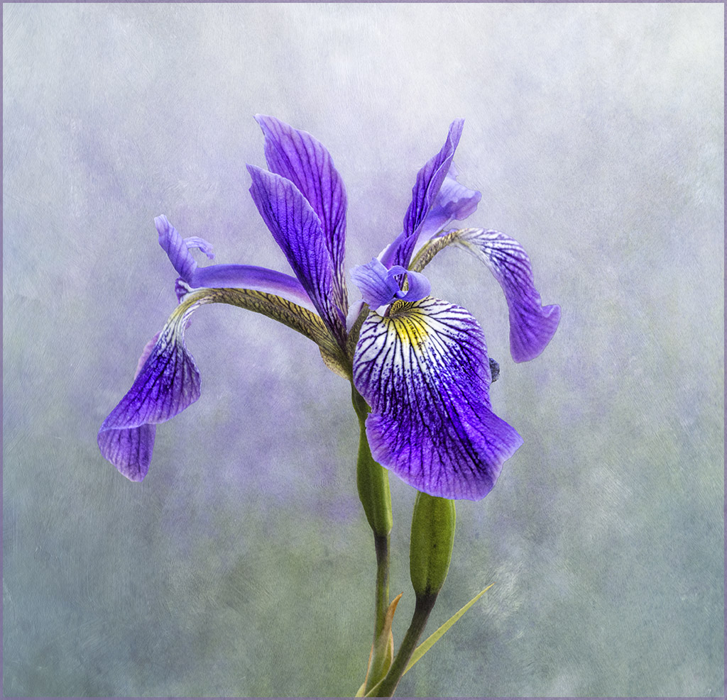
Thanks for your comments Ingrid, the general agreement is to crop the iris image and have included the revised one under Rich's comments. I must admit that I prefer the original. |
Jan 20th |
| 80 |
Jan 26 |
Reply |
Thanks for your comments Doug, it appears that the general consensus is to crop. I've replied to Rich's comments and included the cropped version. |
Jan 20th |
| 80 |
Jan 26 |
Reply |
Thanks for your comments James, here is the cropped version. |
Jan 20th |
 |
| 80 |
Jan 26 |
Comment |
Agree with the majority Ingrid, lovely capture but more specifically I really like your post processing, the petals have a look as you've used "brushstrokes" and painted the texture in. It's so good to see applications like these on images, lovely creative work. Well done. |
Jan 20th |
| 80 |
Jan 26 |
Comment |
Doug, the original is jut a beautiful dahlia, I've not seen one like that. Is that the result of your talent in photo stacking?
On your submission, what an interesting "art deco" abstract interpretation of the original with bold lines and rich, vibrant colors. I do agree with Bob, a B&W version would suit it well. |
Jan 17th |
| 80 |
Jan 26 |
Comment |
Just lovely Marti, love the water droplets on flowers, they add so much interest. I like the the angle and composition. Well done. |
Jan 17th |
| 80 |
Jan 26 |
Comment |
Bob, I've tried to do this but reading your description, I now know where my failure is, my shutter speed is always too high. Next time there's some wind I'm going to try this. Like the movement of the petals and your post processing. Colours are bright and bold, well done. I don't have any suggestions for improvement. |
Jan 17th |
7 comments - 2 replies for Group 80
|
12 comments - 12 replies Total
|


