|
| Group |
Round |
C/R |
Comment |
Date |
Image |
| 41 |
Dec 25 |
Comment |
I like the concept Robin, it reminds me of not forgetting friends/relatives that you haven't seen for some time. The flower forget me not is very appropriate. You may consider using curves to brighten the woman's eyes a bit more and darkening the flower by setting your brush at by 50% opacity and flow. I would also make a tighter crop by cutting out some of her hair on the left and also a bit from the bottom. This would give the eyes and flower more strength. Nicely done. |
Dec 18th |
| 41 |
Dec 25 |
Comment |
Hi Joan, a very creative use of a glass pattern and use it in creating a spider's web. The spider is well placed in the top third of the frame and unlike the others, I think that the lighter yellow on top has the enough brightness to draw the viewer to the spider, the main focal point. In my opinion, you could make the bottom red just a tad darker with the black and white adjustment layer, set to luminosity blend mode and move the red slider which would leave all the other colours in tact. This is easily done even with a flatten image. Nicely done. |
Dec 17th |
| 41 |
Dec 25 |
Comment |
Hi Ian, I can't seem to make up my mind which of your two images I like best. I do like the original and well captured as the depth of colours and how complementary each colour seem to work with the rest is just exquisite.
What the original has and is missing in the next is the illusion of the triangles fading into a vortex, almost like ending up in a black hole. So surreal. I must say the background of the original is best. There seems to be a small "cloud" on the left and if you could expand on that and create a larger cloud then in my humble opinion, I could say we would see a welcoming triangle in outer space. Well done. |
Dec 17th |
| 41 |
Dec 25 |
Comment |
Hi Hazel, this is a lovely composite. I really like how you've positioned the people in the middle of each arch, giving the impression of a day at a church service in an era gone past. I like the colours, they work well and they blend well tying all the elements together. Well done. |
Dec 17th |
| 41 |
Dec 25 |
Comment |
Hi Brad, I think a lot has been said about your image. It is of a surrealism style, especially with the nomads positioned where the "eyes" normally would be. Lovely toning, green/teal and orange is very pleasing to the eyes. My only comment is that the body of the mannequin takes up most of the frame and I believe that the image would have more impact if you cropped a quarter from the bottom up to give more emphasis on the head and the nomads as the title describes. Very nicely done. |
Dec 17th |
| 41 |
Dec 25 |
Reply |
Thanks Hazel. |
Dec 17th |
| 41 |
Dec 25 |
Reply |
Hi Ian, welcome to our group and thank you for your kind comments, much appreciated. I do try to create a storyline with all my composites, this helps me look for elements in my catalogue to make the work more plausible. |
Dec 17th |
| 41 |
Dec 25 |
Reply |
Thanks Brad for your feedback. |
Dec 17th |
| 41 |
Dec 25 |
Reply |
Hi Joan, welcome to Group 41, so pleased that we have more members.
Thank you for your kind and thoughtful comments. I do enjoy compositing and to be honest, it's a distraction from every day woes. Those birds on the ground are Australian magpies, a common bird and often seen in a small flock. |
Dec 17th |
5 comments - 4 replies for Group 41
|
| 80 |
Dec 25 |
Reply |
Hi Ingrid, thanks for your feedback, much appreciated. We've had a cold spring, lots of wind and rain resulting in lots of damaged blossoms. I did clone, used the healing brush tool as well as the remove tool. Not much success and so gave up. |
Dec 21st |
| 80 |
Dec 25 |
Reply |
Hi Doug, not much I can do about the rectangular shape of the blossom, it's a large flower. We've had such a cold spring and most of the flowers were damaged. I do see your point about the soft pink original colour and have gone back to my workings and endeavoured to change it. This is my revised version. |
Dec 21st |
 |
| 80 |
Dec 25 |
Comment |
Hi Rich, how ironic that you would put up an image of "death cap" mushrooms. In July of this year, a woman in Victoria, Australia was imprisoned for poisoned four people, two who were her in-laws by mixing death cap with button mushrooms in a beef wellington dish. Three died and one survived. I was absolutely fascinated and followed the story from the start.
Anyway, you've done a great job in capturing the image as it must have been dark in the forest and focus stacking would have been the best option. I like the angle and the realistic approach. |
Dec 18th |
| 80 |
Dec 25 |
Comment |
Hi Ingrid, like the others, I also avoid shooting flowers in the sun. However, I think you've handled this image well as it doesn't seem to appear harsh. I can't seem to completely make up my mind about the stem at the top right as I like the contrasting colours of the green with the bright yellow, it's a balance. I do find the yellow border a bit strong and for me, it's a bit distracting, perhaps a finer border and softer buttercup yellow. Quite enjoy your work. |
Dec 18th |
| 80 |
Dec 25 |
Comment |
Kamal, your original image is beautiful, you've managed to capture the flower well, it's sharp and a nice composition. A square crop would suit it well giving emphasis on the flower and the surrounding buds.
I do like Marti's version of a black background against the white flower is very complementary.
Well done. |
Dec 18th |
| 80 |
Dec 25 |
Comment |
Hi Doug, still not sure the difference between a Lensbaby and a macro lens - I must check it out. Anyway, lovely shot and I like how close you've managed to get to the center and managed to blur all the outer petals. I would suggest a square crop would give emphasis to the center and still retain the inner softer petals. |
Dec 18th |
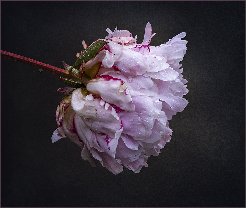
| 80 |
Dec 25 |
Comment |
Hi Marti, I come from a different perspective as I'm a heavy user of textures. I quite like the texture in your image and in my honest opinion, it has given the flower an entirely different look because it has added more light and shade and given it a more "moody" look. All it required after adding the texture is some dodging and burning using curves to bring out the light that has fallen on the leaves when you originally took the image. I've taken the opportunity of demonstrating what I'm suggesting. |
Dec 18th |
 |
| 80 |
Dec 25 |
Comment |
Hi Bob, I really like your latest creation. It looks quite realistic because you've used a water lily and if it was for some reason out at sea it would be floating and it would have splashes of ocean water on it. You've handled the water through the flower quite well and the water droplets on the flower adds to its credibility. Well done |
Dec 18th |
6 comments - 2 replies for Group 80
|
11 comments - 6 replies Total
|


