|
| Group |
Round |
C/R |
Comment |
Date |
Image |
| 41 |
Oct 25 |
Reply |
Hi Brad, the same comment that Tom made. The "grey trim" is the frame that supports the pillars. I left it there to support the clock. I did remove it but it looked strange. I'm not sure what you mean about the base, is that the base of the pillars on the sand? Can you please let me know what part to transform? That would be very helpful. Thanks |
Oct 22nd |
| 41 |
Oct 25 |
Reply |
Hi Tom, thanks for your feedback. The "back pillars" are not pillars but the frame that supports the front pillars. This was taken from a building which has the two pillars as its main entrance. It's not meant to make people think of a cell phone but of the many ways we waste time and then regret it. Maybe doing one with people sitting on their phone all the time even while walking is a good thought. |
Oct 22nd |
0 comments - 2 replies for Group 41
|
| 80 |
Oct 25 |
Comment |
Hi everyone, please accept my apology for not responding earlier but I'm not receiving any notifications when someone comments or replies. |
Oct 29th |
| 80 |
Oct 25 |
Reply |
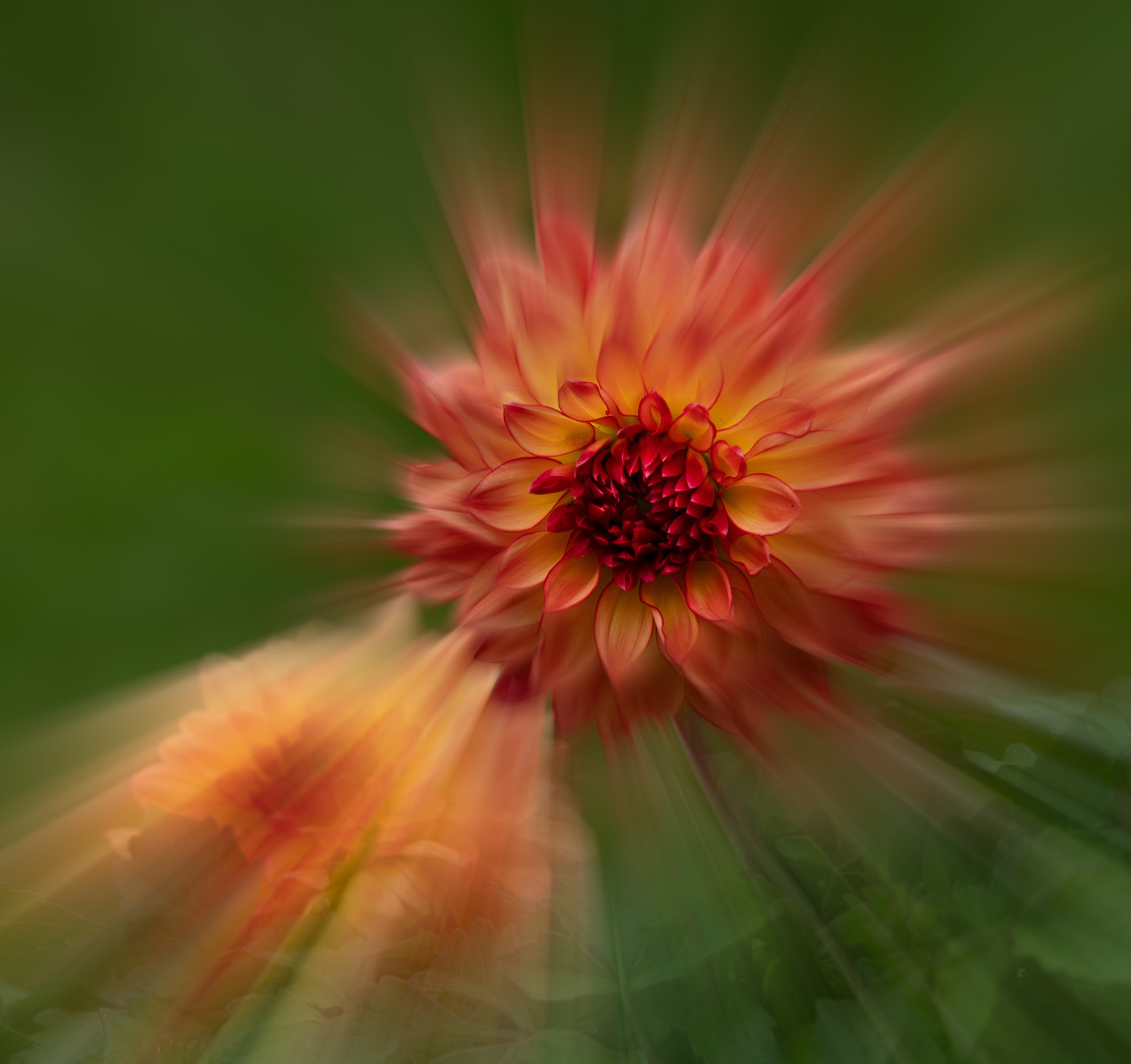
Thanks Ingrid, I wanted to blend the back petals more into the background and have only the center ones visible. I like your suggestion and will try another version.
|
Oct 29th |
| 80 |
Oct 25 |
Reply |
Thank you Rich. Can't remember it's name but it's from the double picotee variety. |
Oct 29th |
| 80 |
Oct 25 |
Reply |
Thank you Kamal |
Oct 29th |
| 80 |
Oct 25 |
Reply |
Doug, I like it a lot. Thanks for your input. It does look better with the background lighten up as you have presented. |
Oct 29th |
| 80 |
Oct 25 |
Comment |
Hi Rich, I've not tried this technique and it looks like a very appealing approach to represent flowers, especially in their natural setting as this one is. I love the green grassy textures around it complementing the nice purple colour. It certainly stands out and eye catching. Perhaps a tighter crop but then it's all a personal taste. Like it a lot. |
Oct 23rd |
| 80 |
Oct 25 |
Comment |
Hi Kamal, I agree with the others on your lovely poppy. The bee adds a story about nature. Well done. |
Oct 23rd |
| 80 |
Oct 25 |
Comment |
Hi Marti, I'm at two minds about this image. I agree with Bob and Ingrid about toning down or softening the cream coloured leaves and allowing the space around the red ones to make them pop more. However, I do like the cream coloured leaves as in my mind they complement the red leaves and provide a diagonal line from top left corner to bottom right leading the viewer to explore the whole image. I would have liked to see a full leaf creamed coloured part. Lovely composition. |
Oct 23rd |
| 80 |
Oct 25 |
Reply |
Thanks Marti
|
Oct 19th |
| 80 |
Oct 25 |
Reply |
Hi Bob, thanks for your feedback.
|
Oct 19th |
| 80 |
Oct 25 |
Comment |
Hi Ingrid, great work in presenting the texture, colour and shape of the dahlia. I like how you've placed it against such a bold and sharp background and it works so well. I've no constructive suggestions. Well done |
Oct 19th |
| 80 |
Oct 25 |
Comment |
Hi Doug, what lovely creations and all from one flower. I can't choose a favourite as they are all equally lovely. Well done and I really can't add any suggestions. |
Oct 19th |
| 80 |
Oct 25 |
Comment |
Hi Bob, I do agree with the others about the main dahlia being a striking image on its own. I do, however, appreciate that you've applied your artistic "eye" to give a different perspective and a zoom is a good technique to use. You might consider "zooming" all of the outer petals to meet with the "halos" on the outside of the flower and leaving just the center in focus. I've taken the liberty to visually explain what I envisage as sometimes I'm not sure I'm clear. I've also lighten the center a little to make it stand out a bit more. I do like the effect, something quite different. Well done. |
Oct 19th |
 |
7 comments - 6 replies for Group 80
|
7 comments - 8 replies Total
|


