|
| Group |
Round |
C/R |
Comment |
Date |
Image |
| 41 |
Jun 25 |
Reply |
Melissa, thank you so much for your kind and encouraging comments. Very much appreciated. |
Jun 21st |
| 41 |
Jun 25 |
Comment |
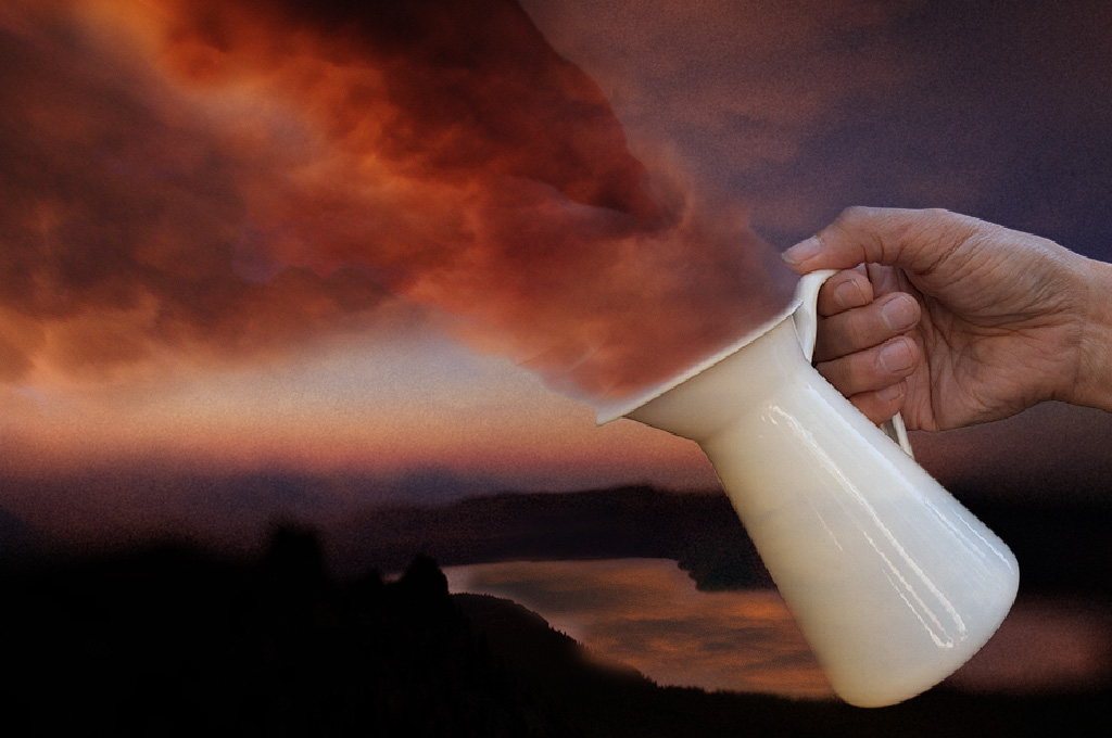
What a great idea Brad, I really like it. Personally, I would make the hand and jug larger and increase the amount of cloud coming out of the jug to fill most of the top part of the frame. I would also make a reflection of the clouds on to the water. Something like this. Nice job. |
Jun 11th |
 |
| 41 |
Jun 25 |
Comment |
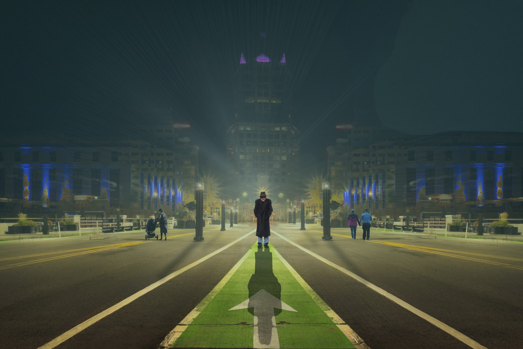
Hi Melissa, this is very well handled, I like the embossing on the church, it give it a very different perspective and certainly is eye catching. I think the moon competes with the church for attention and do agree with Brad, that the tone could be toned down a little so that it complements the image |
Jun 11th |
| 41 |
Jun 25 |
Comment |
Tom, this is a great image and Brad is right, it feels like it's Gotham City at night. My only tiny suggestion would be: as you have haze already there, add some more "haze" in the background. This would make the figures on both the left and right side less dominant and make you stand out more. By the way, I like the star halo behind your head. Well done. Something like this. |
Jun 11th |
 |
| 41 |
Jun 25 |
Reply |
Thanks for visiting our group Stephen and appreciate your thoughtful feedback. |
Jun 11th |
| 41 |
Jun 25 |
Reply |
Thank you for your really nice comments Brad, much appreciated. This is the result of the comments I received on a previous image I posted (December 24). I took the comments on board and gave me an idea of what to do for a future image.
|
Jun 11th |
3 comments - 3 replies for Group 41
|
| 80 |
Jun 25 |
Comment |
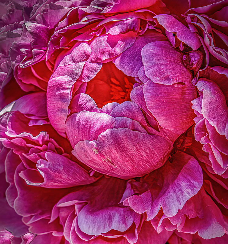
Hi Rich, what a wonderful way to showcase the flower. What a creative way to use light behind it to give it a different perspective and show it in a different way. Well done, really like the creative work. |
Jun 20th |
| 80 |
Jun 25 |
Reply |
Thanks for your thoughtful comments Ingrid, certainly appreciated. |
Jun 20th |
| 80 |
Jun 25 |
Comment |
Hi Ingrid, I do agree with the others about the beauty of this peony rose, especially the colour and I like how you've made the center the focal point. My tiny suggestion would be to slightly crop from the bottom and just leave the opened petals from the center in. This would reduce some of the highlights and bring more attention to the center. Something like this. |
Jun 18th |
 |
| 80 |
Jun 25 |
Comment |
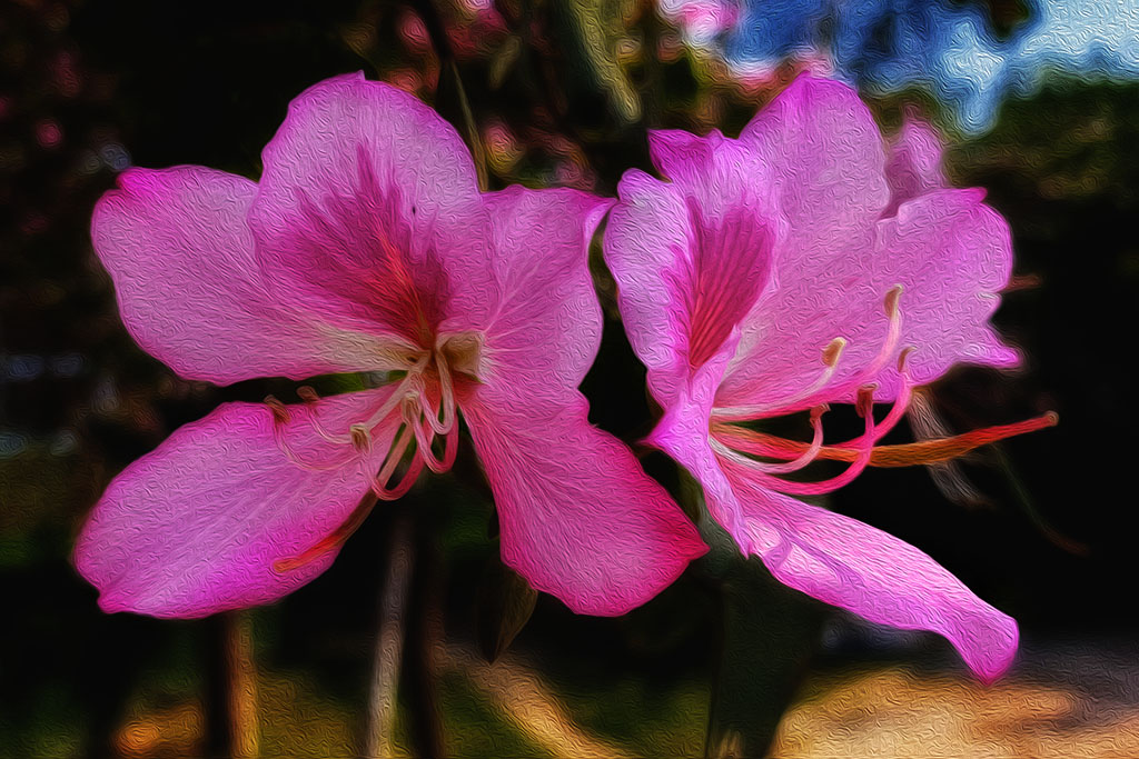
Kamal, I think your previous submissions have been great where you presented the flower/s in their best way. I think the background distracts from the beauty of these two and they don't stand out as well as they could. I don't think you need to do much to make the flowers stand out more against the background.
I hope it's ok and that I have attempted to make some minor adjustments and these can easily be done in CS6. I've used black and white adjustment layer in luminosity blending mode and used the blue slider to darken the sky, then used curve adjustment layer to darken the background in multiple blend
mode at about 70% and then masked out the flowers. Something like this.
|
Jun 14th |
 |
| 80 |
Jun 25 |
Comment |
Lovely composition of the Tulip Doug. The colours are striking and works well against the green background. I really like the shape of the stem, it really adds to the image. |
Jun 14th |
| 80 |
Jun 25 |
Reply |
Wow Marti, that looks great. I did try but I think I need to go and watch a tutorial. Thanks for sharing. |
Jun 14th |
| 80 |
Jun 25 |
Comment |
Thanks for your comments Doug |
Jun 11th |
| 80 |
Jun 25 |
Reply |
Thank you Bob, I was told that this is a "heritage rose" but what attracted me to it is the white stripe that runs through the petals. It's tough and sometimes if the winter weather is warmer it might flower. |
Jun 11th |
| 80 |
Jun 25 |
Reply |
Thank you Marti |
Jun 11th |
| 80 |
Jun 25 |
Reply |
Thank you for your kind comments Rich, much appreciated. |
Jun 11th |
| 80 |
Jun 25 |
Comment |
Marti, both you and Bob seems to be such masters at Polar Coordinates. I've never tried it and I think with the quality of both images presented this month, I might give it a go. It seems that you need multiple flowers to achieve the outcome, is that correct or can you use just one flower?
I like the one you presented as it's beautifully done, it's simple, sharp and the salmon colour complemented by the green mixed in. The background in my view is just right, it does not complete with the main image but complements it. The black background is too harsh in my view. |
Jun 11th |
| 80 |
Jun 25 |
Comment |
Hi Bob, what flowers are these, I can't recognise them?
My second comment is that I like original 2, I like how the colours are arranged and displayed, very pleasing in my opinion.
On your image, it's so dramatic how you have managed to blend all those colours with the purple being the more striking colour sitting almost in the center, surrounded by the greens and yellows and then complemented by the orange tones. It looks like a ceramic bowl. Nicely done. |
Jun 11th |
7 comments - 5 replies for Group 80
|
10 comments - 8 replies Total
|


