|
| Group |
Round |
C/R |
Comment |
Date |
Image |
| 41 |
May 25 |
Comment |
Tom, not a favourite type of composite for me but I can fully appreciate what you've achieved especially on how you have blended your face so well into the Orangutan's. Only a minor suggestion, given how you always wear a hat in your composites, you might think about putting a hat to complete the image. Well done. |
May 22nd |
| 41 |
May 25 |
Comment |
Hi Melissa, what a wonderful idea and well put together. Agree with Brad's comments about bringing all those images into one to tell a story. Adding these random images seem to work really well with dragon, all mystical. I like the child in the mouth of the dragon and it looks like he/she is cleaning its teeth. I can't add any suggestions for improvements. Well done. |
May 20th |
| 41 |
May 25 |
Comment |
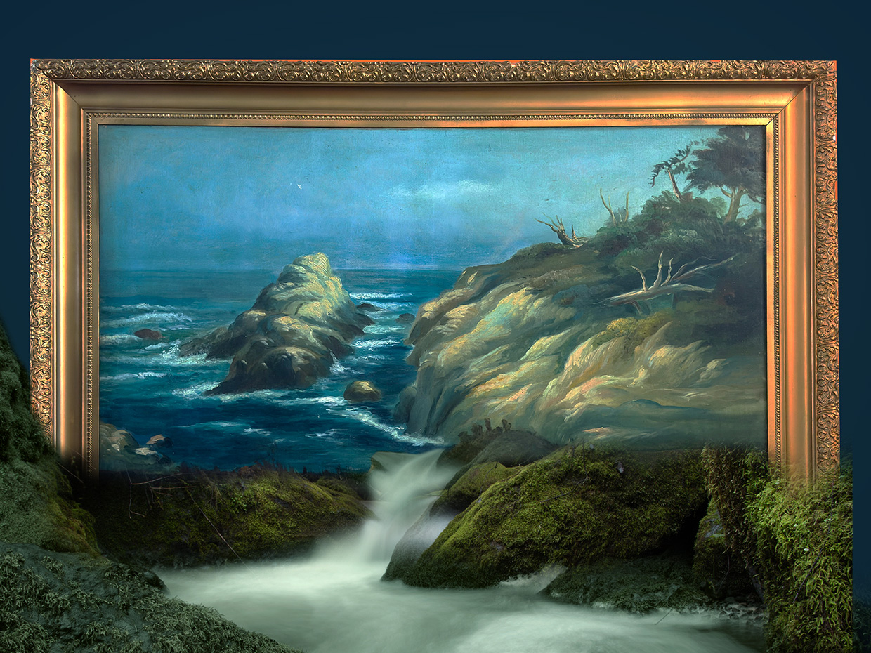
Hi Brad, what a wonderful composite. I really like this composition and have been thinking along these lines for a while and have been too timid to attempt it. My only suggestion would be to cover the bottom part of the frame and have that covered with the rocks to give the impression that the frame is embedded into the rocks. Something like this. |
May 20th |
 |
3 comments - 0 replies for Group 41
|
| 80 |
May 25 |
Comment |
Kamal, what a beautiful flower, I really like the depth of the red colour. Personally, I think the chosen background colour is too strong for this beauty as it competes for viewer's attention. You might consider choosing a more subtle colour to showcase it. All in all a nice presentation. |
May 20th |
| 80 |
May 25 |
Comment |
A very pleasant image Rich. The colour is just lovely, you've retained parts of the background to anchor it and the crop suits it well. Well done. |
May 20th |
| 80 |
May 25 |
Comment |
What a beautiful orchid and you've captured it at its best. I like the background as it complements the flower well. You might consider cleaning the lighter parts on the top left and right side in the background and make it more even. |
May 20th |
| 80 |
May 25 |
Comment |
Thanks Doug, I appreciate your comments. I left the green leaf in as, for me, it provides a colour balance. I thought that the colour of the flower was too much and dominated the scene. |
May 20th |
| 80 |
May 25 |
Comment |
Doug, what I find attractive is the angle of the composition, the yellow/green stripes on the flower very pleasing as is the curves of the petals.
The textured background is quite nice but you might consider lightening it and reducing the opacity to about 60% which would make the green tulip stand out more. I find the green colour of the flower "bleeding" into the background and creating a halo distracting. You might consider cleaning it to give the tulip more definition and separate it from its background. |
May 17th |
| 80 |
May 25 |
Comment |
Marti, do agree with the others, this image stands out as a monochrome. What I like is how you made the three small cones on the top part of the frame as the focal interest in the composition. I didn't notice the twig until I read both Bob's and Ingrid's comments. |
May 17th |
| 80 |
May 25 |
Reply |
Bob, I think I like this one best. I like how you can see some parts of the flower in the swirl, it gives the impression as if the flowers are in a vortex. Nicely done. |
May 17th |
| 80 |
May 25 |
Reply |
Bob, I hope you have more success with clematis than I. I love them and bought 8 different varieties and only three have survived. This is one of them. What happened with this one, end of last year we had some severe winds and one of those days my lattice fence was blown off its frame leaving the clematis dangling. Like you, I like to capture the stamen and the petals with the leaves but I thought that the way this flower dangled with some rain drops looked interesting. Look forward to seeing your new flowers and plants. |
May 17th |
| 80 |
May 25 |
Reply |
Hi Rick, thanks for your comments, much appreciated. In answer to your question, I don't create artificial backgrounds but what I do is photograph anything that I think might be good to use as a texture, such as wood, concrete, steel, stone of any kind, old walls especially ones with cracks etc. With this one, I made a stamp visible of the photo, then used a stamp visible brush to blur the background, that's how I got the purple, green and yellowish colour in the background. I then used the transform tool to move it and then reduced the opacity. I also photographed the colour of a broccoli soup that I made (I liked the olive colour) and then blended that into the background as well as a concrete texture and then used curves to give me the light colour. I have three versions of this and this is the one I like the best. I hope this helps. |
May 17th |
| 80 |
May 25 |
Comment |
Hi Bob, I'm of the same view as Ingrid, I like your original image, the colours are just striking. I think this image is suited to an abstract as it doesn't have a focal point but the colours do it wonders. I like how you can see some of the original flowers at the beginning of the twirl, some in the center and some as you go out of the frame and the black background sets it off really well. Is that by design or is it a result of the 180 degree twirl? |
May 16th |
| 80 |
May 25 |
Reply |
Hi Ingrid, thanks for your feedback, much appreciated. I like experimenting with different backgrounds. This time, I used a stamp visible brush to blend the original background and then added some extra texture. I photographed a pot of broccoli soup (nice green colour) and then blended a concrete texture to it. |
May 16th |
7 comments - 4 replies for Group 80
|
10 comments - 4 replies Total
|


