|
| Group |
Round |
C/R |
Comment |
Date |
Image |
| 41 |
Jun 24 |
Reply |
Hi Tom, I think that's a great idea. Thanks for your feedback. |
Jun 26th |
| 41 |
Jun 24 |
Reply |
Hi Brian, thanks for your suggestion, it's the same suggestion my husband made so it appears that I need to put some more work into this image. |
Jun 20th |
| 41 |
Jun 24 |
Comment |
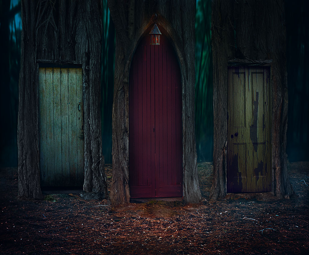
Hi Lisa, very creative and interesting effect. Almost looks like a neon filter put through the composition. Nicely done. |
Jun 17th |
| 41 |
Jun 24 |
Reply |
Hi Hazel, thanks for your feedback, it's suppose to represent something like the crossroad that we often find ourselves at and wonder which road or door will be best for us not knowing what the future holds. |
Jun 17th |
| 41 |
Jun 24 |
Reply |
Hi Brian, thanks for your feedback, it always good to get an idea of how others see the image. I've gone back and added some darkness to the background by just using curves in multiple blend mode. I can see how the doors seem to stand out a bit more. On another point, I'm really surprised on how dark the image looks on the site. It must be the jpg compression. |
Jun 17th |
 |
| 41 |
Jun 24 |
Comment |
Tom, I agree with Brad, you've handled this image very well and it does give the impression that the hawk is in its natural environment and you were allowed to get close enough to take a close portrait of it. |
Jun 17th |
| 41 |
Jun 24 |
Comment |
Hi Brian, I agree with Brad, it's a very interesting image and the title is very fitting. It does look like you're trying to reach to the flower but it's escaping your grasp. I think the background texture is nice as is the placement of your hand and flower. My only suggestion would be to add a stem on the flower which would look like you're trying to grab it. Otherwise, I think it a lovely concept. |
Jun 17th |
| 41 |
Jun 24 |
Comment |
Hi Hazel, a very creative way of displaying some flowers in a bowl. I particularly like the texture of the powdered gold in the water, it creates a very interesting element that complements the flowers. For me the bowl is too crowded with the flowers and would prefer to have about three or five flowers and the pattern created by the gold powder float around. For example like your original 2 and 3, they are just lovely. If you're concerned about the flowers floating and sharp images, then you can use continuous shoot to freeze the frame. I do that when I photograph a flower in slight wind. I do manage to get some sharp frames. Otherwise a creative image. |
Jun 15th |
| 41 |
Jun 24 |
Comment |
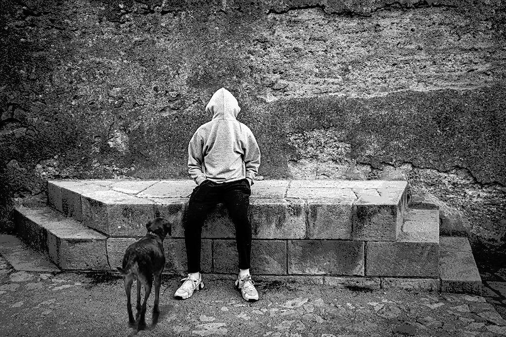
Hi Brad, I sincerely had to look twice at your son to understand that he is wearing his sweater in reverse and thought how clever and the that fact that I spent some time trying to figure out what was happening, for the me the image has succeeded. My only comment is the dog. It's out of proportion in scale to your son and looks odd. I thought that it would add to the story if this is your son's dog and the dog is trying to understand what's happening. I hope that you don't mind, I've cut out the dog and placed him next to your son. My suggestion for a title would be "Is that you?" |
Jun 15th |
 |
| 41 |
Jun 24 |
Comment |
Here is an edited version. I removed as much fog as I could given the "final stage" of the image. |
Jun 10th |
 |
| 41 |
Jun 24 |
Comment |
Hi Brad, thanks for your feedback. I put some fog over the image to give it a mystic look and I can see your viewpoint. I'll go have see if I can remove it. My intention with this was not so much as "horror" but of choices we make in life. So each door would represent a different path we take in life, so "which door" would be the "best path." I suppose I might have said "which door is the best" or something like that. |
Jun 10th |
7 comments - 4 replies for Group 41
|
| 80 |
Jun 24 |
Comment |
I quite like the composition of this flower Rich, especially how you have brought out not only the detail of the anthers but also made them the focal point. My only comment would be to remove the two blurred ones in the background as they are a bit distracting. |
Jun 14th |
| 80 |
Jun 24 |
Comment |
Agree with the others Ingrid, a beautiful representation of an iris. Even though you did such a tight crop, you still know what flower it is. |
Jun 14th |
| 80 |
Jun 24 |
Comment |
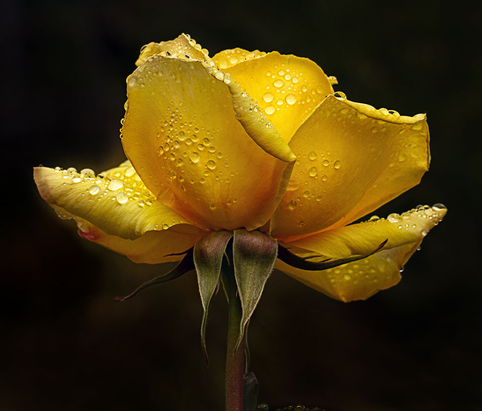
Hi Kamal, I really like the tones in this image, the bright pink of the water lily and the various tones which complement it beautifully. I do agree with the others about the filter/texture on the flower and bud. I normally have the texture only in the background as a way of making the flower stand out. I also agree with Marti about a tighter crop but I also think you should flip the image horizontally so it faces into the frame rather than out. Other than that, it's a beautiful image |
Jun 14th |
 |
| 80 |
Jun 24 |
Comment |
Hi Doug, every time I see one of your beautiful stacked images, it encourages me to try. I have to admit that I just love the coloured one, it has a real sense of being on "its last legs" so as to speak whereas the BW is more like death.
I've had a closer look at the coloured one and just love the details. I can't offer any comments for improvements. Well done. |
Jun 14th |
| 80 |
Jun 24 |
Comment |
Hi Marti, I think your image is superb, I like the position of the butterfly and like Rich, it's the main focal point. For me this a story in nature, the butterfly going about its business. I don't even mind the flower on the edge of the frame, well done. I'm encouraged to take photos of flowers with insects. |
Jun 14th |
| 80 |
Jun 24 |
Reply |
Thanks Marti
|
Jun 14th |
| 80 |
Jun 24 |
Comment |
Bob, I agree with Rich, you do have a flair for creating abstract images and I really like the colours and the flow in this one. For me the sunflowers are a bit lost and my eyes are drawn to the most striking red colours on the left and right of the frame. You might consider giving the sunflowers a little bit more definition and leave a little bit of the yellow colour in so that they are a focal point and all the other elements around it are complementary.
|
Jun 13th |
| 80 |
Jun 24 |
Reply |
Thanks Bob, I've included a updated version with a reduced yellow tone on the left. |
Jun 13th |
 |
| 80 |
Jun 24 |
Reply |
Hi Rich, that you. One of my favourite colour rose is yellow. I've toned down the yellow bit on the left and included the new version below. |
Jun 13th |
| 80 |
Jun 24 |
Reply |
Hi Marti, thanks for your feedback much appreciated. It seems that so far the common thread is to darken the left side, so, I've revised and included the edited version below. |
Jun 13th |
6 comments - 4 replies for Group 80
|
13 comments - 8 replies Total
|


