|
| Group |
Round |
C/R |
Comment |
Date |
Image |
| 41 |
Mar 24 |
Comment |
Tom, I also like the symmetry of your image. As you have two images of yourself, I thought it would be interesting if you had two images of your granddaughter. One where she's defiant and then another where we see her back and she's looking at you walking away, probably calling you to come back. A scene I've been through and see many times when I go into town. |
Mar 23rd |
| 41 |
Mar 24 |
Comment |
Hazel, I too like the yellow flowers against the blue water. This is a really lovely image. My only comment is that the background chosen texture is too "strong" - you can work with that by applying gaussian blur at around 30 or so radius or to your choice. It will soften the colours and you'll still have some texture. I think I'll try your technique. Like the idea a lot. |
Mar 23rd |
| 41 |
Mar 24 |
Comment |
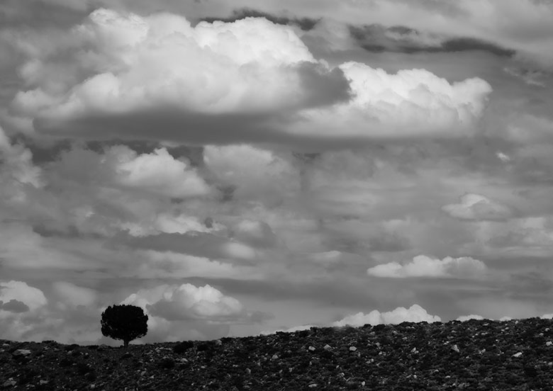
Hi Brad, this is a very good minimalist image, a lone dark tree set against nice structured clouds. My suggestion is to crop the image and just highlight the clouds and the lone tree. |
Mar 23rd |
 |
3 comments - 0 replies for Group 41
|
| 80 |
Mar 24 |
Comment |
What a lovely edit Rich, it looks like a lantern. The colour is not dominant which makes the stamens stand out well. The added background texture enhances the the flower, a nice overall image. |
Mar 22nd |
| 80 |
Mar 24 |
Reply |
Hi Bob, I thought that I answered your question of "what does one do?" in my comments above. My suggestion is that you can easily change the white colour to another in photoshop as demonstrated in my example. |
Mar 22nd |
| 80 |
Mar 24 |
Comment |
Hi Jacob, I think this flower is called a "peace lily". What I like about your image and is the focal point of interest is the spike, it really stands out well from the background and is eye catching. Since the white part of the flowers is near its end, I thought that your choice of colour is good as it doesn't detract from the focal point of interest. Really nicely done. |
Mar 21st |
| 80 |
Mar 24 |
Reply |
Hi Bob, I understand and I apologise for not offering a solution. Not my style to do that if I make a comment on a image. In photoshop you have a number of tools that can change colour, even white. I hope that you don't mind, I took the liberty of changing the colour of the two large white parts. In one part I went back to Camera Raw. There's a radial tool on the top right hand side called "masking." When you go there, there an option called "object" hit that and you'll have a brush. Use that brush on your white part or any other part that you want to change the colour. Once you've done that then scroll down to the Hue / colour bar and choose a colour. You'll also have a number of options like exposure, contrast, etc where you can increase the intensity of your chosen colour. So, one part of your image I've changed the white to a light magenta colour in Camera Raw and the white part on your right side, I've used curves. Don't accept what PS gives you, you can add many layers to achieve the vision you have for your image. I hope I've made some sense. |
Mar 21st |
 |
| 80 |
Mar 24 |
Comment |
Thanks Jacob, I appreciate your feedback. |
Mar 20th |
| 80 |
Mar 24 |
Reply |
Thanks Doug for your comments. I must say that I can't see the "tipping over". The vase is resting on a fence post and I might have cut it off more than needed thus giving you the impression that it might be tipping and not resting properly. After your and Rich's comments I've taken it back in camera raw to check whether it's straight. I've noticed that the base of the vase is not even and nor is the top of the fence post and I think that might give the illusion that it's tipping over. Not really sure. |
Mar 20th |
| 80 |
Mar 24 |
Reply |
Thanks for your feedback Bob.
|
Mar 20th |
| 80 |
Mar 24 |
Reply |
Hi Rich, thanks for your comments. I was very intrigued Haiku photography, I've not heard of it before you mentioned it. I did some exploration and wow, what lovely images. The stand of the vase is not as visible as it could be, it is resting on a fence post lol. I put it there because the light from the background was nice. |
Mar 20th |
| 80 |
Mar 24 |
Reply |
Hi Kathryn, thanks for your comments, well appreciated. |
Mar 20th |
| 80 |
Mar 24 |
Comment |
Wow, Kamal, what a lovely edit and you have given structure to the petals making them more visible. Well done. |
Mar 20th |
| 80 |
Mar 24 |
Comment |
Doug, agree with the others. The focal point is the center and you've captured that beautifully. |
Mar 20th |
| 80 |
Mar 24 |
Comment |
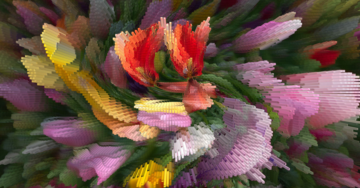
Bob, a really lovely abstract image and your choice of the tulips works well. I agree with Kathryn about the bright parts but overall, a very interesting and attractive image. |
Mar 20th |
6 comments - 6 replies for Group 80
|
9 comments - 6 replies Total
|


