|
| Group |
Round |
C/R |
Comment |
Date |
Image |
| 41 |
Feb 24 |
Reply |
Hi Alan, thanks for visiting and thank you for your compliment and feedback, much appreciated. |
Feb 22nd |
| 41 |
Feb 24 |
Reply |
Thanks for your feedback Hazel. |
Feb 22nd |
| 41 |
Feb 24 |
Comment |
Hi Lisa, great concept and you've executed it really well. I like the colour tone, brown, yellow and red. It really works well and very pleasing to look at. I can see the strongman looking and trying to work out how he could lift that tool - that makes a nice story for me. He might use it as a weapon to fight for the good of mankind. I like it a lot, well done. |
Feb 19th |
| 41 |
Feb 24 |
Comment |
Hi Brian, what an interesting concept - this is more interesting from a visual perspective and how an image is different from mono to various stages of colour saturation. I would have preferred if you presented this in a small hand held folding fan style where all of the four images are pivoted from a central point and given equal visual presentation. My reasoning is that the transition from the mono image to the desaturated one is too great. You can only see one eye and part of her head in the mono image and then all of a sudden it is nearly her full face. The last three images are handled well and appear more balanced from a viewer's perspective. |
Feb 18th |
| 41 |
Feb 24 |
Comment |
|
Feb 18th |
 |
| 41 |
Feb 24 |
Comment |
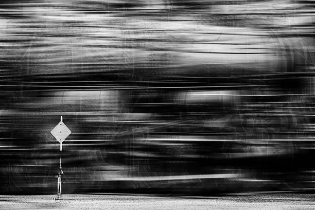
Hi Marta, good work on trying out multiple exposure, something I've not tried and can't imagine it would be easy. As the others have mentioned, the image offers a lot of visual textures and lines and so the eyes tend to wonder a little. Have you thought of building on your image and applying a motion blur to indicate "speed?" With the multiple exposure and the speed you have an very interesting image. Mask out the sign and that would give the viewer an "resting" point to focus on the speeding train. I've taken the liberty of giving an example of what I see in your image. |
Feb 18th |
| 41 |
Feb 24 |
Comment |
Great concept Tom and agree with Brian about removing the partly exposed picture on the right. Have you thought about extending some of the "fork arms" to come out of the frame and feel as if it's endeavouring to grab you, especially those at the top? Otherwise, I have no other comment that would add any value. I like the symmetrical look you've created with forks. Food for thought for sure.
By the way congratulations on your great image being in the Groups' Showcase - great example of our group's work. |
Feb 18th |
| 41 |
Feb 24 |
Comment |
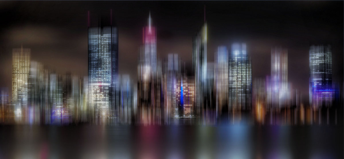
Hi Hazel, like Brian I think you've taken a normal night view of a city scape and turned into a creative piece.
As it is, the dark colour does not do justice to the buildings and the reflections are very strong. You might consider reducing the blur effect on the reflections to give more of a realistic look and that it doesn't blur into the bottom of the buildings. As it stands there's no separation.
You can build on your image and make it really "pop" by brightening it and cropping the bottom reflections so that the buildings are the focal point of interest. I've built on your image to demonstrate what I mean. You might have a look at a technique called the Adamski effect where you select a subject to be in focus and the rest is in a dreamy, blurred background. Well done in turning a normal city scape image into a creative one. |
Feb 15th |
 |
| 41 |
Feb 24 |
Comment |
Hi Brad, I really like the composition of this image and do agree with Brian about the left to right. I too am coming around to his preference. This image lends itself to the application of the "Adamski" effect. If you haven't heard of it, it's an application of applying blur to most of the image and leaving the focal point in focus. It's a technique that I'm trying to learn at the moment. |
Feb 15th |
| 41 |
Feb 24 |
Reply |
Hi Brad, thanks for your comments and do share your and Brian's view about the orientation of the image. It does looks better in terms of flow. |
Feb 15th |
| 41 |
Feb 24 |
Reply |
Hi Brian, thanks for your feedback; it's always good to get another perspective. I do agree with you and the image's flow from left to right looks and "feels" better. |
Feb 15th |
| 41 |
Feb 24 |
Reply |
Hi Lisa, thanks for your feedback. I did tone down his top but looks like not enough. I shall go back and try again. It's pure white so had some difficulty with it. To answer your question about the sphere. This is an outcome of experimenting as I was stuck for ideas. Having a look at my workflow this is basically what I did:
Make sure you're one hundred percent happy with the background and everything is in its place. For me it was my oldest grandson, the big rocks etc. Make a stamp visible layer and turn it into a smart object. Then go to Filter, Distort, Spherize and click ok. With that output go back to Filter, Distort, Spherize and click ok. You should have Stamp Visible smart object layer and underneath that spherize, spherize.
You can now move this layer to where you want it to be. I put mine on the horizon of the scene. Use the Elliptical Marquee Tool and create a circle to your liking and then add a mask. Now you have a sphere. Next go to the fx blending options and then add an outer glow to your colour preference. I added both inner and outer glow. I then clipped a texture in soft lift blend to the sphere to create those little glowing bits and masked out what I didn't want. Add a blank layer under the sphere to create a shadow if you want your sphere to float. I then just experimented with various layers to create the colours to how I visualise it. Hope this helps.
|
Feb 7th |
7 comments - 5 replies for Group 41
|
| 80 |
Feb 24 |
Comment |
When I first saw this image, I thought wow what an abstract interpretation of a protea but after reading your description of how insects see the world and especially colour I appreciated it from another perspective. You've done a terrific job in endeavouring to replicate their world. Now there's two reasons to like what you've achieved, thank you. |
Feb 22nd |
| 80 |
Feb 24 |
Comment |
Hi Doug, I've had proteas in my garden and never seen the inside of a mature one. At the end of their flowering life, they go brownish like that and I just cut and discard them. What an idea to have the chance to photograph one. In my opinion, the image lends itself more for an abstract representation as it's hard to see what protea flower it is or what part of the flower you photographed. You've done a excellent job in stacking so many images to create a sharp one like that. It's all personal preferences and I admire your technical ability. |
Feb 20th |
| 80 |
Feb 24 |
Comment |
Hi Jacob, I tend to favour your original, the colour appear more pleasing and natural. The background of the original is subtle and dark which makes the water lily stand out. The edited version in my opinion is bright and strong which has also made the background lighter thus competing with the flower. I do agree with the others in eliminating the dark verticals next to the flower. |
Feb 20th |
| 80 |
Feb 24 |
Comment |
This is a lovely interpretation of your original. You've made the best of what you have and worked it into a lovely piece. The chosen textured background complements the image well and I like how the choice of texture has created a shadow of the rose. I think it's that, that gives it a painterly look. I haven't any comments of value for improvement. Well done, I like it. |
Feb 19th |
| 80 |
Feb 24 |
Comment |
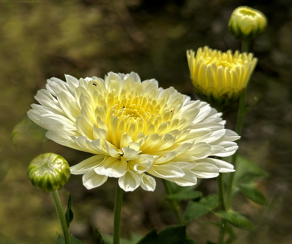
Hi Kamal, I find this image very attractive and very pleasing to look at. You've done a wonderful job in capturing the flower in its various stages of flowering. My only comments would be to flip the image horizontally and this would give you a left to right view, so the viewer can start with the bud, the full flower in bloom and the the eyes rest on the ones at the edge of the frame. Well done, love it. |
Feb 19th |
 |
| 80 |
Feb 24 |
Comment |
Hi Bob, another one of your lovely abstract creations. I particularly like how you've created this one by keeping some of the flower and created an abstract swirl around it, the two are complementary. The green swirl makes the the colour of the inner flower really pop. I do prefer your second, edited version where you've eliminated the outer distractions. |
Feb 19th |
| 80 |
Feb 24 |
Reply |
Thank you for your kinds words and feedback Kamal, much appreciated. |
Feb 19th |
| 80 |
Feb 24 |
Reply |
Thank you Jacob, your comments are appreciated. |
Feb 19th |
| 80 |
Feb 24 |
Reply |
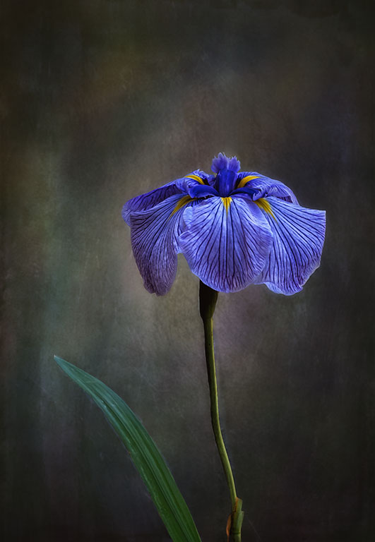
Hi Bob, thanks for your feedback, much appreciated. Having a look at the image again, I can see your those light streaks. I've removed it and darkened the background a little more. Here's the revised one.
We have bearded iris in Australia as well. I'm sure that this iris is in the US as well, I just can't remember the name.
|
Feb 19th |
 |
6 comments - 3 replies for Group 80
|
13 comments - 8 replies Total
|


