|
| Group |
Round |
C/R |
Comment |
Date |
Image |
| 41 |
Oct 23 |
Reply |
Hi Brian, thank you for your feedback. Your evaluation is appreciated. |
Oct 25th |
| 41 |
Oct 23 |
Reply |
Hi Brad, I like it a lot and the church behind him would be perfect. Thank you for sharing. By the way, I love the movie Ghost Rider and everytime it's on the TV, I always make a point of watching it. |
Oct 22nd |
| 41 |
Oct 23 |
Comment |
Hi Lisa, I like the colours you've chosen for this image, especially the purple/orange sunset. I do agree with Tom that you could remove the balloon cover, giving the "ball of water" more of an impact. |
Oct 20th |
| 41 |
Oct 23 |
Reply |
Hi Brad, I don't agree with the lady as a "cut out" - she's been anchored and blended in from the very beginning. Thanks for your input. |
Oct 19th |
| 41 |
Oct 23 |
Reply |
Hi Lisa, thanks for your feedback and it's interesting to see how others view an image. I have to say that I don't agree with you on this scene. She has been anchored as I cut out a fair bit of the ground she stands on in the original image and have blended that into the rocks. She's been put in the scene at the beginning of the composite and at each stage there is a blending of the various elements. You will find that the ground is not even in colour as I've crated various shadows. She's under a lamppost and so the spill light on her is brighter than the rest of the scene. I can tone that down somewhat. I also don't agree with the colouring of her shoes as that's not the original colour. I've used LUTS in some of my composites but I'm not a fan of it as it's too harsh and quite often you have to reduce the opacity. I generally finish all of my work by using gradients. Thanks for taking the time to do all of that work, I do appreciate everybody's input. |
Oct 19th |
| 41 |
Oct 23 |
Comment |
I like it Brad, it reminds me of the movie "Ghost rider" - if I remember there might have been a scene in front of a church and the skeleton on a motor bike with some fire out of his head - that would add to the scene really well. I think he had his mouth opened like that as well! |
Oct 19th |
| 41 |
Oct 23 |
Comment |
Tom. I would put some mist/fog on the horizon and some around the base of the lighthouse to not only create some atmosphere but to also give more of a perspective of distance from the bird to the lighthouse. As it is the atmosphere is too even. Nice image and a great concept. I like it. |
Oct 19th |
| 41 |
Oct 23 |
Comment |
Hi Brian, I would really like to see the original photograph(s) that you used to create this image. I think it would help in terms of visualisation, from start to end. It appears to me that you turned a photograph into a work that's not dissimilar to a graphic design work. I prefer the original as, from my perspective, there's a story there, "the grind of industrial labour" |
Oct 19th |
4 comments - 4 replies for Group 41
|
| 80 |
Oct 23 |
Comment |
Kathryn, I don't mind the frame, I think it helps in focusing on the subject. I do agree with Doug though that the yellow background colours are too strong and competes with the petals. Other than that, it's a lovely image and you've certainly did an excellent job in post processing. |
Oct 19th |
| 80 |
Oct 23 |
Comment |
The colour combination in this image is so pleasing. Centering the flower in the middle works well for me in this image as the leaves surrounding it has a diagonal look from the left to the top right. The flower and the leaves complement each other well. My only suggestion is to clean the minor debris on the leaves and in the water. Well done. |
Oct 16th |
| 80 |
Oct 23 |
Comment |
Doug, this is a lovely composition and a beautiful end result from your edits. I don't think I could add anything that would make a difference. Well done. |
Oct 16th |
| 80 |
Oct 23 |
Comment |
Hi Jacob, the colour of this flower is so dominant that the only minor distraction is the white strip on the left side. If you could somehow tone it down or remove it would make a difference in its presentation. Personally, I like the shape of the leaves of this plant and I would have both a leaf as well as the flower in the composition and in focus. Personal preference. |
Oct 16th |
| 80 |
Oct 23 |
Comment |
Hi Bob, the colour of the iris is very pretty and I think what makes it special is the dew (or is it frost). You've done a great job in isolating the flower from its background and I do agree with Doug that you could darken it more and lighten the flower a tad to make it stand out. Personal preferences. |
Oct 16th |
| 80 |
Oct 23 |
Reply |
Thanks for your comments Doug, I've made the adjustment and posted it under Bob's comments. Cheers |
Oct 16th |
| 80 |
Oct 23 |
Reply |
Hi Jacob, I agree with you about the center as a good subject for a macro shoot. This flower should come out shortly as we're into Spring and will give it a go then. Cheers |
Oct 16th |
| 80 |
Oct 23 |
Reply |
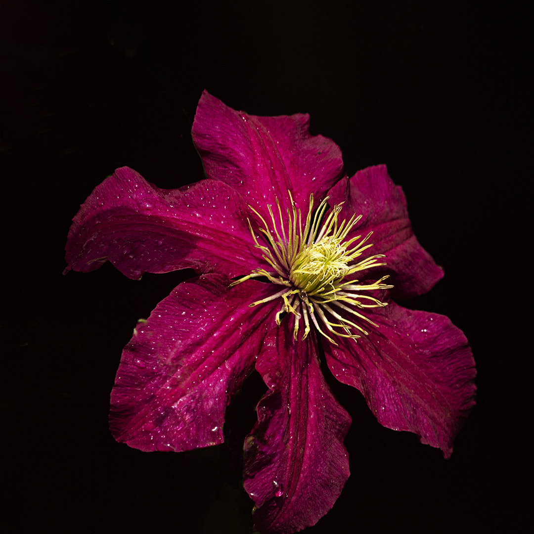
Hi Bob, thanks for the feedback, as suggested by yourself and others, I have removed the "new green growth" on the flower. For your information, the remove tool didn't work as I believe it didn't like the red colour and so I used the old faithful clone tool, much easier on this image. I also took the raw file into Camera Raw and used the healing tool to see what it would do and again it did a poor job. Here is the "clean" flower. |
Oct 16th |
 |
5 comments - 3 replies for Group 80
|
9 comments - 7 replies Total
|


