|
| Group |
Round |
C/R |
Comment |
Date |
Image |
| 41 |
Apr 23 |
Comment |
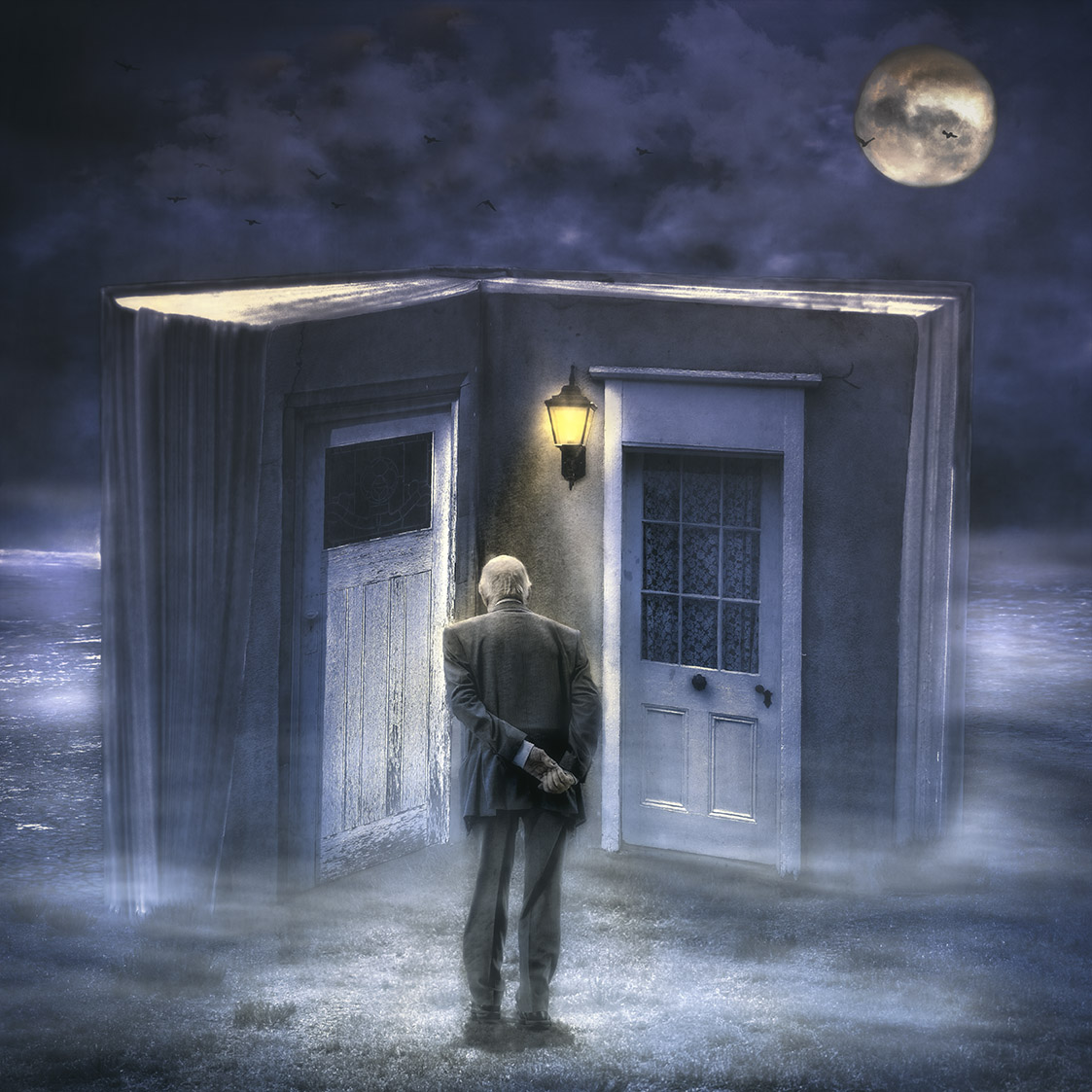
Hi Tom, this image reminds me of the song "Stairway to Heaven" by Led Zeppelin. Somehow some the lyrics fit this image. I think you've captured with your compositing a lovely story. |
Apr 29th |
| 41 |
Apr 23 |
Reply |
Thank you Henry for your feedback. |
Apr 29th |
| 41 |
Apr 23 |
Reply |
Thank you for your feedback Brian. It's interesting how people interpret this image in so many different way and I enjoy reading them. My idea was of past memories. I do like your interpretation though. Cheers. |
Apr 29th |
| 41 |
Apr 23 |
Reply |
Thank you for your feedback Brad. The mound of dirt is his contact shadow and it might be too heavy. |
Apr 29th |
| 41 |
Apr 23 |
Comment |
Hi Lisa, as soon as I saw this I thought of a skelton of bird's wings. I think it has a lot of potential and has the elements to be expanded into be a strong abstract image. |
Apr 19th |
| 41 |
Apr 23 |
Comment |
Hi Hazel, I must admit, the "original" image has impact and does draw the viewer to its strong and vibrant colours. My only comment would be to position the two poppies with the stem coming from the bottom left and working out of the frame to the top right, that is left to right view. This would, in my view, would have a flow of the flowers working their way through the panels. |
Apr 19th |
| 41 |
Apr 23 |
Comment |
Hi Henry, I prefer "original" image. I think the complementary and the subtle colours work well. In my view, the composition is in balance and a lovely representation of an abstract image. |
Apr 19th |
| 41 |
Apr 23 |
Reply |
Hi Alan, good to meet you and thank you for your feedback. I like your take on the image and it does give me some delight that people see it in so many different ways. Also, I appreciated your view and constructive way of looking at the image. I take your points on board and have moved the moon to the right and dim it as well as deleting the birds. I do agree that it does change the scene. I look forward to your feedback in the future. |
Apr 10th |
 |
| 41 |
Apr 23 |
Reply |
Hi Tom, thanks for your comments. I had a look at the image again and agree with your comments. I've moved the moon the right and it does create a nice diagonal and more appealing to the eye. Moving the man is harder as I've merged the layers and when I did move him, it created a weird pattern on the book, so gave up. Cheers. |
Apr 6th |
 |
4 comments - 5 replies for Group 41
|
| 80 |
Apr 23 |
Comment |
Hi Syed, this is a lovely composition. My suggestion would be to crop the image to show all five flowers. Clone out the white parts in the background and then darken the background to showcase the three flowers on the left. As others have said, this composition has great potential. |
Apr 15th |
| 80 |
Apr 23 |
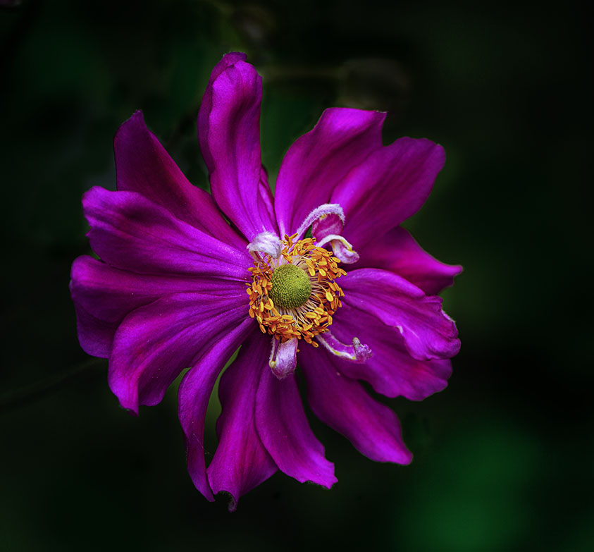
Comment |
Rich, this is just a lovely composition with sharp detail of the pollen. I agree with the others, you've done a great job. Well done |
Apr 15th |
| 80 |
Apr 23 |
Comment |
Hi Kathryn, I think you've done an excellent job at f3.5. I've used f2.8 with a high shutter speed and the bee comes out nice and sharp. My suggestion would be to horizontally flip the image so that the flowers come from the bottom left side and this acts as a leading line to the bee. I would also lighten the bee and the flowers it is sitting on at about 50% opacity as this is the focal point of the image. Beautiful choice of textures, adds drama to the scene. |
Apr 15th |
| 80 |
Apr 23 |
Comment |
Hi Doug, the colours of this daffodil are just exquisite. Nature at its best. I personally think that you've cropped it too tight, the petals at the bottom are on the edge of the frame and the ones on the right are cut off. I like how you've handled the left part. Was that your intention? To showcase such a splendid flower I would show case the flower in its entirety with softness on the outer most petals working towards a sharp centre which is the focal point. A lovely composition. |
Apr 15th |
| 80 |
Apr 23 |
Comment |
Hi Jacob, I really like the way you've handled this image, eliminating all the distractions and converting to mono. It's very creative and the orchid looks like an "angel" with its wings and "hands" out. I might be seeing too much in it but they are the concepts that came to mind when I saw it. I can add any comments for improvements. Well done. |
Apr 15th |
| 80 |
Apr 23 |
Comment |
Hi Bob, this is a lovely edit and looks almost like a painting. I agree with Jacob, a 16 x 9 inch crop would suit this image well and draw the viewer to the focal point being the red flower. |
Apr 15th |
| 80 |
Apr 23 |
Reply |
Thanks for your feedback Jacob |
Apr 15th |
| 80 |
Apr 23 |
Reply |
Thanks Kathryn, I appreciate your feedback. I made the minor adjustments and find the top petal where the bud was an odd shape. The colour does stand out more.
|
Apr 13th |
| 80 |
Apr 23 |
Reply |
Thanks for your feedback Bob. I did a low opacity clone on the buds and then darken it a bit. I'm not all that sure of the outcome as the petal where the bud was looks odd. I know that it's in the original image but it seems to be more obvious that the tip of the petal is missing. It must have been damaged at some stage. |
Apr 13th |
 |
6 comments - 3 replies for Group 80
|
10 comments - 8 replies Total
|


