|
| Group |
Round |
C/R |
Comment |
Date |
Image |
| 41 |
Mar 23 |
Comment |
Very striking and unusual image. I have not used Fractalius nor Topaz Glow (even though I have it!) but I think I might go back and revist the Glow filter in Topaz, maybe I might make one of my composite glow. Lovely image Brian, I can't add to what's already been said - I like the striking colour of the flowers. |
Mar 22nd |
| 41 |
Mar 23 |
Comment |
Hazel, I like how you have interwoven the "patches" to give an interesting and nearly abstract image. Your concept has a lot of possibilities and one that comes to mind is to place a different flower of the same family in each of the "patches" that would show their relationship to one another. Lovely choice of colours that work and complement each other. |
Mar 22nd |
| 41 |
Mar 23 |
Comment |
Hi Brad, I quite like the concept and like the previous comments, the light painting is strong and detracts from the concept. You could use the either the smudge tool or the blur in photoshop to lessen the effect of the red light and bring it more in line with the tone of the rest of the image. |
Mar 16th |
| 41 |
Mar 23 |
Comment |
Lisa, this is so lovely and well done. I don't think I could add to any improvements. The two segments are well balanced. |
Mar 16th |
| 41 |
Mar 23 |
Comment |
Hi Tom, the power of nature can take over anything man has made and that's how I see your image. You've done a great job in realising your concept in this image. I like it. |
Mar 16th |
| 41 |
Mar 23 |
Comment |
Hi Henry, I find this image incredibly bright and eye catching. For me it's an abstract image and like most the key is the bold colours that attract and keep the viewer's attention.
Experimenting with colour, use of filters, distorting all works towards an abstract representation of your original image does have leading lines but doesn't have a focal point. I look forward to seeing your next experiment. |
Mar 16th |
| 41 |
Mar 23 |
Reply |
Thanks for your feedback and I welcome all ideas as quite often I put them aside to see if I can incorporate them into future projects. The idea of the pizza boxes and there's also a McDonald box there as well was to state the rotting of plastic film that covers these packages entering the soil. With these sorts of images I do prefer to be more stated about the message that I am endeavouring to convey. This image came about of some annoyance to the rubbish left on the side of the road and on the beaches where I live. |
Mar 12th |
| 41 |
Mar 23 |
Reply |
Thanks for your feedback Hazel, I do agree about the pizza boxes, they turned out a lot lighter than expected. I might go back and see if I can darken it somewhat. T |
Mar 12th |
| 41 |
Mar 23 |
Reply |
Thank you Henry, you feedback is welcomed. |
Mar 12th |
| 41 |
Mar 23 |
Reply |
As ususal, thank you for your comprehensive evaluation Brian. Your comments are much appreciated. Yes, they are pizza boxes and I do agree with you that they are distracting. The concept was of rotting human waste such as pizza boxes, plastics and food waste entering the earth's soil. Perhaps it's not needed as the tree "eating" the pizza stands on its own. Cheers |
Mar 12th |
6 comments - 4 replies for Group 41
|
| 80 |
Mar 23 |
Comment |
Hi Jacob, I tend to agree with the others, the flowers and the colour are striking but the water in the background detracts from the beauty. If you want to keep them in their environment, then my suggestion is to blur the background somewhat and darken it. Good on you for taking 2 flowers at that angle and both seem in focus. |
Mar 16th |
| 80 |
Mar 23 |
Reply |
They are the most beautiful flowers, pity I can't grow them. |
Mar 16th |
| 80 |
Mar 23 |
Comment |
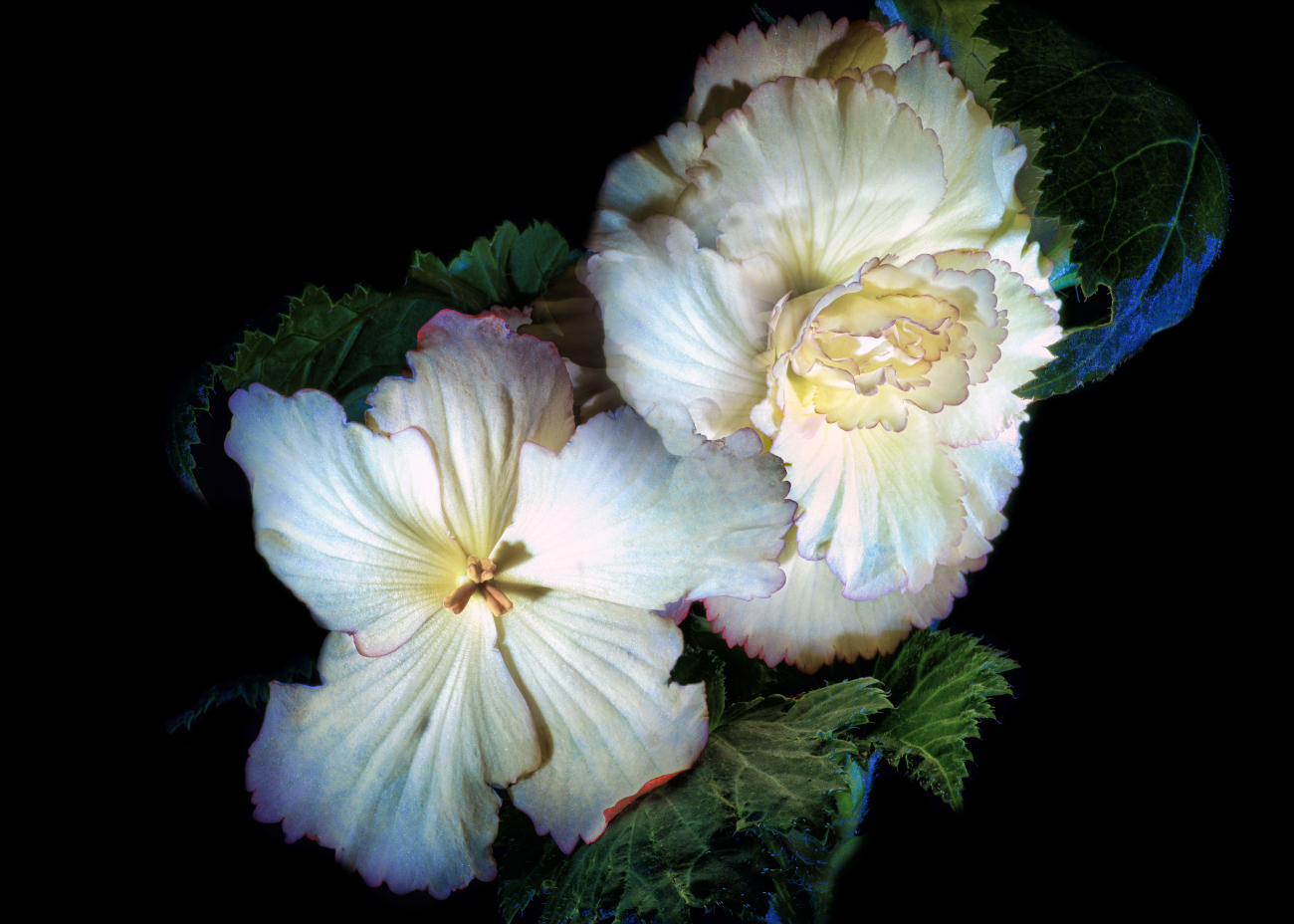
Hi Rich, I do agree with Kathryn that there is a colour cast on these flowers. I have taken the liberty of doing a colour balance and believe that it has brought out it's original colour. I have photographed (few years back now) many begonias and do recall a white with pink edging like this one. I've left the green leaves around it. |
Mar 15th |
 |
| 80 |
Mar 23 |
Comment |
Hi Syed, I think you've handled this well and applying the oil paint filter make the flower more artistic. I do agree with the other comments that to make the centre flower stand out more is to blur the background and make it darker. The white parts in the background takes away from the beauty of the flower and it would be easy to darken those parts. |
Mar 15th |
| 80 |
Mar 23 |
Comment |
Doug, I find your image facinating and etheral / ghost like. I do share other comments about cropping but I would be inclined to crop the top end and retain all of the bottom part as that's the focal point of the image. I wonder what it would look like if the prism image was taken at night?
|
Mar 15th |
| 80 |
Mar 23 |
Reply |
Bob, I preferred the black background. I find that the white background makes me look more at the outer parts of the flower and takes away me from the focal point which is centre part. It also does not add to the artistic idea. I do agree with Rich that you could slighly blur the outer parts which would make the centre piece stand out more. I think that the flower being in the centre works here because of its surrounding parts. |
Mar 15th |
| 80 |
Mar 23 |
Reply |
Thank you for your kind comments. |
Mar 15th |
| 80 |
Mar 23 |
Reply |
Doug, thanks for your feedback, I appreciate your comments. Just want to let you know that I had the white balance on "shade" (about 7,500 Kelvin) and that is the reason for the purpole colour of the flower. I did a white balance correction in Camera Raw and brought it back to the original colour. Most of the Agapanthus flowers in my garden are blue. If you look at the original casing, there's green colour there and all I did is bring that out more via saturation and colour contrast. I wanted to highlight the detail in the casing. |
Mar 15th |
| 80 |
Mar 23 |
Comment |
Bob, I don't know what to say about your image excpet that I think the colours are just lovely. They complement well and your use of a black background sets the image off perfectly. Again your use of the paint filter works well. |
Mar 12th |
| 80 |
Mar 23 |
Comment |
Hi Kathryn, beautiful image and you've done an excellent job in blending the elements together. I like the very fine "frame" around it, it sets if off. Well done. |
Mar 12th |
| 80 |
Mar 23 |
Reply |
Hi Kathryn, thank you, I appreciate your feedback. |
Mar 12th |
| 80 |
Mar 23 |
Reply |
Thank you for your feedback Bob |
Mar 12th |
6 comments - 6 replies for Group 80
|
12 comments - 10 replies Total
|


