|
| Group |
Round |
C/R |
Comment |
Date |
Image |
| 41 |
Nov 22 |
Comment |
Brad, I agree with Tom, you have blended these images well and have retained the colours - doesn't appear like a composite at all. |
Nov 11th |
| 41 |
Nov 22 |
Comment |
Tom, I think the way you created the symmetry of the subway is very believable and I like the tone, the light brown with the saturated colours of the graffiti . I prefer the original, I think the placement of the two models with their "goodbys" is fine and tells the story. The other with the many "Toms" looks out of balance to me because if the man is repeated many times, then so should the woman be repeated to create balance, each in the opposite site - then it would be the story of the "many goodbys" - cheers |
Nov 11th |
| 41 |
Nov 22 |
Reply |
Brian, there are so many possibilities with this style of image and I'll take note of your suggestions. Thank you for your comments. |
Nov 11th |
| 41 |
Nov 22 |
Comment |
Brian, I truly have to say that your "original" is just lovely with the feel of a traditional painting. I like how the white flowers come out of the windows and the blue flowers surrounding the old car. Just lovely. Did you use the oil paint filter in photoshop? |
Nov 10th |
| 41 |
Nov 22 |
Comment |
Hi Brad, I'm pleased that you like Brooke Shaden's images, they are haunting and she's a wonderful composer. Many thanks for your comments, I'm happy with the image but agree that aspects could be further enhanced. As always, all compositions have the flexibility of change and improvements. |
Nov 10th |
| 41 |
Nov 22 |
Reply |
Brian, I'm so pleased that you enjoyed your trip to Tasmania and the weather is similar to the UK, especially the southern part. I've been to the UK a number of times, especially in summer and found it a beautiful country. Thank you for your comments about the image and it looks like it has worked if you're drawn to the dark enterance of the tree. The model slightly holding her dress is suppose to indicate her hesitation. |
Nov 10th |
| 41 |
Nov 22 |
Reply |
Tom, Thanks for your comments and I see your point, the original is not as dark. I think it's the compression that makes it darker than the PSD file. |
Nov 10th |
4 comments - 3 replies for Group 41
|
| 80 |
Nov 22 |
Comment |
Hi Kamal, I'm sorry to hear about your health and hope that you're recovering well.
I do like your BW conversion and it gives the rose a completely different look. Thank you for taking the time to comment. |
Nov 28th |
| 80 |
Nov 22 |
Comment |
Kathryn, this image reminds me of the many images I have taken without too much success of bees on flowers, especially on salvias. The crop Rich has made does make the bee the focal point. I use a 100mm canon macro lens on a crop sensor giving me roughly 140mm. Settings generally Shutter priority at 1/2000 sec, ISO 2000-3000 with f8 or f11 on continuous shoot. |
Nov 17th |
| 80 |
Nov 22 |
Comment |
Hi Rich, a very interesting presentation of the orchid. For me it has a ying/yang feel to it - opposite but conntected. I think your approach works well and do agree with Jacob that a thin border would not only enhance the image but give it more of an interconnected and whole look. |
Nov 17th |
| 80 |
Nov 22 |
Comment |
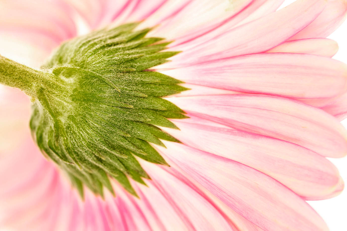
Jacob, this is such a lovely image, what draws me is the way the sunlight lights the petals from the back. It really shapes the petals and gives them character, some are dark, some light and you can even see the veins in others. I've just blurred the background a bit more and darkened it at about 50% opacity using curves adjustment layer in PS with the multiply blend mode to make the petals stand out more. |
Nov 12th |
 |
| 80 |
Nov 22 |
Reply |
Doug, thanks for your thoughtful comments, I see what you mean about obscuring the stem and so have reduced the opacity of that section to 50%. I think it's a good compromise. |
Nov 12th |
 |
| 80 |
Nov 22 |
Comment |
Doug, I really like this composition showcasing a different perspective of a flower. I believe that the focal point is not the petals but the stem and the base of the flower. If that's the case, then I would suggest you darken the stem and base and "bleach" the petals to the point where you just have pink outlines. I think that would give it a different look. Hope you don't mind "editing" your image. |
Nov 7th |
 |
| 80 |
Nov 22 |
Comment |
Bob, that's so bold, I must say, it made me look at it in more detail and in doing so, the image has achieved the objective of forcing a viewer to look at it in depth! I do think that the strength of the background colour competes with the flower and so agree with Kathryn that it could be scaled back. |
Nov 7th |
| 80 |
Nov 22 |
Reply |
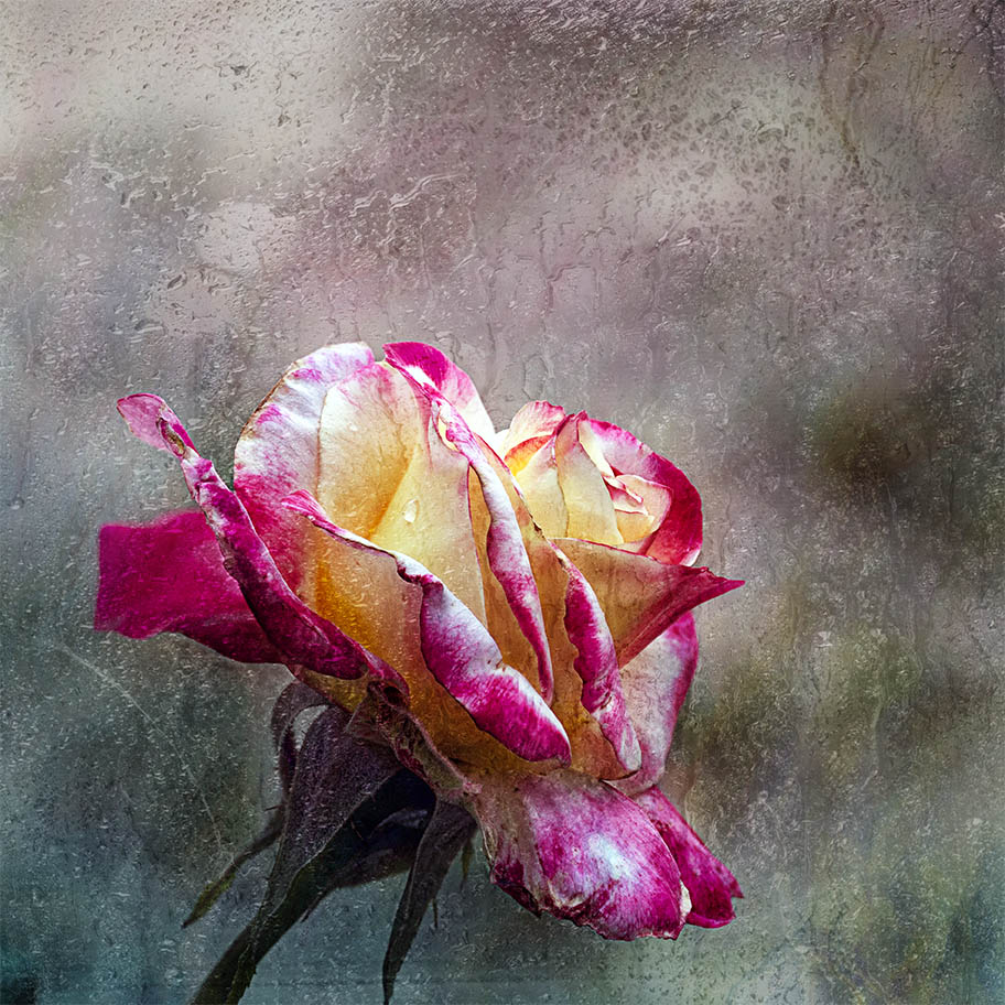
Bob, I like Kathryn's comment and so have incorporated that in the revised verion in my esponse to Rich, his suggestion made sense and so used another image with more rain on it. |
Nov 7th |
| 80 |
Nov 22 |
Reply |
I agree Kathryn, having taken your advise, I posted a revised version in my response to Rich. Appreciate the feedback. Cheers
|
Nov 7th |
| 80 |
Nov 22 |
Reply |
Hi Rich, I agree, I initially had misgivings. Anyway, having gone back to my files, I found another one that gives the impression of the rain being in front of the rose. The other one wasn't "wet enough"
|
Nov 7th |
 |
6 comments - 4 replies for Group 80
|
10 comments - 7 replies Total
|


