|
| Group |
Round |
C/R |
Comment |
Date |
Image |
| 73 |
Jan 22 |
Reply |
Thanks for the comments - have given it a shot and think I like it cropped as suggested. Tom |
Jan 19th |
 |
| 73 |
Jan 22 |
Comment |
And I always thought it was bright blue skies in California! I think a little more contrast might help the image "pop" and show off the swans doing what they do best. |
Jan 19th |
| 73 |
Jan 22 |
Comment |
My first thought was this was a Thomas Kincade painting - the pastel coloration and overall soft and moody feeling. Very nice overall image.
Contrary to Debbie - I might try to crop up slightly from the bottom. That cluster of green at the bottom center caught my eye - and blocking it out lets me personally roll right in to the rest of the image.
|
Jan 19th |
| 73 |
Jan 22 |
Comment |
If only the sun had given you a puff of color on the horizon. For me - I would have probably gone with longer exposure to get the blurred water look even smoother while having the rocks perfectly in focus as you did.
Nice image!
|
Jan 19th |
| 73 |
Jan 22 |
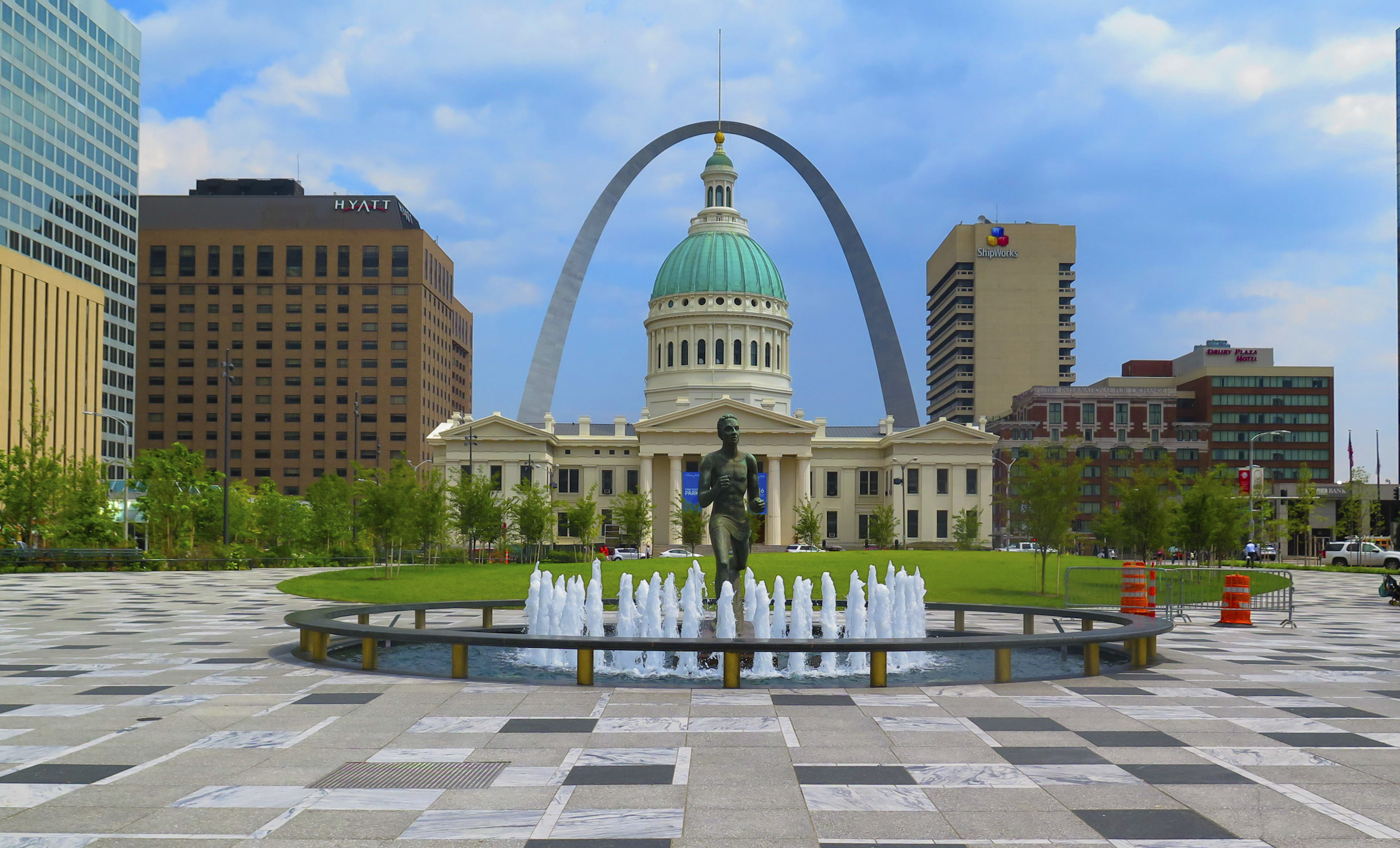
Comment |
I also like the bold colors, the composition with the lines in the walk, and the vibrance and life of the city.
The only piece I find distracting or overpowering is the large blue Monorail post on the right side. I would try cropping it out so that the eye then wanders all the way into the scene. When I full screen the image - I keep getting stuck trying to read the information on the Monorail post. |
Jan 19th |
| 73 |
Jan 22 |
Comment |
Love the image and wish the location was near me. I can almost hear the water cascading down and splashing at the bottom.
My personal preference on waterfalls is always to go for long exposures - and I get the stereotypical blurry water image that everyone else does. I like the water exposure - but feel like the highlights are almost too high giving off an almost HDR type of result. |
Jan 19th |
5 comments - 1 reply for Group 73
|
5 comments - 1 reply Total
|