|
| Group |
Round |
C/R |
Comment |
Date |
Image |
| 20 |
Mar 24 |
Comment |
Good job Fred...I think you have achieved what you wanted...agree with the suggestions made by others too. Well done! |
Mar 11th |
| 20 |
Mar 24 |
Comment |
Great shots of Swan...I feel that if you had a bit more details and contrast on the wings / feathers, it would make them stand out better against the white background. just a thought because, at first glance, the swans seem to merge with the white background. |
Mar 11th |
| 20 |
Mar 24 |
Comment |
Nice job! I like your original stacked image too. The treatment you have given, especially with the vignette, makes the final image pop! Well done! |
Mar 11th |
| 20 |
Mar 24 |
Comment |
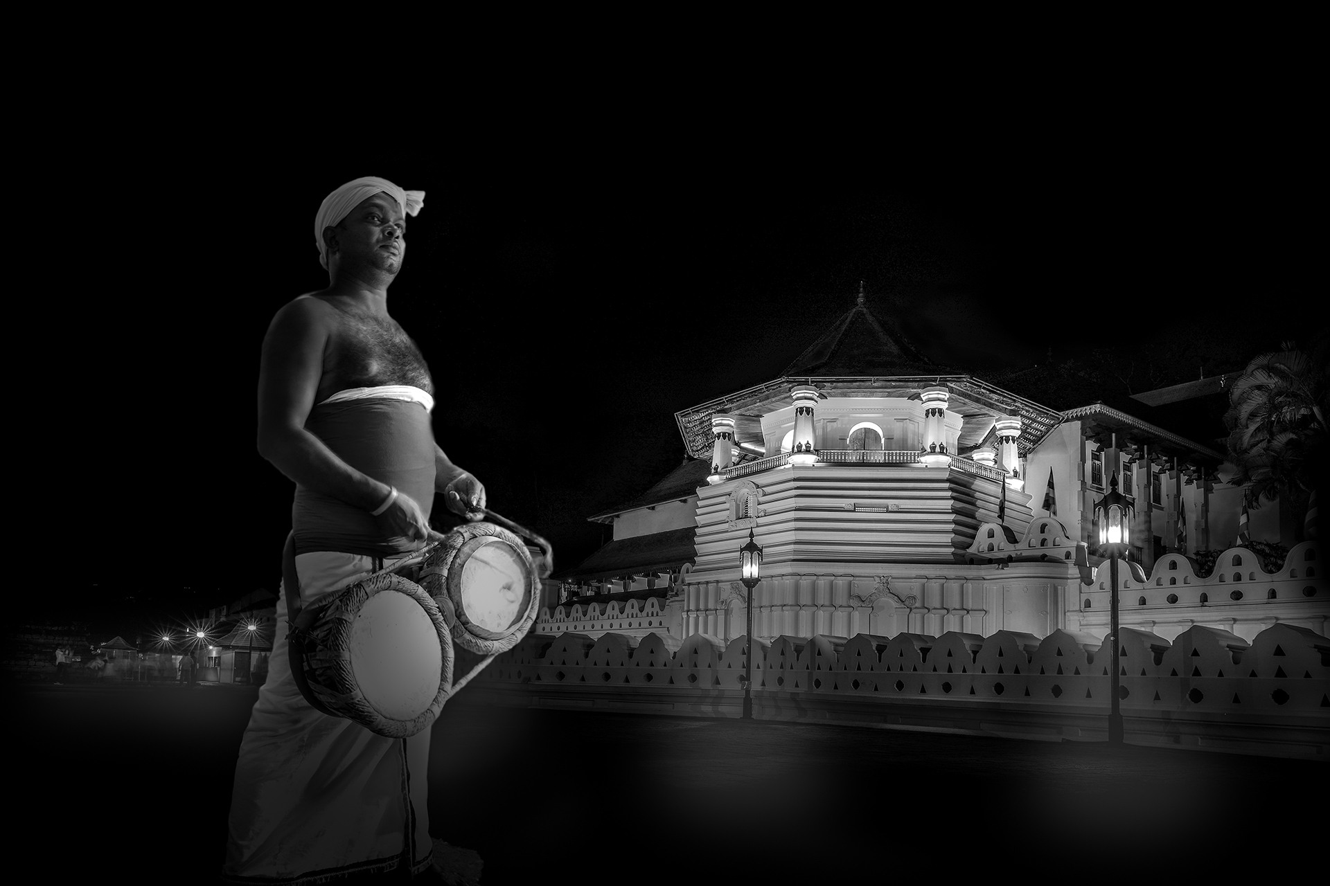
Very interesting composition. While I like what you have done, when I look at the scene as a whole, I feel that there is something amiss. The three images you have used have different lighting sources and directions, and therefore, the colors, light, and shade of the final composite do not match. Perhaps if you used a different image for the sky, you could make this more cohesive and stronger. |
Mar 11th |
| 20 |
Mar 24 |
Reply |
Thanks. I agree with your point about the figure on the right...thanks again! |
Mar 11th |
| 20 |
Mar 24 |
Reply |
Thanks... |
Mar 11th |
| 20 |
Mar 24 |
Reply |
Thanks Angela! |
Mar 8th |
| 20 |
Mar 24 |
Reply |
Thanks Fred! |
Mar 8th |
4 comments - 4 replies for Group 20
|
4 comments - 4 replies Total
|