|
| Group |
Round |
C/R |
Comment |
Date |
Image |
| 20 |
Jan 24 |
Comment |
Very creative! Well done!
I too think the image will benefit from what Peter has suggested. Basically, a darker background could make the image pop. Having said that, as the author, if your idea was to have a dreamy look, then what you have done is right. Well done! |
Jan 30th |
| 20 |
Jan 24 |
Comment |
Hi Angela, beautifully done! I like the original version too. Perhaps, the background colour of the final image takes away the impact...a darker shade of brown or black for the background? Just thinking aloud!!
Great job!
|
Jan 30th |
| 20 |
Jan 24 |
Comment |
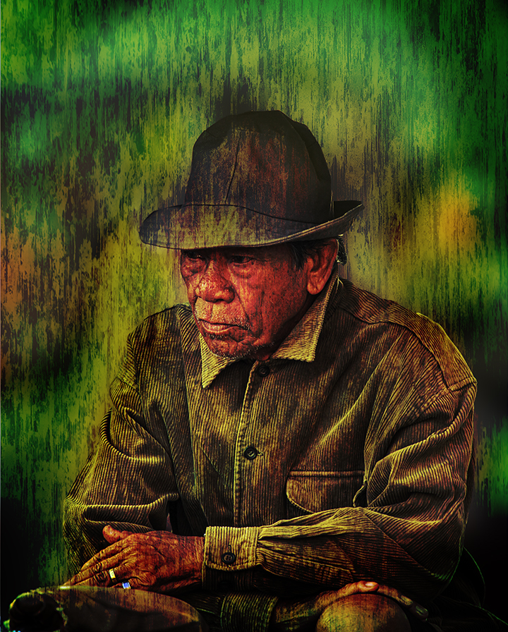
Nice job as always Fred. Nice concept too.
I agree with Angela about the bird's head being a bit too dark...I would also suggest larger font size for the wording. |
Jan 30th |
| 20 |
Jan 24 |
Comment |
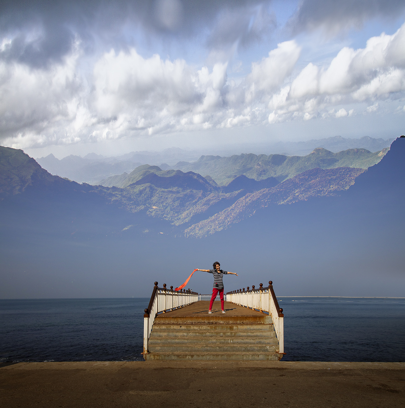
Hi Fran, a nice story and a great job!
If I may suggest, you might want to shift the car slightly to the left, as it looks as if the left front wheel is almost touching the steel guard rail. I also think the image will be much better and more cohesive if you tone down or match the green and brown patches of grass to the general colours of the scene. Some "snow" on the guard rails to tone down the brown will also help.
Overall, an excellent idea, and a well-crafted image. Well done! I look forward to seeing more of your work.
|
Jan 30th |
| 20 |
Jan 24 |
Comment |
Hi Peter, I really like what you have done with your original and the stained glass version. Very different and unique approaches, I might add.
My only suggestion is really on the stained glass version, where I think the design / shape of the flowers you had in your original seem to have gotten less defined because the colour appears to have seeped to the adjacent pieces of glass.
Great job! Very creative. |
Jan 30th |
5 comments - 0 replies for Group 20
|
5 comments - 0 replies Total
|