|
| Group |
Round |
C/R |
Comment |
Date |
Image |
| 20 |
Oct 23 |
Reply |
Thanks Shirley! |
Oct 22nd |
| 20 |
Oct 23 |
Reply |
Thanks Bob! |
Oct 19th |
| 20 |
Oct 23 |
Reply |
Thanks Deborah!
|
Oct 16th |
| 20 |
Oct 23 |
Reply |
Thanks Angela! |
Oct 7th |
| 20 |
Oct 23 |
Comment |
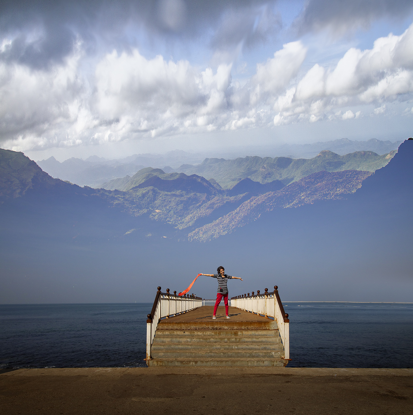
Hi Bob, I like what you tried to create.
One of the main challenges in creating composites (especially of landscapes, buildings and people) is getting the horizon lines (visible or imaginary)of the selected images to match. The two images used here do not match in that context, as one is shot pointing the camera down, and the other pointing up.
I tried a very quick edit, just to illustrate how these two images could be used and match the horizon lines. I have basically squashed the image of the sea and the jetty, to match an imaginary horizon line for the lighthouse.
Hope this helps.
|
Oct 6th |
 |
| 20 |
Oct 23 |
Comment |
Hi Angela, very creative! Really like what you have done in layering, and color adjustments.
Well done! |
Oct 6th |
| 20 |
Oct 23 |
Comment |
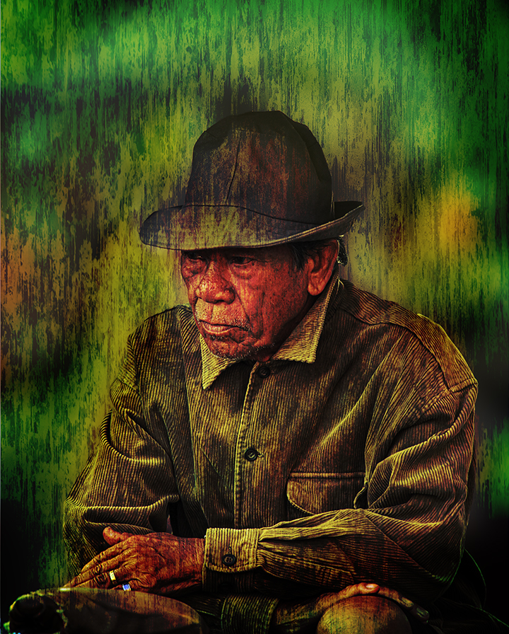
I really like what you have created. Lovely bright colors, draws you in immediately. The abstract lines and shapes, keep you engaged trying to interpret what it is...Having said that, I am curious to know if the slight blur or displacement I see (of the lines and shapes) was intentional? I wonder if you had less blur or displacement, if it would make the image more engaging?
I am not familiar with Corel Painter or Topaz, but am amazed at what you have created. Well done. |
Oct 5th |
3 comments - 4 replies for Group 20
|
3 comments - 4 replies Total
|