|
| Group |
Round |
C/R |
Comment |
Date |
Image |
| 20 |
Jul 23 |
Reply |
Thanks Fred! |
Jul 24th |
| 20 |
Jul 23 |
Reply |
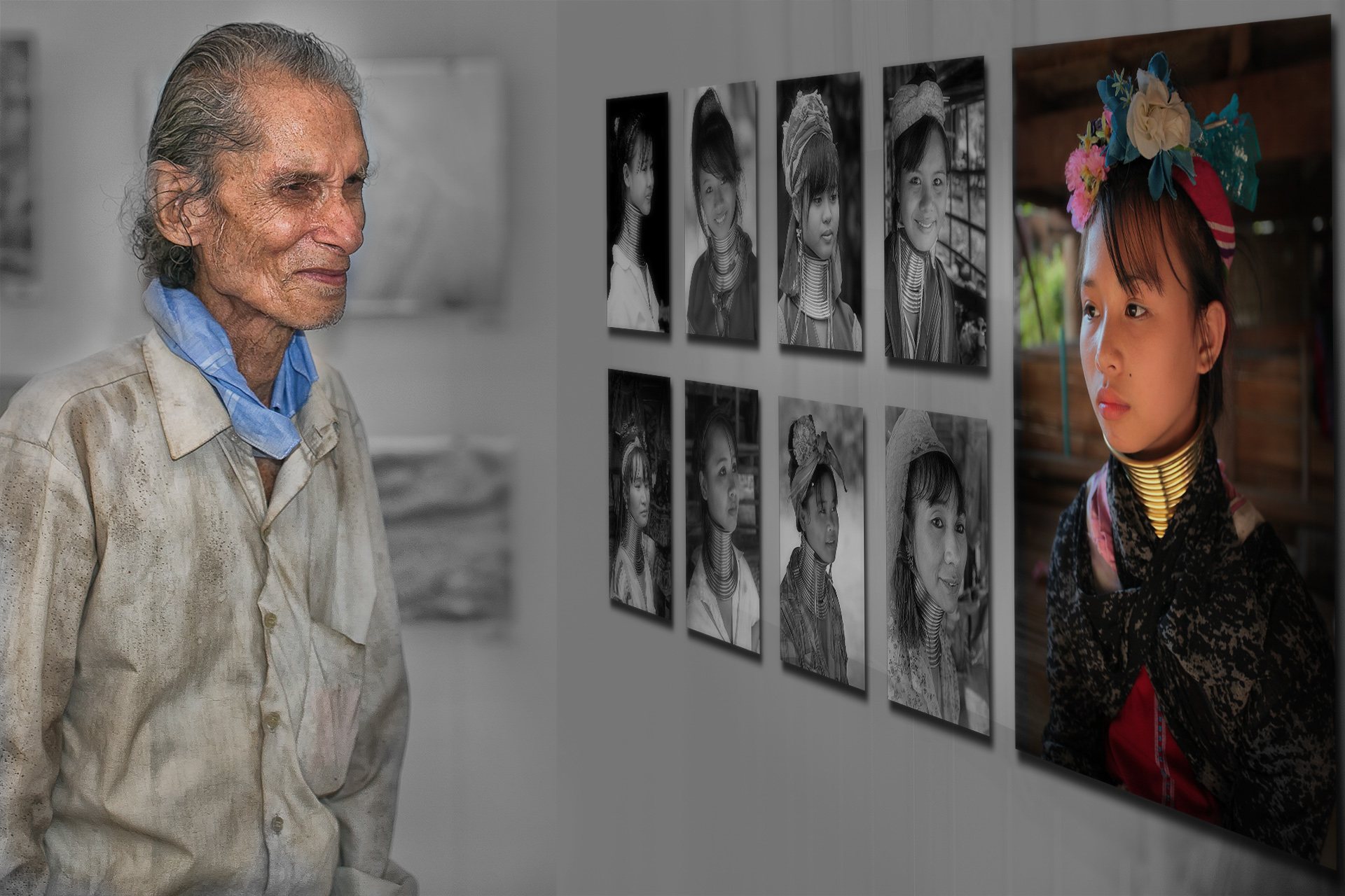
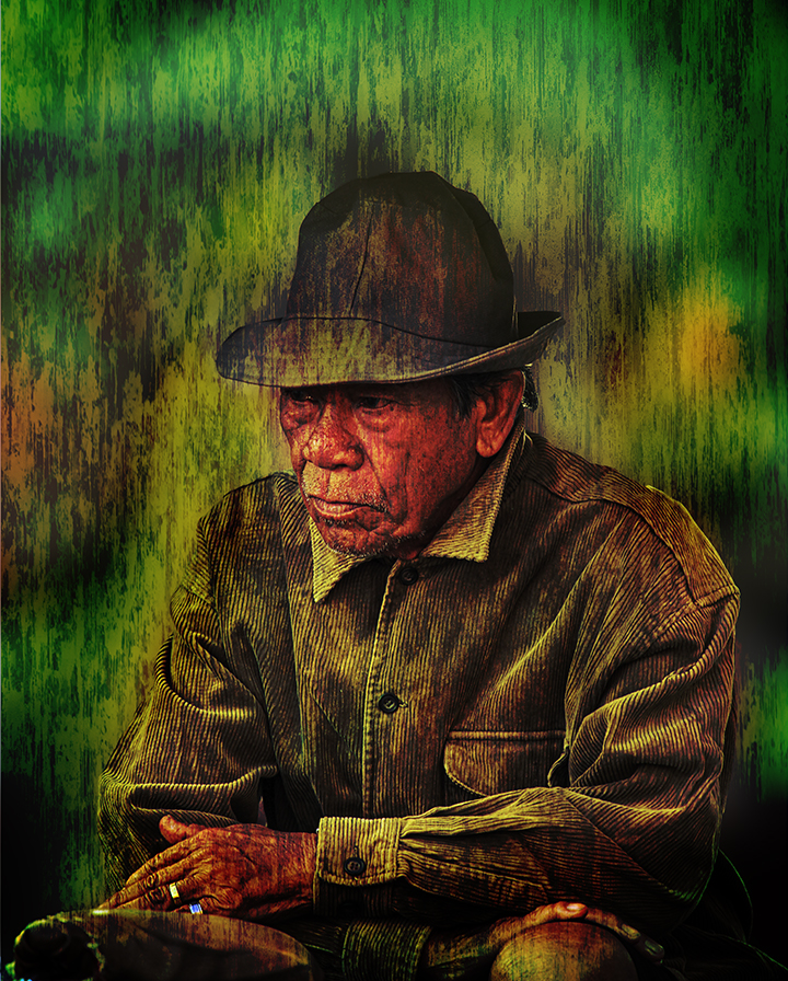
Hi Peter...thanks for trying out and sharing.
in my composition, I kept almost the same subject distance to the wall...but, originally he was looking at an image which was placed in the bottom row, more towards the camera. That is why in my composite the girl in colour is double the height of the other girls, and I intentionally cropped that image to be in the general area where his eyes were focussing on the girls face. But, I still wish I had a slightly different angle of his face, which sadly I don't have.
When you move him closer, his gaze is somewhere else and you loose the connection... |
Jul 11th |
| 20 |
Jul 23 |
Reply |
Thanks Peter...I too wish I had another image of the man closer to the wall! |
Jul 10th |
| 20 |
Jul 23 |
Comment |
Welcome to DD20.
I like your thought process in creating this image. I too feel that the oversaturated colours of the corals are competing for attention, taking the attention away from your main subject. It is better to focus on the theme / idea and pay more attention to them...treating each element in a way it helps convey your idea to the viewer.
In art there is no right or wrong, but my first reaction was how can a fish have a reflection, until I read the title again! Very clever!
|
Jul 8th |
| 20 |
Jul 23 |
Comment |
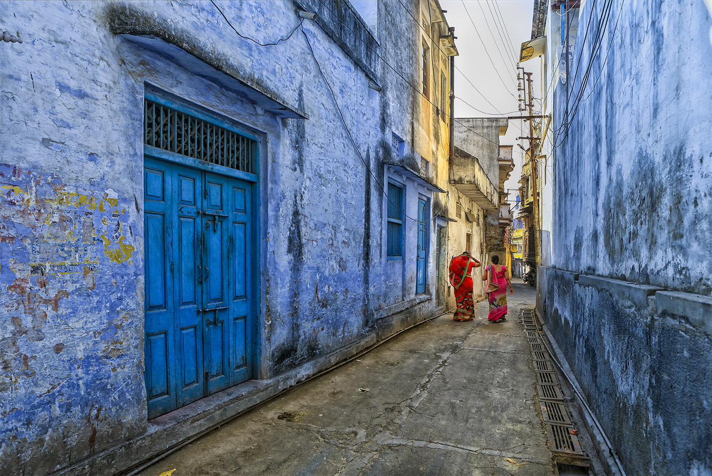
Wow...you have got some great set of images that can be used individually as backgrounds in composites. I hope you have a larger frame of each image with the walls etc...personally I am more attracted to the colour images, especially the 3rd...which has a lot of character.
Well done with the collage...agree with Bob and Angela about perspective correction. |
Jul 8th |
| 20 |
Jul 23 |
Reply |
This is definitely better, keeping the eye more in the middle of the image... |
Jul 8th |
| 20 |
Jul 23 |
Reply |
Thanks! |
Jul 8th |
| 20 |
Jul 23 |
Reply |
Thanks!
|
Jul 8th |
| 20 |
Jul 23 |
Reply |
Yes, I do agree that the man should have been closer and I wish I had a slightly different angle which would have made his gaze more direct towards the girl. Thanks for the feedback. |
Jul 8th |
| 20 |
Jul 23 |
Comment |
Cider looks a mischievous bundle of joy! Good sharp images, and a very creative way to represent what must be going through Cider's mind...well done! |
Jul 2nd |
| 20 |
Jul 23 |
Comment |
Another great piece of creativity and art. Well done...
Get well soon! |
Jul 2nd |
| 20 |
Jul 23 |
Comment |
Fantastic! I really like this image, and the colours you have chosen, which makes this image pop. Very well done...I wonder if it would look even better if you were to tone down the green patch at the bottom left? Great Job! |
Jul 2nd |
5 comments - 7 replies for Group 20
|
5 comments - 7 replies Total
|