|
| Group |
Round |
C/R |
Comment |
Date |
Image |
| 20 |
Jun 23 |
Reply |
Thanks Paul for your review and comments on my image.
Welcome to the Group! Looking forward to see your images.
|
Jun 30th |
| 20 |
Jun 23 |
Reply |
Thank you! |
Jun 18th |
| 20 |
Jun 23 |
Reply |
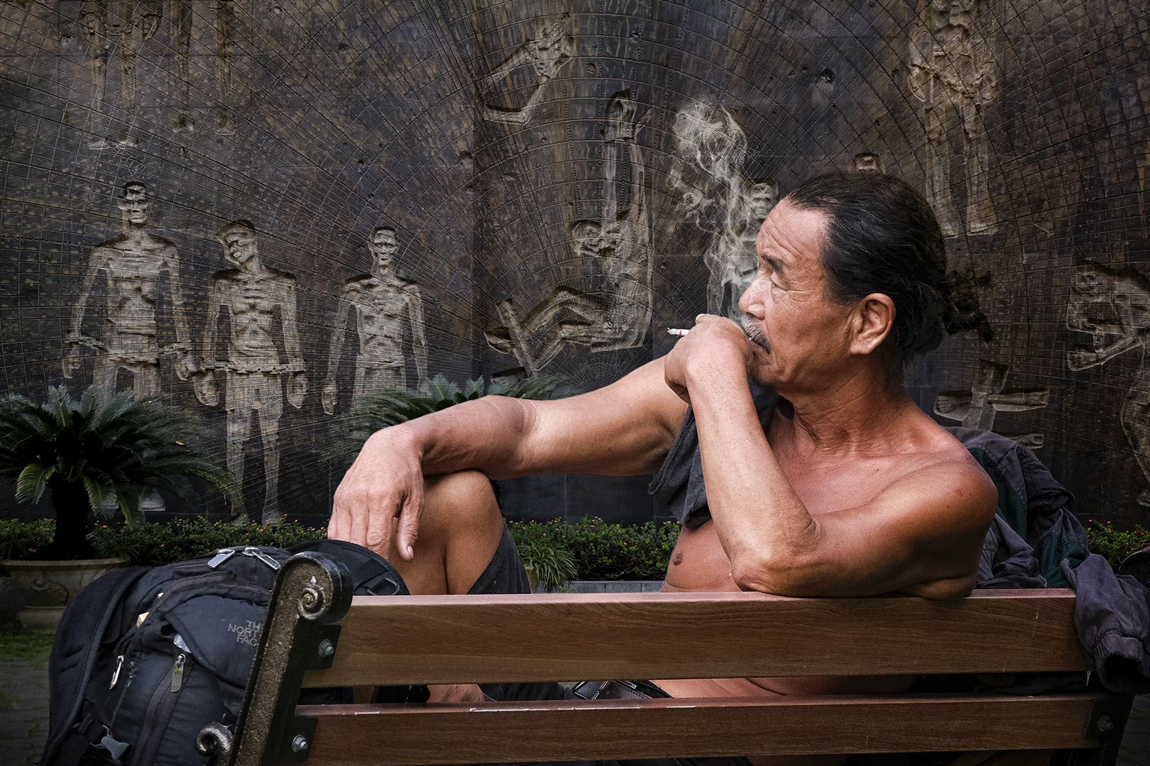
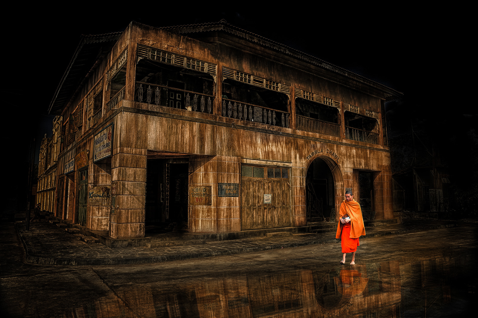
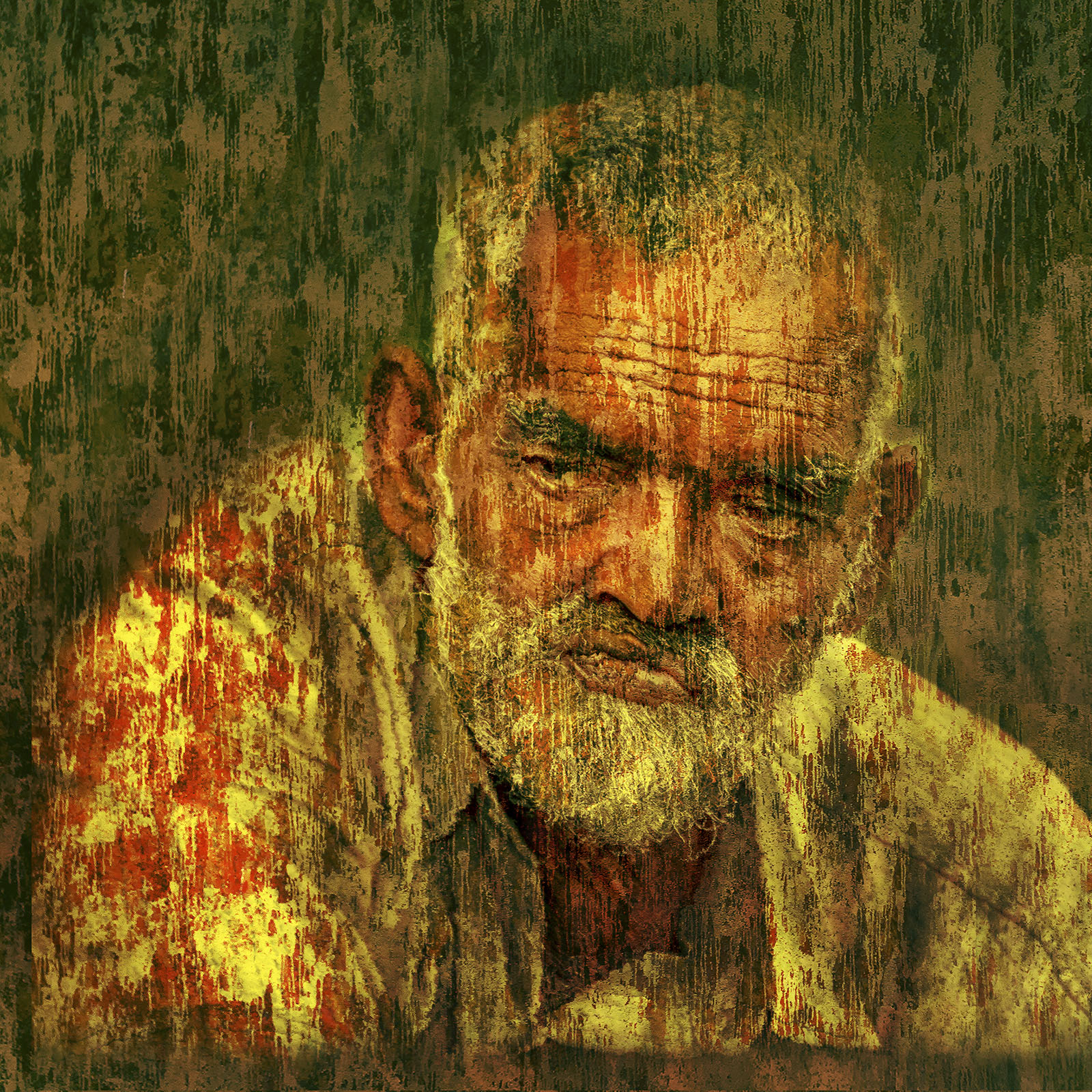
Thanks Bob...at the time we visited, a part of the Prison in Perth had been converted to a business / IT incubator while the rest was used as a tourist attraction. It was an eerie feeling going through the cells, the art the prisoners had drawn on walls, the chapel and the gallows...I guess every prison would give that feeling...Changi would not be an exception on how prisoners would see the guards. |
Jun 8th |
| 20 |
Jun 23 |
Comment |
I am just wondering if the original and the edited images got mixed up? |
Jun 6th |
| 20 |
Jun 23 |
Reply |
Thank you! |
Jun 4th |
| 20 |
Jun 23 |
Comment |
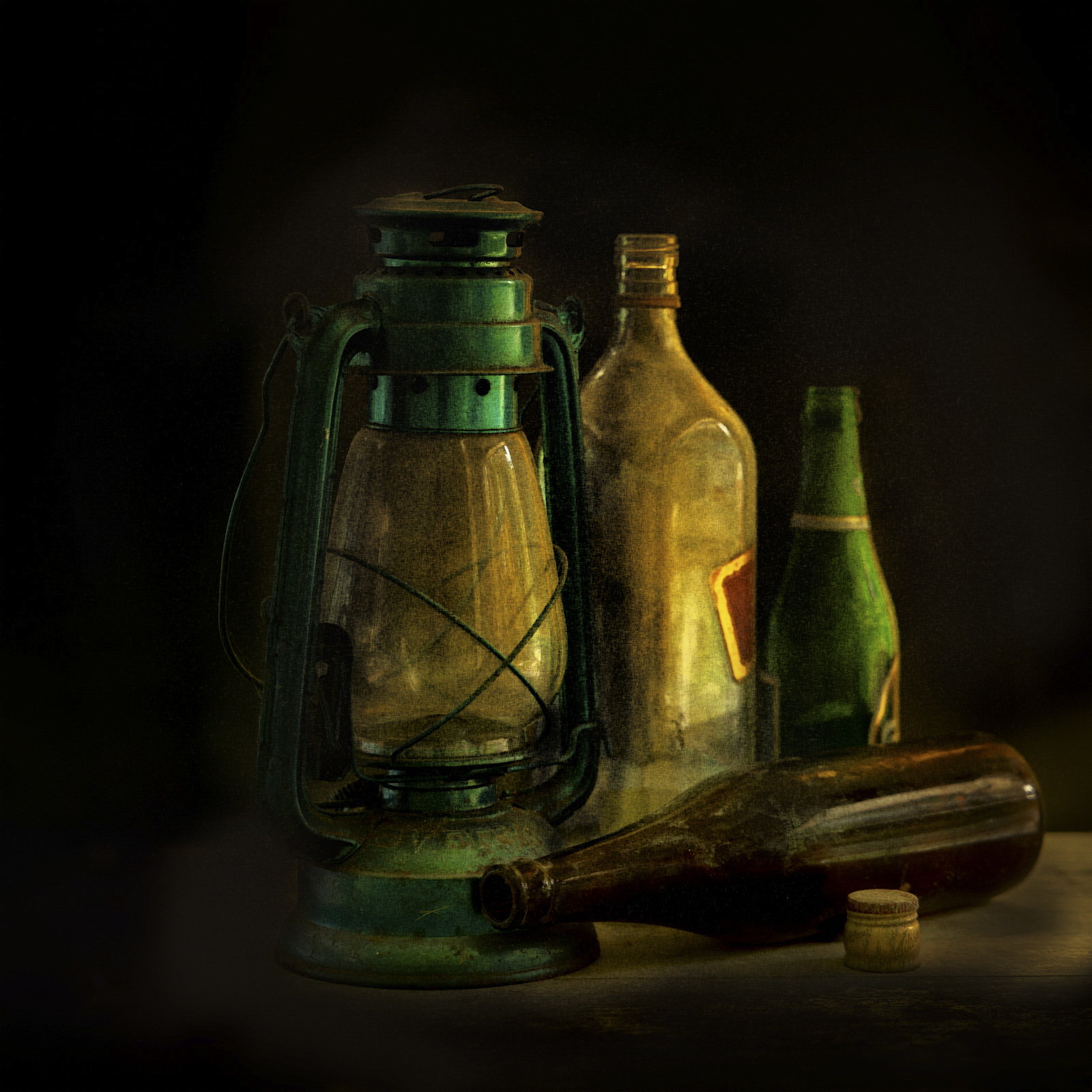
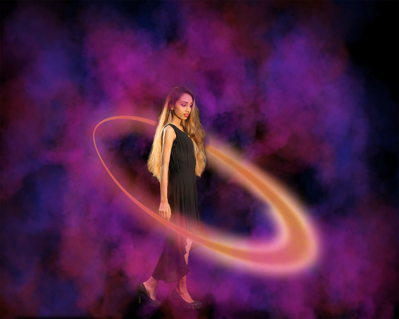
I think you have three good source images to start with. Subject placement, lighting (or direction of lighting) and the treatment you wish to give the image are areas that you need to work on. As your intention is to create a whimsical composition anything can go, but they have to work together... |
Jun 4th |
| 20 |
Jun 23 |
Comment |
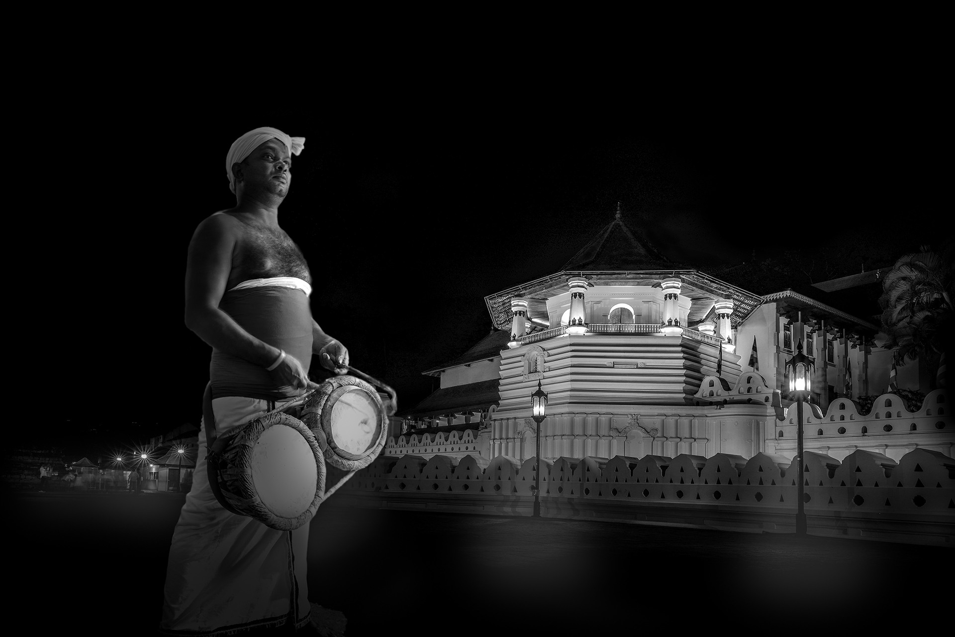
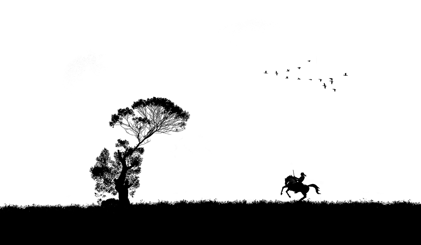
Fred, it really is mysterious...I like your creative thinking, and the depth to which you push PS layers...but for me, there are too many competing elements and contrasting lighting situations which prevents me getting the story...simplifying the image by removing all non essential items from the image and paying a lot of attention to the lighting, direction of lighting, and source of lighting could help in my humble opinion. |
Jun 4th |
| 20 |
Jun 23 |
Reply |
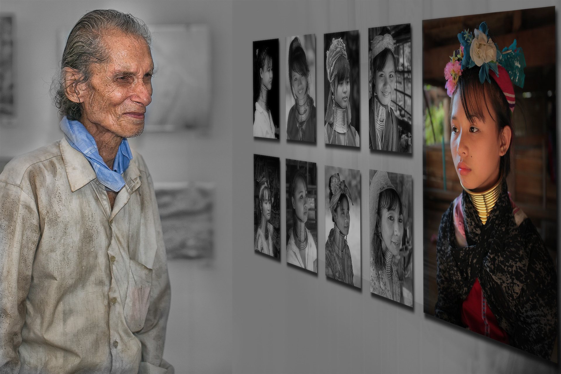
This is much better...see the area marked in the copy of the edited image...is it possible to extend/shape the top/blouse to reach the bottom of the frame? |
Jun 4th |
 |
| 20 |
Jun 23 |
Reply |
Thanks! |
Jun 4th |
| 20 |
Jun 23 |
Comment |
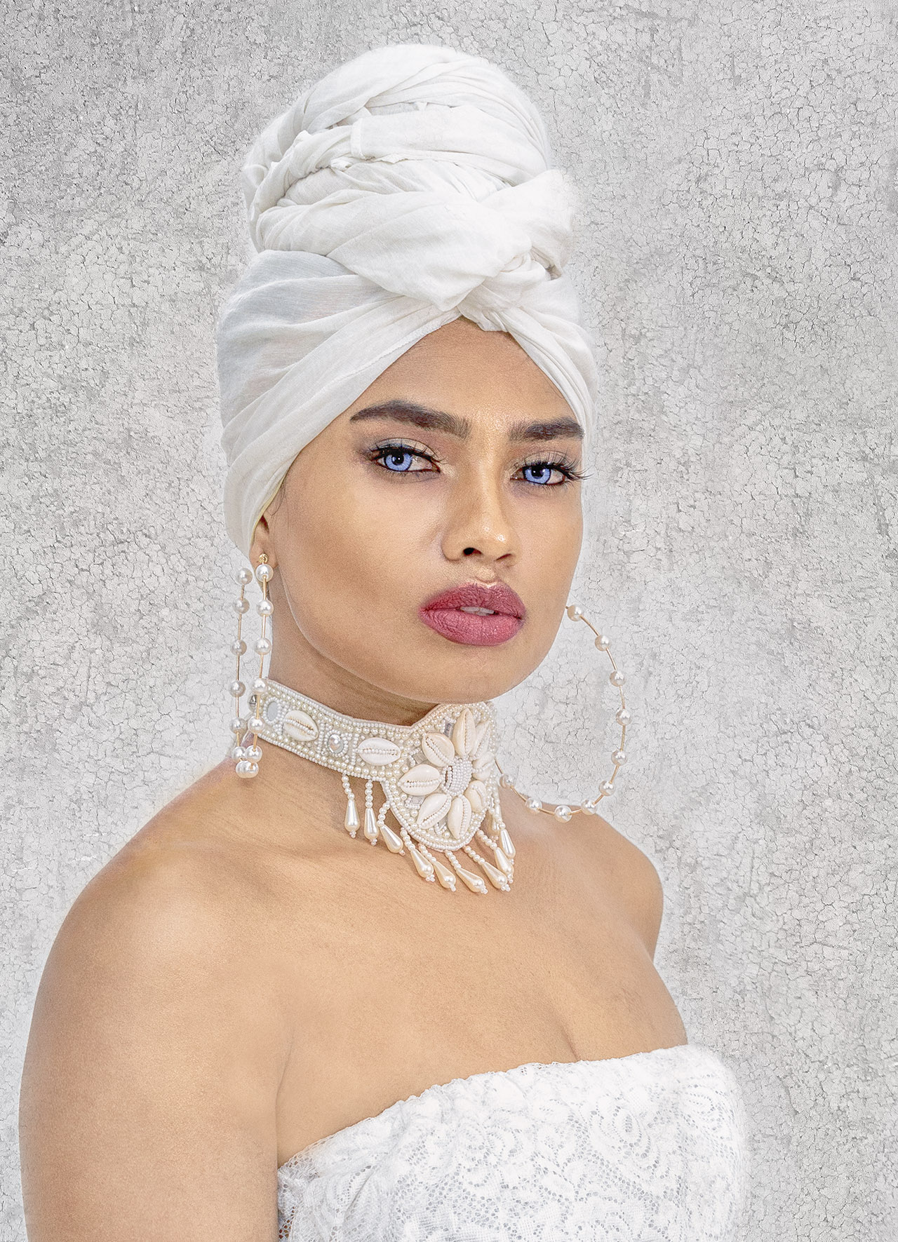
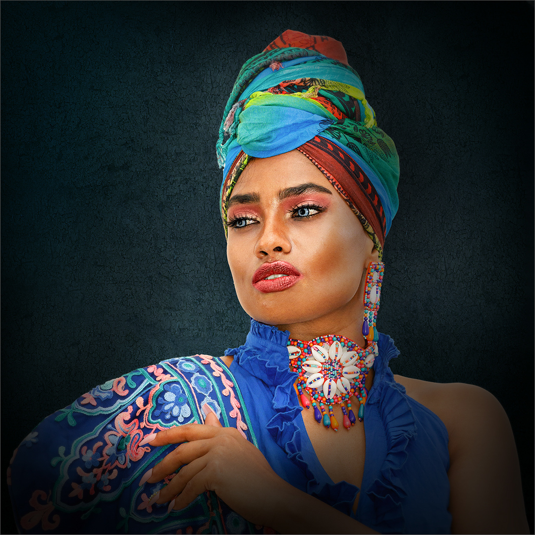
Good job...agree with Fred's suggestion. A little bit more details towards the left where the ladies top would make the image continue...that will also create a leading leading line, directing the viewers eyes towards the subject.
Good job! |
Jun 2nd |
| 20 |
Jun 23 |
Comment |
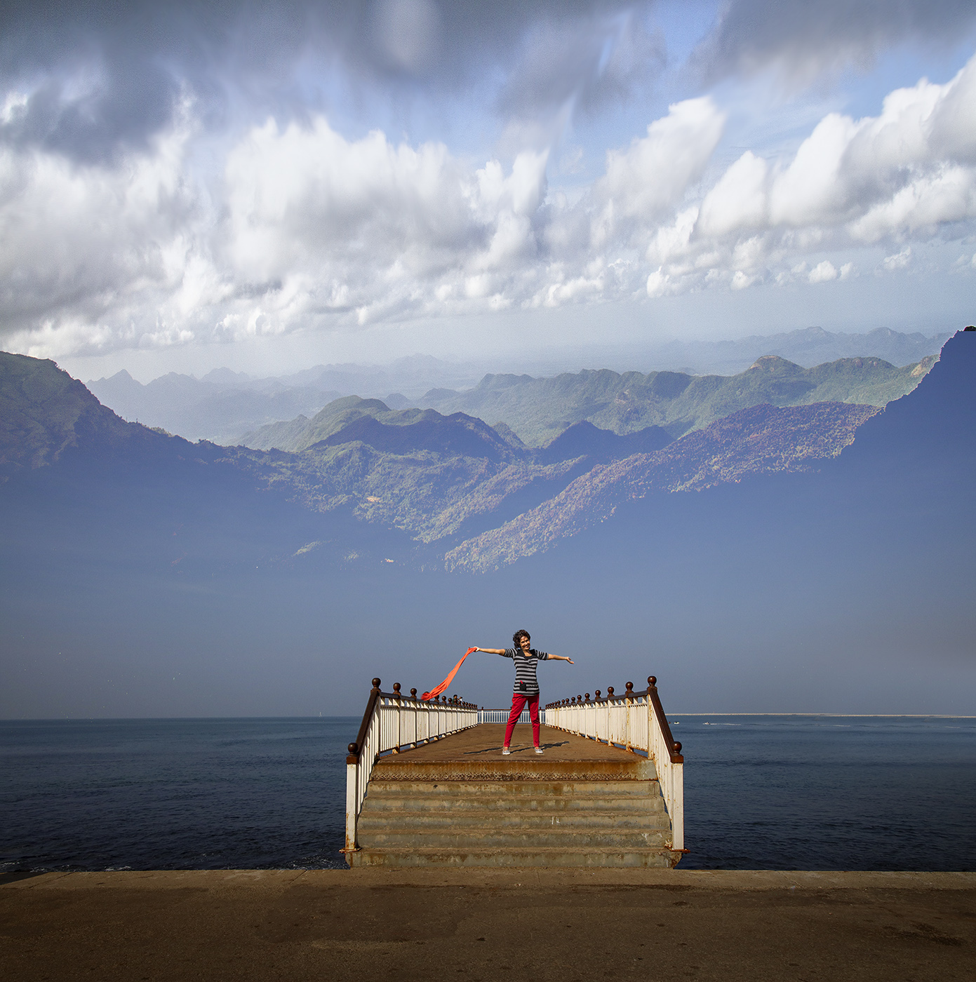
Nice collage...individually, each image is having a lot of potential for further creative expressions.
Until Fred pointed out above, I did not realize the background is your source image...
Your pictures look tack sharp. But details are not visible as the file is too small. May I suggest that your post be resized to a larger size...at least to 1600pix wide? That will make the image appear bigger on screen when clicked, and give us an opportunity to appreciate great creative work you present?
Nice collage, great pictures and well done!
|
Jun 2nd |
| 20 |
Jun 23 |
Reply |
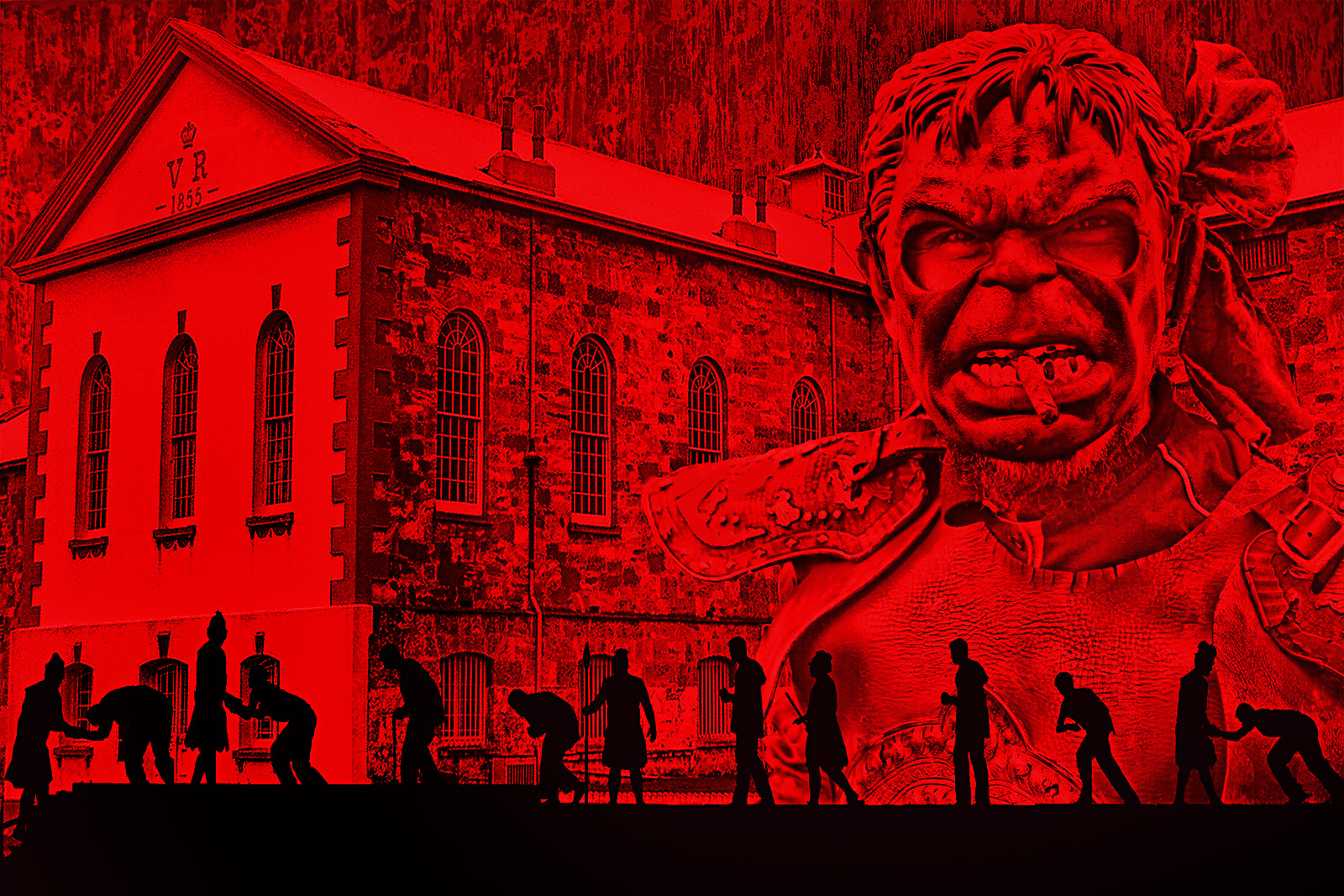
Thanks Fred...I see what you refer to about the repetition...Though they are slightly different in pose, at the first glance looks too similar. Thanks for pointing it out.
|
Jun 2nd |
5 comments - 7 replies for Group 20
|
5 comments - 7 replies Total
|