|
| Group |
Round |
C/R |
Comment |
Date |
Image |
| 20 |
Apr 23 |
Reply |
Thanks Shirley for the feedback. |
Apr 23rd |
| 20 |
Apr 23 |
Reply |
Thank you Bob for your feedback, and the very valuable suggestions and the edited image of the composite. I shall work /incorporate them. Thank you! |
Apr 15th |
| 20 |
Apr 23 |
Comment |
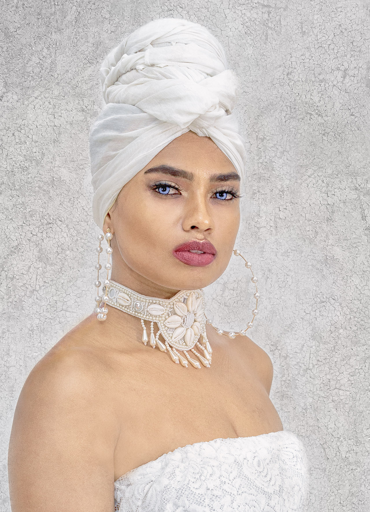
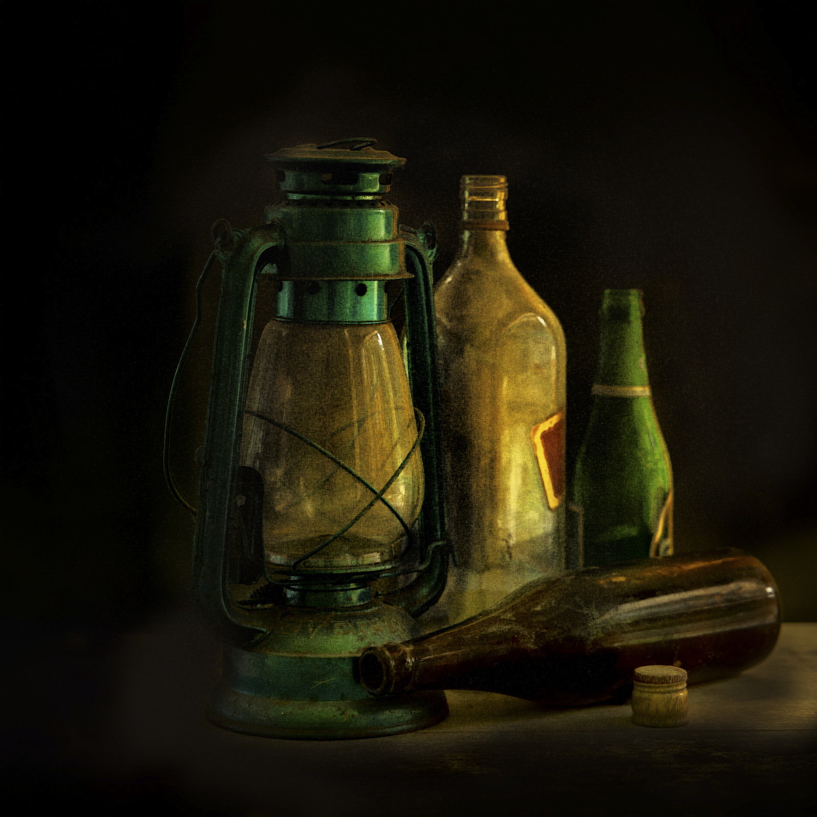
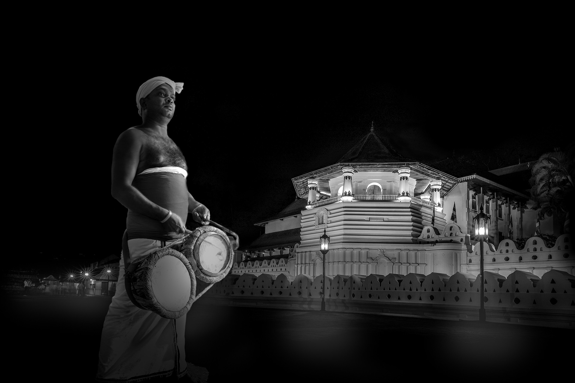
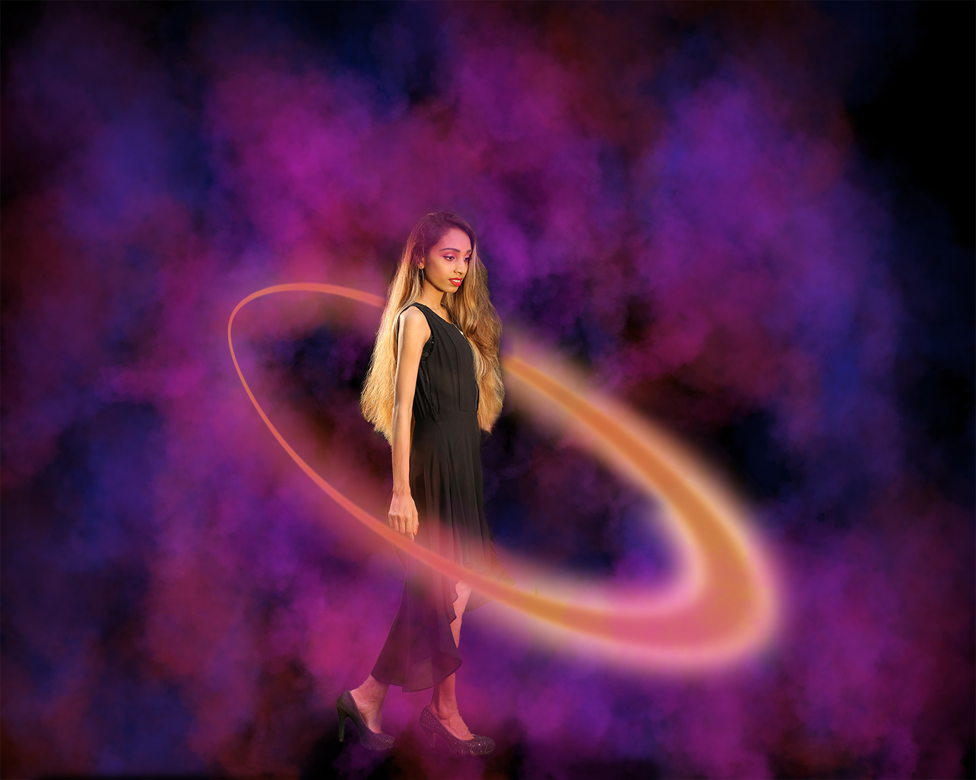
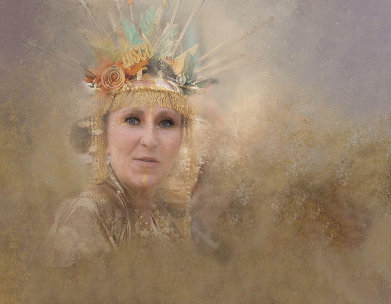
A composite with a great story...I really like the way you have added the notes which makes the whole story complete. Well done!
Yes, it was a good thing that you darkened the lower part of the image...wonder if it would be better if it is made horizontal? Notes on the dress also could be masked out...
|
Apr 6th |
| 20 |
Apr 23 |
Reply |
Thanks Fred. |
Apr 4th |
| 20 |
Apr 23 |
Reply |
Thanks Deborah. |
Apr 4th |
| 20 |
Apr 23 |
Comment |
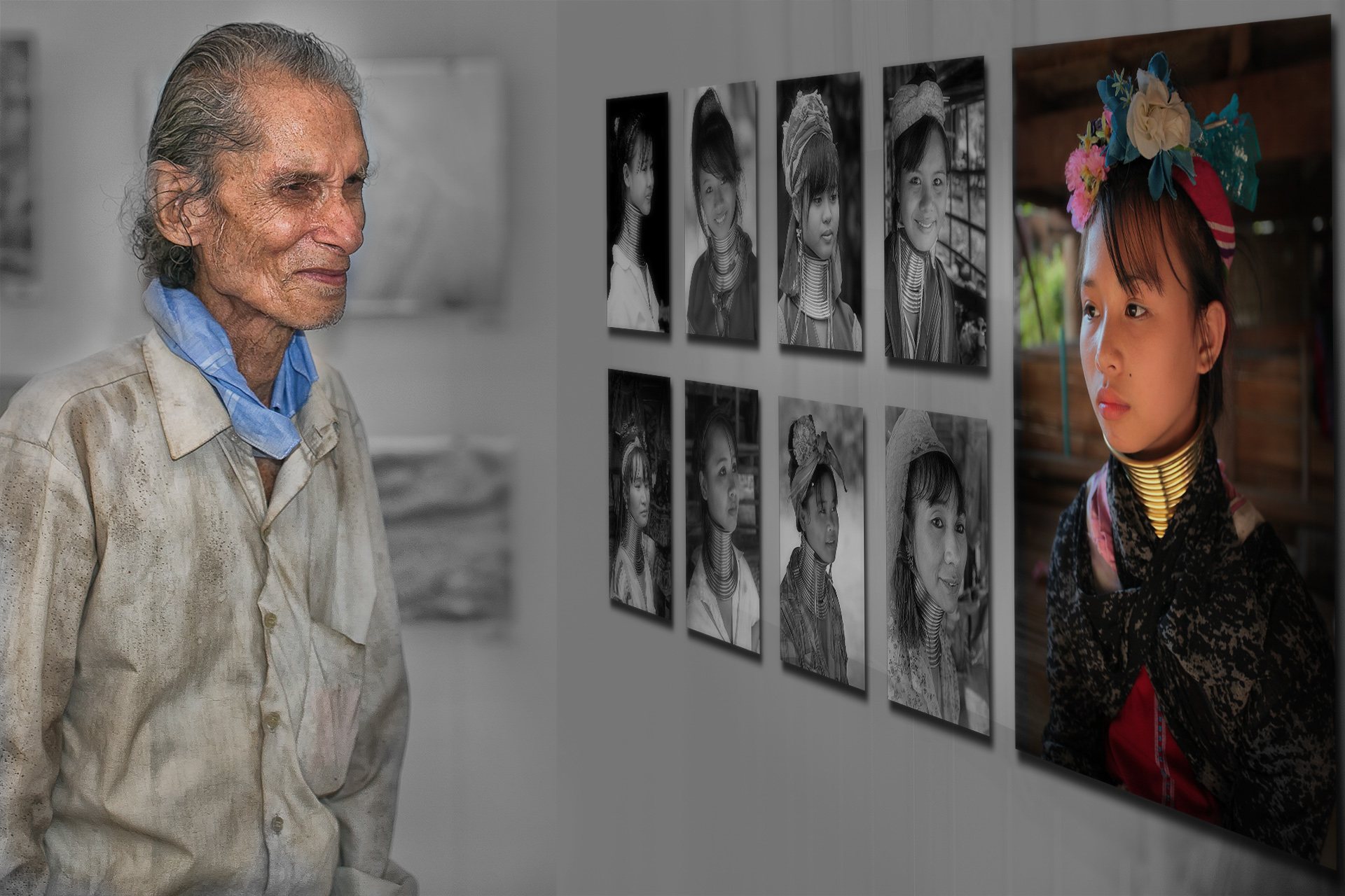
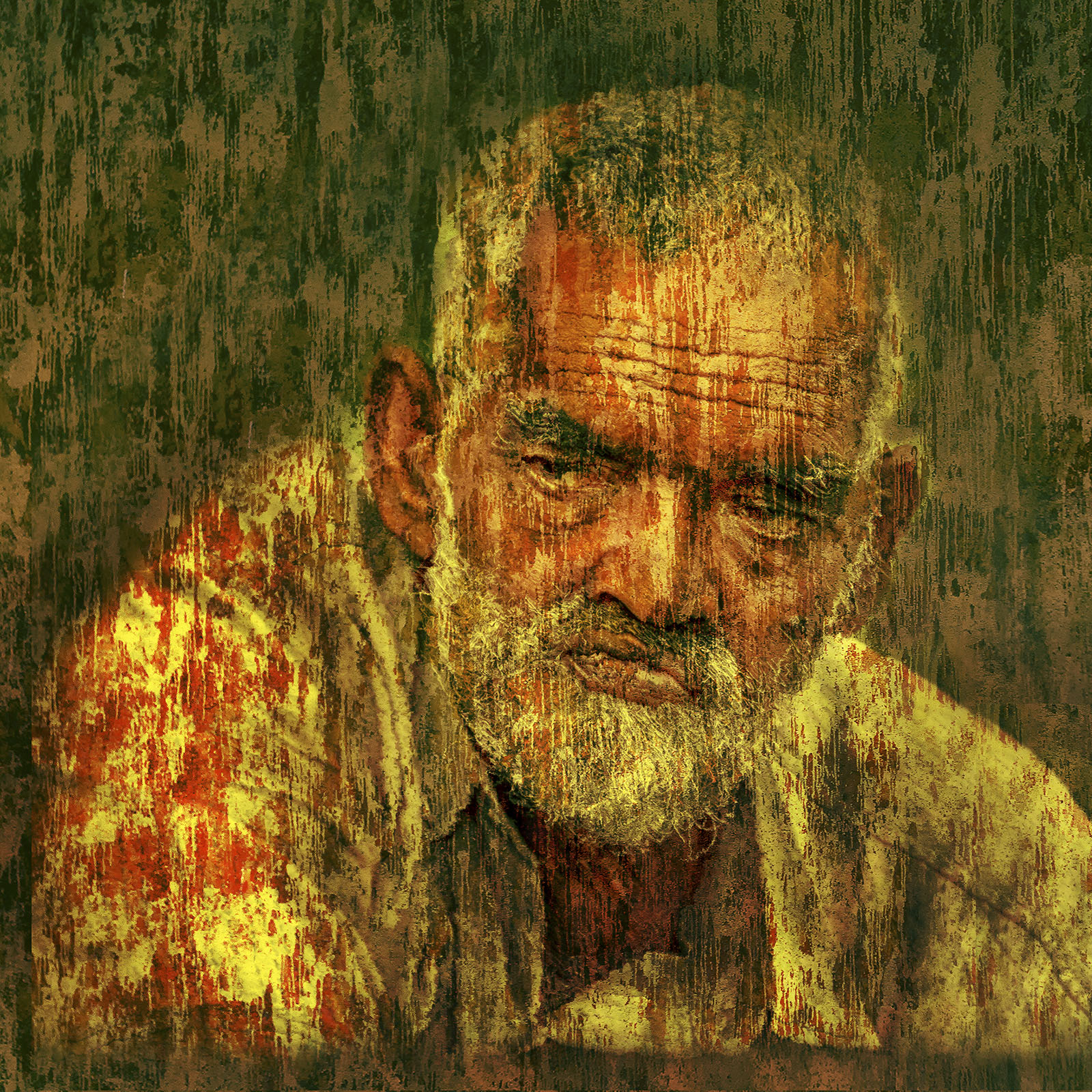
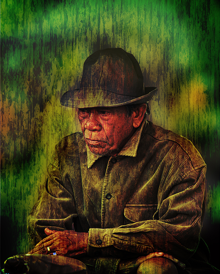
I too really like the colour palette, and what you have done with this image. Well done!
Areas you may wish to focus on improving this image that I could suggest are, the placement and the scale of the face on the canvass, areas which you wish to bring out (for example the eyes) more to direct the viewer's eyes and the sharpness of those areas compared to the rest of the image.
Attached is a very quick attempt I had in applying what I said above, just to illustrate the points.
|
Apr 3rd |
 |
| 20 |
Apr 23 |
Comment |
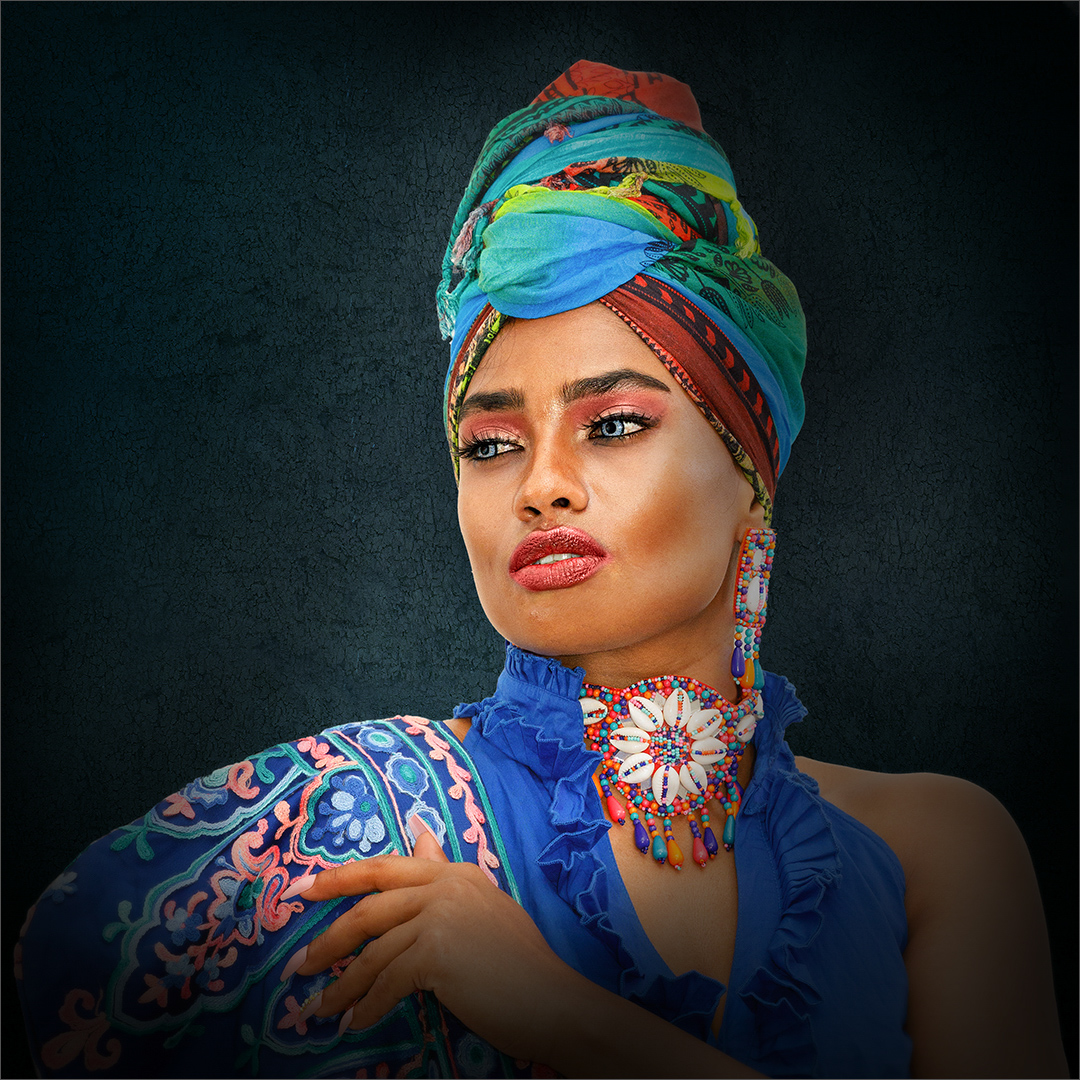
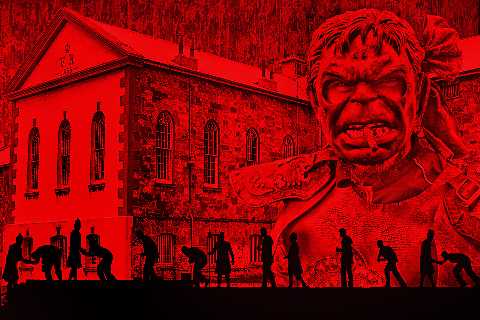
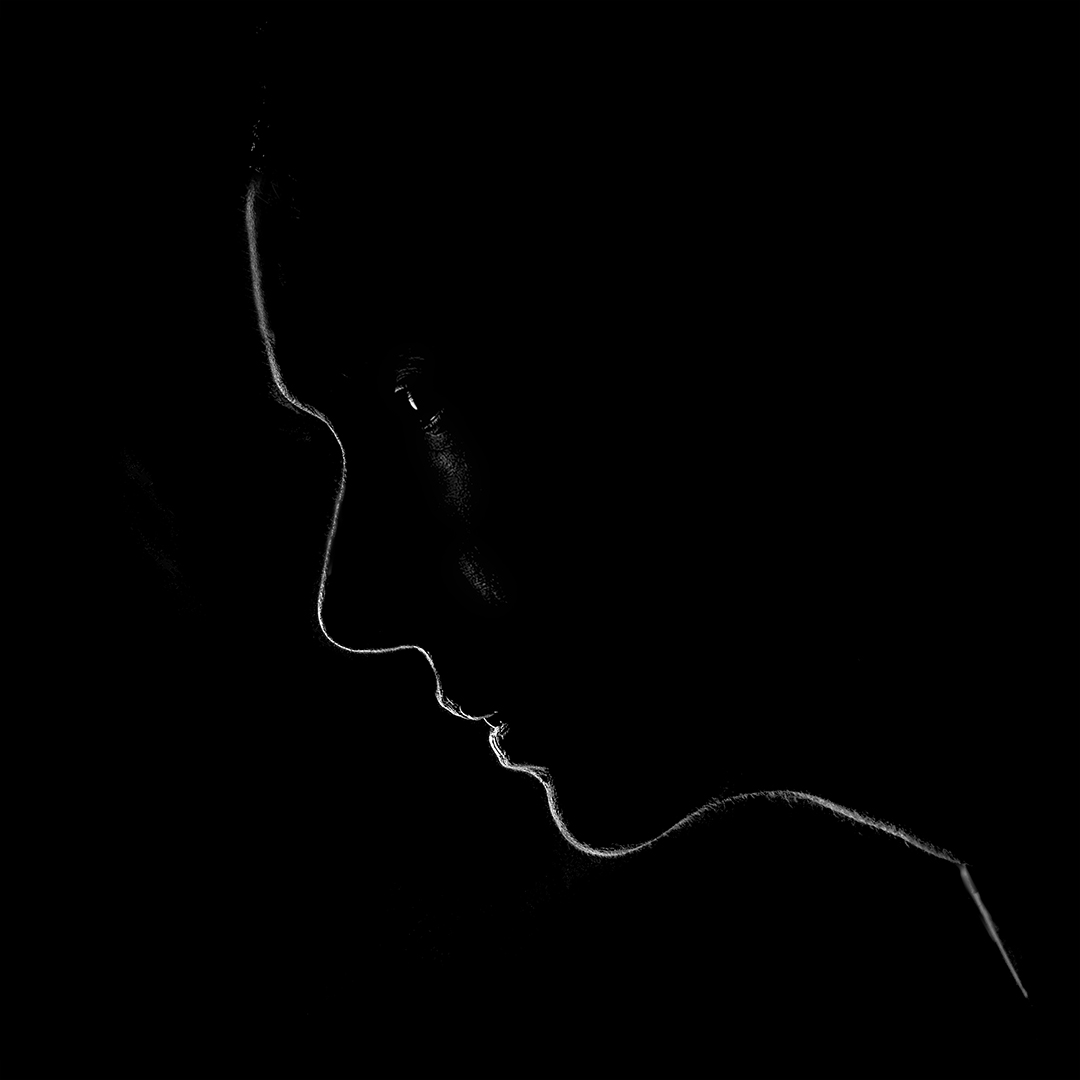
Very creative...and unusual.
Thinking on your question on "how to make it look more realistic"...I tend to feel that you may be feeling so because the transition from the apple to the face is too sudden and hard edged...you can try a softer brush closer to the area where you want to show the face to see if it works for you.
For me this image is fine as is. |
Apr 3rd |
| 20 |
Apr 23 |
Reply |
Thanks Angela! |
Apr 3rd |
3 comments - 5 replies for Group 20
|
3 comments - 5 replies Total
|