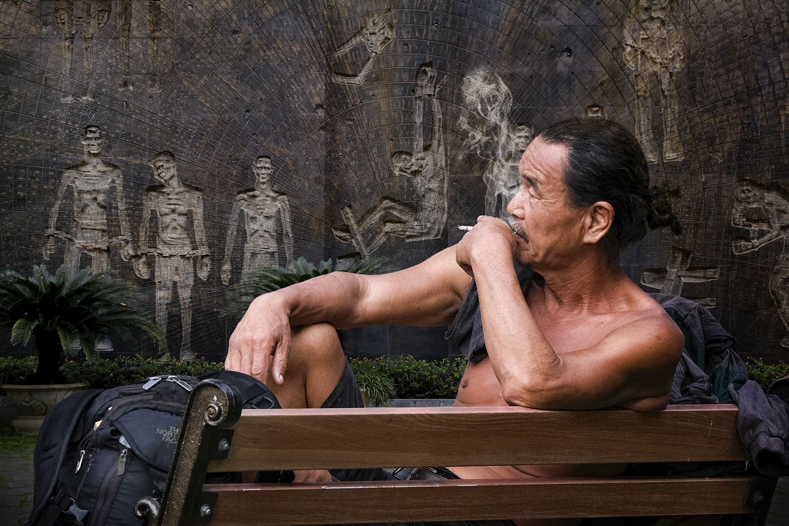
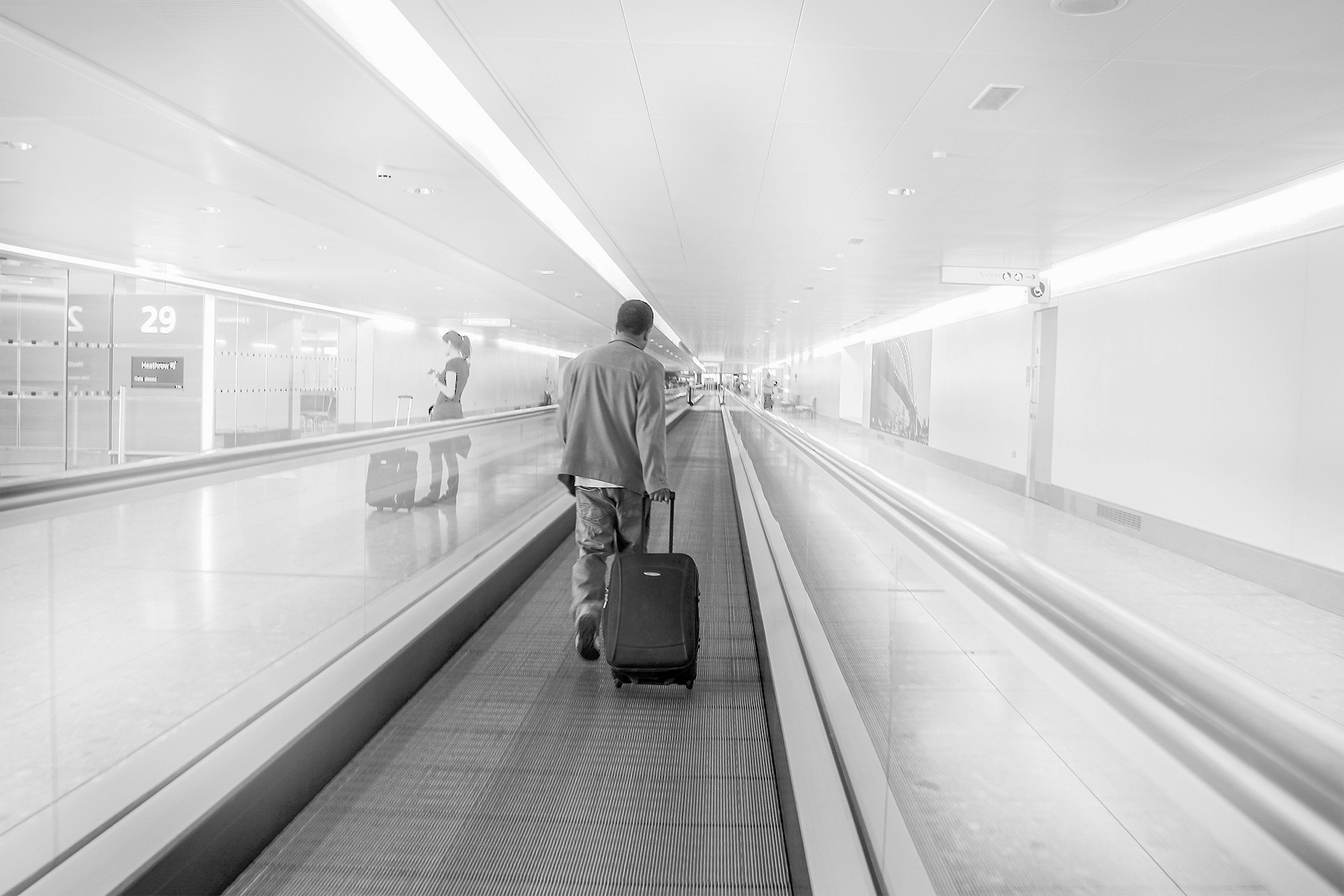
|
| Group |
Round |
C/R |
Comment |
Date |
Image |
| 20 |
Mar 23 |
Reply |
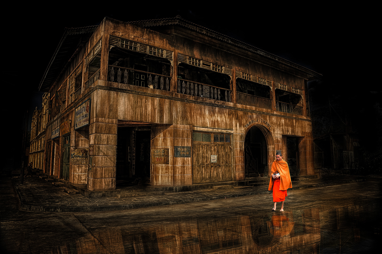
Thanks.
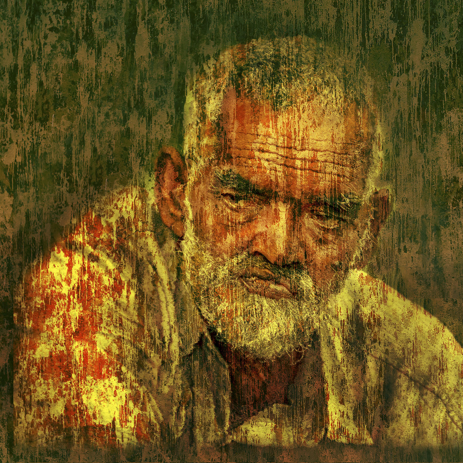
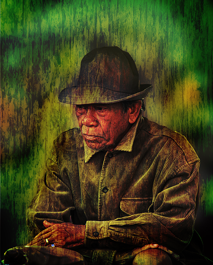
The sliver of the colour difference was intentionally done to give some sort of three dimensionality. In hind sight, as already pointed out by Angela, it may not be working as well as I intended it to...it is possible to remove it from my psd file, as I usually apply these using brushes and masks...
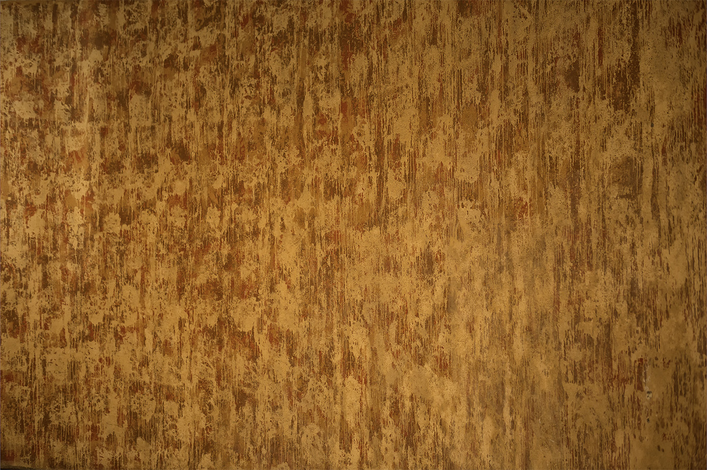
I am attaching the wall texture I used in its original colours...
Thanks again for the feedback. |
Mar 8th |
 |
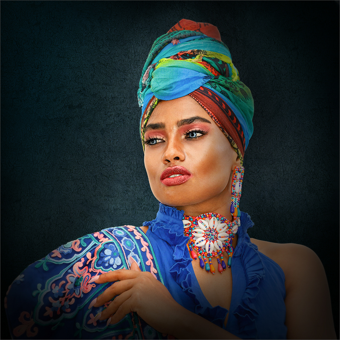
| 20 |
Mar 23 |
Comment |
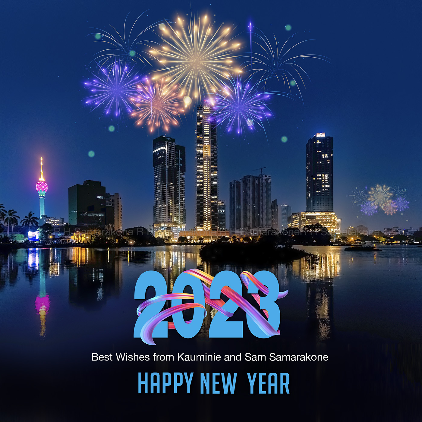
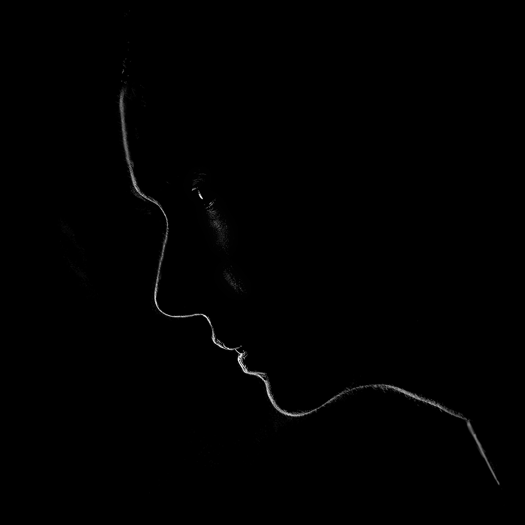
Very Creative...and nice colour pallet. Wonder if your main subject/s would stand out better if you added a vignette...just an idea.
Well done! |
Mar 1st |
| 20 |
Mar 23 |
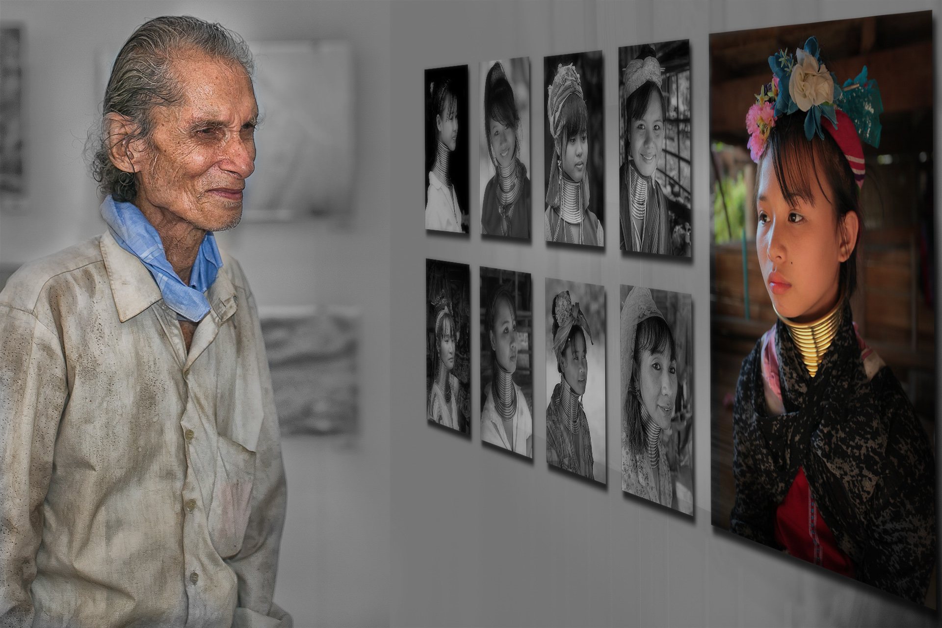
Comment |
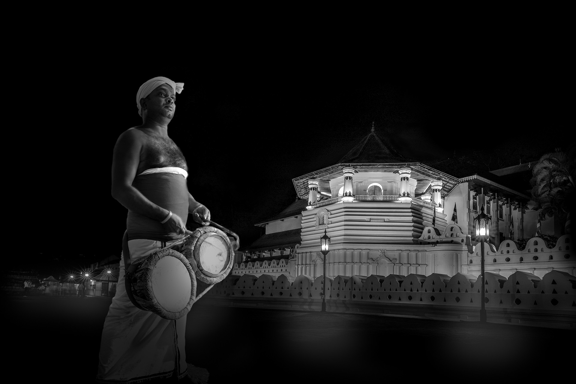
Good job in blending the two images and a good concept too. My only comment or suggestion is to colour grade this image, so that the lighting and tonality matches.
Well done! |
Mar 1st |
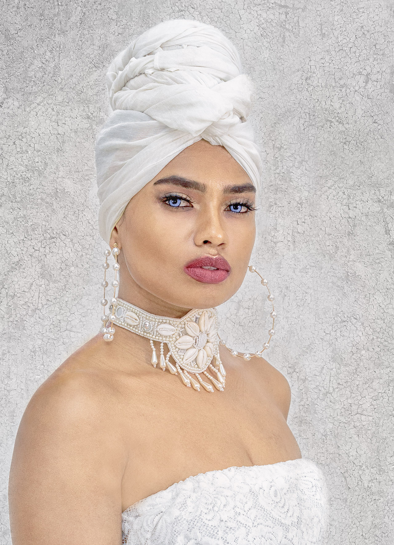
| 20 |
Mar 23 |
Comment |
Hi Deborah, welcome to the Group.
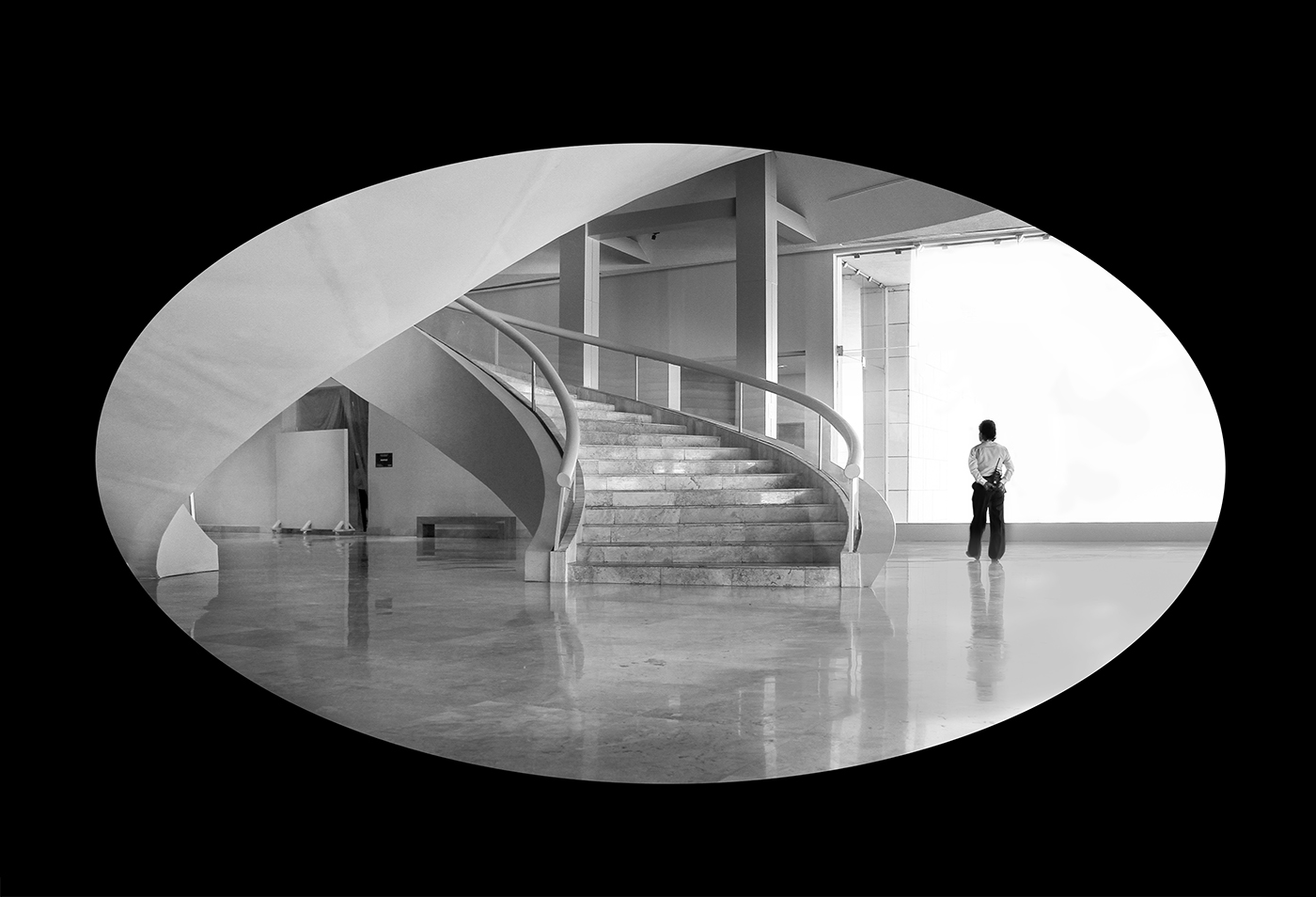
Very interesting treatment to a great series of images. I tend to agree with Fred's comments. You have captured some very interesting images and love the costumes and expressions. I think that each on its own can lead to some creative work. Sometimes, less is more! |
Mar 1st |
| 20 |
Mar 23 |
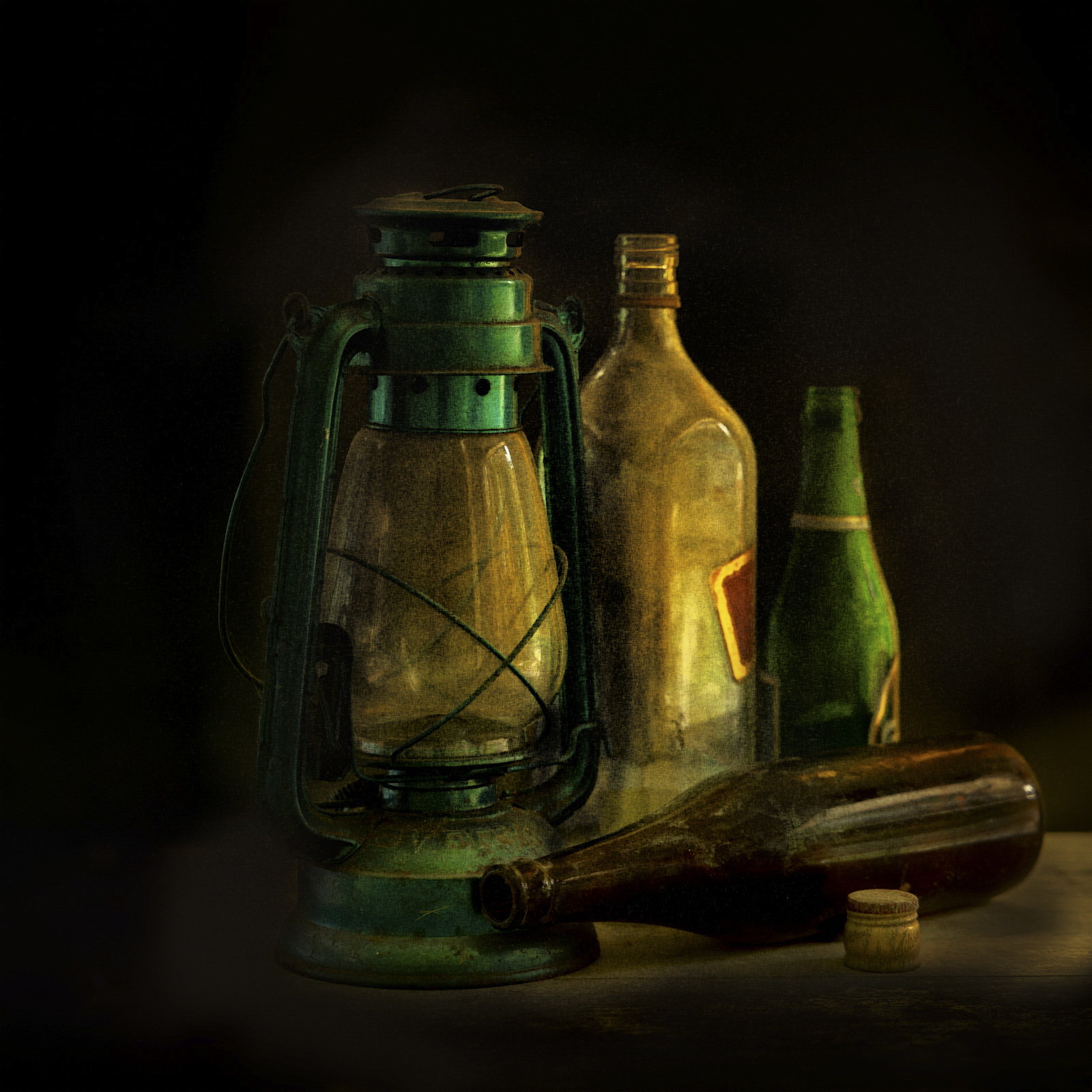
Comment |
Great creativity...lovely colours.
Just wondering how this would come out if you shoot from a lower perspective to limit or eliminate the iPad screen, to give more prominence to the bulb? Just a thought.
Very creative. Well done! |
Mar 1st |
| 20 |
Mar 23 |
Reply |
Thanks Deborah... |
Mar 1st |
| 20 |
Mar 23 |
Reply |
Thanks Fred... |
Mar 1st |
| 20 |
Mar 23 |
Reply |
Thanks Angela... |
Mar 1st |
4 comments - 4 replies for Group 20
|
4 comments - 4 replies Total
|