|
| Group |
Round |
C/R |
Comment |
Date |
Image |
| 20 |
Aug 22 |
Reply |
Thanks Bob! Very interesting comment...Thanks!!!
|
Aug 29th |
| 20 |
Aug 22 |
Reply |
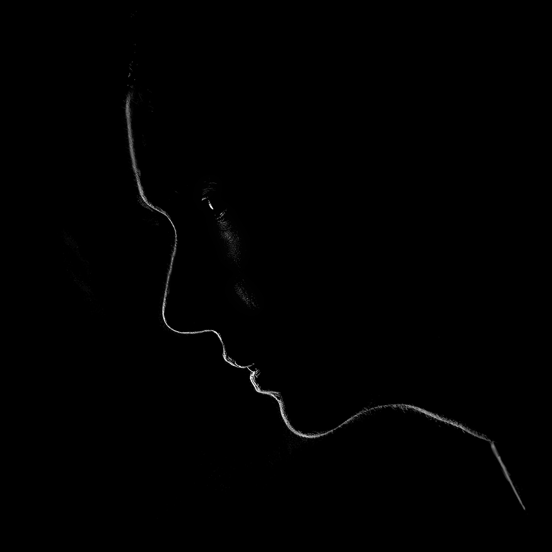
Thanks Ham. In fact, based on the feedback I got from others I tried toning down the saturation, and felt that I was loosing the impact...and makes it another portrait...I now have to see if I can get to a happy middle ground...thanks again for the comment. |
Aug 11th |
| 20 |
Aug 22 |
Reply |
Thanks Shirley! |
Aug 7th |
| 20 |
Aug 22 |
Comment |
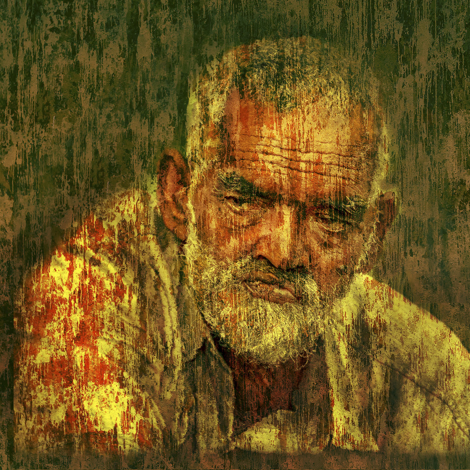
Thanks for sharing this image and your process. Very well thought out, and crafted. I am wondering if it would help if the exposure of the hand was slightly increased? You could also try softening the horizontal line running across above the hand, and a bit bright red on the blood (to make it more dramatic)?
Lovely work.. well done! |
Aug 4th |
| 20 |
Aug 22 |
Comment |
Lovely work Fred! I really like the whole concept of this...perhaps a gradual fading of sharpness and exposure/brightness of the bridge towards the moon might be helpful to allow the viewers eyes to be directed towards the moon, and then to explore the universe...I have done a very quick edit, hope you don't mind.
Brilliant concept...well done! |
Aug 4th |
 |
| 20 |
Aug 22 |
Comment |
I too think the crop is fine, a bit of head room would have been nicer. You have created a nice abstract image...my only comment would be about the red tulip, it is attracting a little too much attention, taking the eyes away from your main subject. But, if you tone it down too much, you will loose the plot...
Well done! |
Aug 4th |
| 20 |
Aug 22 |
Comment |
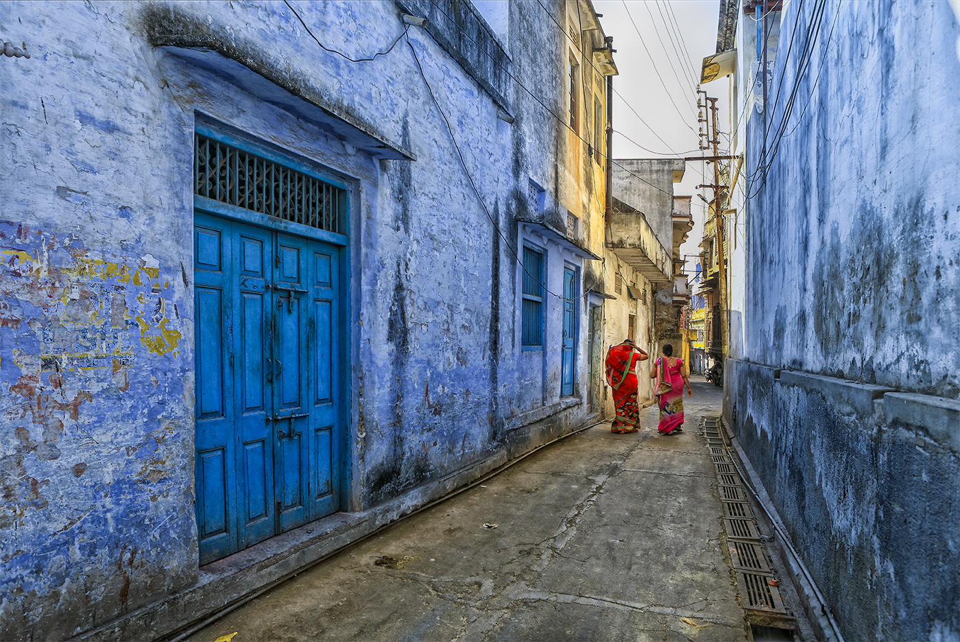
What a lovely location for photography!
You have done well in creating the HDR, applying the texture, and cloning out the people. Personally, I would prefer the texture / grain size to be smaller, but that's a personal choice.
I am wondering about the blue cast that you have got on the mountains and the rocks... was it intentional or was it because you increased the saturation too much in converting to HDR? Perhaps tone it down a bit, at least on the rocks, that might make the image better in my opinion.
Good job! |
Aug 4th |
| 20 |
Aug 22 |
Reply |
Thanks Fred! |
Aug 4th |
| 20 |
Aug 22 |
Comment |
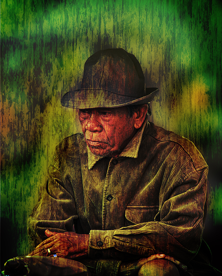
Thanks Angela...yes, he really looked sad! I get your point on the colour saturation...thanks! |
Aug 2nd |
5 comments - 4 replies for Group 20
|
5 comments - 4 replies Total
|