|
| Group |
Round |
C/R |
Comment |
Date |
Image |
| 20 |
Jun 22 |
Comment |
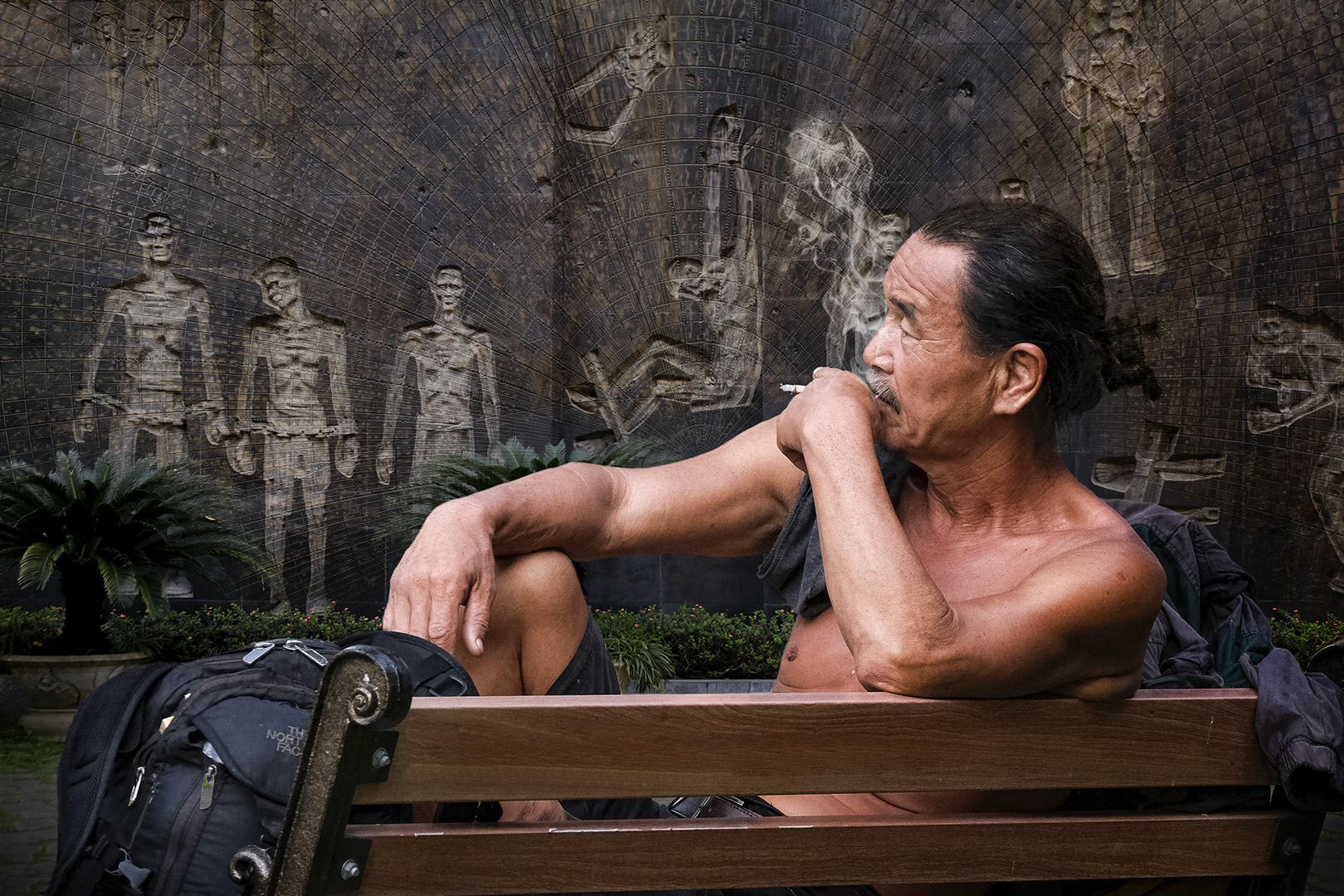
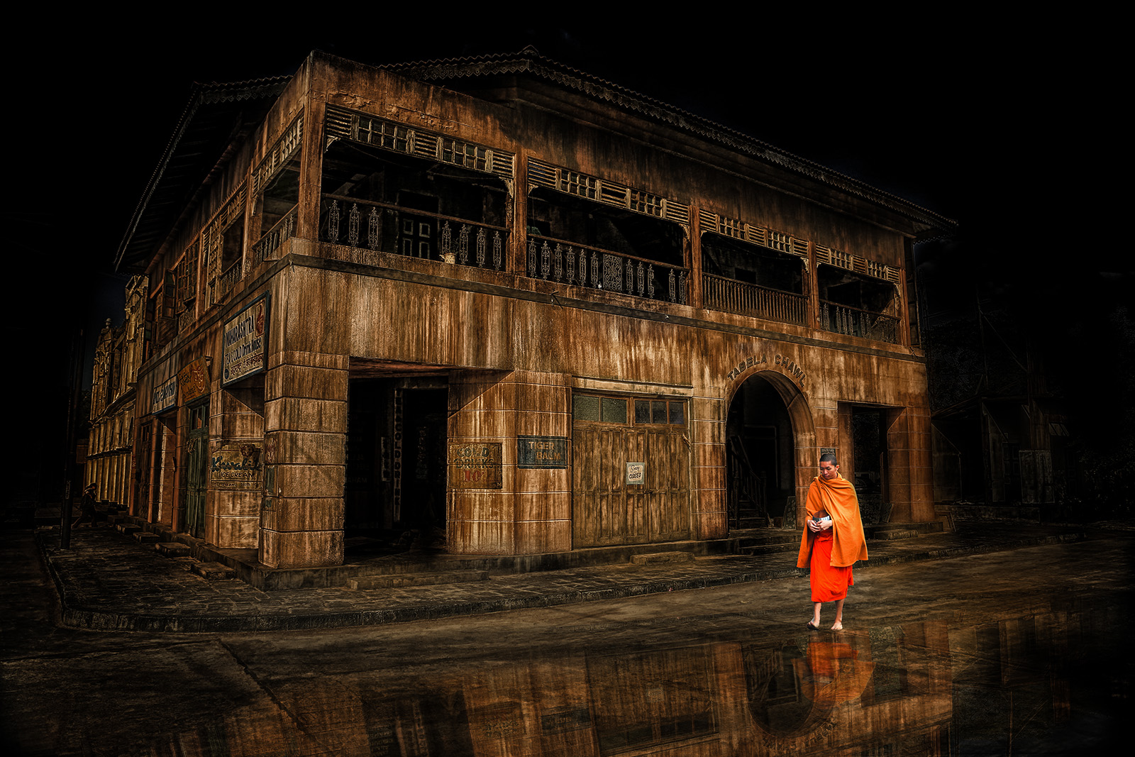
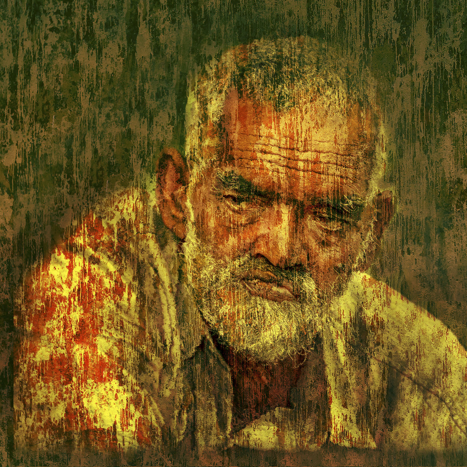
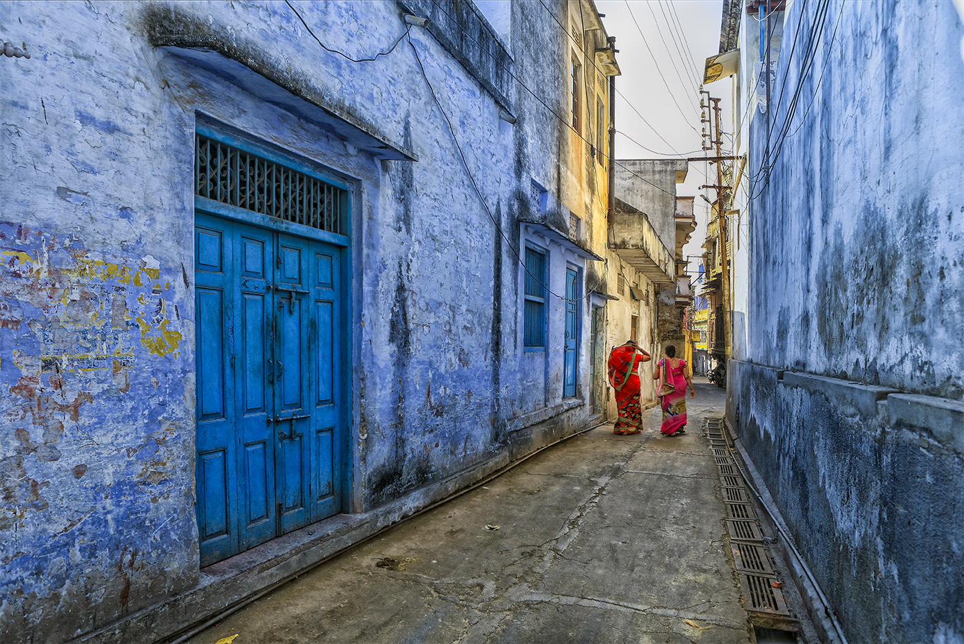
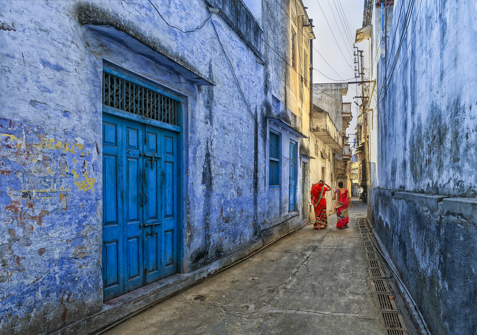
Based on the feedback from Bob and Fred, I have done some editing, especially to get the level correct. Sky is lightly darkened. I have left the wires intact, as it gave more character and a feel to the place. Thanks everyone for your feedback and suggestions. |
Jun 20th |
 |
| 20 |
Jun 22 |
Reply |
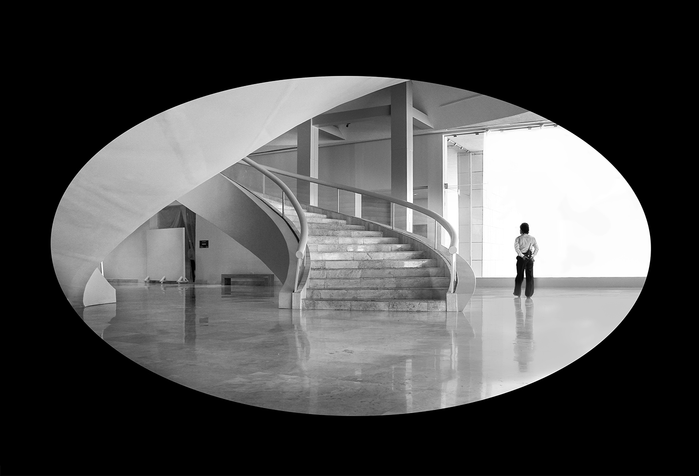
Hi Ham, thank you for your feedback...India is a photographers paradise...You can spend a lifetime and will not be able to capture the diversity in their cultures...Thanks again for your feedback. |
Jun 20th |
| 20 |
Jun 22 |
Reply |
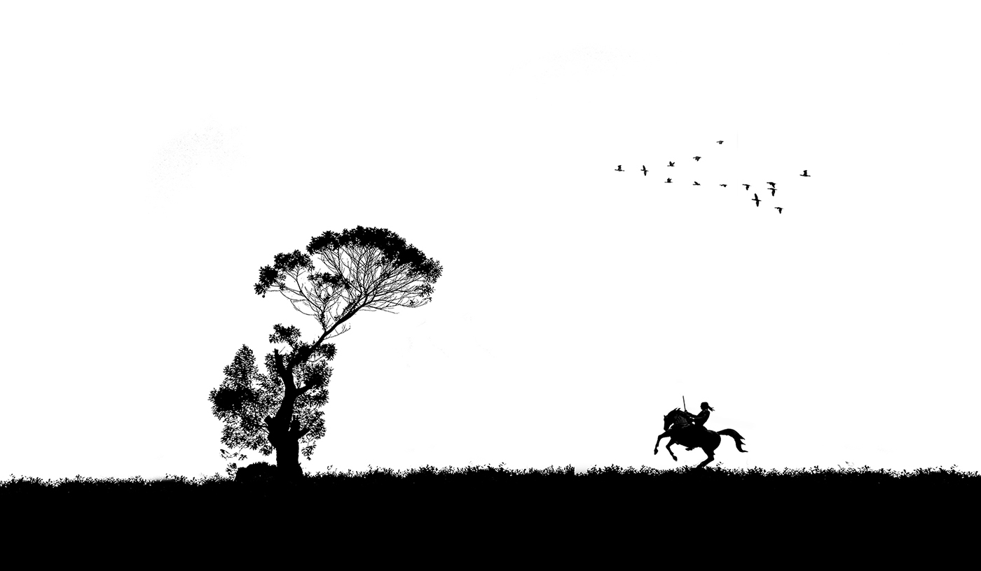
Hi Fred, thanks for the feedback.
I too am confused somewhat as to what is causing the slope of the alleyway. I checked the verticals, they are nearly perfect, but as you and Bob have correctly pointed out, the level of the ground is not right...I also looked at the original, and tried to recall the location. I think this appearance is due to the slope that was there for rain water to flow towards the drain, and the slight incline that is there in the alleyway.
I did remove the wires (and part of the lamp post) as suggested by Bob, but, it looks too clean and took away the character...
Having said that I shall re-work with the original to take away the slant, and clean up the sky without loosing character.
Thanks
Sam |
Jun 14th |
| 20 |
Jun 22 |
Comment |
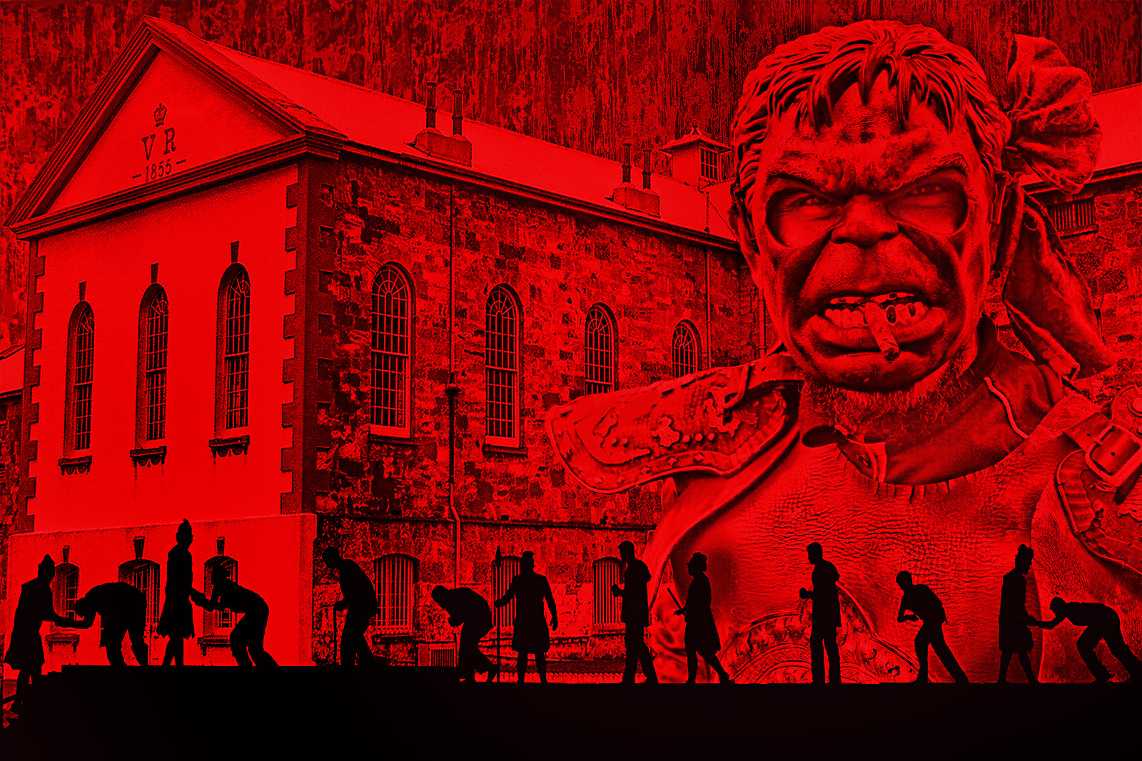
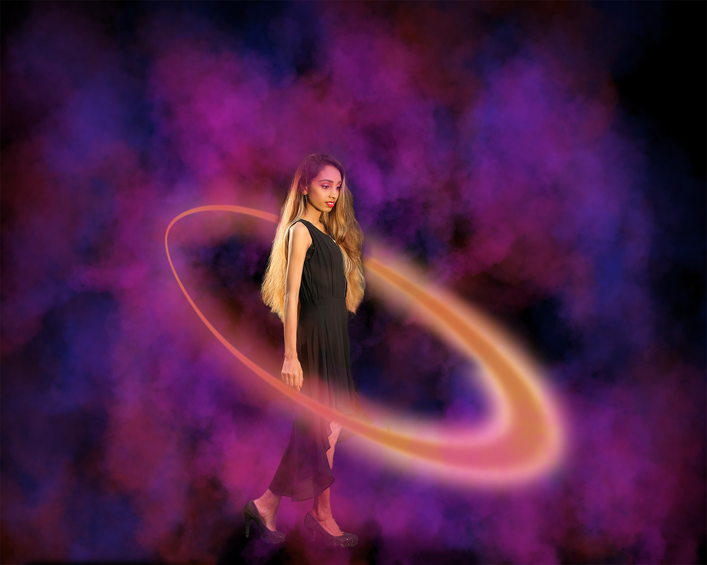
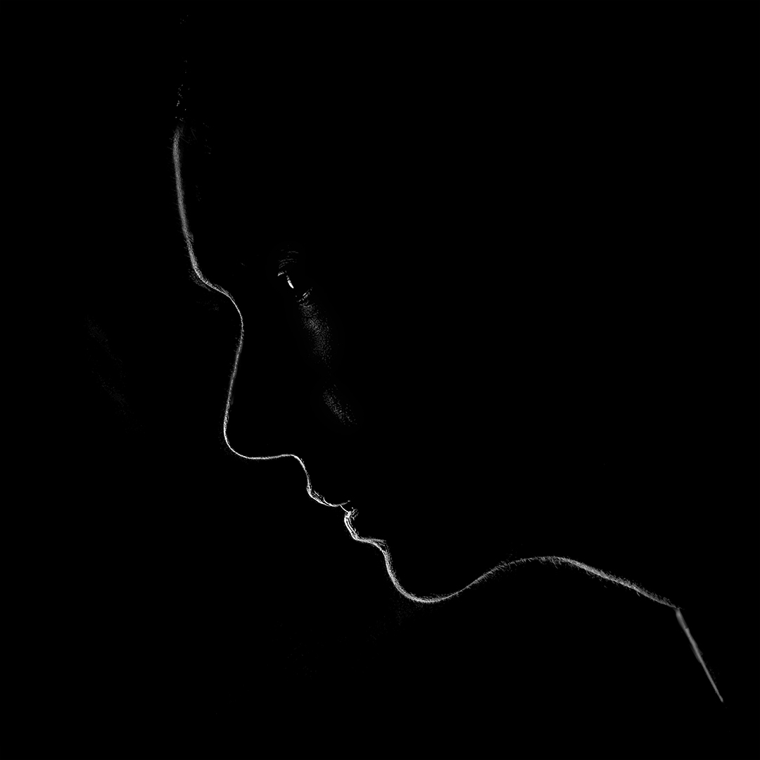
Hi Shirley, I have not used Topaz, and am not familiar with the filters, but I like what you have done with the image using Topaz.
The artistic result you have achieved on the image is very interesting. One thing I am not too sure is if the two outlines are really necessary? Especially the red outline which is competing for attention with your main subject.
Sam |
Jun 13th |
| 20 |
Jun 22 |
Comment |
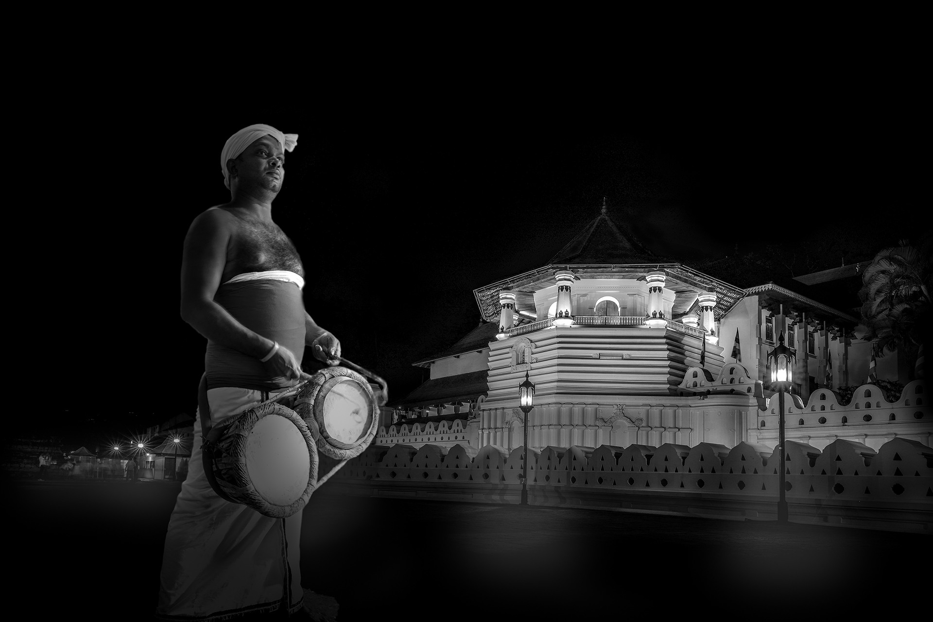
Hi Ham
Interesting B&W conversion.
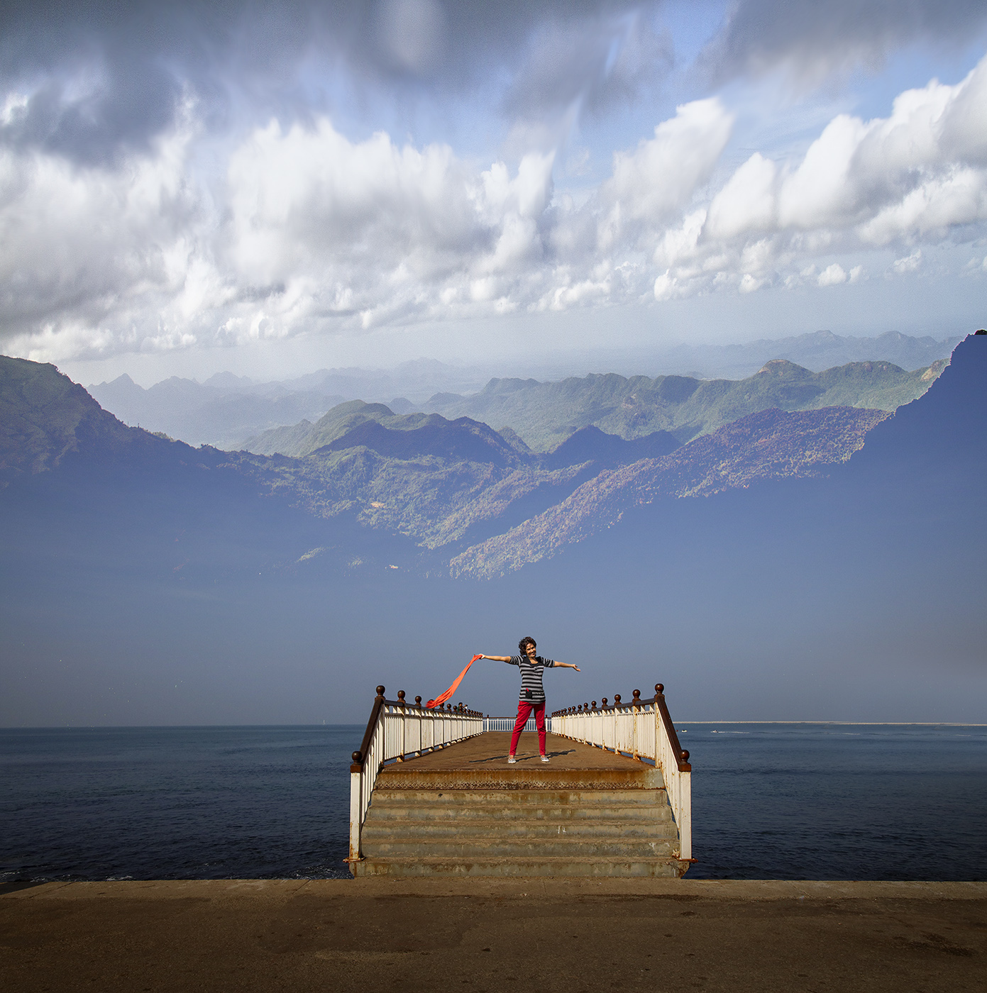
Personally I like to tonal variations in your original, and the reflections in the waters. I wonder if you had a picture taken in landscape format?
I have taken the liberty of doing a B&W conversion in ACR, with more contrast, and with a slightly different crop. Two things that compete for attention in the image are the reflection of the clouds at the bottom right, and the white object in the waters.
Sam |
Jun 13th |
 |
| 20 |
Jun 22 |
Comment |
Hi Fred, I really like what you have done...subdued colors and the texture adds to the impact its is creating.
I am just wondering if it would be even better if you were to bring back a tad bit of purple closer to the stamens to just to get them to pop...
well done! |
Jun 13th |
| 20 |
Jun 22 |
Comment |
Hi Bob
Very interesting concept and the approach taken to tell a story.
The subdued tones do work to some extent, but if I may, I have the following observations:
I feel that the all the trees in the foreground should be equally sharp, I guess this is by using the radial filter. That will make them stand out as that is where the story lies.
I also think your story would be more effective if the blue skies and the clouds were not as subdued as they are now.
The green shades of the forest could benefit by a bit more saturation in contrast with the dead trees.
I have attached a quick edit I did, apologies if I have taken it in a different direction to your original intent in the edit.
Sam |
Jun 12th |
 |
| 20 |
Jun 22 |
Comment |
Hi Bob,
Thank you very much for your review and suggestions. I shall repost with the suggested edits soon.
Thanks again.
Sam |
Jun 12th |
6 comments - 2 replies for Group 20
|
6 comments - 2 replies Total
|