|
| Group |
Round |
C/R |
Comment |
Date |
Image |
| 93 |
Feb 26 |
Reply |
I forgot to add, I added a tiny bit of magenta to the sky as well |
Feb 22nd |
| 93 |
Feb 26 |
Reply |
Thanks Darcy! And agree, I need to crop a bit more in the foreground. |
Feb 22nd |
| 93 |
Feb 26 |
Comment |
Hi Ed, it's fun to revisit old stuff! I want to do it more.
I don't know if it's there, but maybe open the shadows on the right a tiny bit more, I think it would balance it out as the left is a tad brighter. To my eye, you might have sharpened it a bit too much -- the water and reflection looks too sharp, maybe try a local an decrease sharpness/clarity/texture to see how it might look?
I like how you cropped it and how you edited it to highlight the light and reflections. |
Feb 22nd |
| 93 |
Feb 26 |
Comment |
Bob, for some reason, I hadn't saved my original comments, sorry for the delay. I really like the layers here, but my eye gets stuck in the dark and I'm looking to see more details in the foreground. I took a crack at editing it, this is just my interpretation of how I'd take a stab at the image - hope you don't mind.
First I made a global adjustment to open up the shadows. Then I did local masks:
Sky: decreased the highlights, increased white and decreased black; added 2nd mask to darken the top of the frame a tiny bit
Fog layer, radial grad and increased the whites (did some fine tuning with the mask to remove the dark luminance)
Middle ridge: added a radial and darkened a tiny bit to help with the depth
Bottom left: added radial and desaturated the color a bit and darkened it.
|
Feb 22nd |
 |
| 93 |
Feb 26 |
Reply |
Hi Darcy, no, not a sky replacement. You have some great clouds there and feel that you can bring out a bit more detail in there. I did a quick edit on this and selected the sky, decreased the highlights, added a tiny bit of dehaze, and boosted the whites and added black to help with the contrast. I then added a linear grad to the top to darken it a bit more to help keep the eye in the frame. I also added a linear on the bottom and darkened a tiny bit there too. Let me know your thoughts! |
Feb 22nd |
 |
| 93 |
Feb 26 |
Reply |
Tom said it better than me! |
Feb 18th |
| 93 |
Feb 26 |
Reply |
Thanks Tom, noted on the crop. I think you are right, a bit more the bottom may help! |
Feb 15th |
| 93 |
Feb 26 |
Reply |
Thanks Carol |
Feb 15th |
| 93 |
Feb 26 |
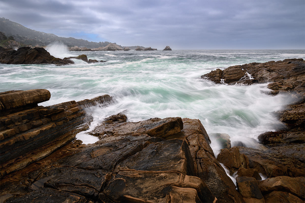
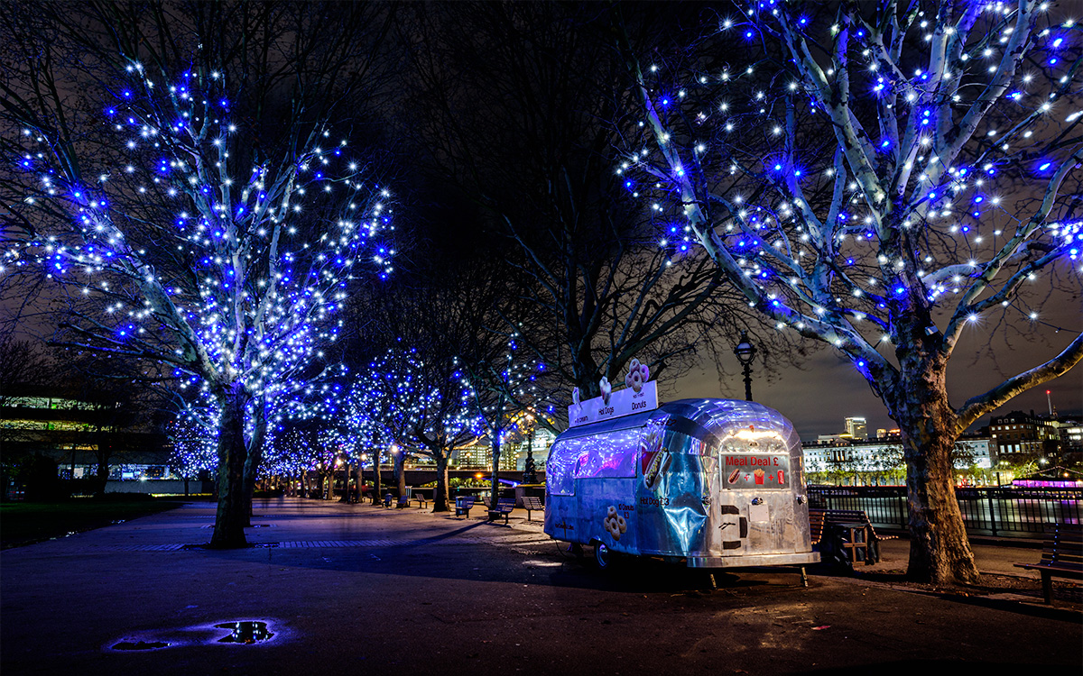
Comment |
Hi Carol, what a gorgeous view! I like how you have processed this. I think this image would be better as a 16x9 crop or around there. I either wanting to see more of the foreground or none of it. I'd also like to see a bit more sky, it just feels too tight to the mountains. Maybe bring it over to PS and expand it a bit given the sky is so blue it would be easy to add?
Can I ask where you took this? |
Feb 15th |
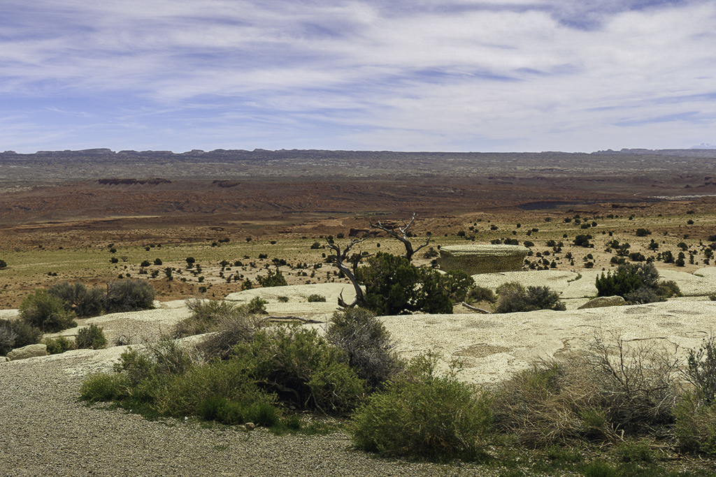
| 93 |
Feb 26 |
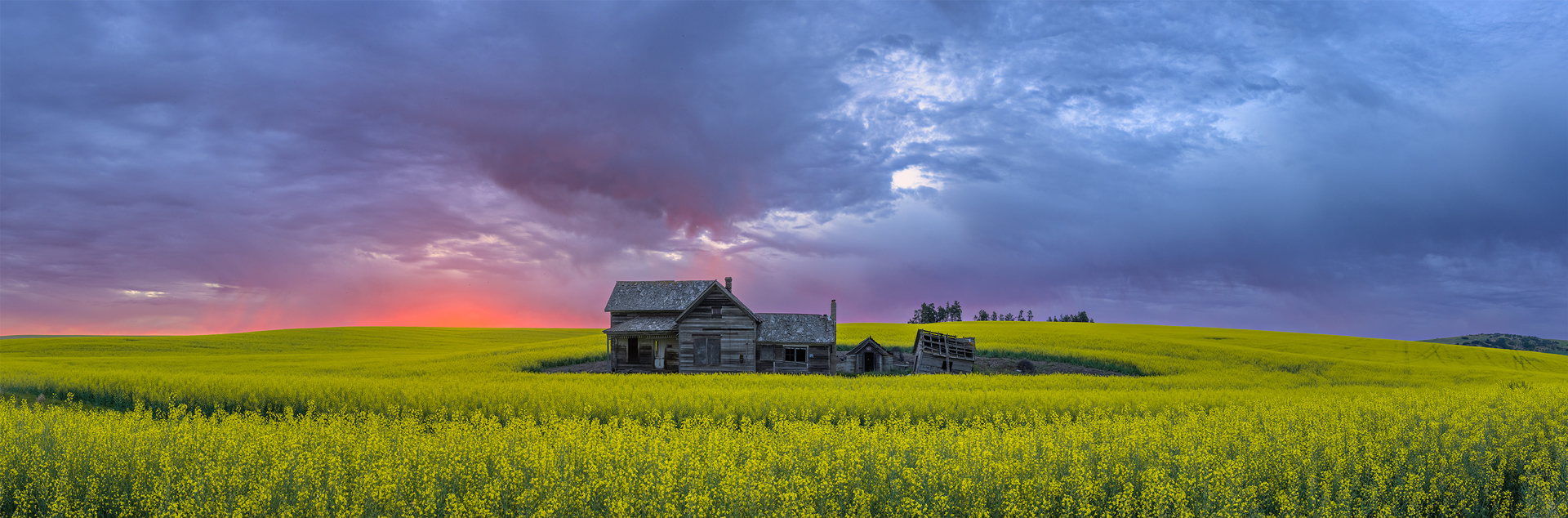
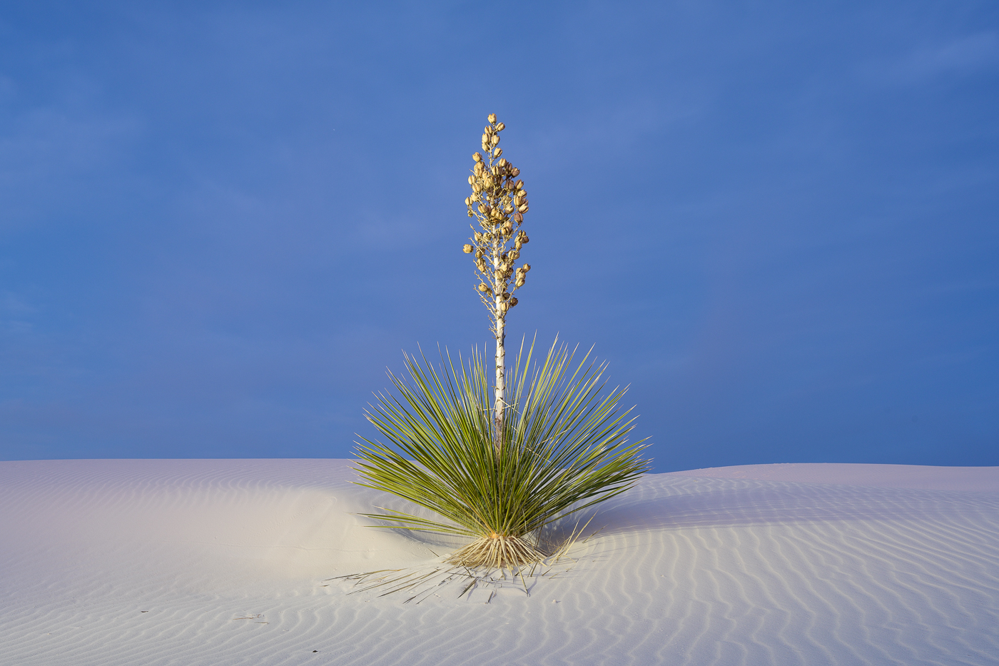
Comment |
I like how you brought out the red color here Darcy. I also appreciate the line of the shrubs leading left to then booking agin to the right by the open ground. I think
The image might benefit with adding a darker tradition the sky as my eye goes up and stays there a bit. |
Feb 15th |
| 93 |
Feb 26 |
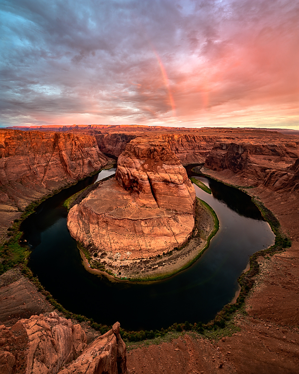
Comment |
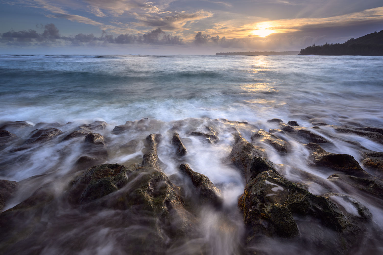
I love the pops of color on the bow with the pops of orange and then the nice sunrise. I like the perfect symmetry on each side of the bow. Nice selection of the room!
Your editing was spot on as well. Curious if you tried to accentuate the suns rays a bit more or the reflection on the ocean? |
Feb 15th |
| 93 |
Feb 26 |
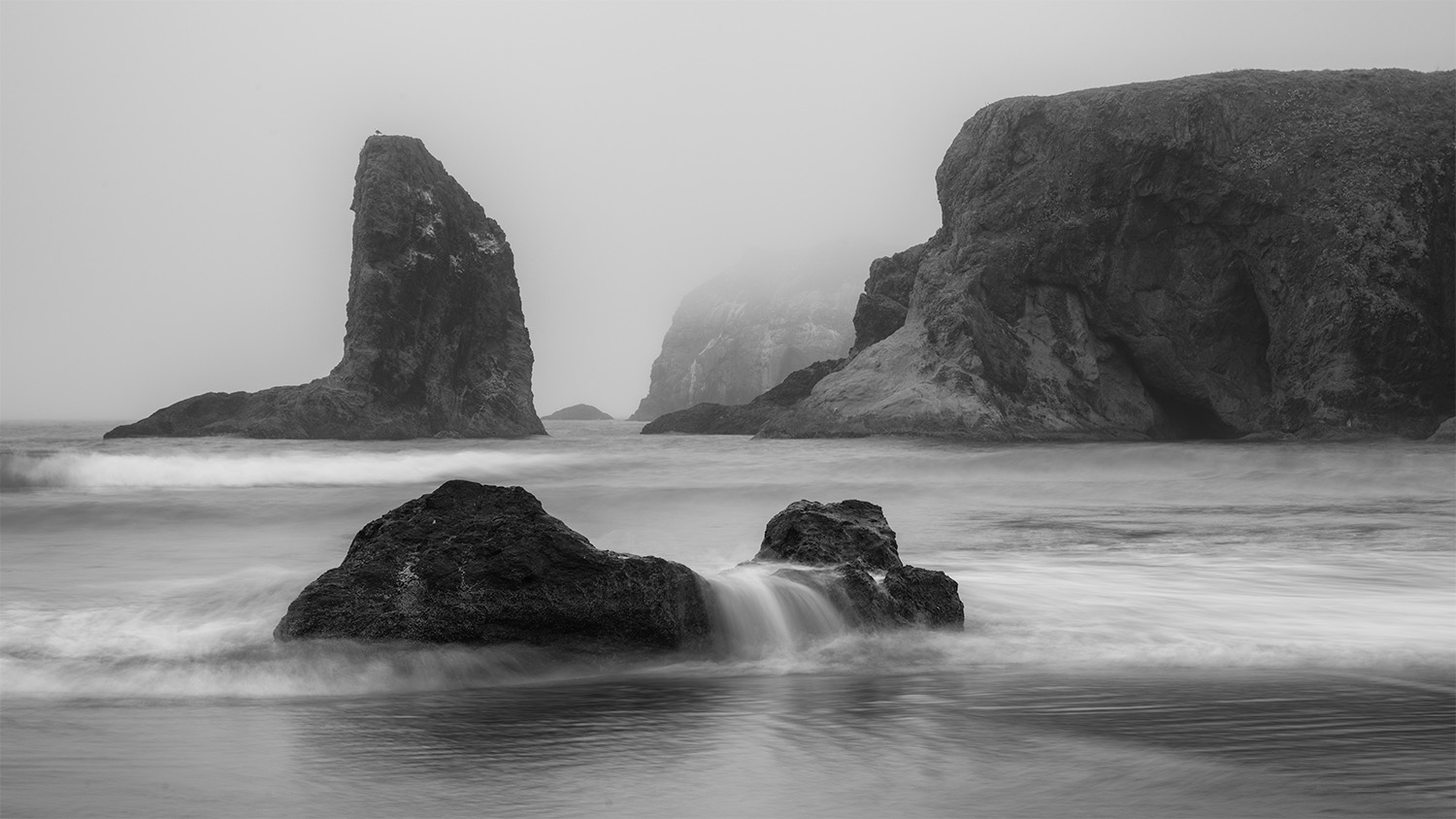
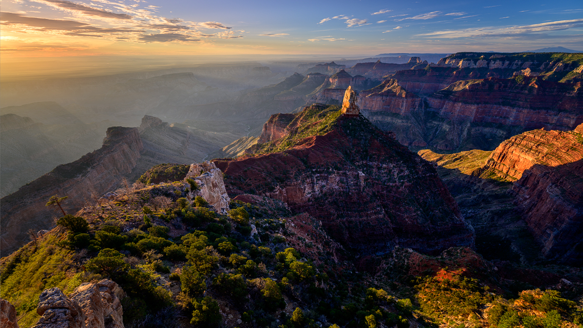
Comment |
I really like this Francois! The lines lead my eyes throughout the image and the conversion to B&W is a great choice. Nice tonal ranges throughout as well. How did you get this image without people??? |
Feb 15th |
6 comments - 6 replies for Group 93
|
6 comments - 6 replies Total
|