|
| Group |
Round |
C/R |
Comment |
Date |
Image |
| 93 |
Sep 25 |
Reply |
*dehaze slider |
Sep 22nd |
| 93 |
Sep 25 |
Reply |
Try the dehire slider a bit, I have been liking that a lot when processing the sun lately. |
Sep 21st |
| 93 |
Sep 25 |
Reply |
Thanks for the suggestion Ed, I can see how that would bring the eye in a bit more to focus on the waterfall. |
Sep 21st |
| 93 |
Sep 25 |
Reply |
Thanks Darcy, it's quite beautiful for sure. |
Sep 21st |
| 93 |
Sep 25 |
Reply |
Thank you Tom, appreciate it |
Sep 21st |
| 93 |
Sep 25 |
Reply |
Thanks Francois, Looking at it again, I feel it's a tad too blue, but it was the blue hour, so there's that :D |
Sep 21st |
| 93 |
Sep 25 |
Comment |
Tom,
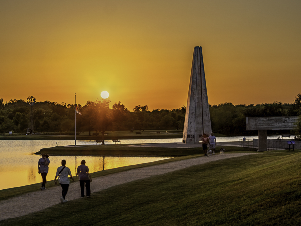
I like all the lines in this image. I agree with Ed and Darcy that the sun is a bit too prominent. I hope you don't mind, but I took a crack at editing this to highlight the lines and color. For the sun, I did a radial filter and decreased dehire, clarity and texture. I also decreased the highlight a tiny bit and accentuated the sun stars. I also highlighted the green hill in the bottom right to highlight how the light was hitting it. I did a few more local adjustments to the path and the obelisk as well. |
Sep 21st |
 |
| 93 |
Sep 25 |
Comment |
I like how you framed the rock on the right with the smaller rock and movement of the waves on the left side. The rock feels like it's just a tad too far away, did you consider cropping the foreground a bit, just to cut out the small rock in the right corner? I think that might make it a more intimate image with the rock and that huge cloud.
That large cloud is pretty cool and it feels like it's enveloping the image, but I feel that the right side of it is a tad too dark to my eye and might help if it was lightened a tiny bit to show some of the details in the cloud. |
Sep 11th |
| 93 |
Sep 25 |
Comment |
Great luck with no direct light here, I think that helped with the image.
As we all know, editing an image is a personal thing and we could all edit things differently to show the same image in a different way. I don't think I'd crop the foreground, I like it in your original image as to my eye, it adds a bit more depth. Also, this is a nit for sure, but that big 'ol leaf on the rock is draws my eye in and I get stuck on it a bit.
I think I'd add a gradual filter to the waterfall to try to highlight that a bit more by adding white and decreasing dehaze a bit. and perhaps take a brush to the smaller falls at the top to keep my eye moving on them with similar adjustments.
Curious why you had such a high ISO using a ND? |
Sep 11th |
| 93 |
Sep 25 |
Comment |
Hi Bob, I think you succeeded in your intent here. I like the layers from the darker foreground to the lighter sky. To my eye, I don't think you need the top 1/4 to 1/3 of the image and could crop it a bit. I think that this might help emphesize the layers even more. It may be my screen, but is seems a tad too green? Perhaps add a tiny bit magenta and add a tiny bit of blue? |
Sep 11th |
| 93 |
Sep 25 |
Comment |
Beautiful color! I like that you cropped out the foreground from the original framing. I also understand your approach in processing. I like the silhouettes of the people on the beach as well. Given it's an image with the sun highlighted, I think that your exposure in your original is a bit more organic and shows the reflection on the ocean a bit better than your edited version, even though the rock is there, I think it still works. |
Sep 11th |
5 comments - 6 replies for Group 93
|
5 comments - 6 replies Total
|