|
| Group |
Round |
C/R |
Comment |
Date |
Image |
| 93 |
Oct 24 |
Reply |
No! Good simplicity evokes so much more than boredom! This is not boring in any way! |
Oct 18th |
| 93 |
Oct 24 |
Reply |
Thanks George, appreciate the feedback! Interesting, hadn't thought of doing a gradient from the left, will try it now. |
Oct 15th |
| 93 |
Oct 24 |
Comment |
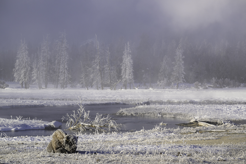
Hi Paul, I like how you framed the building in the bottom left of this image and how my eye moves around the depth of the trees. To me, this feels a bit cool for fall colors. I took the liberty to make a few changes as how I might process this one. I played with the WB, added some masks, and one specifically around the house as I wanted to see it a bit brighter and more red. As always, this is my interpretation. Let me know your thoughts!
|
Oct 12th |
 |
| 93 |
Oct 24 |
Reply |
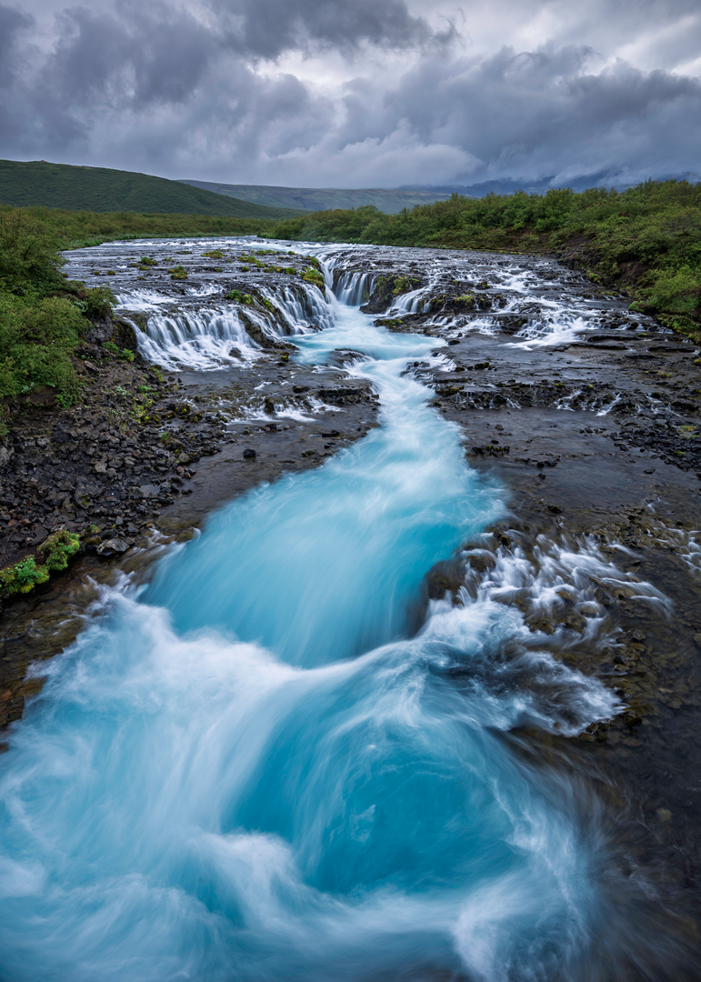
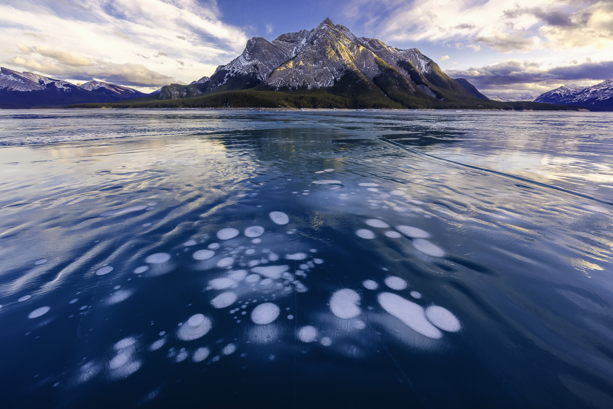
Thanks Darcy! Good thought on metal, I've never heard of foil printing, what is that? I did try to crop it, but wanted to keep the tree reflections on the right and the snow patches balanced it for my eye at least. And never mind you trying something different! It's always fun to see how someone else edits my shots. |
Oct 12th |
| 93 |
Oct 24 |
Reply |
Oh, yes! I meant moon! Bret job scouting! |
Oct 9th |
| 93 |
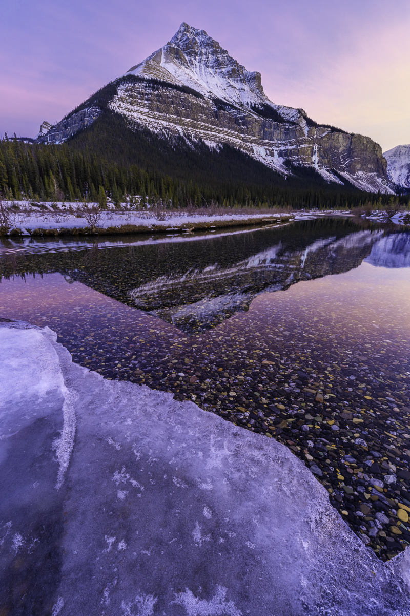
Oct 24 |
Reply |
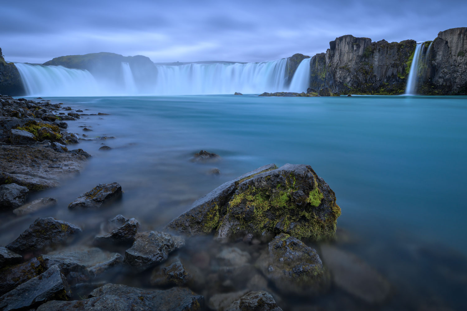
Thanks Paul! I forgot to add, that right after I took this, I left the ice shelf I was standing on and the one to the right of me broke and someone I was shooting in got their feet a bit wet! The things we do for an image :D |
Oct 8th |
| 93 |
Oct 24 |
Comment |
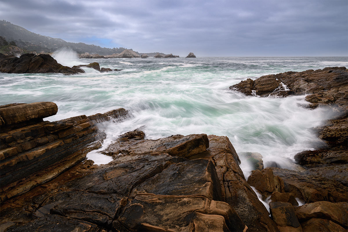
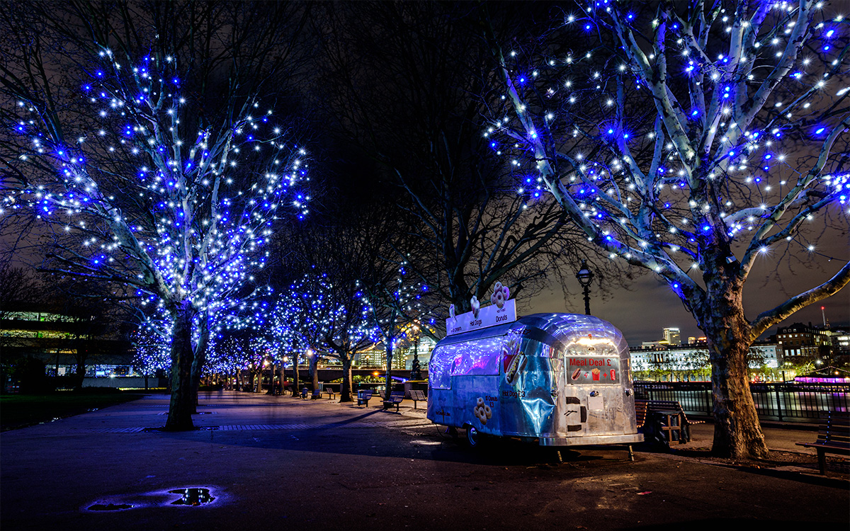
To me, this image shows the old, new and the environmental impact. I like that you included the people on the bank of the river, searching, contemplating, or just simply going for a walk. |
Oct 5th |
| 93 |
Oct 24 |
Comment |
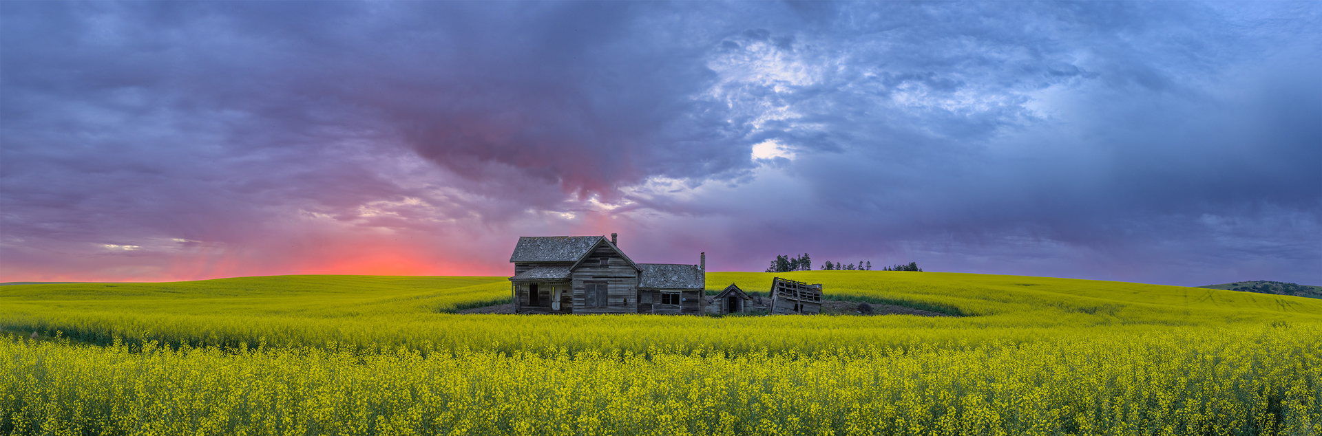
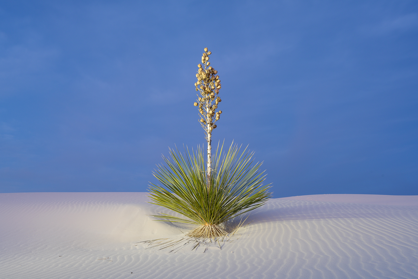
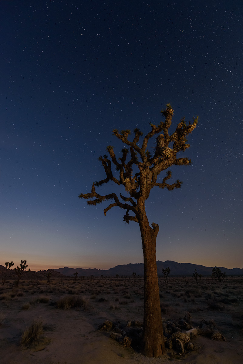
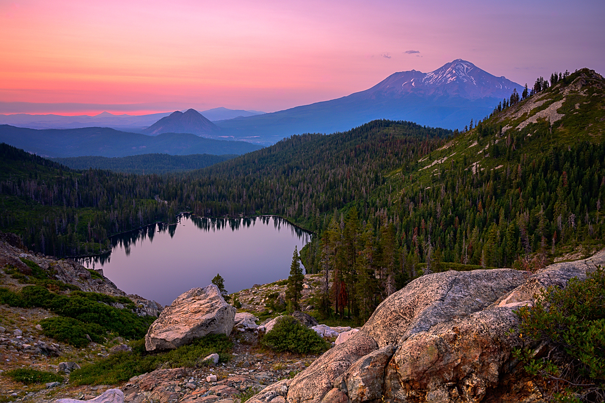
Darn, Oregon has a lot of different types of landscapes! Good job on the DOF here. My story about the lone tiny tree is that it's surviving in an area that looks like both the heat of the summer and possible cold winters would make it hard to survive, but it fights on. |
Oct 5th |
| 93 |
Oct 24 |
Comment |
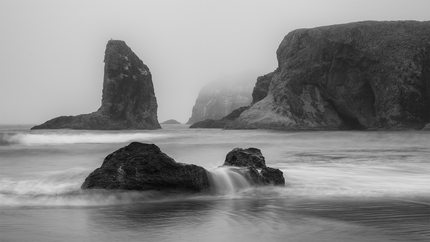
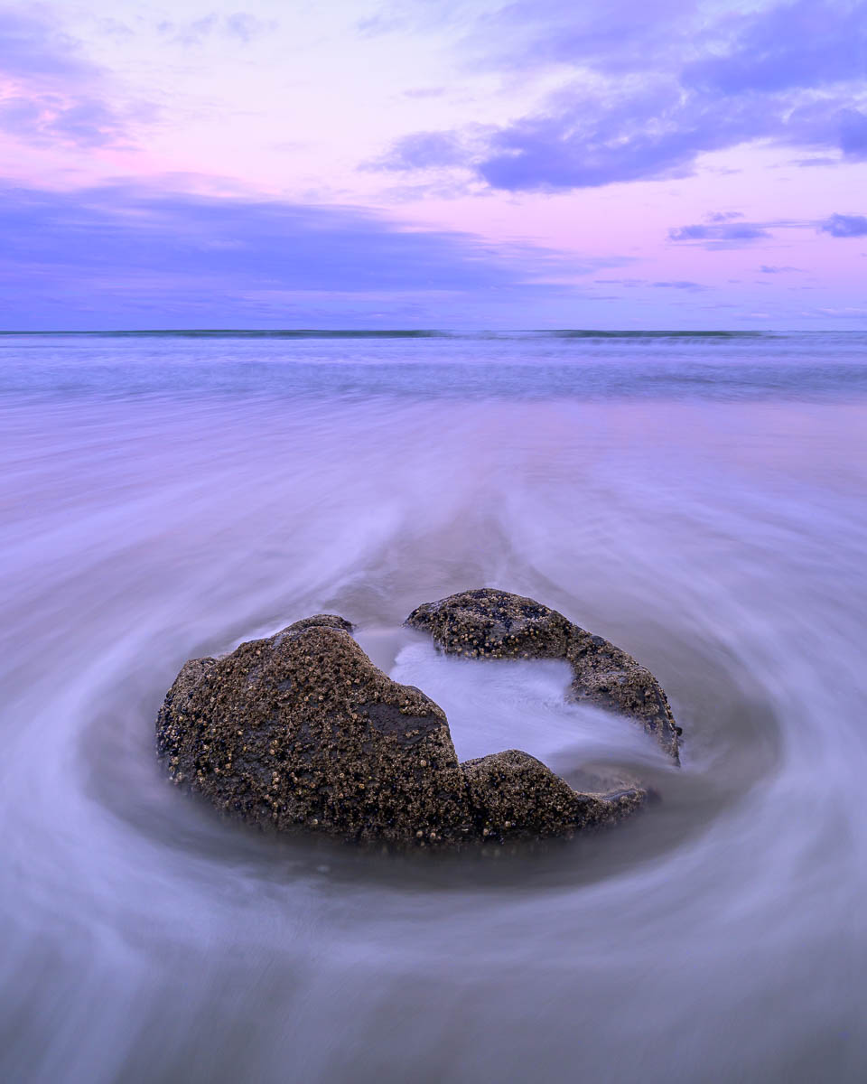
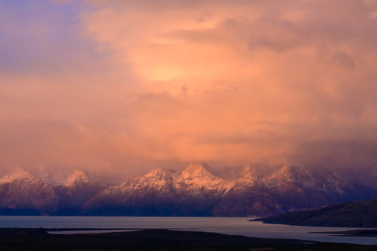
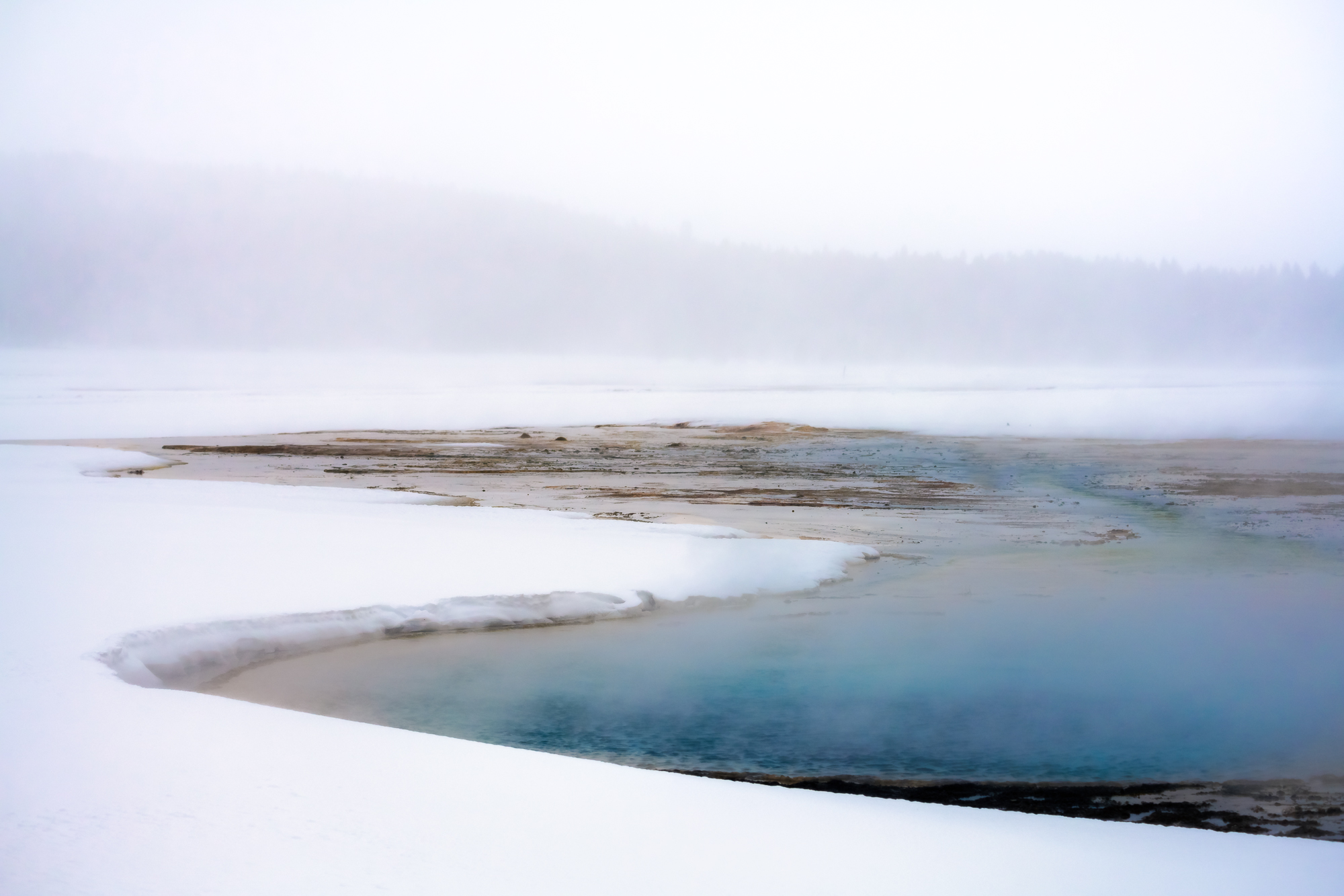
I like the simplicity of this Jay, it's very serene. The blue sea is contrasting with the sunset color then the gradation up to the blue top is really "soft" and peaceful.
Curious about your settings on this and was it hand held? |
Oct 5th |
| 93 |
Oct 24 |
Comment |
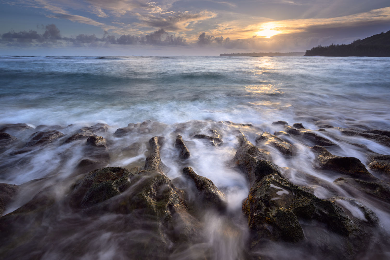
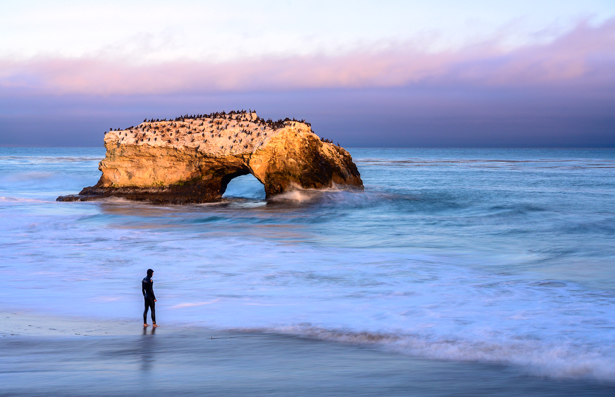
Darcy, I like the water curving to the ocean with the reflection of the sun, Nice framing! I like the little wisp of waves hitting both rocks as well. I'm assuming you used a tripod given 1/2 second?
As always, it's personal preference, but I like the original sun a bit more. If I didn't see it, I'd like how you edited it as well, but I prefer the deeper color just a bit more. |
Oct 5th |
| 93 |
Oct 24 |
Comment |
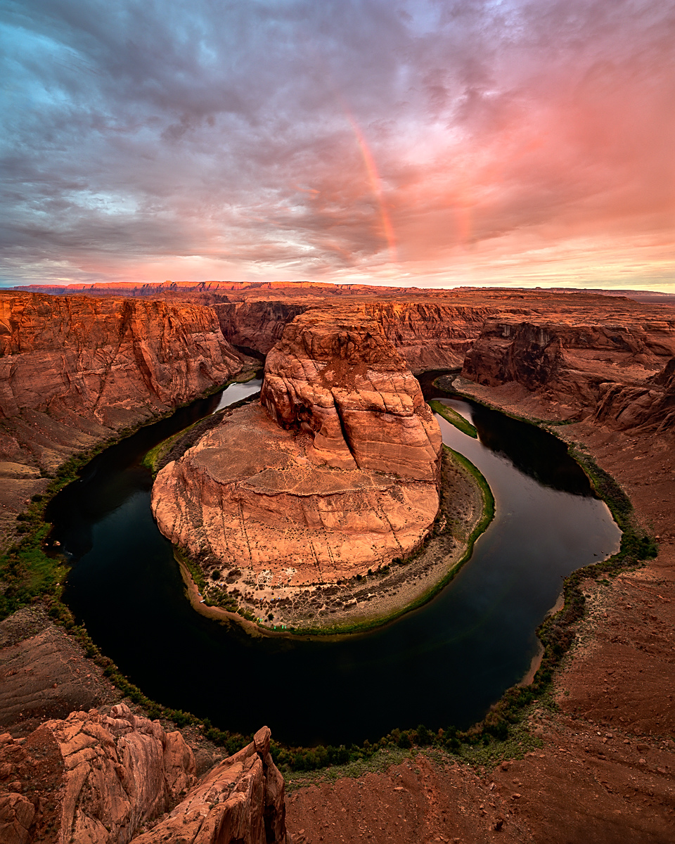
I like the leading line to the monument, how the two monuments in the back left and right frame the main one, and the depth of field with the stack is great. I like the wispy clouds as well and the soft light.
Couple of questions, how many images did you have to stack and what program do you use? I've been using PS, however don't like the results too much. How far from the ground were you? |
Oct 5th |
6 comments - 5 replies for Group 93
|
6 comments - 5 replies Total
|